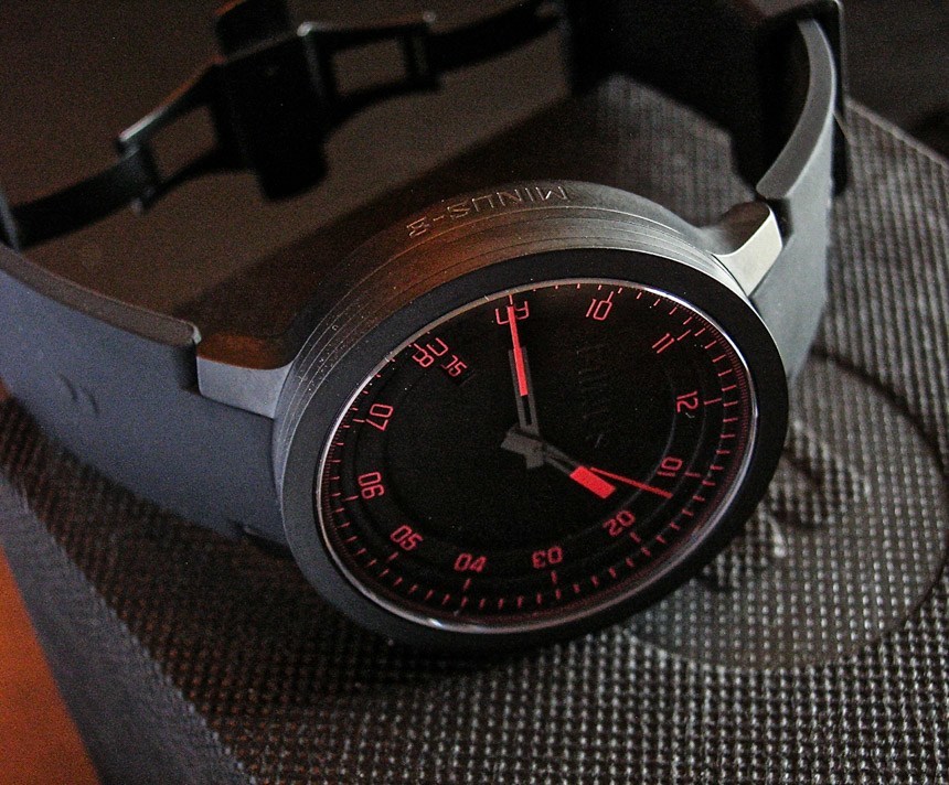
 We thank Michael K. for his pictures and watch winner review after being the lucky recipient of the Minus-8 Layer watch our October 2014 watch giveaway. Don’t forget to enter this month for a chance to win a Maurice Lacroix Pontos S dive watch here.
The Minus-8 Layer is not a watch I would have normally picked, so I decided to use the generous opportunity provided by Mr. Ariel Adams, aBlogtoWatch, and Ms. Natalia Daniel (a delightful woman with PCH/MINUS-8), to take a leap. I’ve been intrigued by blackout dials for some time, but always wondered about reading the things, and the Minus-8 Layer seemed to have an edge.
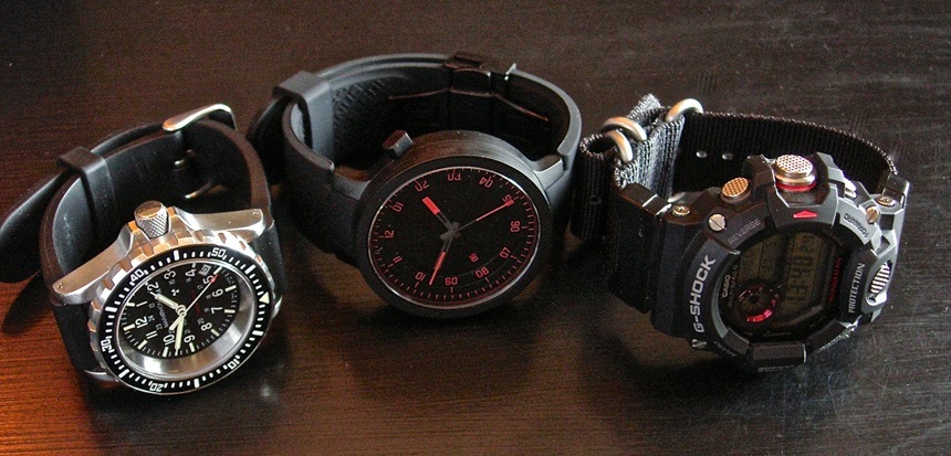
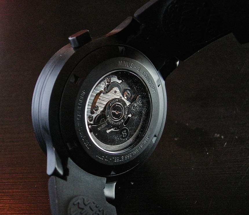
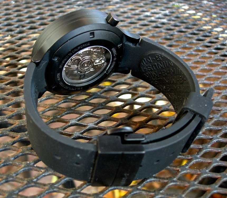
When I set it in my watch box amongst the divers, retro Russians, and MIP-PRF roughnecks, I was reminded of a line from Mel Brooks’ classic Blazing Saddles: “What’s a sophisticated urbanite like you doing in a place like this?” It’s sleek and retro/future in a cool Blade Runner sort of way. An obvious eye for detail and design went into this. It’s got a solid if unpretentious Seiko NH35A inside. Fresh out of the box, it’s keeping roughly +20/seconds per day dial up, crown up, and on my wrist, a good consistent rate. The regulator screw is dead center, so there’s plenty of room to tweak it after some break in if I want to get fussy.
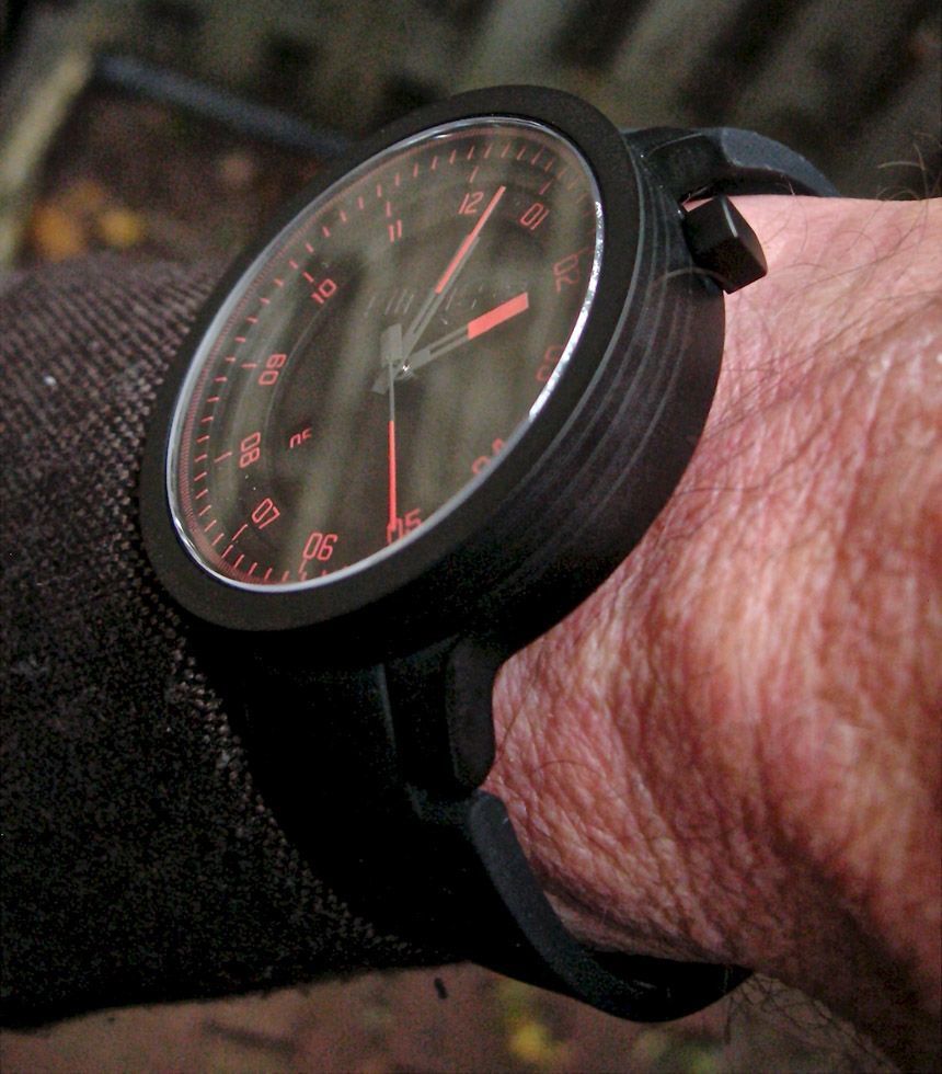
The movement is tucked away deep inside the case, and what a case it is. It’s a beast. It makes my Marathon TSAR look dainty, like it’s a cooling tower from a nuclear power plant. It’s thick and tall, with vertical sides for emphasis. Short, steeply-angled lugs curve it nicely, however, to my 7” wrist. PVD coating tones down the Industrial Age presence, but there are three other variations if one wants something bolder.
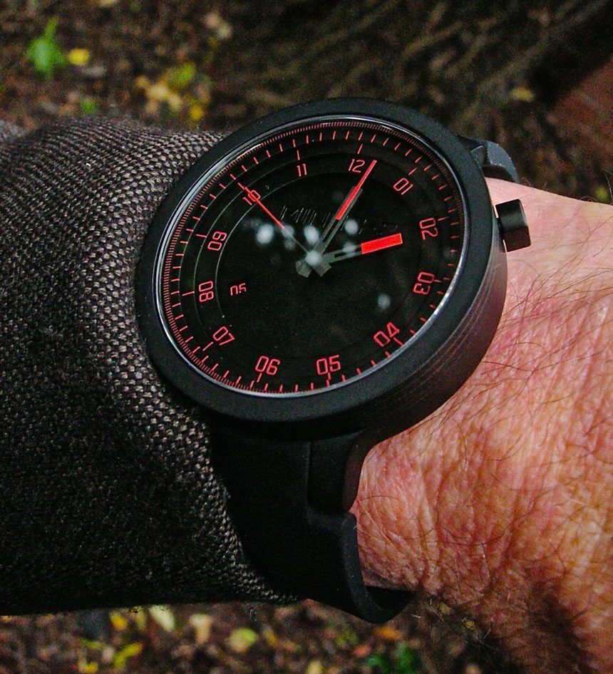
It’s the dial that really showcases the design ethos. It’s a blackout dial, so it doesn’t shout the time across the room, but the red-on-black scheme makes it surprisingly readable with a deliberate glance. The hands have a clean Deco vibe to them, the minute hand, especially, reminds me of the Chrysler Building (are you listening, Shinola?). The Minus-8 Layer is…layered, and they used the layers cleverly to pack a lot of information onto a very clean dial. The hour hand is tucked into the bottom layer with the date window, which I like at 8:00 very much, for some reason. Next layer up has hour numerals, font and double-digit format thoughtfully matching the date. Next up are baton marker for the hours or five minute increments, then the seconds markers, and on top, a narrow ring with 1/6 seconds hashmarks. That’s a lot, but the center of the dial is very clean. The hands reach only to the most relevant information, but there’s more if you look beyond, and a tasteful, stealthy logo keeps things minimal too.
If there was ever a watch that screamed for a good, thick anti-reflective coating it’s the Minus-8 Layer. It’s a big, flat sheet of sapphire, and gets optically-correct reflections from, well, everything. It’s much more legible in indirect light. Take it out in the sun, and some contortions are required to get past the Hubble-like images. Maybe it was a deliberate decision to have something shiny on the watch, but if that crystal would vanish, that dial would really, really sing.
Of course, there is the NFC-enabled strap. I haven’t mentioned it until now, since I don’t have any other NFC capable devices I can’t have much of an opinion. It’s pretty neat, but I’ll leave it to others more au courant to weigh in. Having the Minus-8 Layer unlock your phone might be kind of handy, and I think it might be very cool to link it to a smart door lock, and then just grab the knob and the front door opens. Maybe there’s way to set it so whenever you check the time you buy the closest thing to you? I don’t have the imagination to make it more than a bit of a gimmick to me at the moment. The strap itself is terrific, a “proprietary silicone” that feels like good nitrile, but does pick up a bit of lint. It’s thick, supple, and has a comfortable rough-out texture inside. A decent butterfly deployant clasp gives it an extra touch.
I do have to mention the crown. I think this is one instance in which common sense was mugged by design. I understand why it’s a funny little rounded rectangle thing, I really do. It’s totally in keeping with the shape of the case, but manipulating that odd little knob is frustrating. Crowns are round for a very good reason. Strip design ruthlessly to it’s basic functionality and stop there.
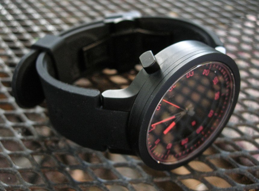
I’m a bit ambivalent about the look of the Minus-8 Layer because it’s just not totally me. Nevertheless, I admit the design is cool, for those looking for modern watches. I’m a diver/flieger guy (but is there a little EZM1 DNA in there?) and past the trendy young urbanite stage, if I could ever have pulled it off anyway. I must admit to glancing suspiciously at my wrist, fighting urges to grow a lumberjack beard and start vaping – but I can appreciate the Minus-8 Layer for what it is. It’s bold, different, and tools-up a fashion watch. Or fashions-up a tool watch – I’m not sure. It’s solid, well made… “machined” in the old-school precision industrial sense, and I’m sure one of you crazy kids can make the NFC chip indispensable. Man, AR that crystal and… seriously, do it.
Finally, how fun is it to have a cool guy you follow online email to say “Hey, I’m giving you a watch?” Mr. Adams and Ms. Daniel rushed it to me in only three days, and I’m grateful for the chance to try something new.
