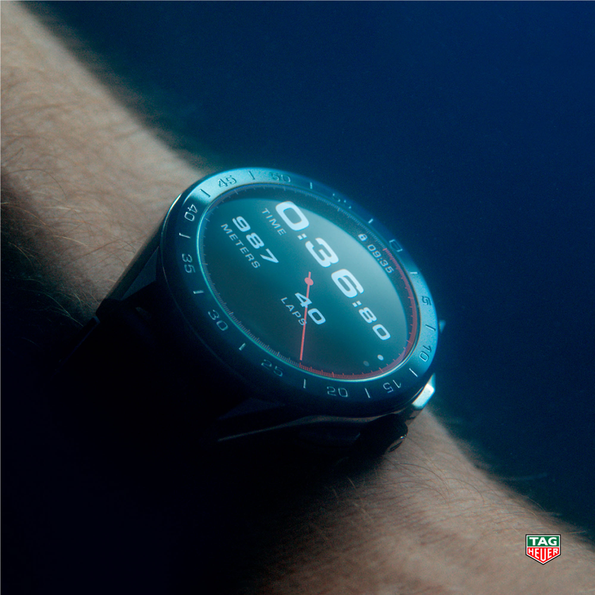
I was shocked to learn that it was some six years ago that I wrote our first hands-on article with TAG Heuer’s then-new smartwatch proposition. That’s allowed over half a decade for the Swiss watchmaker — and for Google, the provider of the base operating system — to refine wearability, performance, and, perhaps most importantly, user experience. I was curious to find out how the latest version of the TAG Heuer Connected smartwatch fared in 2021, and so I have been wearing one (in titanium, no less) daily for close to a month now. Here’s what I learned.
There’s so much to talk about. I could rave on about how most other Swiss luxury watchmakers have quietly removed their half-baked or overly optimistic offerings from the smart/connected field of products. But the point of all that would just be that I tip my hat to TAG Heuer and Hublot for flying the flag for the Swiss luxury watch industry in this uphill battle against tech industry giants. And also to Montblanc because they, too, appear to be pushing on, albeit with less zeal.
Instead, I’ll open with a note on where I, myself, have been overly optimistic: I thought the TAG Heuer Connected would transform me into a dedicated smartwatch-wearer. Into someone who finally saw the light, someone who became spoiled by all the available information on the health of my body — and that of my digital self. Speaking of which, there is something sad about the necessity of “digital health.” I saw a fair chance that I would be turned into someone who felt frustrated about every moment spent without his wrist-worn gadget, about not “filling my fitness rings” and making my “health achievements.” Long story short? Transform me it hasn’t, and here’s where this may be relevant to you.
There’s a first time for everything, and so, there’s a first time for buying a smartwatch…
…But the question is: Why buy a smartwatch in the first place?
Yes, even after all these years, at least some of us are still asking this question — and rightfully so. Why buy this smartwatch when you can get a quartz Aquaracer for less, or a mechanical one on a neat steel bracelet for exactly the same amount? And let’s be frank, an “unsmart” Aquaracer is much more likely to be worn and enjoyed 3+ years down the road, while that’s when the similarly priced smartwatch will likely be on its way out — either because the battery no longer lasts as long as it used to or because the tech has moved on both in smartwatches and the smartphones they are connecting to.
The manufacturers’ proposed answer is: Buy the TAG Heuer Connected for the added functionalities. TAG Heuer has produced a great variety of spectacular videos to explain much is on offer, after all: lots of various health and workout monitoring apps, a supposedly easier way of handling pesky notifications and other annoyances that would otherwise require taking out, unlocking and then putting away one’s phone (for the hundredth time that day). Plus there is the prospect of customizability with more dial variations, case, and strap styles than you could shake a stick at. That’s the pitch, and I was curious to see the realities of it.
How good is a smartwatch these days?
It’s only reasonable to measure “how good” by how well it executes all those aforementioned tasks linked to health monitoring, activity tracking, notification handling, time telling, etc. There are two ways to go about this and, frankly, both are equally valid. First, if you are tech-savvy and/or you were born in this century with a smart device already in hand, chances are that you’ll suffer little-to-no hardship handling the large and impressively sensitive, low-latency touch screen of the TAG Heuer Connected. Swipe left, swipe up, swipe down, press the crown, swipe sideways, tap, swipe, tap, scroll, tap… And you finally have some health tracking running. It’s all second nature, to some.
Second is the case of those of us who are either not tech-savvy, or we thought that we were… But it turns out just because you were ace with T9 on the keypads of brickphones of old doesn’t mean you are anywhere near as dexterous with a round 1.39″ OLED touch display. At the age of 32, I had to face the harsh reality of an SMS-battle-hardened T9 ace who today struggles in passing anger with all these swipes and taps and crown presses. I cannot, and do not wish to, remember for every app which different side of the screen I have to swipe from, when I can rotate the crown to scroll between options and when I cannot, and when I can use the physical pushers and when I cannot. I need all these things to work exactly the same among various apps — but the reality is that, in my experience, they do not, and my mind has, I’ll confess, struggled to memorize the various patterns of gestures that vary from one app to another.
And so, to me and folks like myself, a good smartwatch is a smartwatch that does many things automatically, on its own, with as minimal input as possible.
Sadly, and this is much more of a fault of Google than it is of TAG Heuer, Silicon Valley’s WearOS sometimes requires a ridiculous number and variation of inputs. It’s improved a great deal over the last few years, and it has to be said that my temporary frustrations with it must be coming from the fact that it’s so good at this point that I can see the light at the end of the tunnel — the light that implies a hassle-free, intuitive user interface that is perfectly consistent across apps and screens and inputs. That frustration is coming from the fact that it’s just not there yet. And these inconsistencies in the user interface may be annoying to some, while, to be fair, it may not even occur to others.
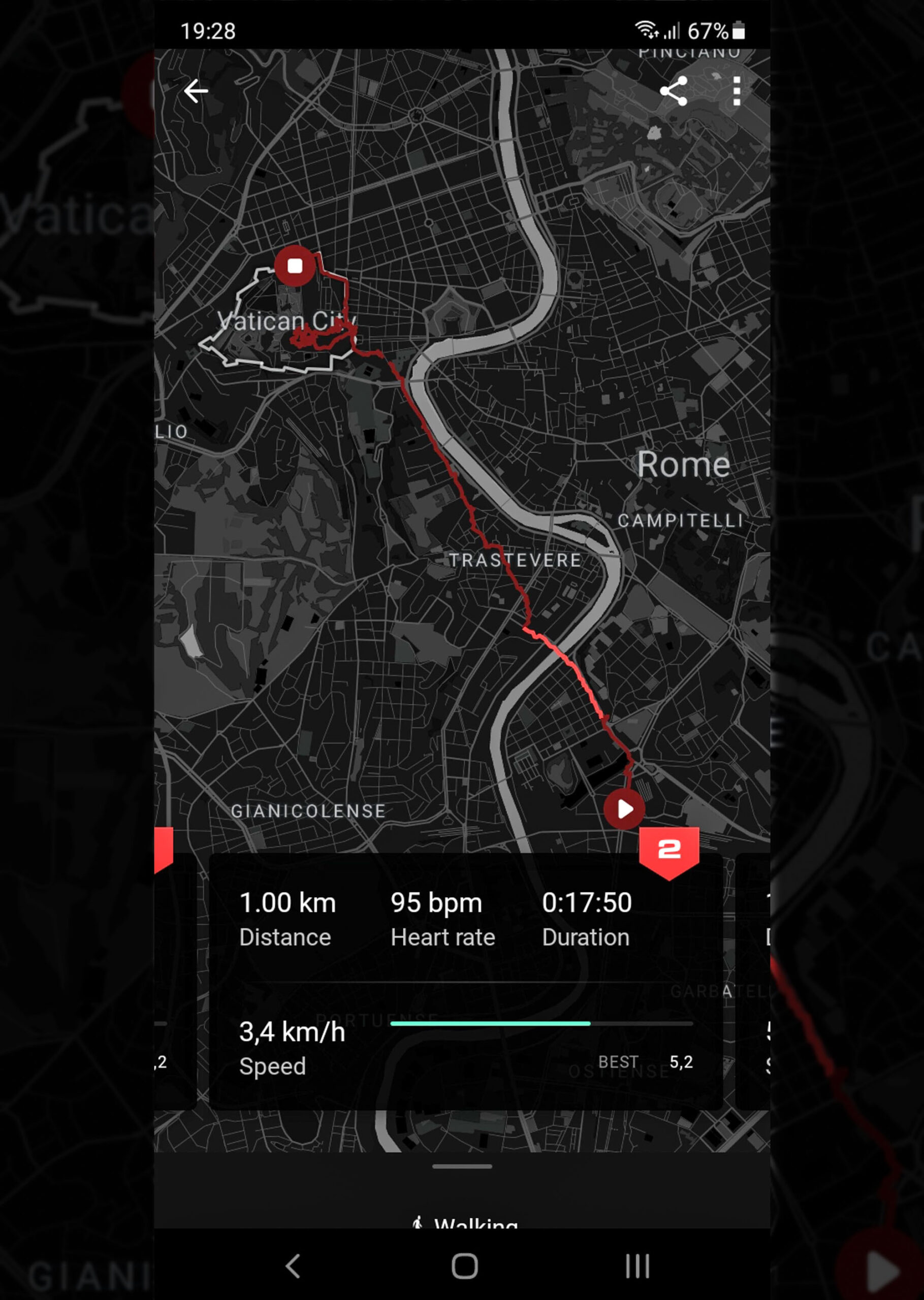
The TAG Heuer app looks great and syncs reliably. More details and information would be appreciated in some areas.
Activity & Fitness Tracking
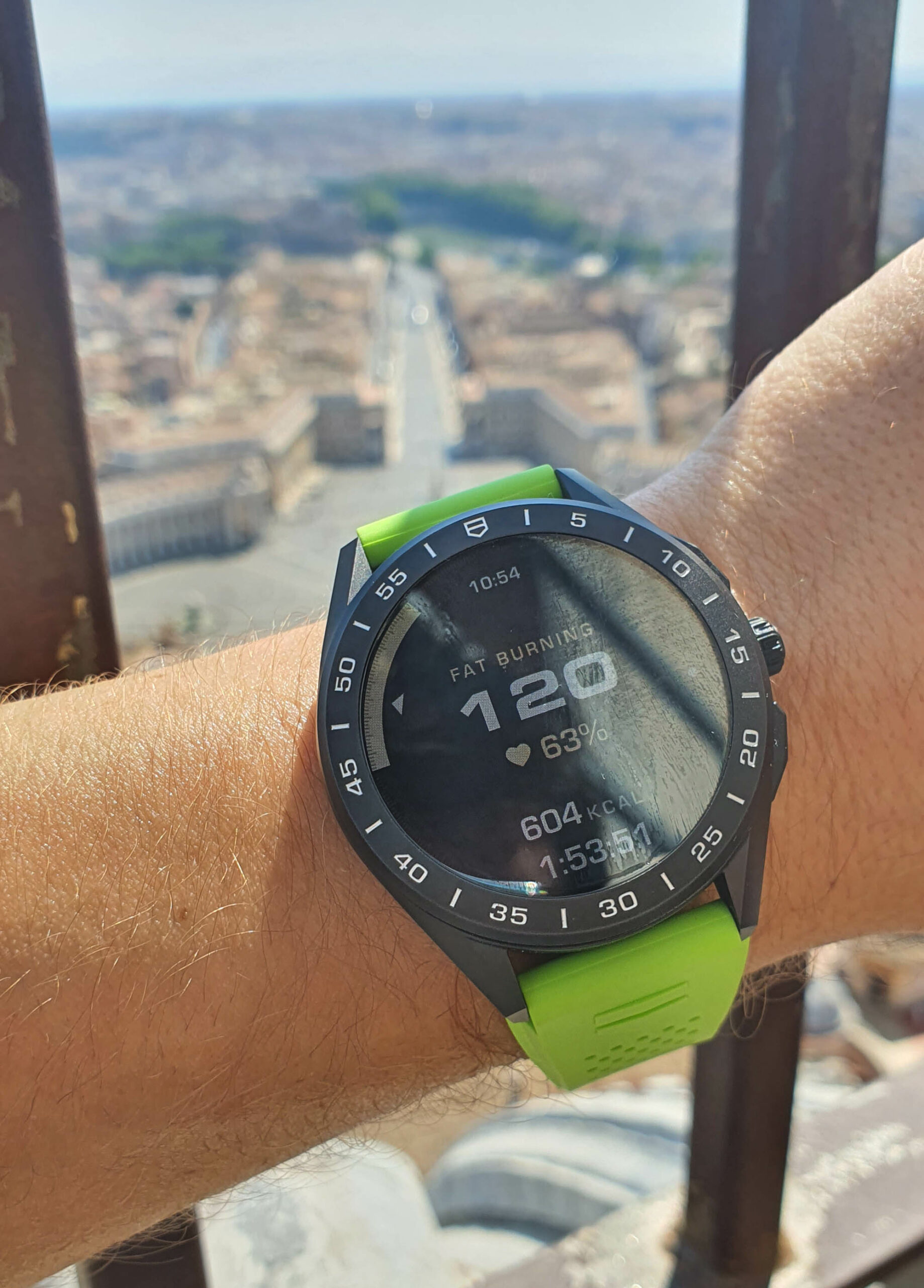
For example, I’d like the watch to keep track of my walks, my runs (if I did any, ha!), and my bike rides without me having to search for the correct app and then search for the correct activity and then select “GO!” and only after all this for it to start keeping track. I want it to do it all of the time, automatically. I guess noticing the beginning of a fitness workout session is more challenging than that of a walk, run, or bike ride, but I’d rather it started monitoring these right away. Likewise, it doesn’t stop (or even offer to stop) tracking — finding your session running 3-5-7 hours later (because you forgot to stop it) with all your heart rate and performance data corrupted by returning to a regular pace of life is rather infuriating.
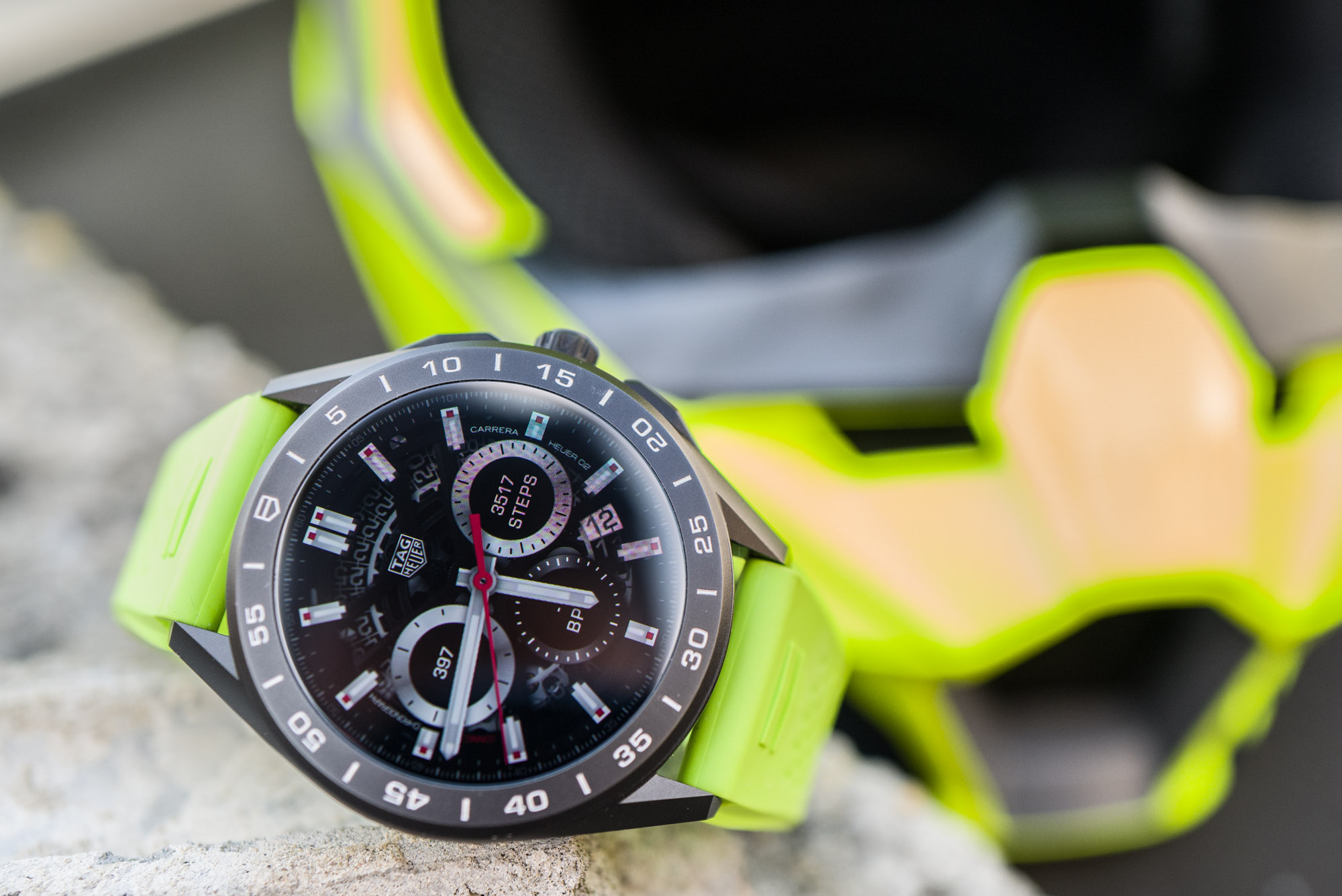
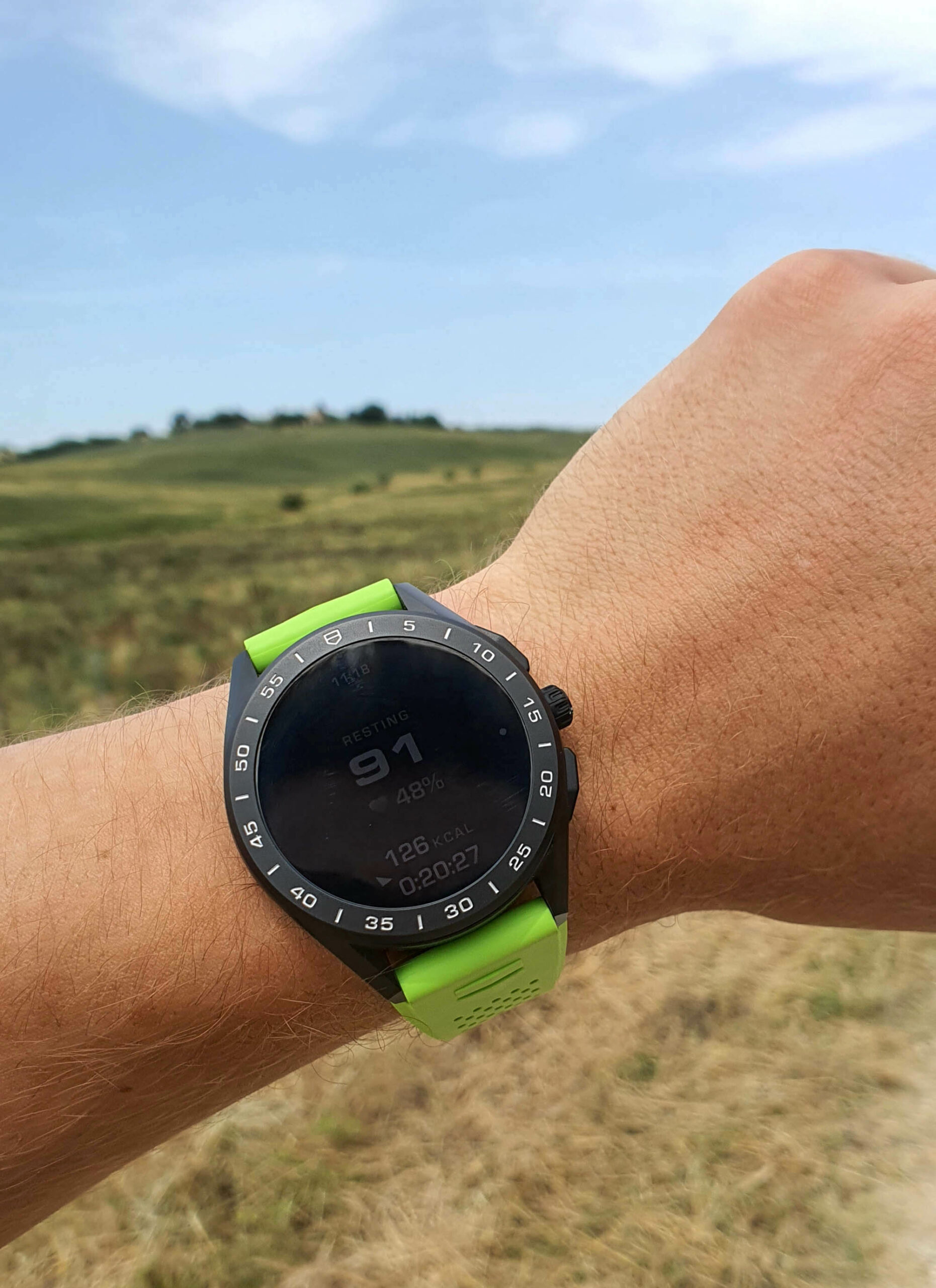
Some watch dials display steps; with others, step and calorie count are displayed in the notification menu.
Riding a bike to a workout session four times a week means performing all the aforementioned swipes and taps on the TAG Heuer Connected when starting the bike ride, stopping the bike ride, starting the workout, and then starting the bike ride home again. Three separate activities, four times a week, plus the daily walks and so on. Forgetting to set things up and initiate tracking shouldn’t be infuriating because you won’t be able to brag about your results on social media, but because what’s the point of keeping daily/weekly/monthly track of one’s progress if a number of sessions are missing, are incomplete, or otherwise corrupted? It all should be automatic. I believe the requirement for the manual launching of activity tracking is required to save battery life (more on that later), and that’s fair. But still, I’d appreciate something simple, such as a notification based on my movements, asking, “It looks like you’re riding a bike. Want to start tracking?” and “It looks like your session is over. Want to stop tracking?” It’s a first-world problem, sure, but it’s one that costs $2,350. For that, I’d expect more proactivity and less managing.
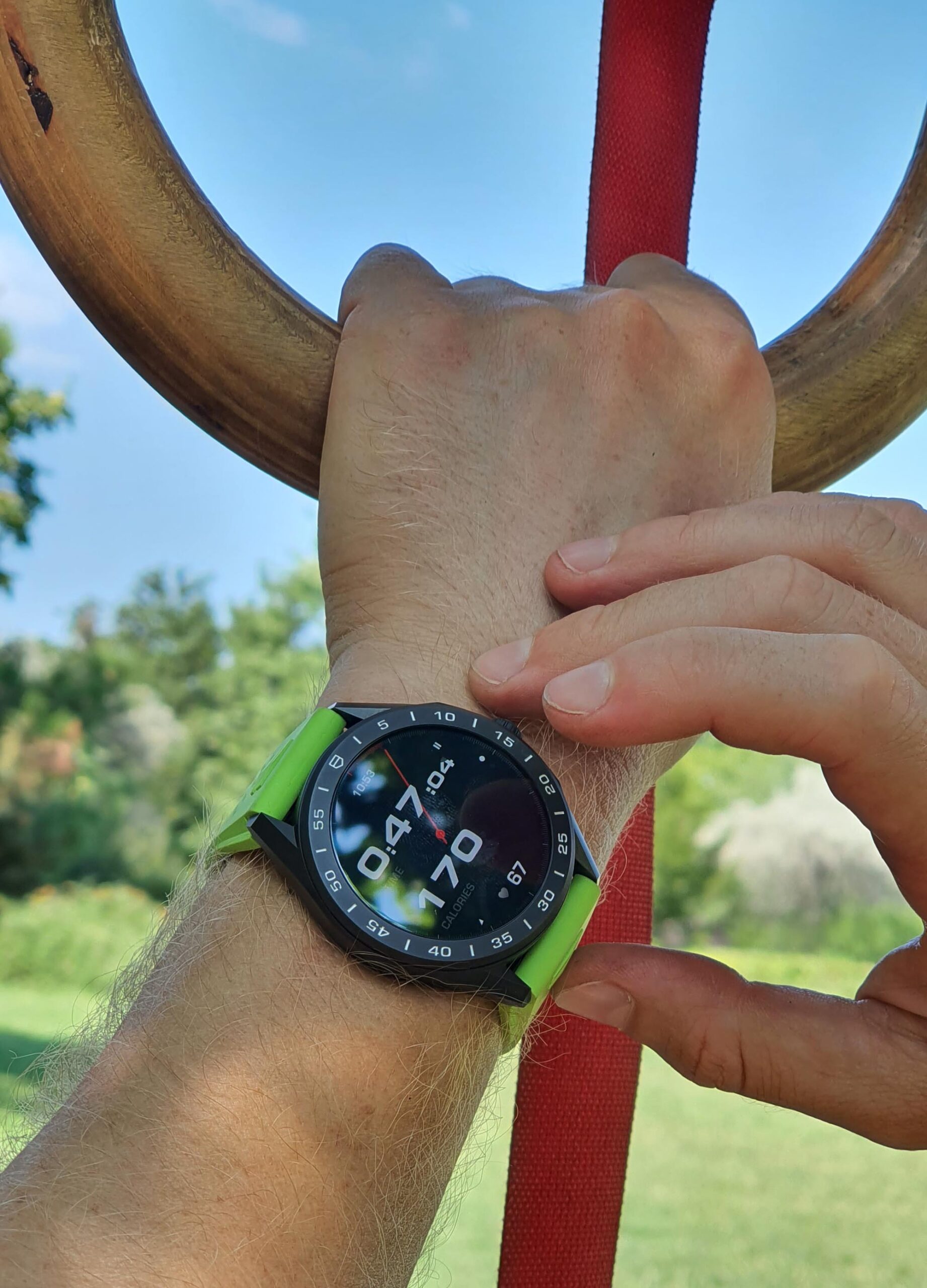
While much of the navigation requires many swipes and taps and scrolls, i.e., a lot of interaction, I felt as though most apps simply did not have enough options in them. Let’s say I’d want to be able to change various things or learn about various displayed pieces of information in greater detail; most often this is just not possible — there are no sub-menus or more detailed setup possibilities on the watch itself. This is such an all-encompassing experience that I can’t single out any one or two apps; being able to one-tap-measure my pulse in the health app, more easily browse detailed or previous health data, quickly check other time zones and reach other time zones from the main watch display, change certain device settings… a lot is missing. Sure, this would make the device less streamlined and more confusing to some, but, as it stands now, it often falls between the two extremes. It takes a lot of input and gives limited information.
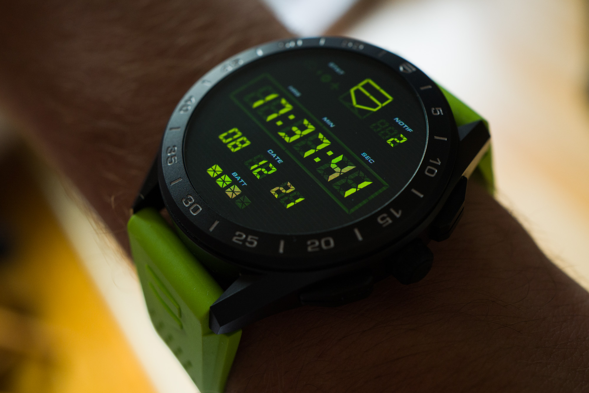
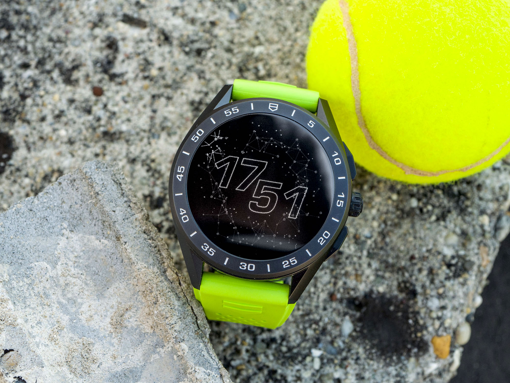
Any color fringing is seen only by the digital camera – colors are vibrant and consistent for the human eye.
Telling Time & Watch Dial Customization
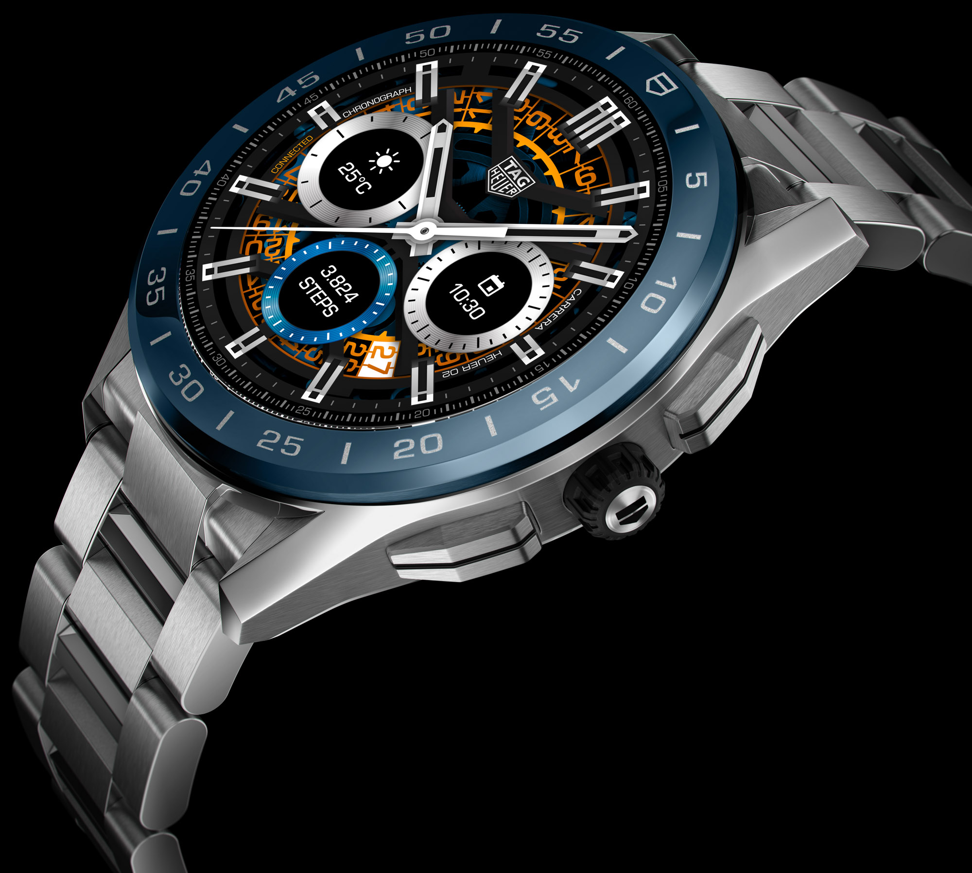
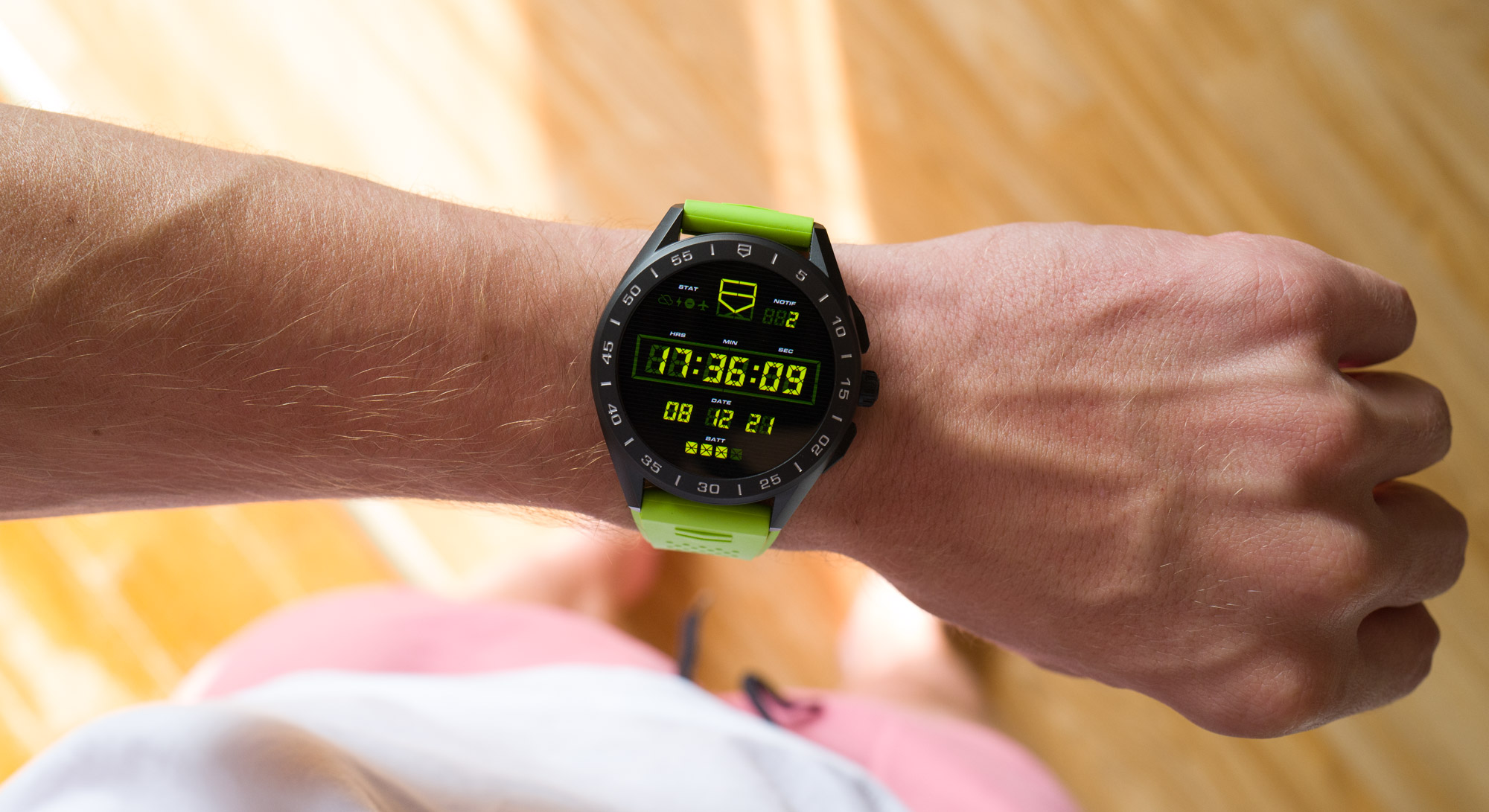
The TAG Heuer Connected smartwatch offers a range of dial options. While the colorful display and its fancy app screens may come across as tech verging on juvenile, the impression on the wrist is still more of a proper device/sports watch than a toy for rich kids. If you want to go classy, then the “Classic” and “Heuer02” watch dials help take off the funky edge completely. A particularly charming detail is how the Always-On mode of the “Classic” version is a luminous version of this familiar Carrera-styled display. The large sword hands and indices light up in green and stand in ample contrast against the black and dark gray areas of the rest of the Always-On display.
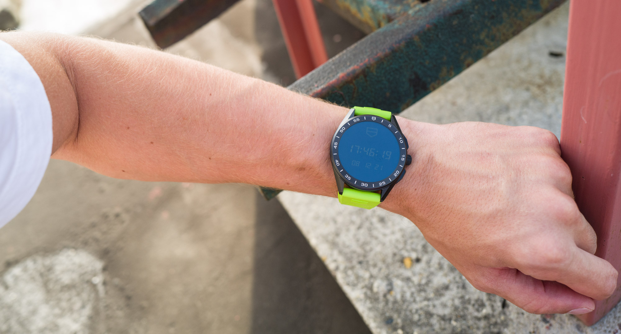
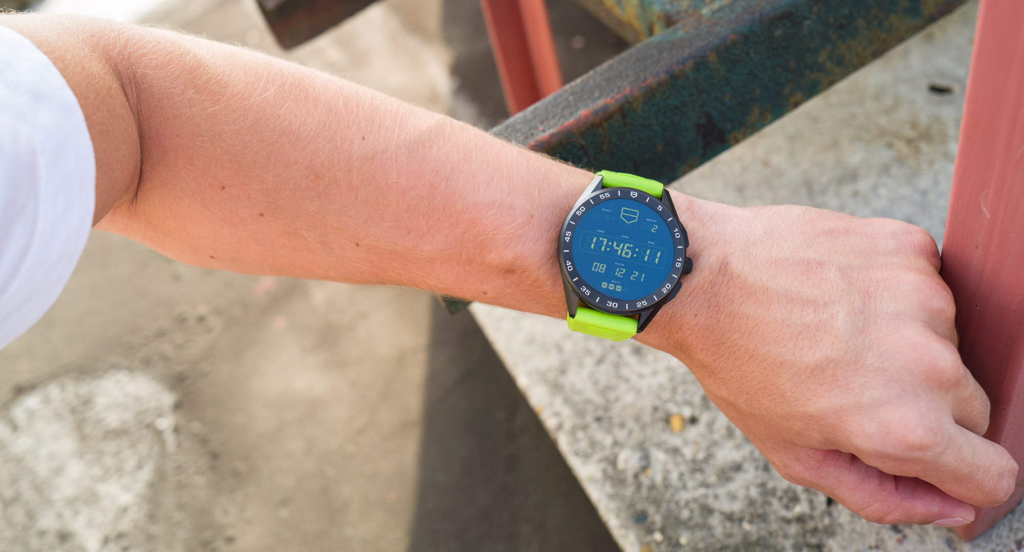
The Always-On display is virtually impossible to see in direct sunlight. The On display is sufficiently bright for most circumstances.
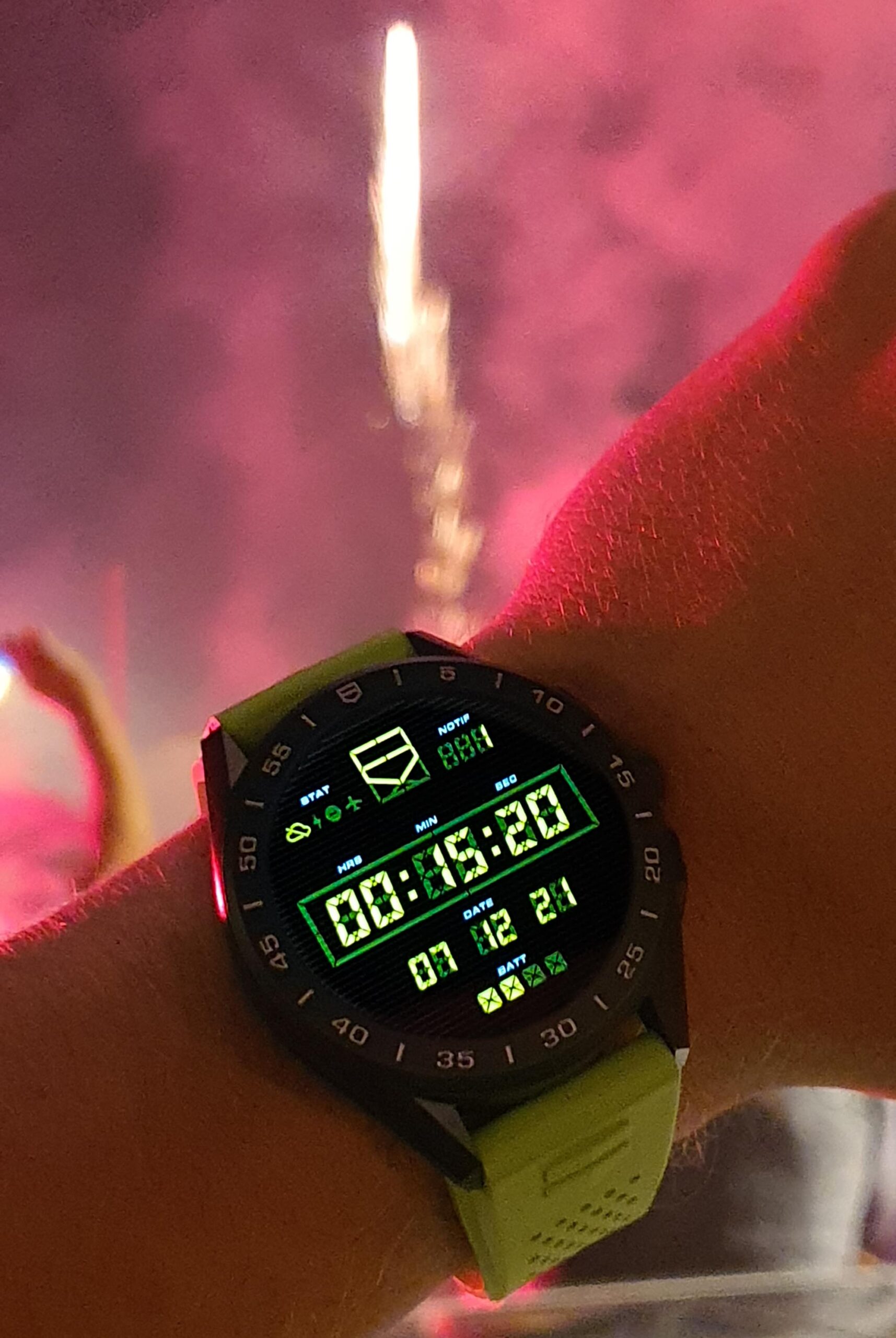
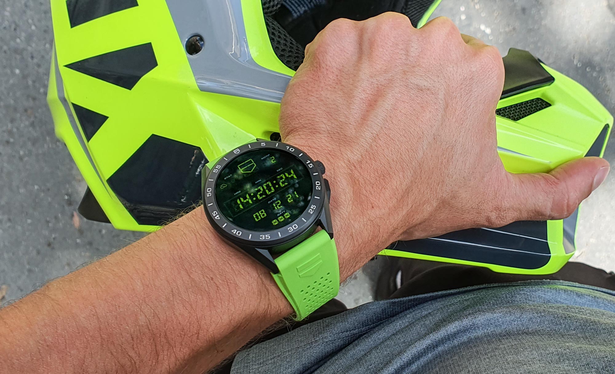
Flick the wrist, and the display turns fully on — no big deal, as most all smartwatches do this these days — and your choice of a familiar TAG Heuer dial comes to life in full brightness, color, and detail. If you choose a chronograph “face,” tap on the screen to start the chronograph, tap again to stop, double-tap to reset. It would be great if the dials without a chronograph function could swap between a primary and a “GMT” time on a double-tap. I find it odd that such a popular modern feature (namely a second time zone display) is missing or is so hard to find on what so deliberately wants to be a proper watch. The overall legibility of many of these displays could be fine-tuned further: One of the coolest watch displays, called “Timekeeping,” is an emulated digital display that in fully “on” mode has the “unlit” digital parts a bit too bright, meaning there isn’t much contrast between the bits that display the digits and the bits that are supposed to be off. Nuanced stuff like this.

A terrible phone shot taken at the pleasant surprise of the imitated “lume” display for the Always-On mode of the Classic dial.
Battery Life, Handling Notifications & Other Smartphone Features
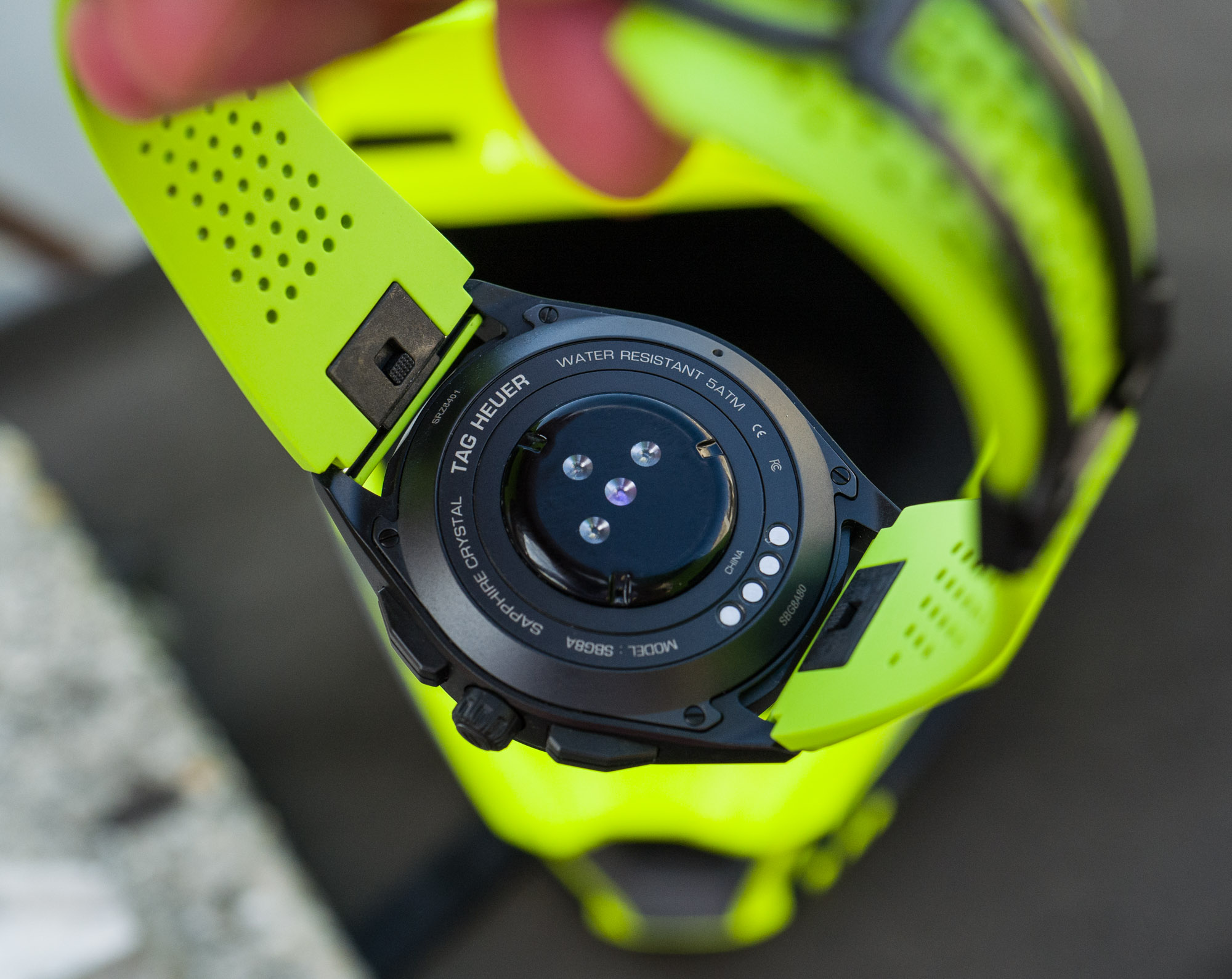
With just about every highly specified smartwatch (that has GPS, constant connection with other devices, WiFi, a bright display, etc.), putting the device on charge at the end of the day had better became second nature. This I didn’t find much of an inconvenience — as someone who always removes his watch when arriving home, it really doesn’t matter to me if I place it on a shelf or on a charging dock. The dock took a few days to get used to, but now I can attach it without paying much attention to it. When I had to, I could have the TAG Heuer Connected span three full days of wear — but that did include turning its Bluetooth and WiFi connections off and just using it as a watch and activity tracker — activity that reliably and automatically synced with my phone once the two reconnected, which is something I definitely appreciated.
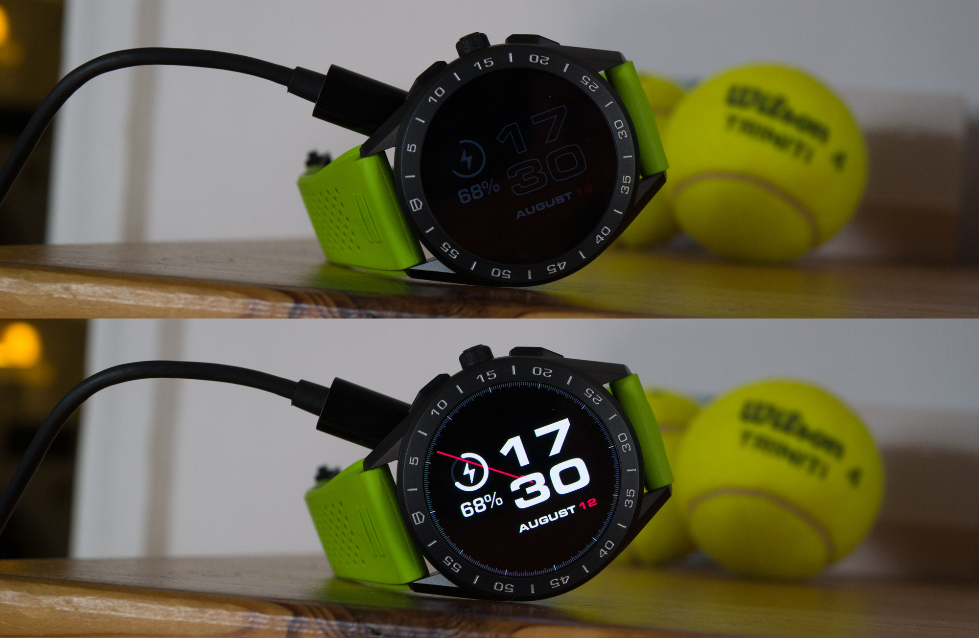
When placing on the charger, the bedside mode would flash up once and the watch would return to normal mode — I couldn’t find a setting to make it reappear.
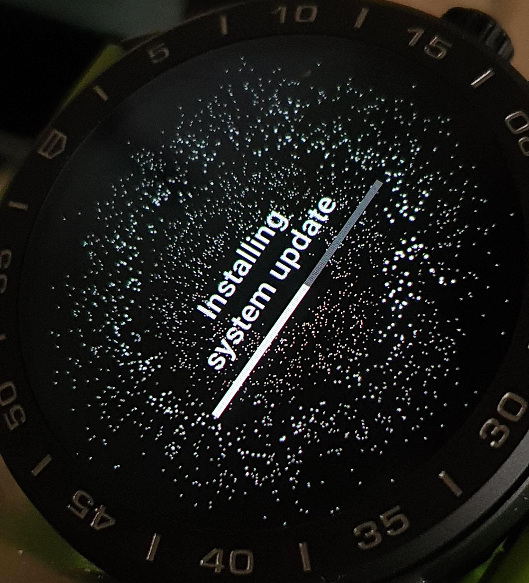
You have to know that using GPS tracking for runs, walks, cycling and what not may deplete a full charge in 3 to 4 hours. In return, you’ll get a super accurate map view on where you’ve been and you can select various sections of your run to check distance, heart rate, time duration and average speed. A full day exploring a city with everything tracked is not yet a possibility, given how power-hungry GPS receivers are and how much power such a tiny battery can hold. But then again, that’s a thing with smartwatch technology in general and is not specific to the TAG Heuer Connected.
A real head-scratcher however is Energy Saver mode. It turns the watch off almost completely and just leaves you with a low-brightness, low-resolution display to be able to read the time. Now, to exit Energy Saver mode, the watch requires connecting to a charger, irrespective of how much charge the watch has still remaining. I have absolutely no clue why this is necessary, and it is immensely frustrating. Without a charger, the watch just gives you a “charger image” and won’t turn on, even if it’s at 90% charge. So, if you set the watch into Energy Saver, for whatever reason, and have just left home with the watch on and you want to wake the watch (already on your commute), you won’t be able to use it unless you get back home to the charger. This is very odd, and it got me at least a few times.
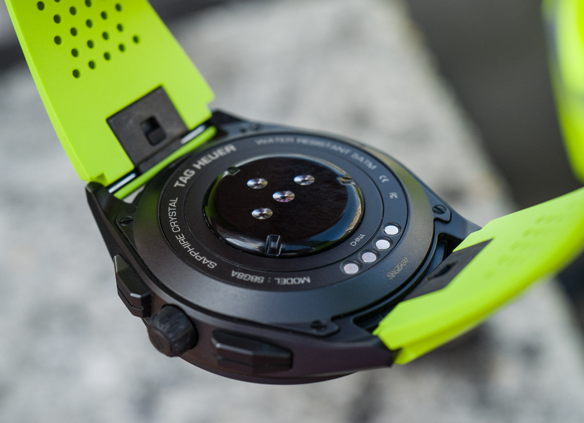
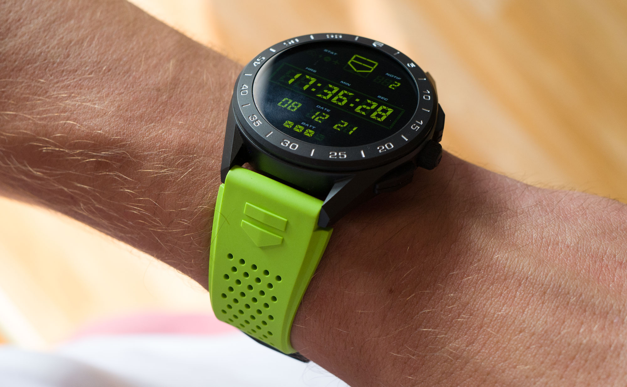
The second question: Why buy an expensive smartwatch?
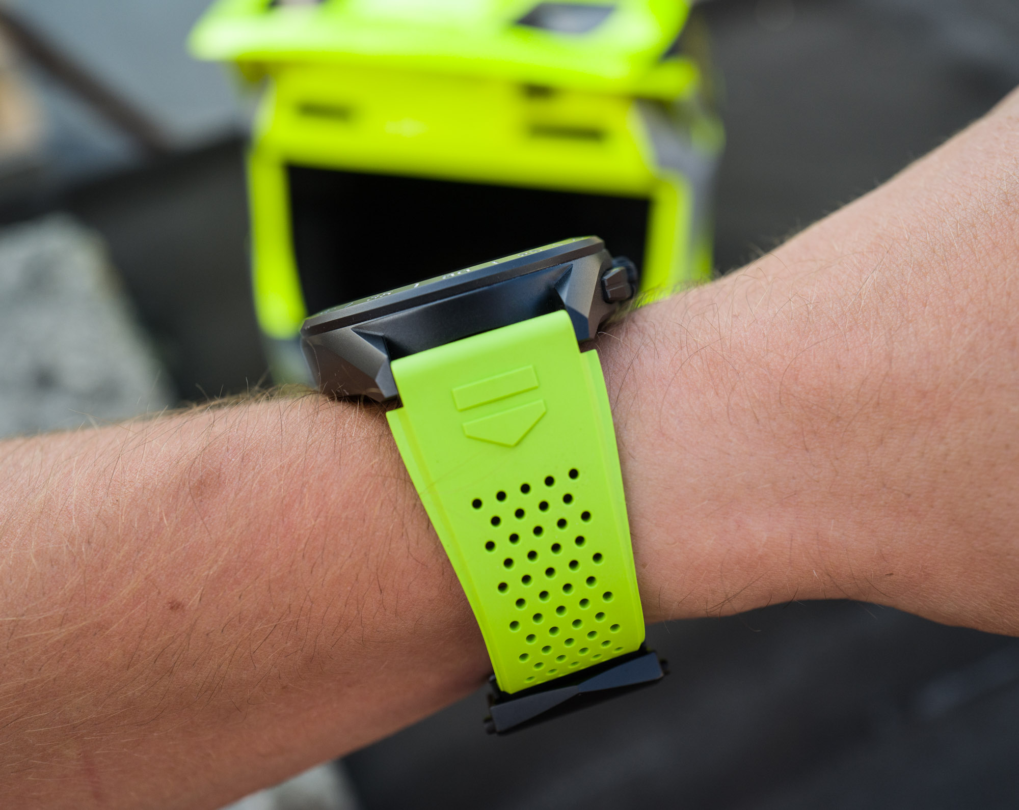
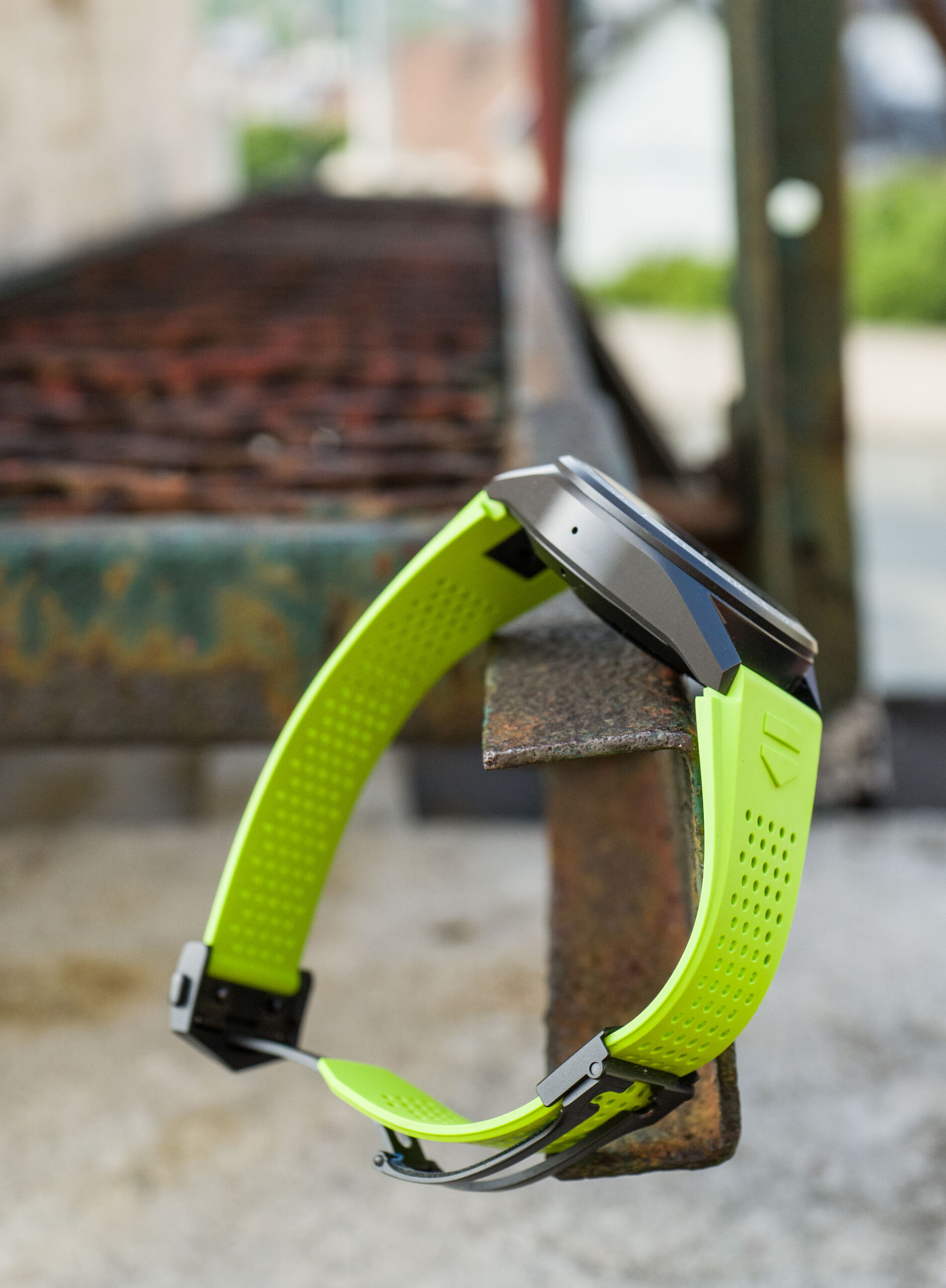
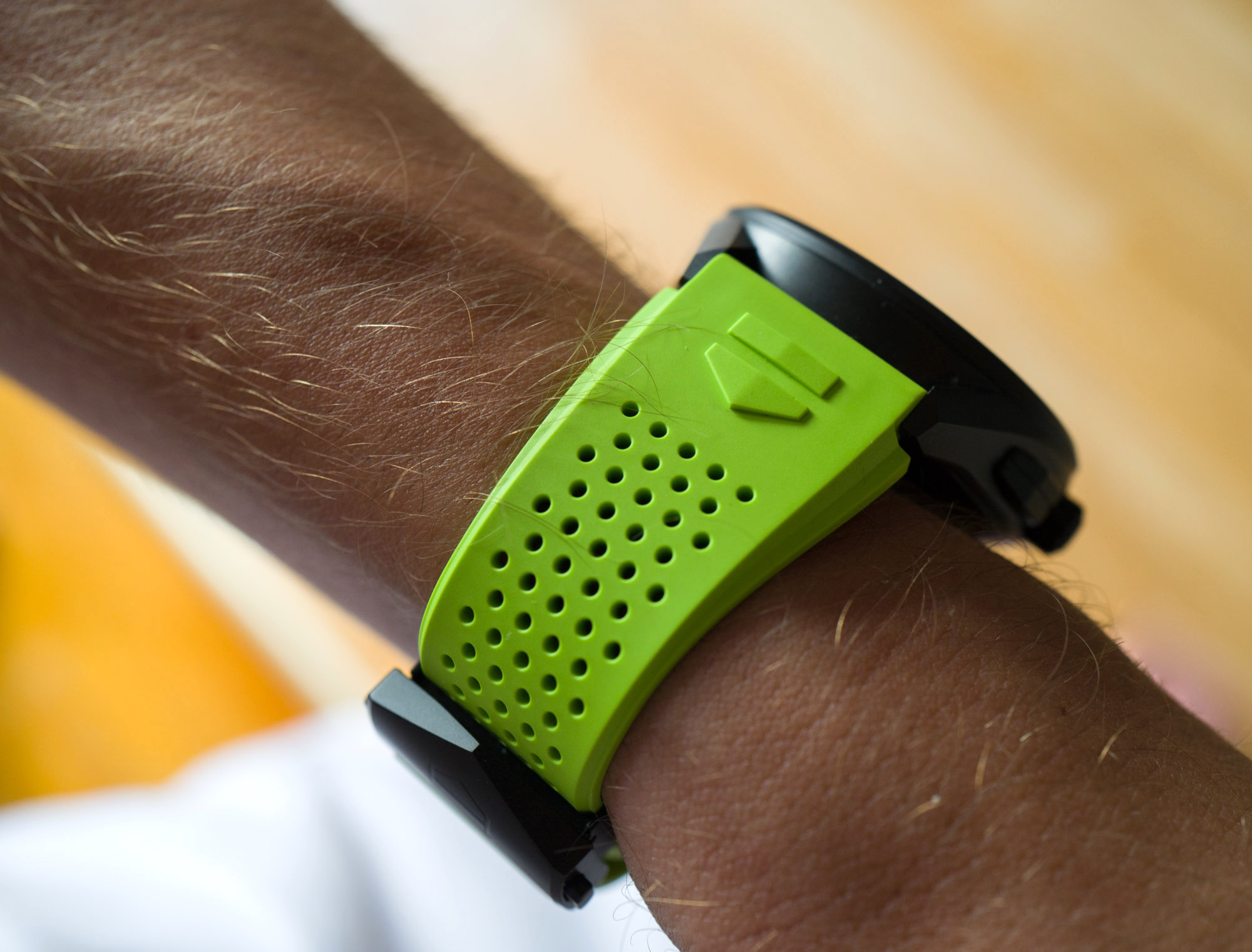
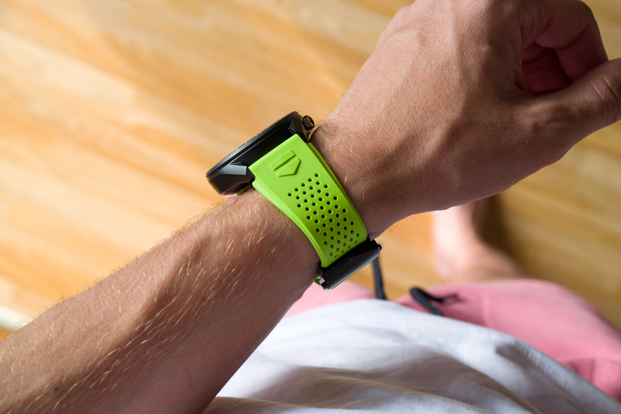
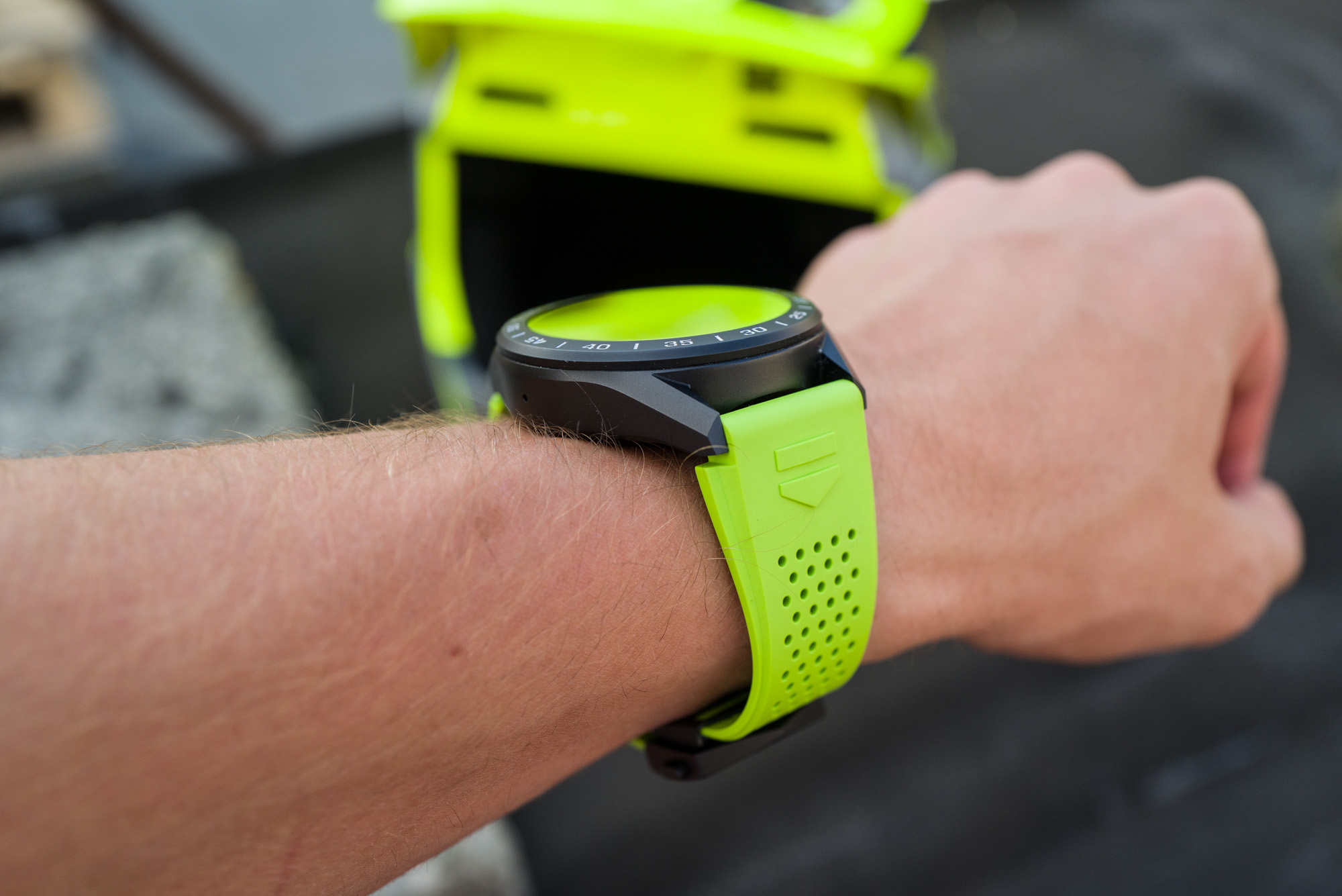
To be honest — at the risk of coming across as a helpless snob — I quite enjoyed wearing TAG Heuer’s expensive take on the smartwatch. There is something to the black-coated titanium case, buckle, and neon green strap (other strap colors are also available) that looks and feels sufficiently refined and solid, even to someone who’s completely accustomed to wearing what watch snobs would snootily call “proper” watches.
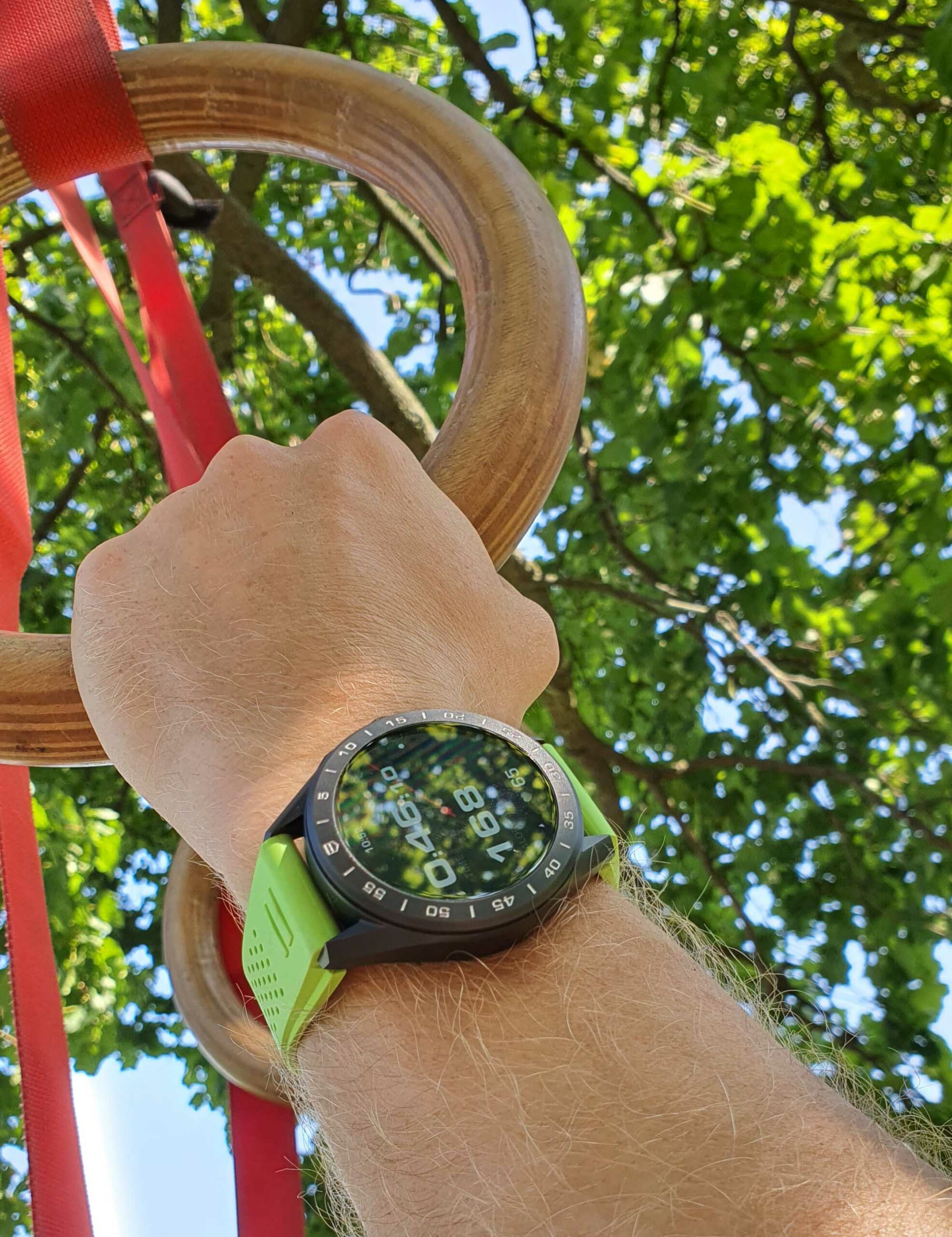
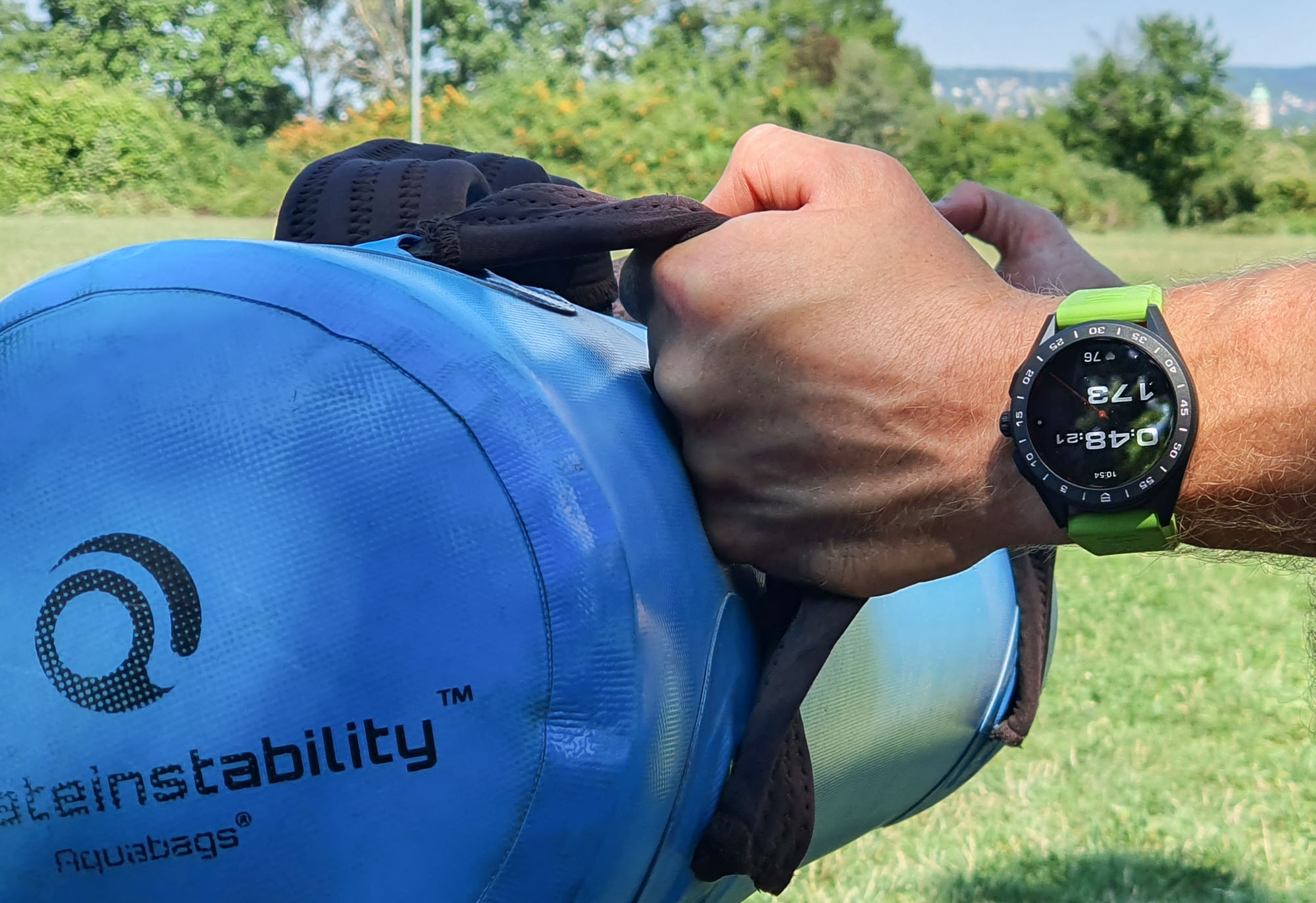
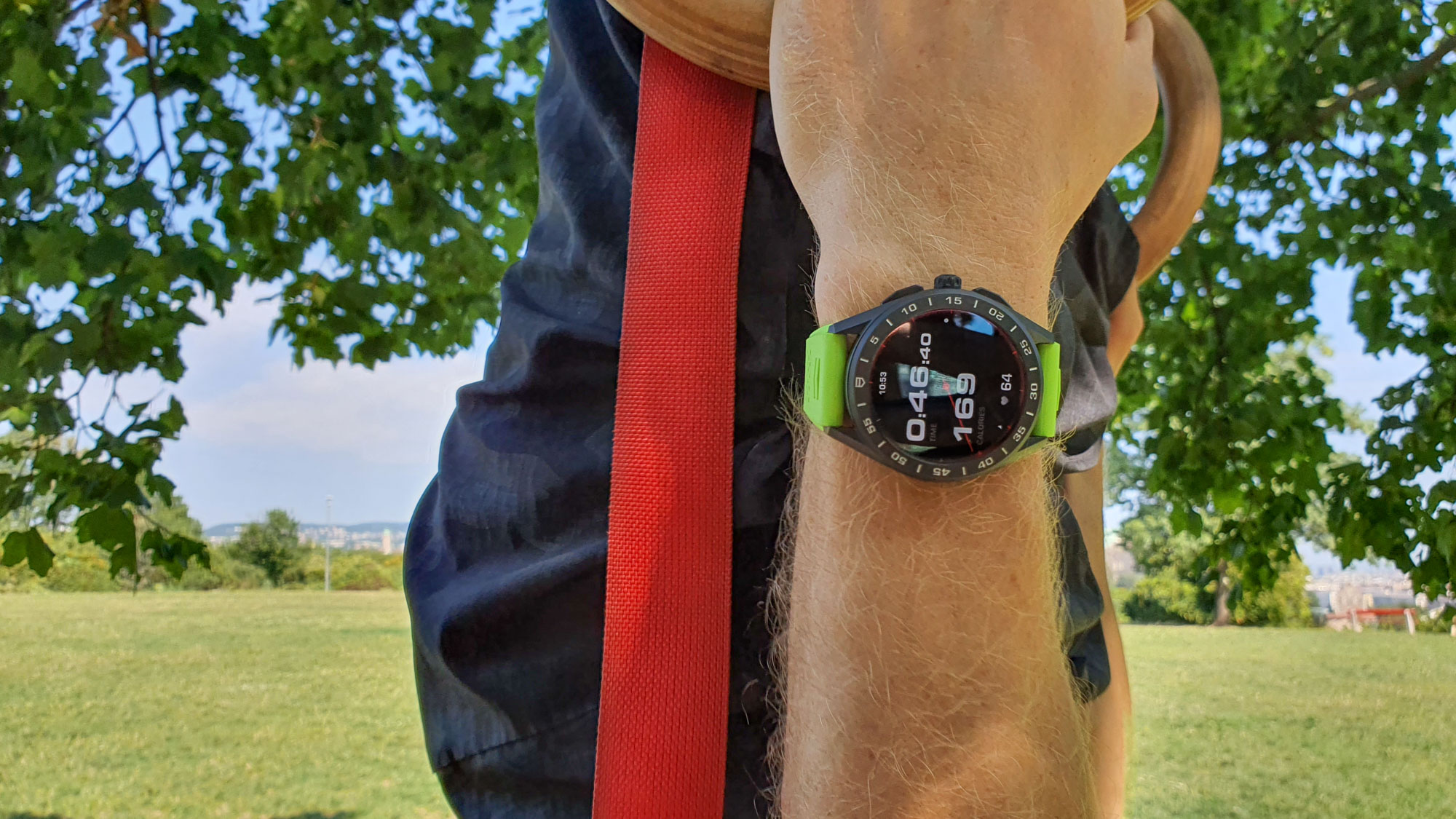
One area in which the Connected really excess is durability. I had an eyebrow or two raised when I first put this black-coated titanium case on my wrist, having experienced both extremely durable and disappointingly fragile exterior surface coatings on watches before. With gyms closing due to COVID, my trainer has been performing his 3-4 weekly workouts outdoors since late 2020. Having never returned to the gym since, we have been climbing trees, using various kinds of weights, sandbags, weight vests, gymnastic rings hung from trees, and so on. Plus, I’ve been riding my bike to the location that we have more or less made ours during this time. Having put the TAG Heuer Connected through all this over the last six weeks (adding this section to the review on the very last day), the watch still looks exactly as new, which is, frankly, astounding. Every smartwatch owned by family and friends around me, except for the sapphire-topped Apple Watches, look like a dog’s dinner after just a month or two of such wear — and this level of durability is definitely something most all cheap(er) smartwatches struggle to offer.
TAG Heuer has really excelled with the exterior execution of the TAG Heuer Connected in titanium. It has proper edges and neatly defined surfaces, unlike the potato-like renderings of many other titanium watches in this price segment. I was pleased to find an excellent water-repellent coating on the display — a little-discussed spec — that makes a world of a difference every time when wearing the Connected in the pool. Literally seconds after lifting the watch out of the water, every last drop rolls off the screen as though it had never been wet before. Really cool and very useful. The touch display, or rather the software that drives it, is exceptionally smart at ignoring water droplets and other unwanted inputs, making all the TAG Heuer ads where the Connected is worn for serious swim sessions that much more legitimate.
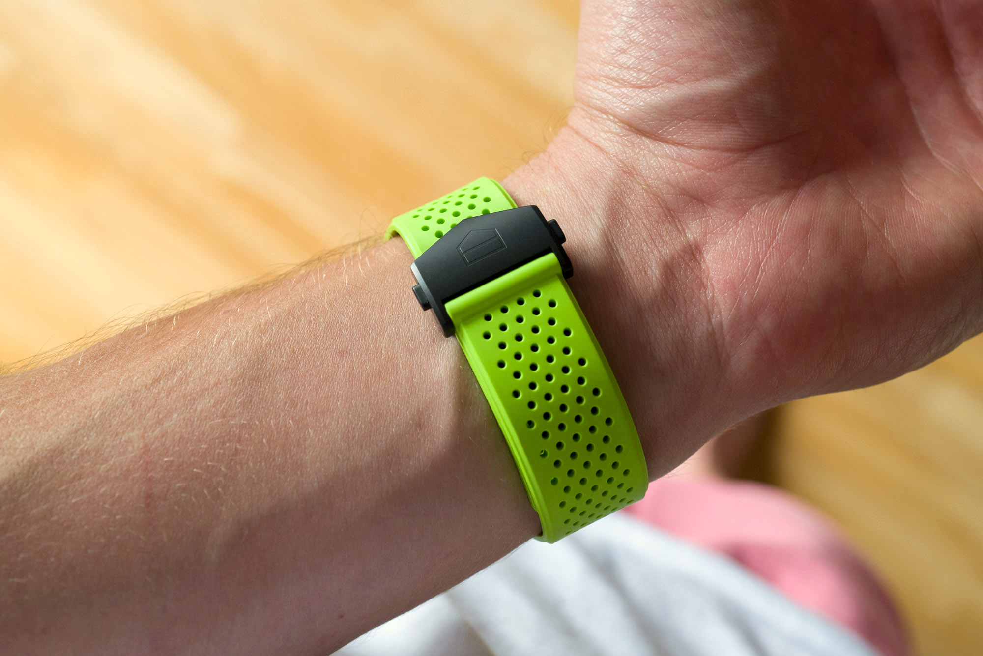
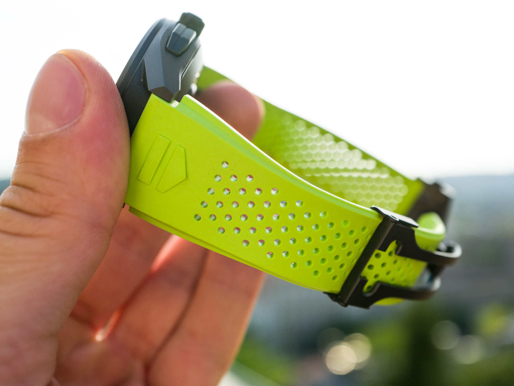
In closing, I’ll flip that question around and say, “Why buy an expensive regular watch?” For many customers, it’s about build quality, wearing experience, and status — and every watch that’s considerably more expensive than another should offer noticeable upgrades, at least in one or more of those three areas. The TAG Heuer Connected does exactly that: It feels a lot better to the touch than your run-of-the-mill Android smartwatches; it at least tries to offer a better wearing experience through bespoke TAG Heuer Fitness apps; and it definitely outperforms all alternatives by rocking the TAG Heuer shield on both ends of the straps (right next to the watch head where they can be seen), at the center of the bezel, and by displaying recognizable TAG Heuer dial options. Whether or not these upgrades justify the extra outlay is for everyone to decide for themselves.
Summary
In conclusion, the TAG Heuer Connected looks and feels great to wear and is built well enough to please watch enthusiasts who are used to regular watches. But, when rendered in this smooth black titanium, it is more expensive than many of the regular quartz and automatic watches that TAG Heuer offers. The software side of things still needs a fair bit of work across all areas — with those bugs and limitations gone, I could definitely see myself wearing the Connected on weekdays and for workouts. Until then, if I were going to spend $2,350 on a TAG Heuer, I’d be very tempted to get an Aquaracer Calibre 5 for the exact same amount (on a steel bracelet), or save $600-$700, and get the quartz version.
TAG Heuer is extremely close to nailing the smartwatch, and it has been carrying the flag for the Swiss watch industry by coming this far. The software-based shortfalls of the Connected are shared by all other smartwatches, in my experience — and there are hundreds of thousands of happy smartwatch users out there who are not as bugged by them as I was. If you like what current smartwatches can do and want the best, most upscale wearing experience, the TAG Heuer Connected is something you should consider. If you are still on the fence about smartwatches, about what they do and how they do it, I’d say hold out for another year or two. Price for the 2021 TAG Heuer Connected smartwatch in black titanium is $2,350 — prices for the TAG Heuer Connected smartwatch start at $1,800. You can learn more about the TAG Heuer Connected at the brand’s website.
Necessary Data
>Brand: TAG Heuer
>Model: Connected smartwatch SBG8A80.BT6274
>Price: $2,350 USD
>Size: 45mm-wide, 14.5mm-thick, and 53mm lug-to-lug distance.
>When reviewer would personally wear it: Weekdays for health and fitness tracking.
>Friend we’d recommend it to first: Not new to the world of smartwatches, looking for an upscale offering.
>Best characteristic of watch: Feels and looks great on the wrist. Feels sturdy, comfy, and well-made even during workouts, cycling, and swimming.
>Worst characteristic of watch: User interface requires a confusing variety of inputs while frequently offers insufficient depth of data and settings.

