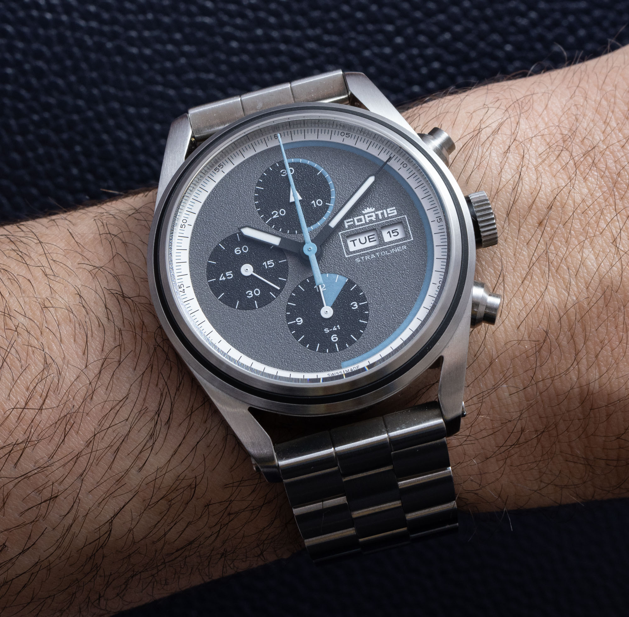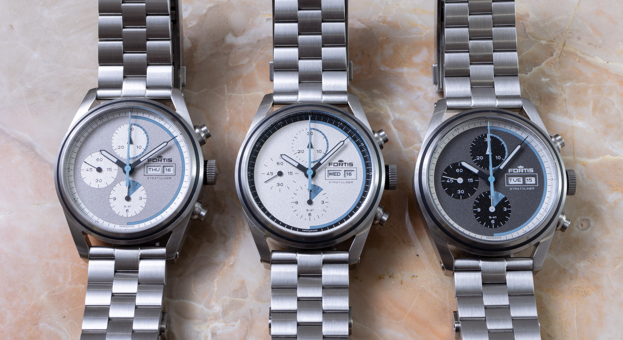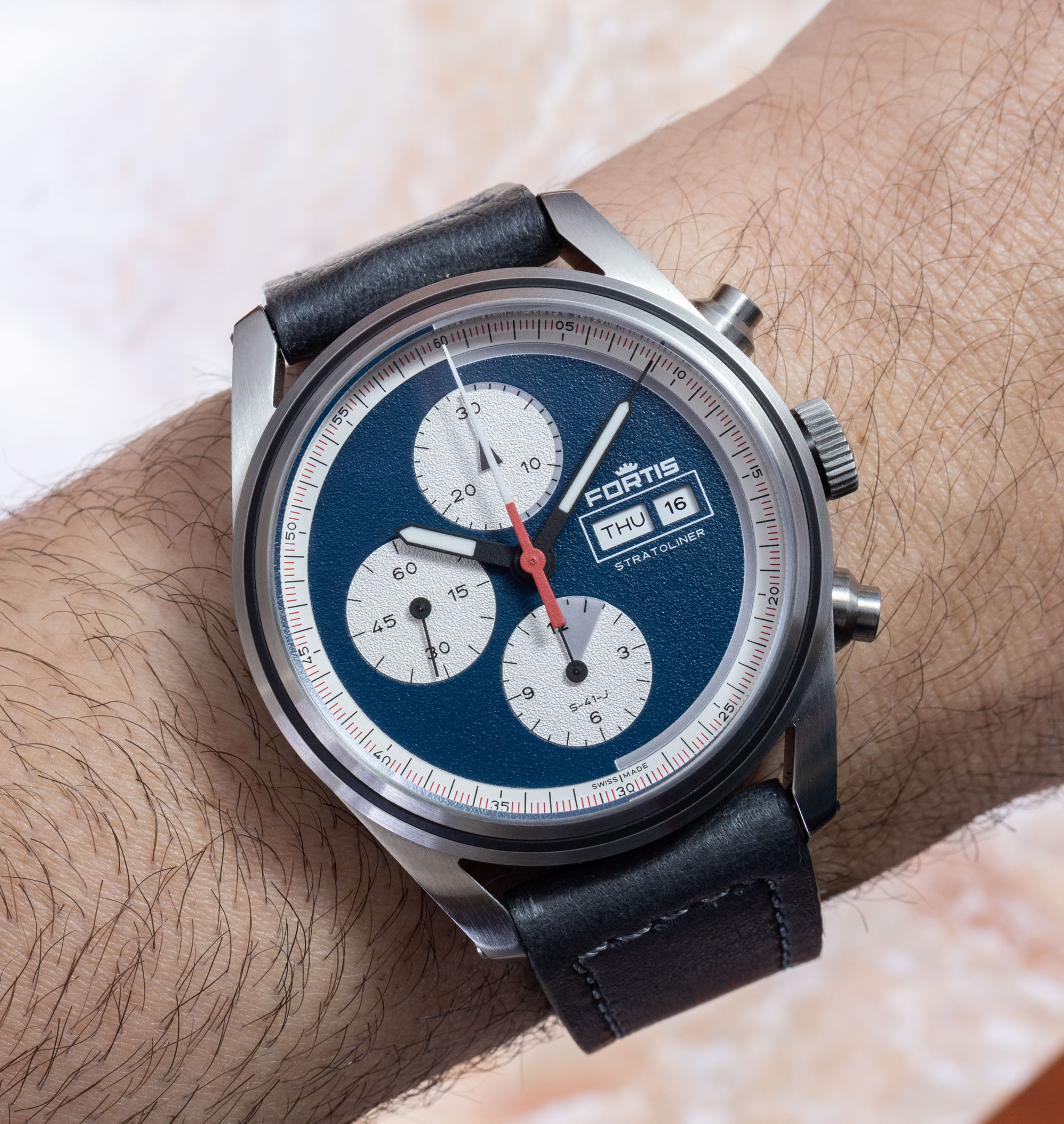
From a purely academic standpoint, the still-fresh Fortis Stratoliner S-41 collection of watches is a rich lesson in how traditional watches today create relevance and passion with interested buyers. Fortis isn’t a new brand, but under the current ownership, it is currently undergoing an exciting transformation that includes not just new products but also a different mentality to designing and marketing those products. From the development to the movement to the text used on website product pages, everything about the Fortis Stratoliner S-41 is from the “new school” of luxury watch design and marketing. I won’t be able to go into nearly all of the relevant details, but I think it will be interesting for people to notice all the little things in the watch and its communication that Fortis intended specifically to position this mechanical sports watch differently from previous sports watches.
On a basic level, the Stratoliner S-41 watch collection is a logical extension of Fortis’ history of making pilot and cosmonaut watches (and was originally debuted on aBlogtoWatch here). This time, however, with commercial (versus purely government) space flight in mind. The dial of the Stratoliner S-41 makes specific reference to the various current stages of Virgin Galactic flights (I’ll talk about that more later), and Fortis even partnered with the Swedish Space Corporation for future cooperation. Perhaps more important is that the “WERK 17” movements inside the Fortis Stratoliner watches are the first to be tested in the Earth’s stratosphere (hence the “Stratoliner” name of the series). Fortis WERK 17 movements were tested in the stratosphere, a feat that Fortis was understandably proud of.
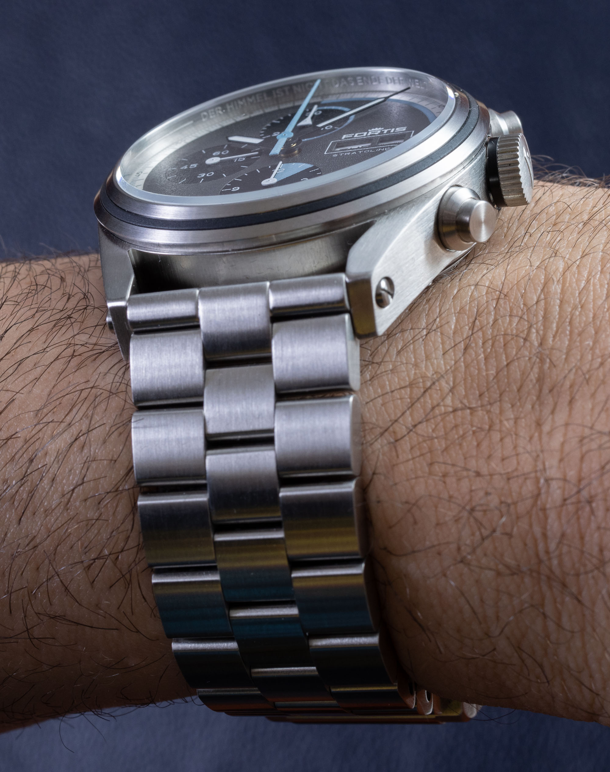
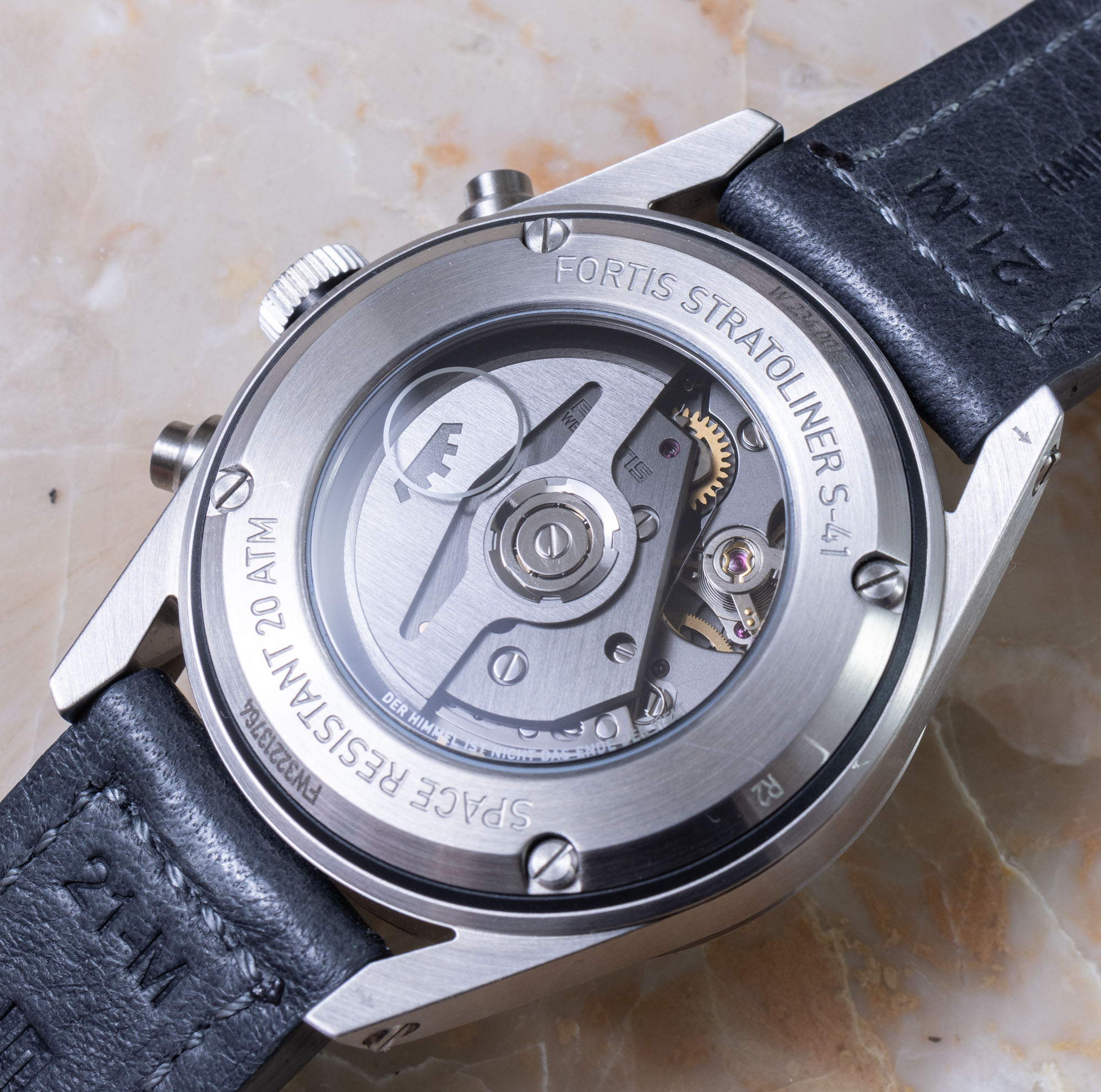
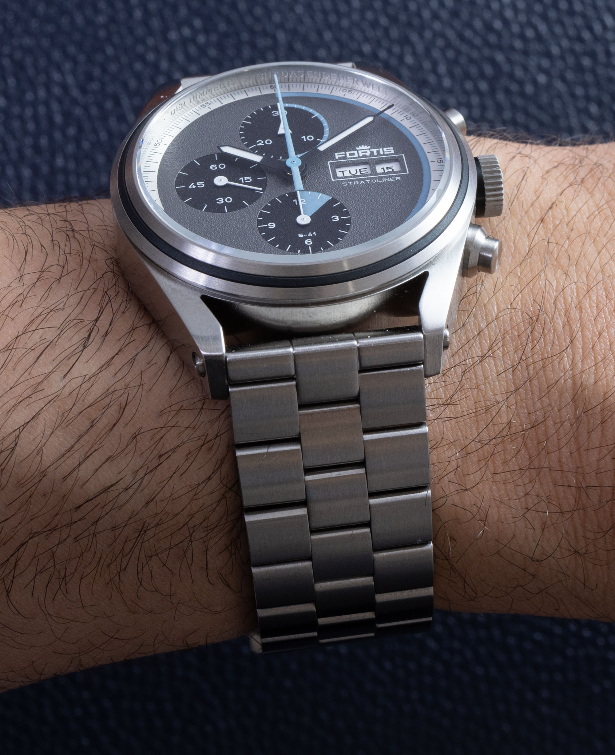
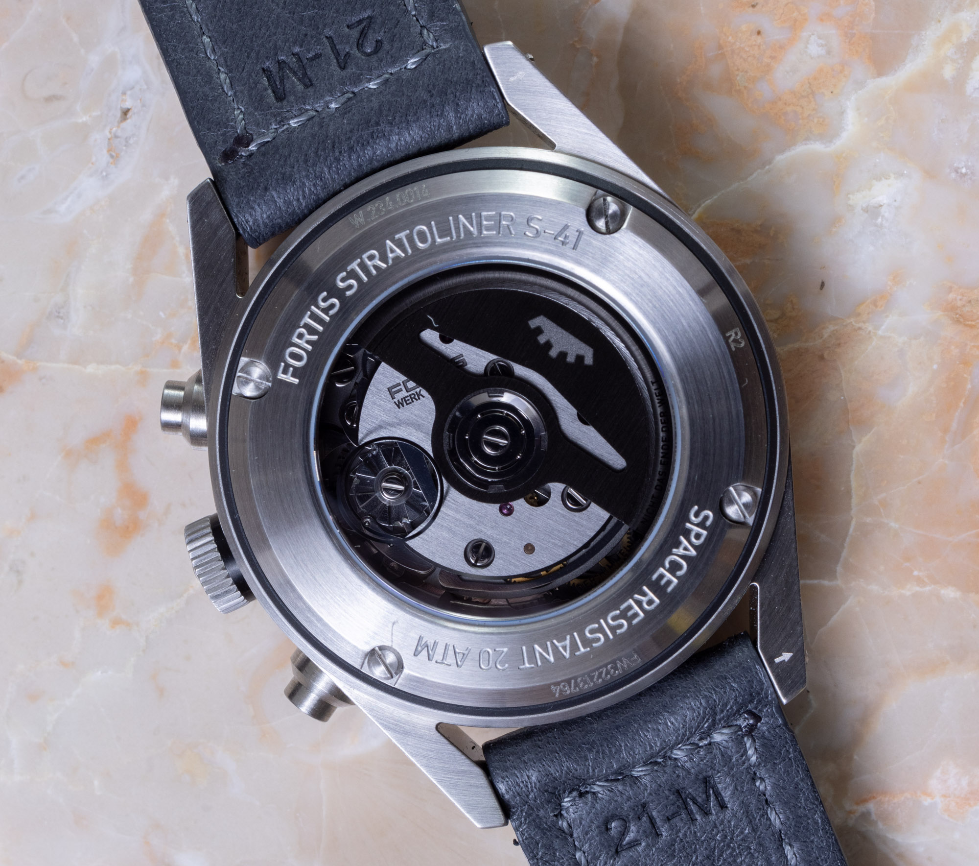
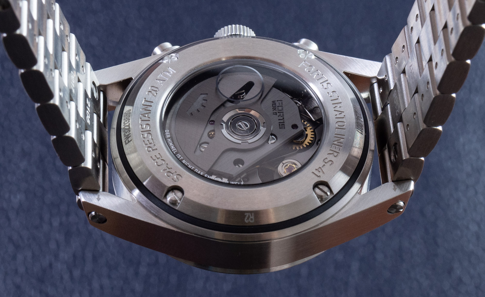
The movements are exclusive to Fortis and pretty nice-looking workhorse automatic chronographs. They operate at 4Hz with 60 hours of power reserve and are designed with a bridge that contains a special regulation adjustment system that Fortis claims is used to regulate each of the watches to high levels of timing accuracy. The WERK 17 movements feature the time with a 12-hour column-wheel controlled chronograph, as well as a day/date indicator. The layout is similar to that of the ETA Valjoux 7750. Through the rear of the Stratoliner case, you can view the movement through the sapphire crystal. There is a small metalized print ring around the view of the relatively wide column wheel. An interesting piece of text on the caseback of the watch is “Der Himmel Ist Nicht Das Ende Der Welt,” which, in English, means “the sky is not the end of the world.” Not necessary for a tool watch, but again, one of those new-era emotional statements that people like written on their sports watches from time to time. Note that this statement is also written on the upper sidewall of the case.
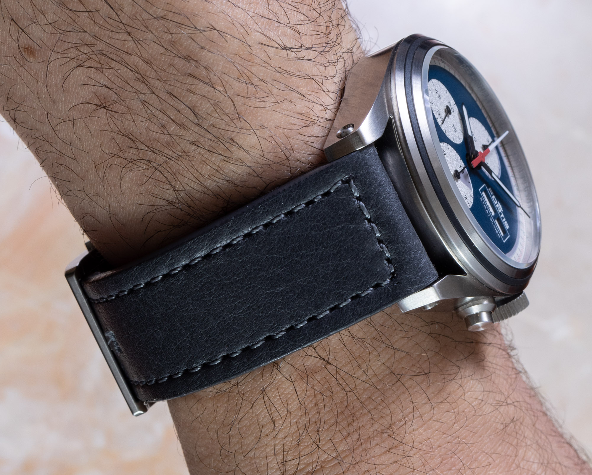
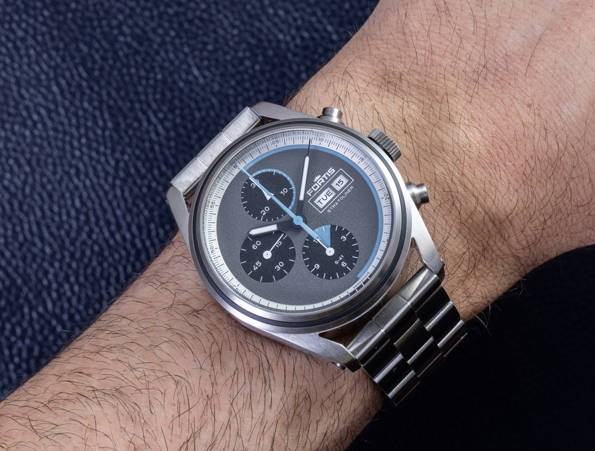
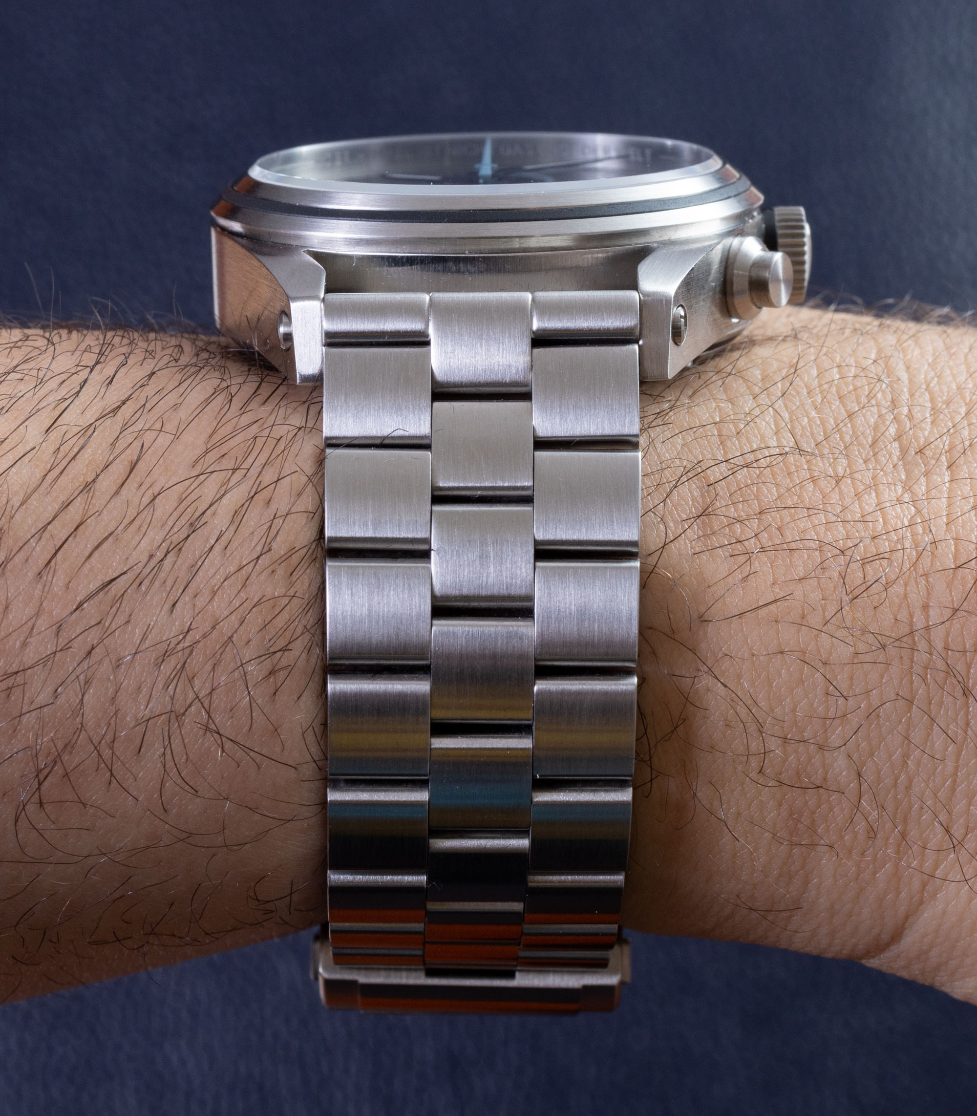
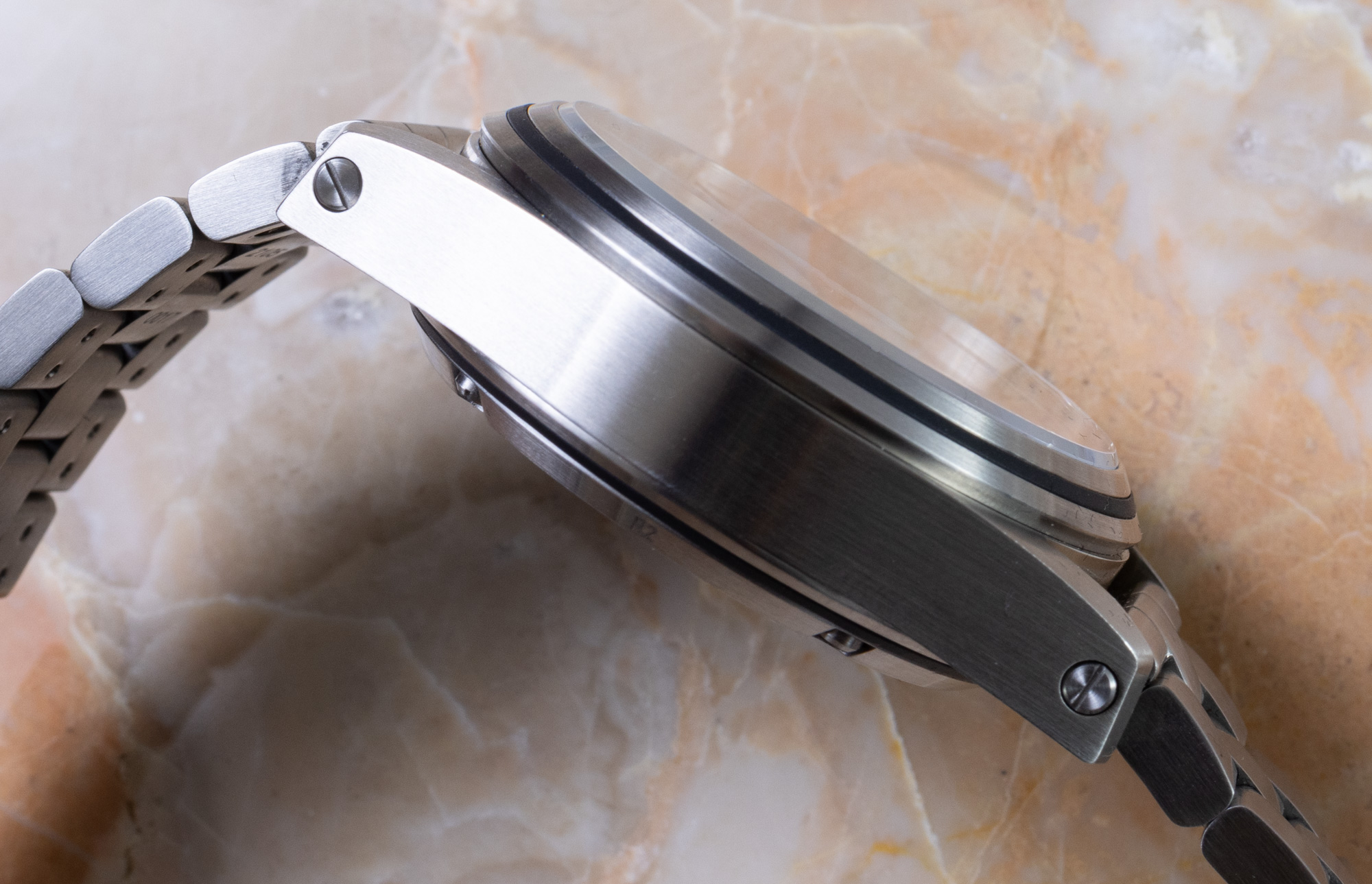
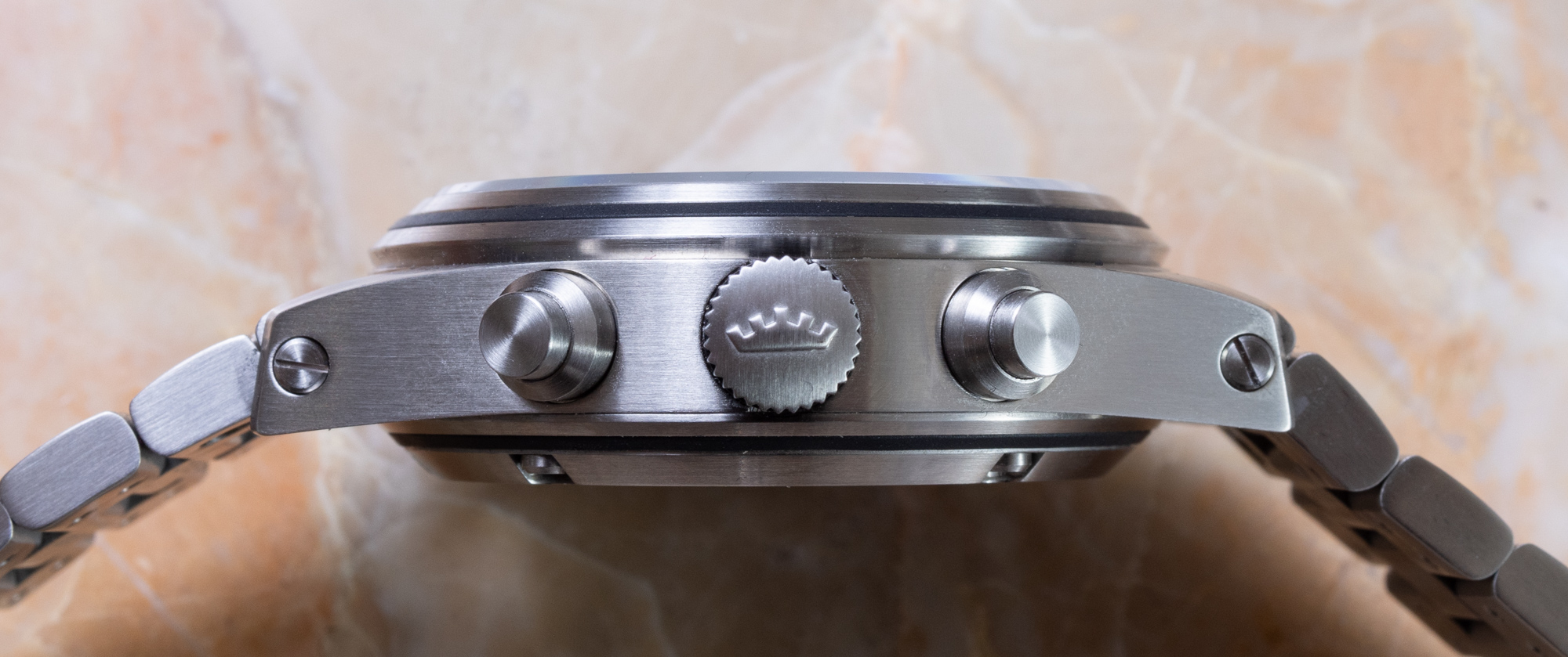
Fortis rates the Stratoliner S-41 as a 41mm-wide watch and doesn’t publish information about the thickness and lug-to-lug distance (which they should). That’s because the Stratoliner isn’t a small watch, and the lug structures and case thickness make it wear on the larger side. Now I don’t claim that this is too large a watch — because it isn’t. But I would like Fortis to more easily identify its size since those facts do matter to wearers. Suffice it to say that the Stratoliner’s case is technically 41mm-wide, but that it does wear on the larger side, being about 15mm-thick and with a 50mm long lug-to-lug distance. The case is water-resistant to 200 meters and over the dial is raised, flat-topped, and AR-coated sapphire crystal.
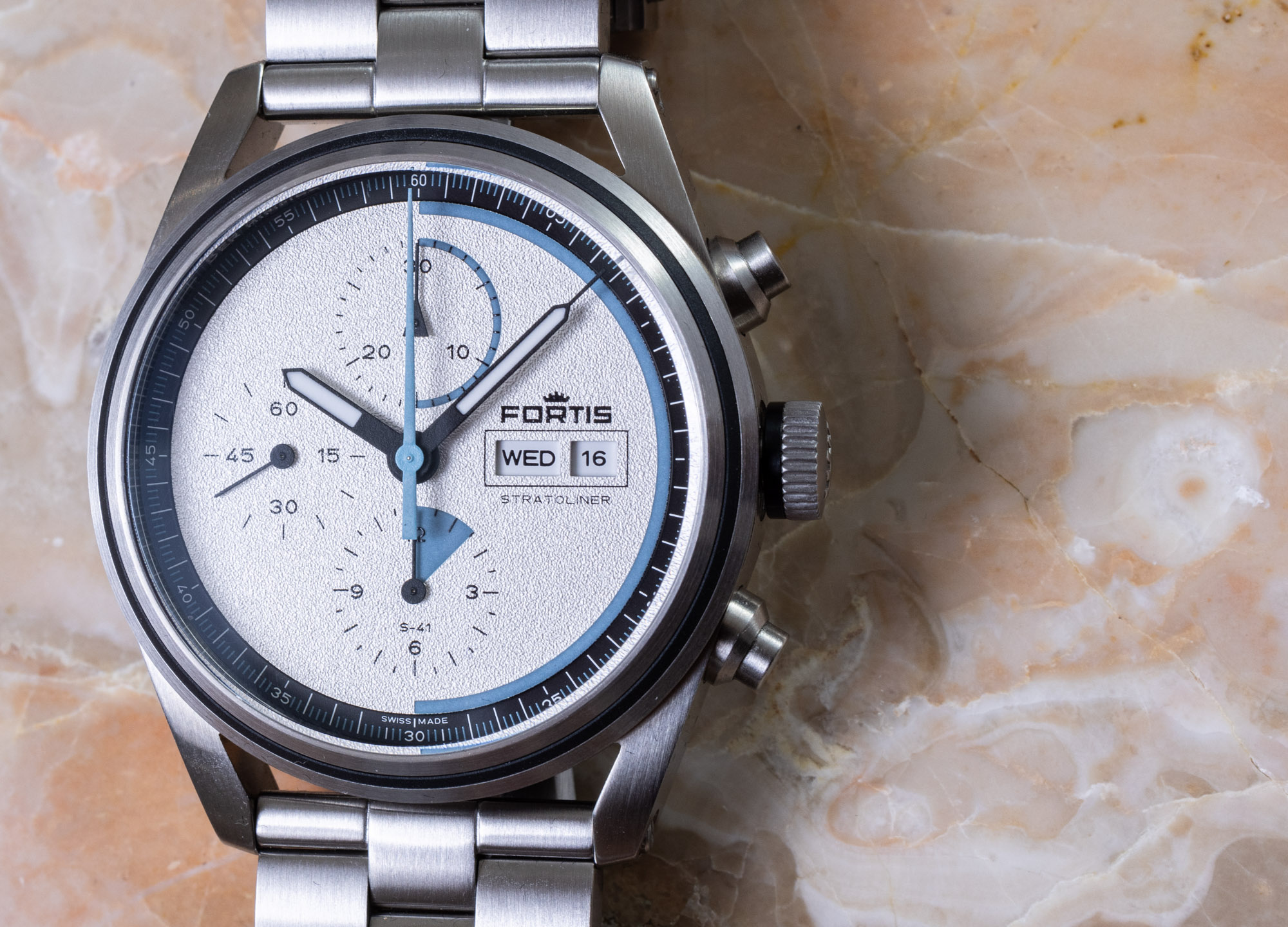
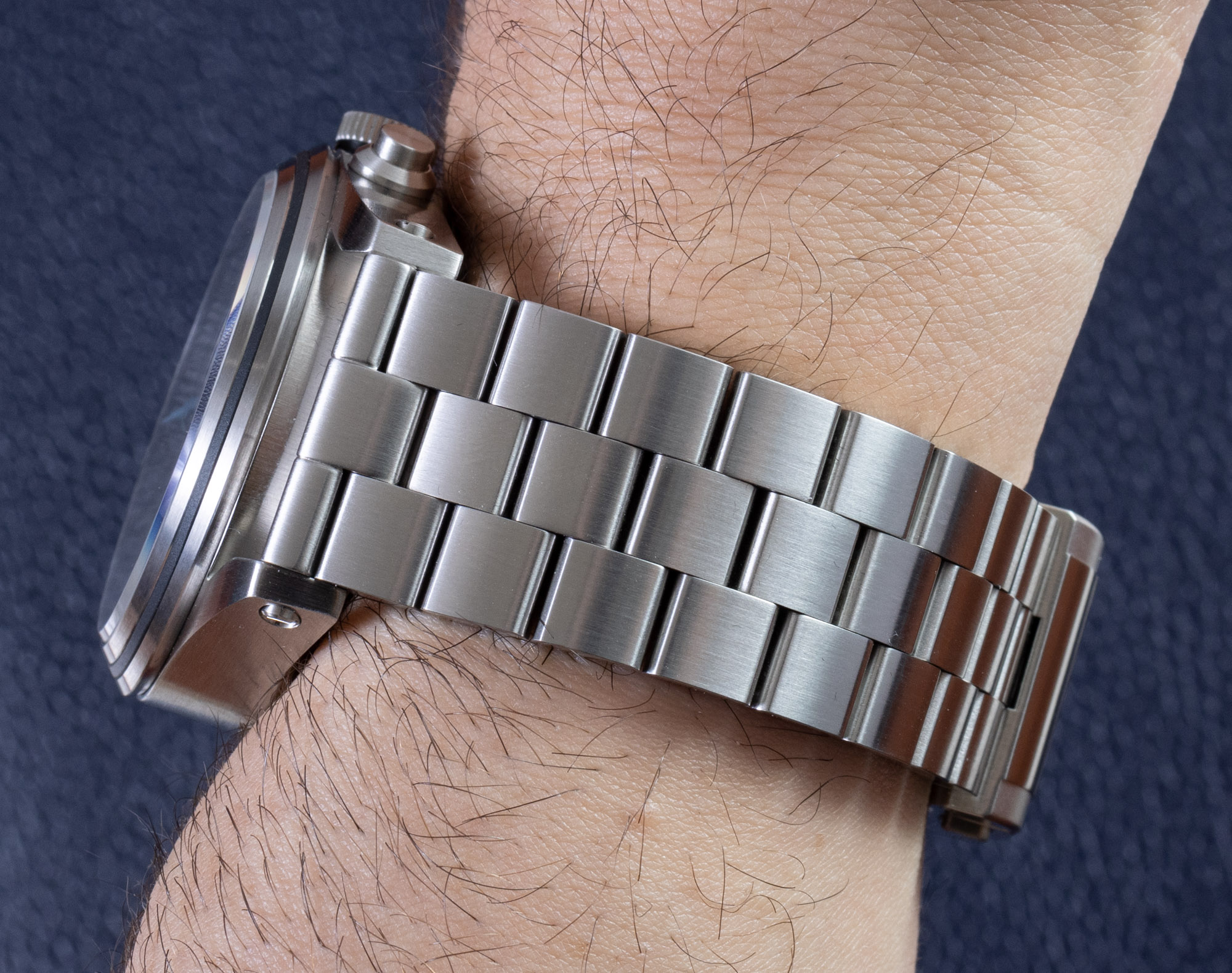
Size and overall beefiness are part of Fortis’ strategy with this collection, in general. The watch is fitted with a bracelet that is a bit thicker than necessary with screws that are a bit wider than necessary. I find the weighty steel case interesting, overall, with lugs that are integrated into the side flanks of the case, as well as the interesting stepped bezel design that includes a matte-black ring layer. This same black ring is positioned on the caseback of the Stratoliner S-41 as well. I should also note that according to Fortis, the case of each Stratoliner S-41 is produced from recycled steel.
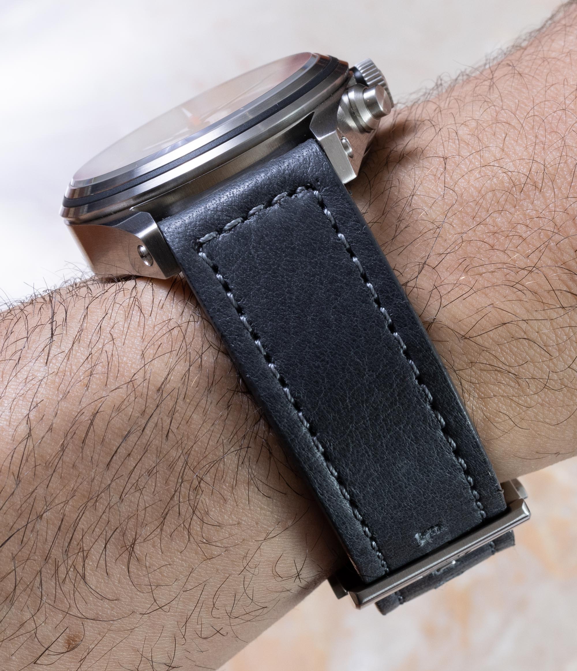
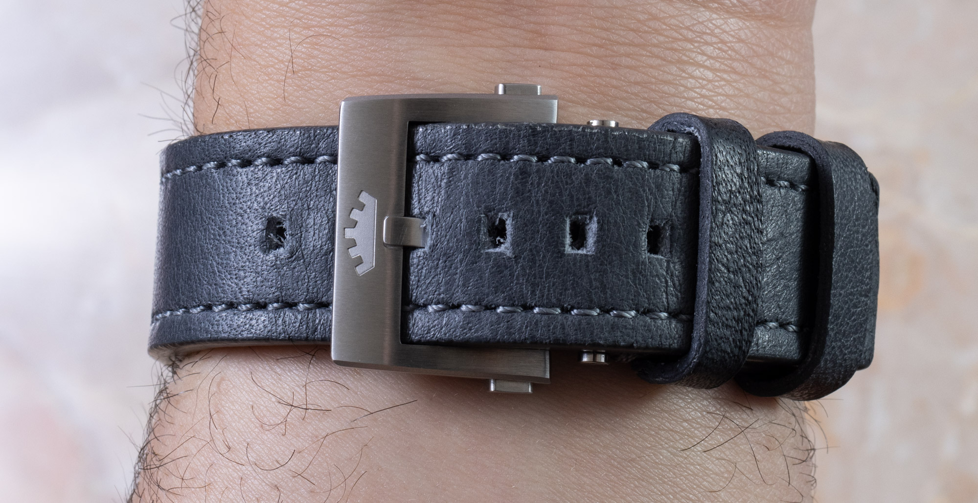
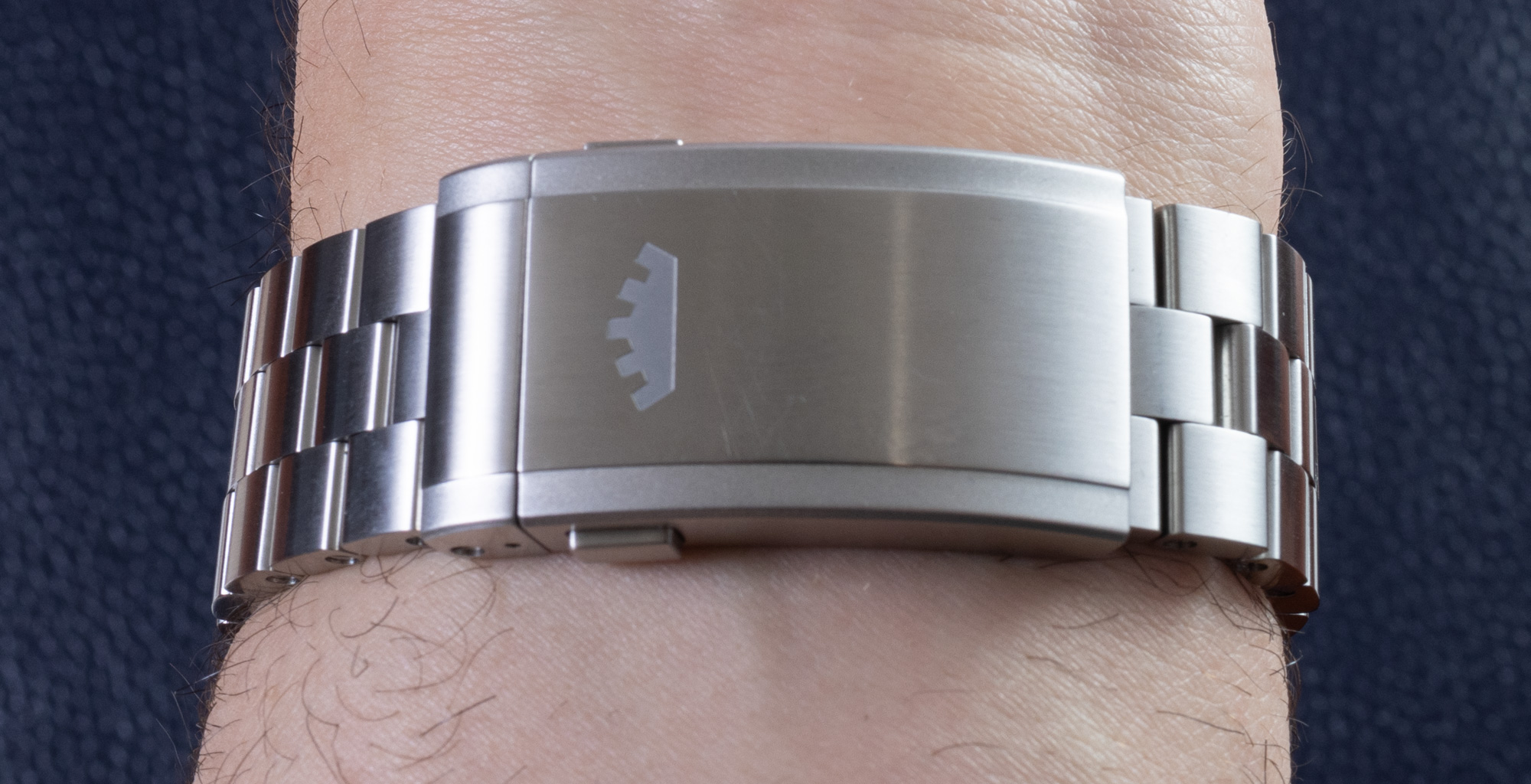
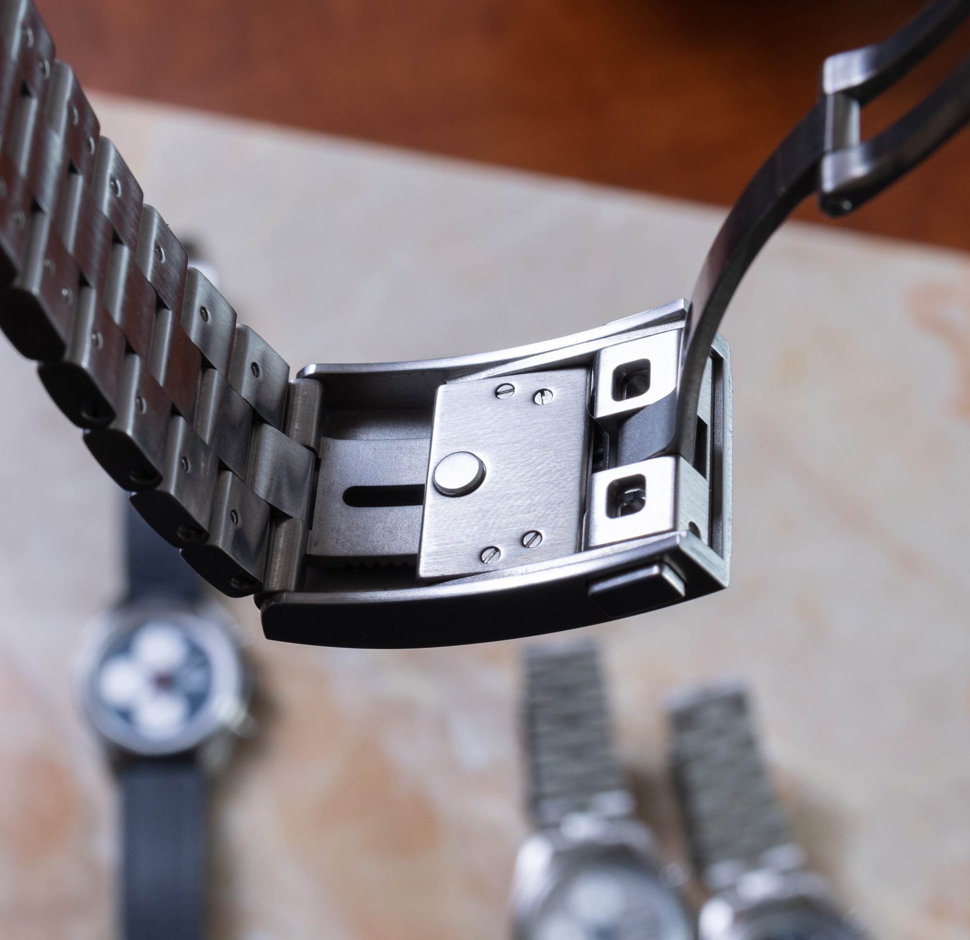
In addition to the “block bracelet” in steel, Fortis also offers a lovely leather strap available with each of the Stratoliner S-41 watches. The straps are a bit more dressy and cost less, and are also perhaps a better option for those with smaller wrists since the bracelet is wide and thick. Fortis paired the three-link bracelet with a large deployant clasp that reminds me of the types Breitling used to use. The clasp has a micro-adjust feature that uses a small pusher on the inside. This helps the bracelet open and close a few millimeters so that you can more precisely size the watch or open up the bracelet if you temporarily want to wear it more loosely.
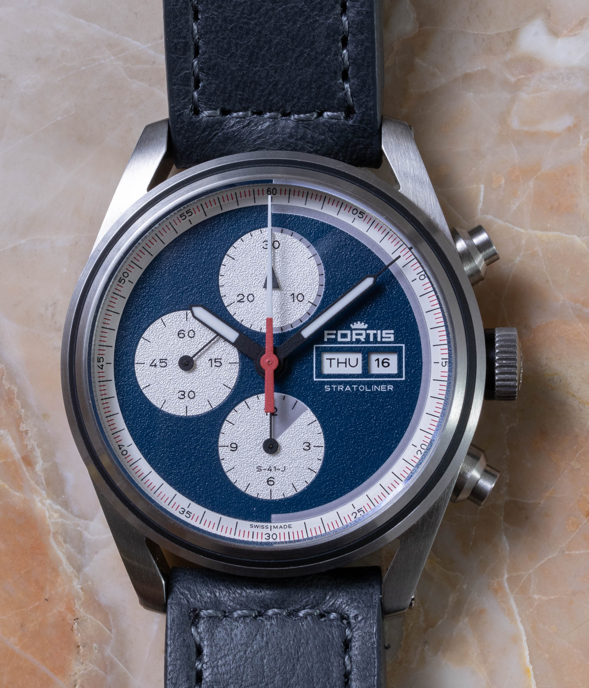
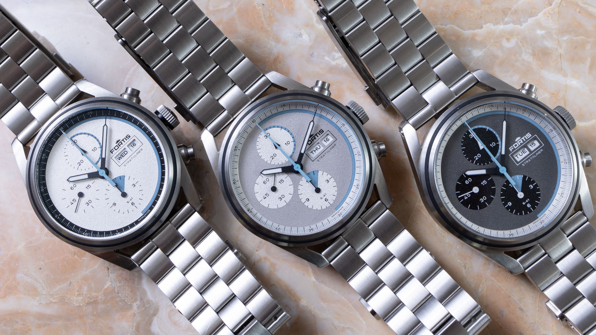
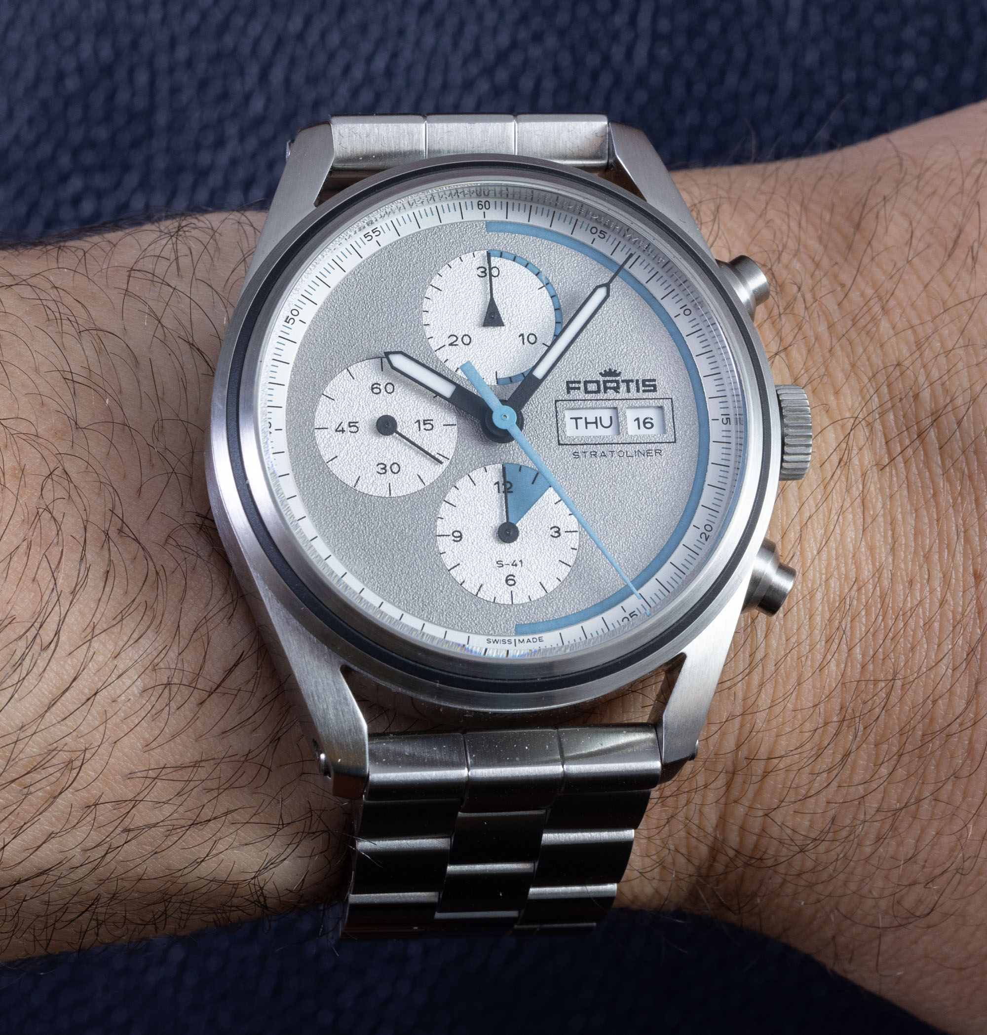
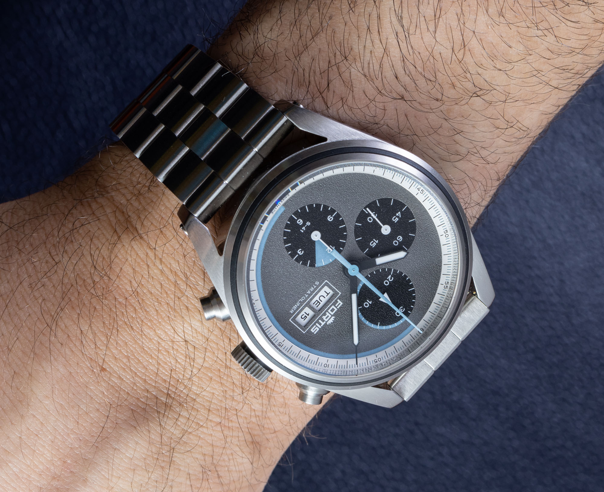
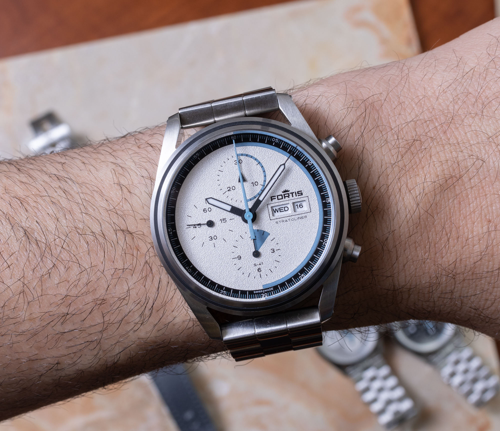
Fortis seemingly had the most fun with the watch dials for the Stratoliner S-41 products, and I have a feeling that more dial colors will come in the future. The dials are meant to be inspired by modern space flight instrumentation and vehicles. It feels like an artsy rendition of the Speedmaster, and there is nothing wrong with that. You can tell that this dial series was mostly designed on a computer. A good example (in addition to the overall flatness) is how the day and date window text is quite small. It is true that having that text fill up the boxes that make up the window indicators isn’t as visually attractive as if you include a bit of white space around the text. However, when you produce the dials and use them in real life, you understand that the size of the text in these windows has traditionally been maximized so that you can read them as easily as possible. There is certainly some text on the Stratoliner dials that you need pretty good vision to read. Don’t forget that a designer was probably mostly looking at these compositions magnified 300% on a larger computer monitor. This isn’t a huge deal, but I like studying brand new watch designs and wondering to myself what the designers were thinking, and certain blindspots they can sometimes have when it comes to how their creations will look in person.
While the Stratoliner dials do have a nice texture to them, they are flat. Perhaps that is a matter of taste, but much of the time I’ve come to like dials with a bit more depth to them. I think that Fortis could have made a separate layer for the outermost minutes/seconds scale ring and applied it over the base dial to create some depth, as the dials themselves are on the deeper side. Functionally speaking, you don’t want much of what I just mentioned in a tool watch. Having the dial be flat with high contrast hands is about all you need. So, this is one of those functional versus fashionable arguments that we seem to have in the context of luxury timepieces all the time.
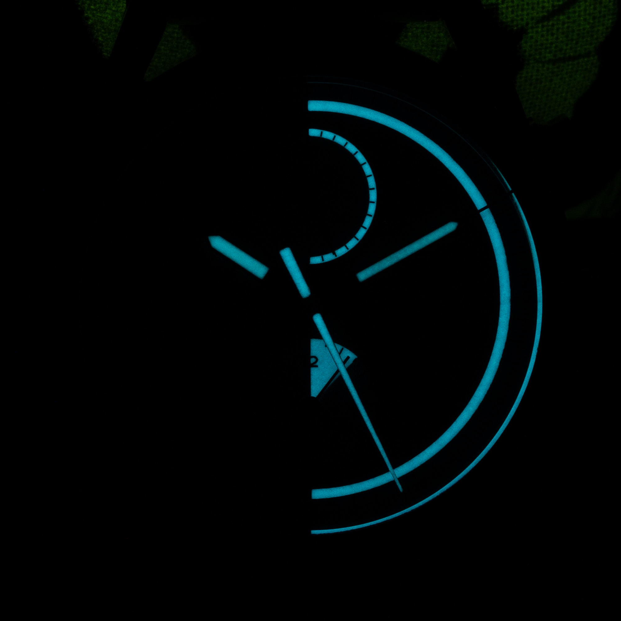
Speaking of functional versus fashionable, Fortis went with an interesting design decision for the luminant. The hour, minute, and chronograph seconds hands are traditionally lumed, but the dial itself has a more whimsical lume style that is very space-travel/sci-fi. About half of the dial has luminant, and none of it is really there to help you read the current time. In fact, the lumed sections relate to what I was mentioning earlier about the stages of each Virgin Galactic flight. Those flights first involve a 60-90 minute long “mated flight” where the main vehicle is towed into flight via a “mated” plane that it is connected to. That segment is lumed in the chronograph hours counter. Next is the “boost” phase of the flight which lasts for 60-90 seconds. That is when the Virgin Galactic ship accelerates high into the ski nearing the apogee of its flight. This segment is indicated by a 30-second counter (which seems low if the phase takes 60-90 seconds on average). The final phase of flight for Virgin Galactic flights is a descent phase called “Zero-G,” because that is what most of the passengers are there for. This fills up half of the chronograph’s 30-minute counter, a total of 15 minutes.
I really do love how cheeky the text on the Fortis website is, as well as the overall presentation. At first glance, it looks like a standard high-end luxury watch product page, but then you start to see all the little “rebel” details such as placing the watch’s date to “Friday the 13th” in the product photographs (the 13 numbers are all orange while the rest of the date numerals are in black) and saying things like “We pay close attention to our components and chose only the highest quality ingredients” (as though they are baking horological cuisine). This bodes well for the brand that it is not only making cool watches but also indicates that it delivers on the very important product experience part of the equation.
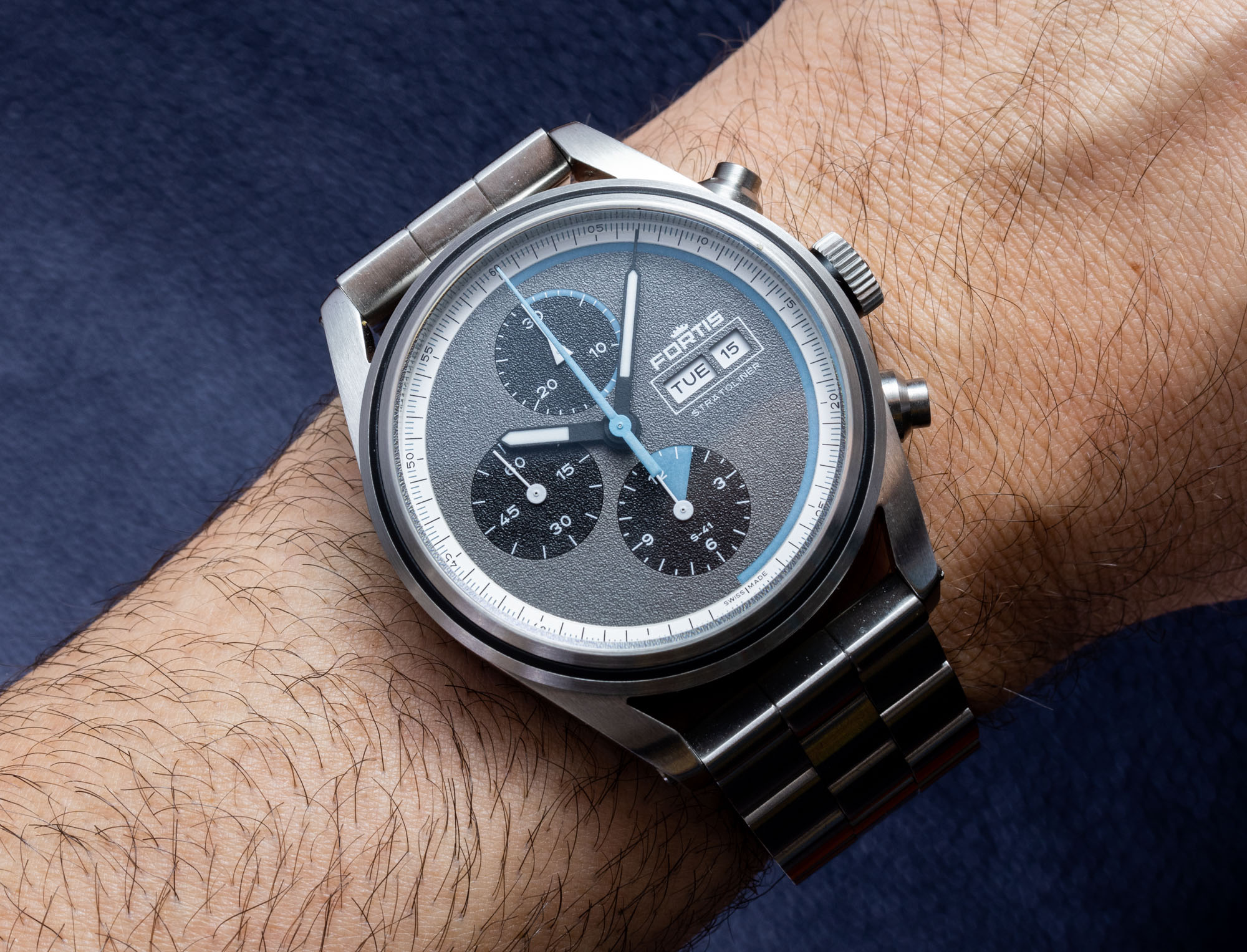
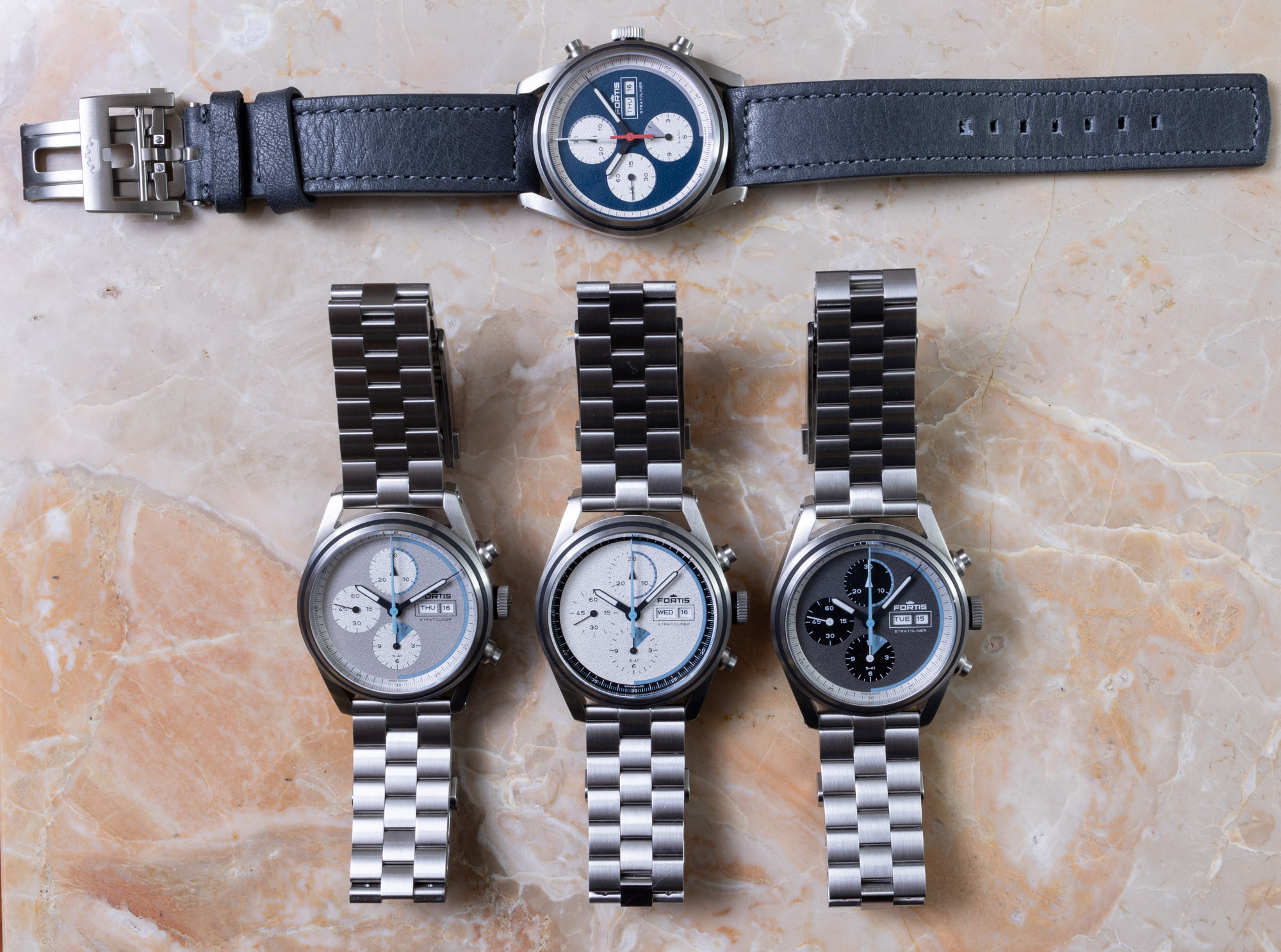
The debut dial colors for the Fortis Stratoliner S-41 pieces are White Dust, Cool Gray, Cosmic Gray, and Blue Japan. I happen to like the dials with the more contrasting subdials, but each of these is pretty nice. Fortis has also left itself a wide berth to come up with plenty of other interesting dial color combinations for the Stratoliner S-41. Prices are on the ambitious side, but Fortis has made it clear it will not settle for anything but products with rich stories and interesting features. Right now, these are the only watches you can get with a stratosphere-tested movement and that are specially designed for modern space flight purposes. I think Fortis did a pretty admirable job of marrying the past with the present, and while the Stratoliner S-41 watches are not without quirks, they have a lot of personality and spirited fun behind them. Price is 4,700 Swiss Francs on the leather strap and 5,050 Swiss Francs on the recycled steel bracelet. Learn more at the Fortis watches website here.
Necessary Information:
>Brand: Fortis
>Model: Stratoliner S-41
>Price: 4,700 – 5,050 Swiss Francs
>Size: 41mm-wide, ~15mm-thick, ~50mm lug-to-lug distance
>When reviewer would personally wear it: Certainly to the stratosphere. Around space travelers. In a group of modern engineering or aviation enthusiasts.
>Friend we’d recommend it to first: Commercial space travel professional. Fortis brand enthusiast keen on the brand’s bold new direction. Sport watch lover seeking something high-end but with a novel story behind it.
>Best characteristic of watch: Handsome case and inspired concept. A successful example of brand personality communication on both the watch and the brand’s website. Movement functions nicely. Feels well-made.
>Worst characteristic of watch: High price; the dials are a bit flat.

