We’ve all spent plenty of time on brand websites, and we’ve had experiences that run the gamut from Rolex’s awful, laggy site to the different-but-the-same brand sites of the Richemont Group, to the grab bag that is microbrand websites. Considering it’s been more than 30 years since Al Gore invented the Internet and creating a dynamic, easy-to-use site is easier than ever, it’s shocking that everyone isn’t getting it right, even at a basic level. I’m no expert on web design, but I have spent more time looking at and navigating brand websites than I care to admit, so I’ve at least achieved armchair expert status. Beyond looking visually appealing (high-quality images and graphics, consistency in layout and design, minimal clutter), a brand website’s purpose is to facilitate the end-user’s perusal of the brand’s watches.
Whether you’re a forum-hardened veteran enthusiast or a casual consumer just seeing what’s out there, you’re heading to a site to look at watches. I expect brands to highlight a collection or a few pieces, whether they be new releases or seasonal picks, or something else. But I also need to have a quick way to see the full lineup. Put it right up top in a heading-level link. Don’t make me expand a hamburger menu to find watches. The exception I think is fair to make is for brands like Montblanc, which is better known for its pens than its watches. I understand with these brands watches may not be front and center all the time; but that should only result in a single additional click. At a bare minimum, there needs to be a fast, clear way to see all the watches a brand currently offers (an archive is incredibly helpful but should be separate from current offerings).
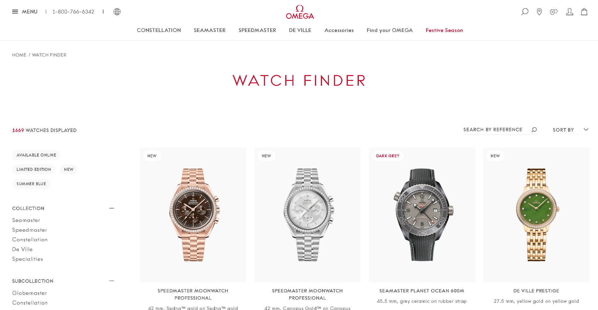
Once I’m looking at the watches, I have some needs. This is not the place for lifestyle photography — I want plain and simple, straight-on soldier shots that clearly show the dial, case, and band. If the catalog is large enough, I’d better be able to search by specific criteria. I shouldn’t have to scroll through 15 pages just because a brand didn’t want to build in filters. For that matter, a brand shouldn’t have 15 pages just because it has a separate item for each strap option on a given model; there are easy ways to show that a model is available on multiple bands (and standalone straps don’t belong in the watches catalog). I should also be able to see pricing in whatever currency I want, and prices should be fixed for each major currency rather than fixed in one and market-dependent in every other.
Finally, I’ve found the watch I’m interested in. I need to be able to see 360° of the watch, whether through some interactive element or several shots — and no renders, please. I expect some marketing copy about each timepiece, but I also want to easily be able to skip to and read comprehensive specs. That means full dimensions and full movement specs and anything else that can be included — more is more and more is better (microbrands seem to have figured this out before the big guys). Here’s where a site should show me how the model looks on the different strap options, and tell me how I can choose or add those on. And if I can’t buy the watch on the site, there should be an easy way to find brand boutiques and authorized dealers.
I could go on and be even more granular, but I think you’re getting the idea here. Websites need to look good, work smoothly, and not put any obstacles between the consumer and the watches. If you want solid examples from across the industry, look at Urwerk, Omega, or Bangalore Watch Co. None of them has a perfect website, but they all do an exceptional job of making it easy to look at their watches despite taking three very different approaches. This isn’t that hard. It’s 2024. We’ve been doing the Internet for a long time, and there are accessible solutions for brands of any size to meet these reasonable expectations.


