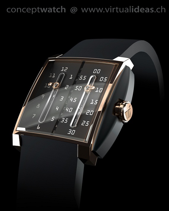
Allow me to present you with another watch concept from Switzerland based Virtual Ideas, a design firm that creates watches for established watch companies (a lot of the time large companies rely on smaller, independent design firms when it comes to watch design. They then figure out how to produce it, market it, and then sell it). The first concept I shared with you (a while back) was the Pink Panther watch concept. The concept watch here is called “Big Time.” You can see the thematic similarity to their previous concept design.
Big Time is a larger, square shaped watch with dimensions that should be in the 50mm wide and 45mm tall range. The dial itself is perfectly square, but as you can see there is an interesting rubber guard/bumper around the crown. The case is curved a bit and looks nice in rose gold. You can see the sharp faceting around the edges. Lugs are set widely apart but cut short and sharp for a technical feel. They also help preserve the angularity of the design. You see more faceting around the edges of the sapphire crystal.The design looks good with the rubber strap, but would also look good with a reptile strap.
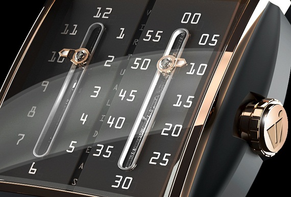
All the action of course is in the dial – one that has a unique way of telling the time. The face is separated into two areas. Once for the hours (left), and one for the minutes (right). As the hand moves vertically along the dial, it actually turns when it comes to the top or bottom. Thus each side of the path is utilized. These paths are also called “rails” by Virtual Ideas. Although this watch is a concept, this style of telling the time has been done before. It was actually quite a coincidence, because although Virtual Ideas did not base their design around Italian Carlo Ferrara watches, the manner of telling the time is the same. Carlo Ferrara was able to do it with a modified ETA 2892A2 movement, so the complication has bee done before.

The dial color could be a dark brown (that matches gold well), black, or any other color. It looks nice being a bit bare. I find the font that Virtual Ideas used for the numerals to be interesting. A technical, almost computer generated font that you’d expect to see on a receipt print out. It makes the counting of time more mathematical, or rather the watch look more like an instrument. The hands are smaller but useful. They might stand for some improvement so as to be more clear . They look to be lume covered, so I hope the numerals on the dial are as well. Virtual Ideas designs concepts such as this show watch companies what they can do. As fresh ideas are often better than a stale design department (many of you out there can attest to that). Whenever I see their designs I wonder to myself what brands the looks best fit with.
While Virtual Ideas is often inclined to create highly luxurious creations, it is often the fact that such designs are remarkable good at being “mainstreamed.” Good watch designs can design for all timepiece levels. A common theme in all their designs is the ability to innovatively display the indication of time. This is the goal for many watch makers actually, and I applaud and appreciate their efforts (and the results). Big Time fits directly into this meme. Although they aren’t the first to produce the hands on rail system, they did so a novel way, with attractive results. I can easily see myself putting on a watch like this and grinning at the results. Very cool.
