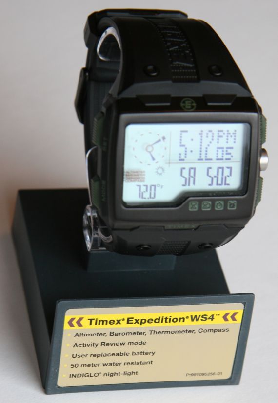
Timex is one of the most important watch brands in the world, and is certainly the king of US watch brands in terms of volume. The company has lots of sub-brands or departments, and they consider the “Timex Expedition” line to be its own mini entity. This watch is the result of some interesting development, and is one of the most appealing male watch designs that I’ve seen in a while. While the watch is unique looking, it is trying to be familiar. Let me explain. It basically strives to resemble that world of wrist-borne gadgets and instruments that we’ve been seeing in movies and video games for years… finally ready for us real people! The best part is that the Expedition WS4 is more than just looks, the user interface is genuinely well-designed to be easy to operate and useful. All this needs to be taken in consideration with the reasonable price of the watch, as well as it’s pedigree.
The best watches to compare this with are the Casio Pathfinder watches (one of which I reviewed recently). The watches both share the desire to go outside and rough it, are products are large high volume companies,as well as offer a bevy of major functions that include:
- Time with full calendar
- Compass
- Altimeter
- Barometer (with mini-weather station readout)
- Thermometer
- Logs for all major functions
- Stopwatch
- Timer
- Alarm
- Two easy-view timezones
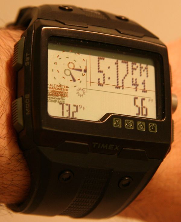
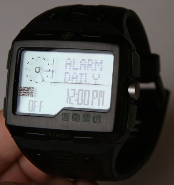
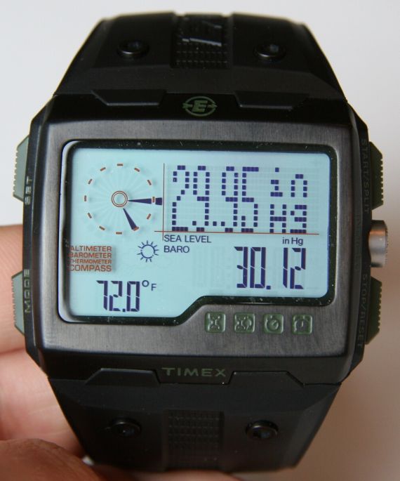
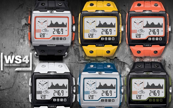
Aside from the major functions, there are lots of little functions included to enhance the user experience; chimes that can be turned on and off, a useful night mode for the Indiglo backlight, among lots of other features which are nice to have around. The best part is that the interface is friendly and relatively intuitive. If you recall, I praised the Casio Pathfinder watches for doing so much, but complained that you need to be well trained in learning how to use them all. Timex really put a lot of effort in the UI (user interface) design and it shows. The biggest effect of that work was the large informative display screen. A lot of good information is just a glance away – rather than having to cycle through display screens. The default screen gives you the time in two ways (digital and [digital] analog), the temperature, the weather estimate (an image for sun, clouds, rain), and a switchable area that indicates the date and month, altimeter reading, or barometric pressure. Having this information right there is really helpful and nice to have. Timex has some graphics (sort of orange colored) on the back of the crystal that attempt to visually separate the areas on the LCD screen or add visuals. These aren’t exactly necessary, but don’t distract too much (though I wouldn’t mind if most of it wasn’t there), and add to the techie look of the watch.
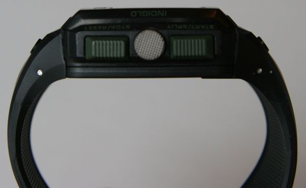
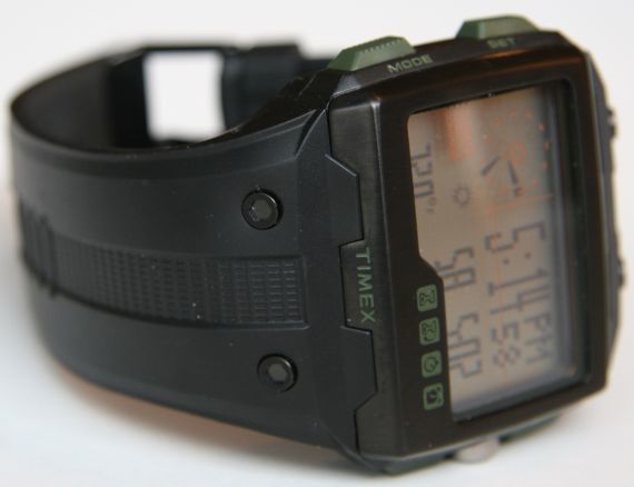
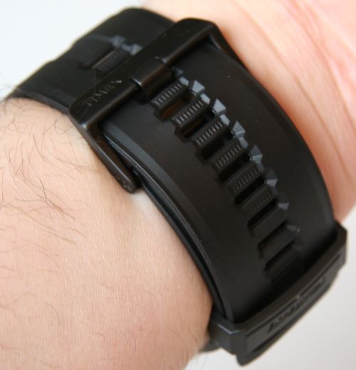
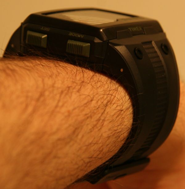
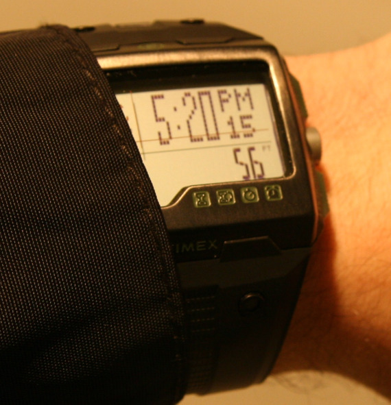
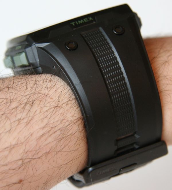
The watch case is about 53mm wide and 40mm tall, while being 16mm thick. The textured rubber strap is a massive 30mm thick. The watch case itself is black IP (ion plated), or satin finished steel, for the front and rear between a plastic section where the buttons are located. Most of the colored buttons (olive green in this instance) are plastic. The rubber strap is quite snugly attached to the case with the now popular hex screws to help add style. The Expedition WS4 is available in 6 fun colors, which is a nice option. Pictured is the all black model – which will no doubt be the major seller as it is the most neutral – but other color options are pretty nice looking (with yellow and orange being the loudest). You can almost think of these watches as being functional toys for adults – kids too, but around $200 might be a bit much for your 12 year old. While the strap is big and looks very tool-like, is comfortable and thin in depth. The buckle is thin and wide making it easy to strap on. Even on my less-than-giant hands, the instrument look of the watch is pretty neat looking. There are going to be a lot of people who are smitten by the accessible geek allure of this timepiece.

The more I wear the watch, the more it makes me feel like a character in a video game – in a good way though. This emotional attachment to men’s pop culture is likely an intended side effect of the design, and is part of a genius marketing strategy by Timex. Most other Timex watches are pretty ho-hum, even though they are functional. Even if those watches had the large amount of functions that this Timex Expedition had, they wouldn’t be nearly as desirable without the cleverly designed case and strap that encourage you to go out and make use of the clearly functional utility this watch offers. The watch isn’t for everyone, but for those who love it, you know who you are. It is certainly a fun escape from ‘average’ watches that are out there.
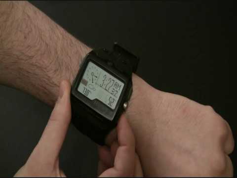
Digging deeper into the functionality of the watch you’ll continue to appreciate how nicely designed the operating system of the watch is. On-screen instructions are incredibly helpful, and absent in competitor watches. It is nice to have the watch say “Hold To Reset,” while pressing a button to let you know how to use the function. This is very welcome indeed, and like I said, something you really don’t see in most watches. I typically gloss over a lot of the functionality when it comes to the logging functions, but the included graph combined with the easy to use metrics makes it a breeze to use. Play with it for a bit and you’ll know what I mean. You will however need to calibrate some of the functions yourself – but the instructions on doing this are pretty simple, so expect to sit down with the watch for an hour or so when you first get it to figure it out and go over all the settings and calibration. In addition to the user manual, Timex throws in a larger quick reference guide with lots of pictures that helps make using the Expedition WS4 watch as simple as possible.

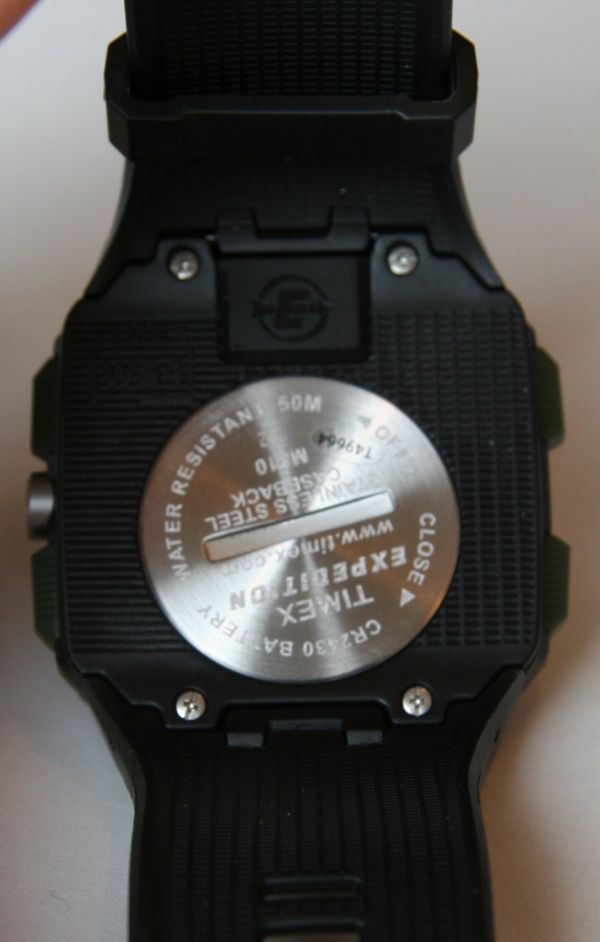
Living with the Expedition WS4 watch is pretty easy. While big, it is relatively comfortable (the wrap around strap helps this greatly. . The watch is easy to read, and Timex’s Indiglo illumination makes it easy to read in the dark. On the back of the watch is an easy to use battery replacement compartment – which uses CR2430 batteries that can be bought at most drugstores, meaning you don’t need to visit a watch repair place to get a new battery. I believe that the crystal over the screen is mineral crystal, while the watch is water resistant to 50 meters.
Timex doesn’t intend on the Expedition WS4 being a big investment for watch and outdoor enthusiasts. With a retail price of $199 it will be a no brainer for some people, and is roughly half the cost of some of the competition. I appreciate Timex’s understanding many people in this generation need a bit more incentive to wear a watch. Plus, the generation I am speaking of (which includes myself) are part of what I can the “screen” generation. The concept is that a basic watch won’t have a lot of perceived value over the clock on a cell phone (etc…), but adding functions and connecting with the familiarity of a “screened” device makes it a much more attractive proposition. The layout of the dial itself communicates a data rich approach that will appeal to people in the information age. Timex is showing that they can evolve with a watch like this – which is a good sign. The Timex Expedition WS4 is due for release right about now as you are reading this.
Get your Timex Expedition WS4 here direct from Timex.


