Changing a watch brand’s core visual DNA is an understandably tricky endeavor. Some brands focus on constant visual innovation, leaving only a handful of recognizable cues between product lines. Others (like Rolex, for example) prioritize preserving familiar silhouettes, proportions, and visual hallmarks so highly, it becomes almost impossible to stylistically innovate. Especially as a watch becomes more successful, and a brand becomes a fixture in the public consciousness, changing the “signature look” of an entire product line becomes a formidable exercise in balancing the needs of design and marketing. These revolutionary changes still do happen, however, and for a brief moment in the early ‘80s, Omega seemed poised for one of the most radical visual shifts in its long history. Only one prong of this broadly spanning restyling effort survives to the present day, but of all the experimental designs the Swiss giant released at the time, perhaps none is more intriguing or attractive as the Omega Speedmaster “Teutonic.” This sleek, futuristic re-interpretation of the brand’s hallmark chronograph series may have been a stylistic dead end, but it remains one of the most under-appreciated models in the vast Speedmaster catalog and a fascinating glimpse into a transitional period in watch design.
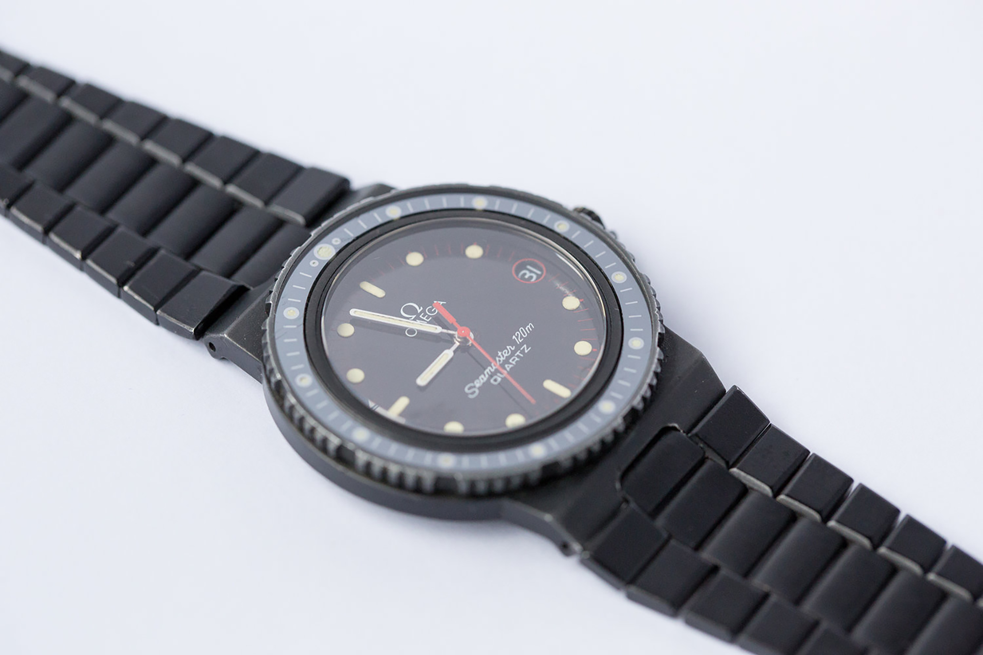
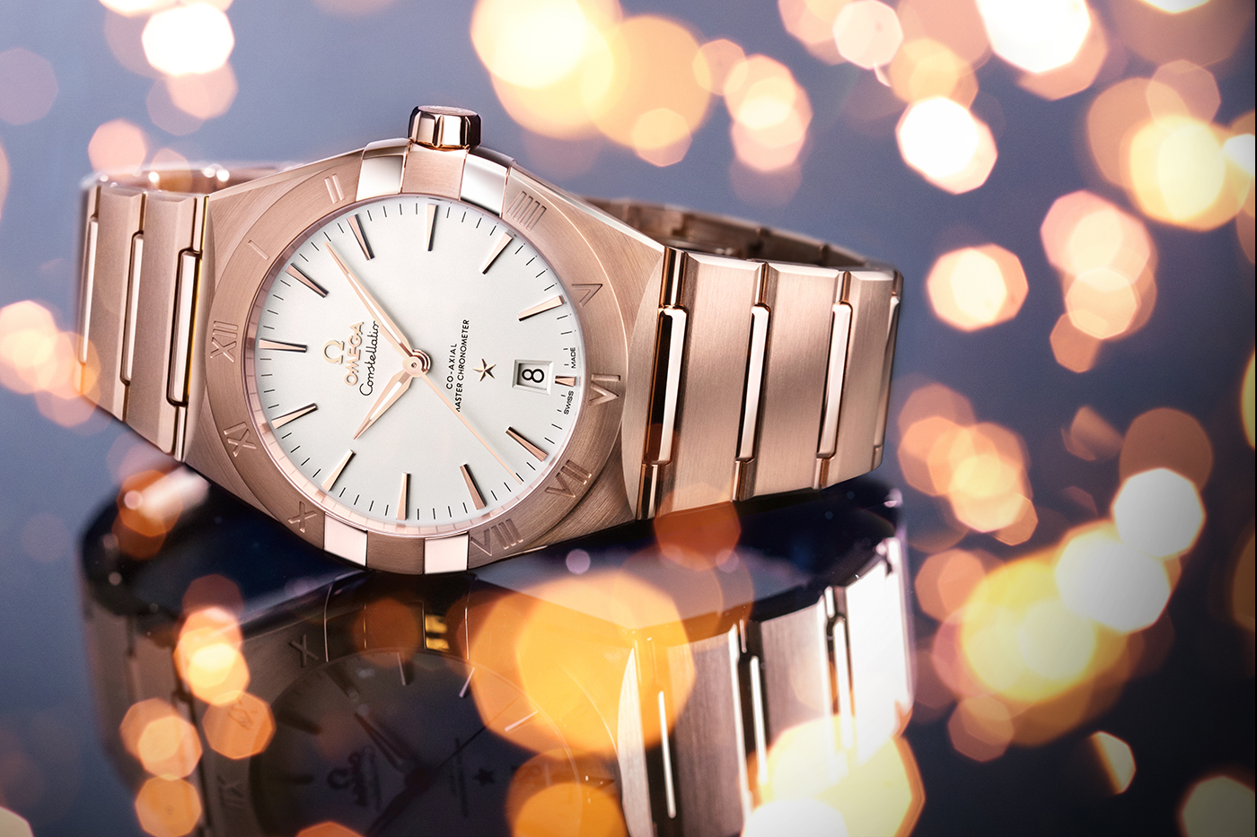
By the early 1980s, legacy Swiss brands such as Omega were beginning to adjust to the realities of a post-“Quartz Crisis” industry landscape. Quartz models were losing the sense of revolutionary newness they had carried for much of the previous decade and were becoming more of an established fact of life in even traditionally luxury-focused brand lineups. On a similar note, the vibrant, outsize trends of the ‘70s were wearing thin in design circles, and many watchmakers turned their focus toward revising product lines that had grown stale over the years. In Omega’s case, incredulous as it may seem today, this clean-slate thinking extended even to the lyre lug case design that had become a calling card for both the Speedmaster and the Seamaster 300 series since the ‘60s. The new direction would be smooth and rounded, with an organic feel, hooded or integrated lugs, flowing crown guards, and a distinctive half-moon-shaped rounded bevel to visually differentiate the lugs from the main case body. This set of design principles would be rolled out across each of the brand’s most enduring product lines – the Speedmaster, the Seamaster, and the Constellation — beginning with the Seamaster 120 “Nimitz” in 1981.
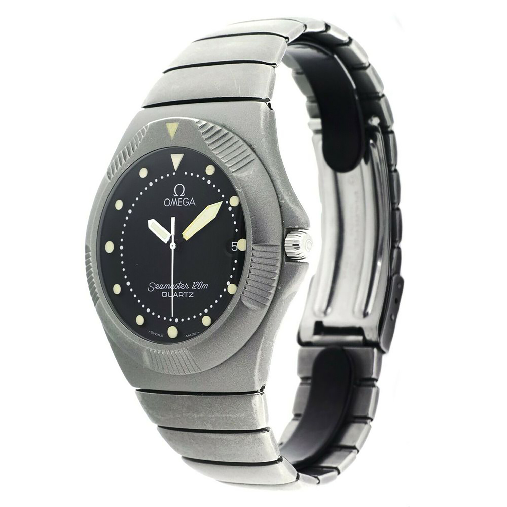
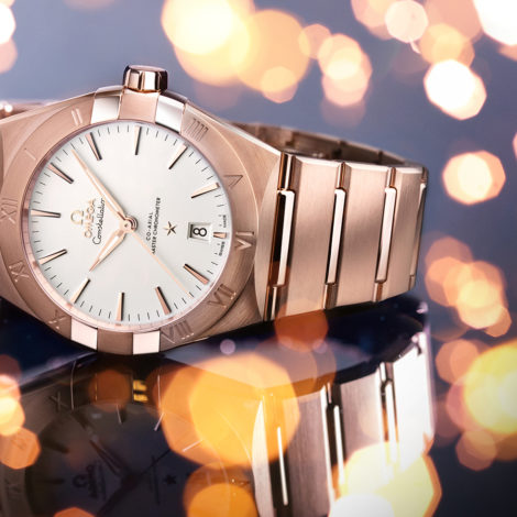
The black-coated Seamaster “Nimitz” is something of a transitional first test for this new philosophy, retaining several sharp case edges (particularly through the crown guards and abruptly angled lugs) but introducing softer, organic forms to the dial. More importantly, the “Nimitz” debuted a tapering integrated three-link bracelet design that would be carried over nearly verbatim to the Speedmaster “Teutonic.” By 1985, Omega had taken the Seamaster line further down this aesthetic path with the softer, more radical Seamaster 120 “Recife,” with a fully streamlined matte case alongside a unique low-rise rotating bezel with distinctive ridged grips. The Constellation line would see the most success with this new design philosophy, launching the Constellation Manhattan in 1982. The Manhattan’s smooth form and dramatic bezel “claws” would prove to be a hit with consumers, and it still forms the visual bedrock for the base collection four decades later.
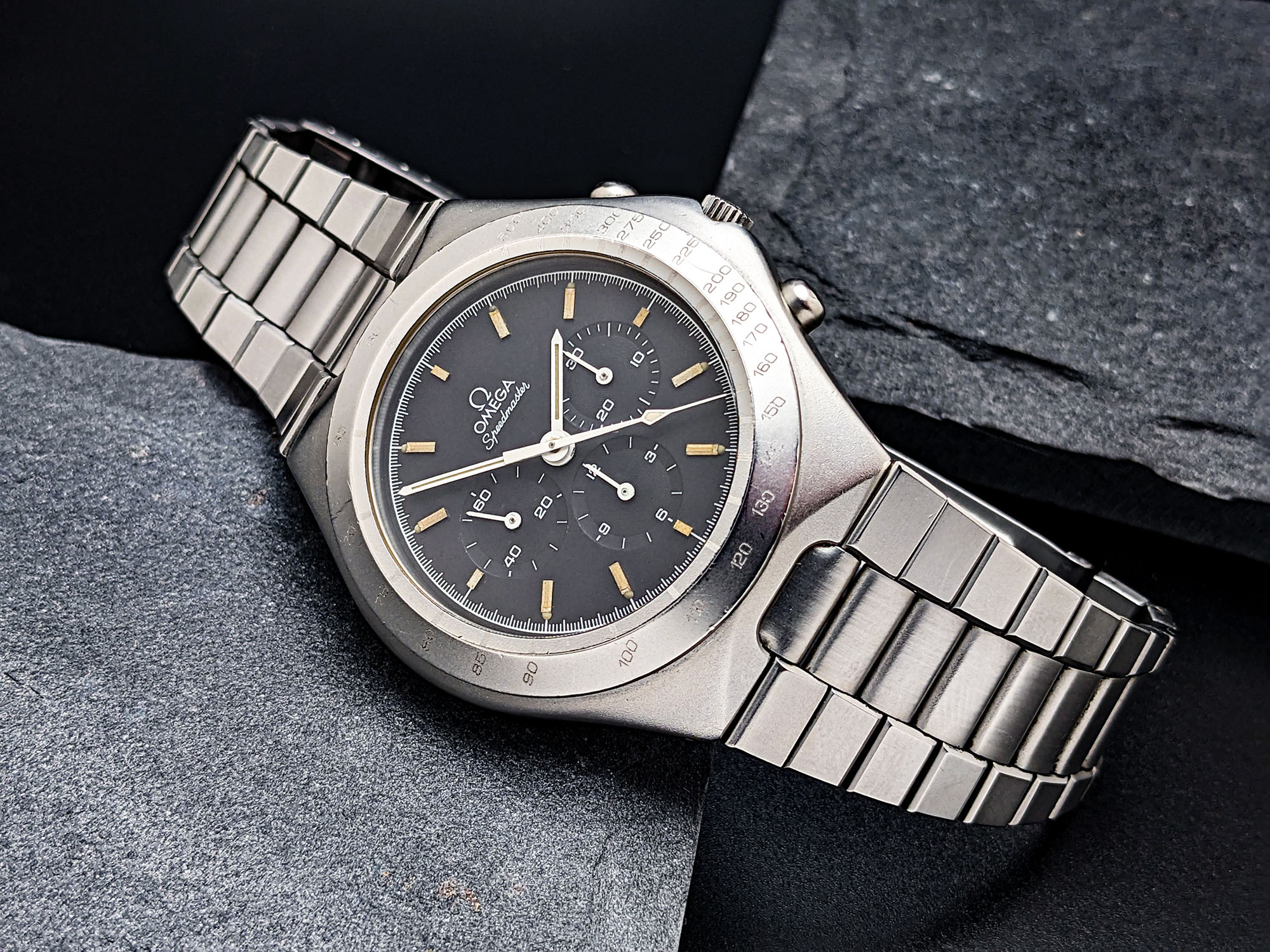
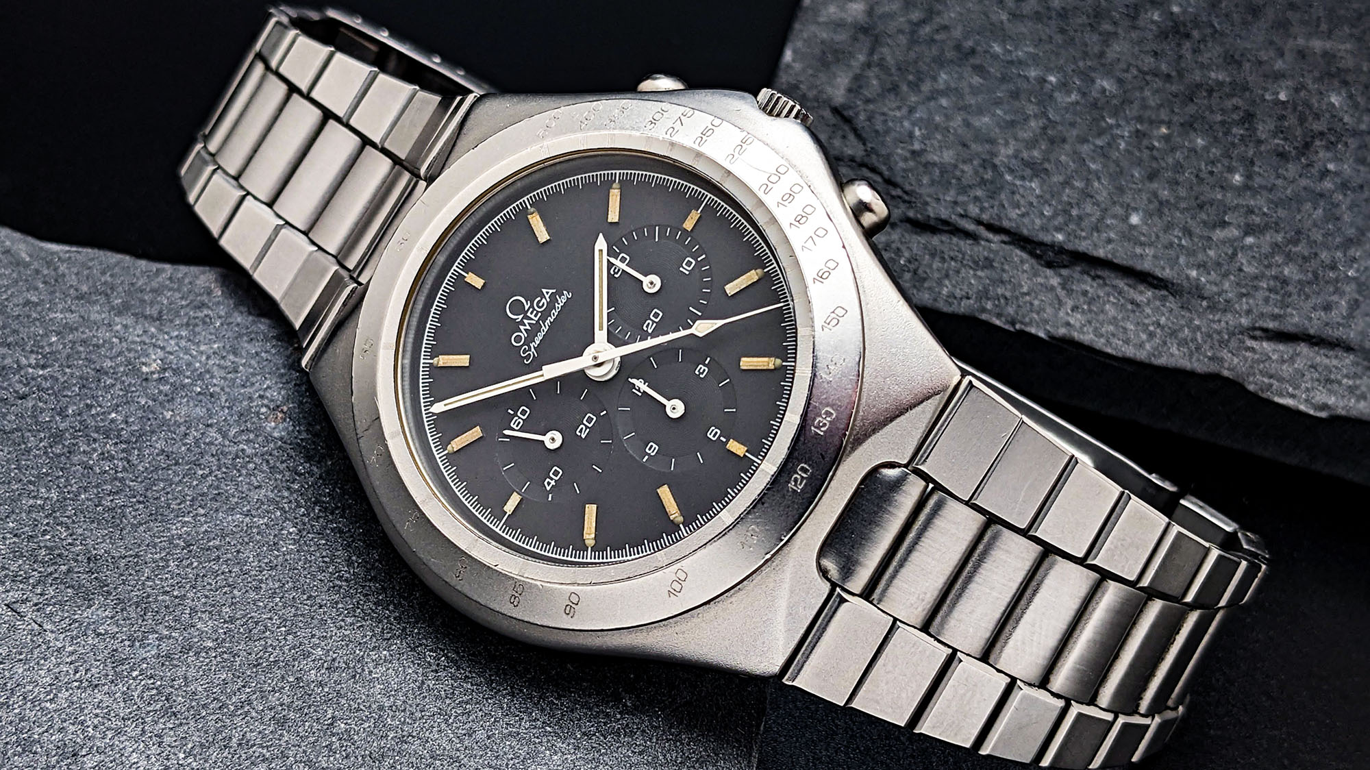
Although it may well be the most fully realized design of all the ‘80s “streamline” Omegas, the Speedmaster “Teutonic” enjoyed comparatively little visual staying power. Only available for a handful of years beginning in 1982, the “Teutonic” earned its name by being released exclusively in German-speaking markets. Core models were released with black, gray, or two-tone dials in stainless steel or two-tone steel and gold cases, equipped with the legendary Caliber 861 hand-wound chronograph movement. The “Teutonic” Mark V was also released during this time period, with automatic Lemania movements and slightly thicker cases. When looking for the simplest, most focused expression of the design, however, the reference 145.0040 presents itself – particularly in classic black dial trim.
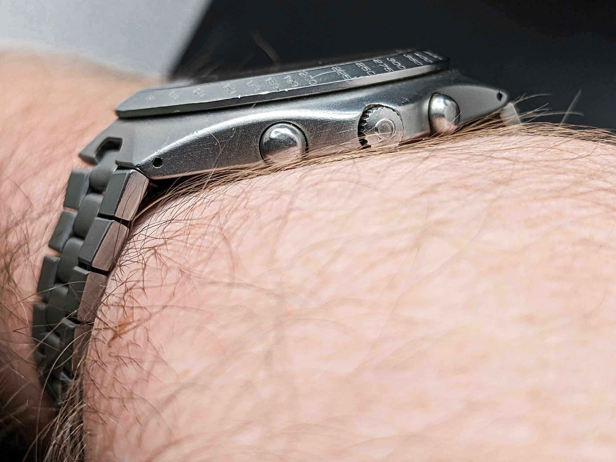
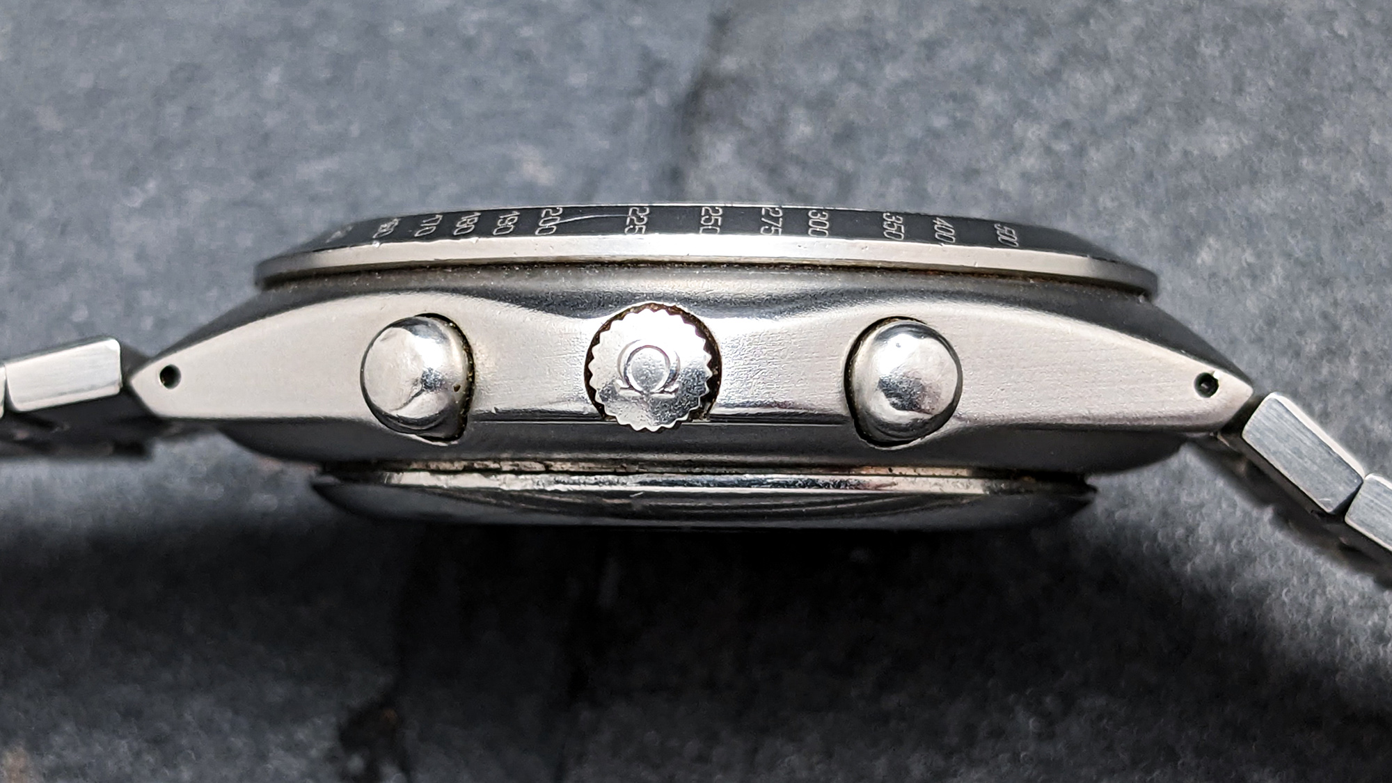
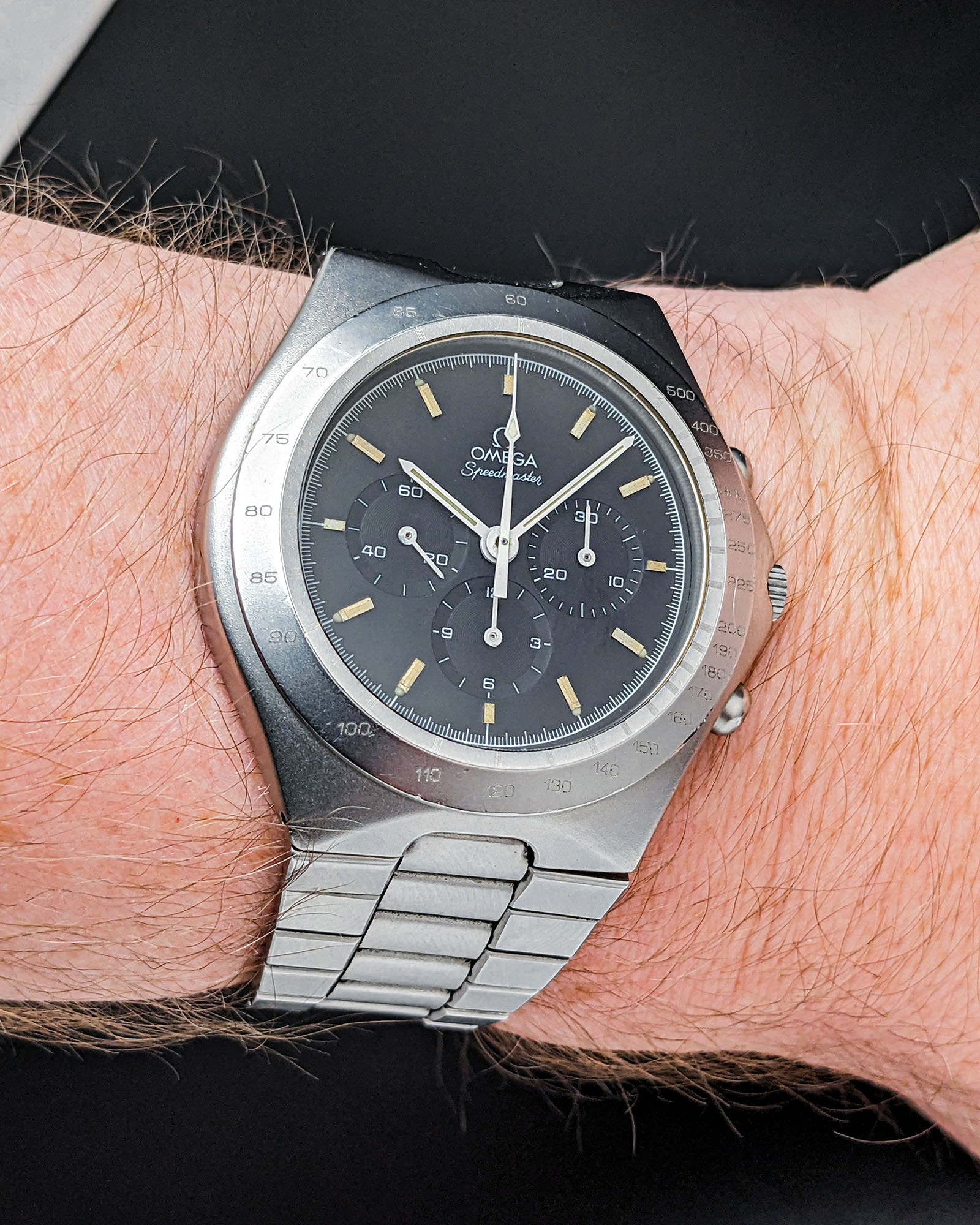
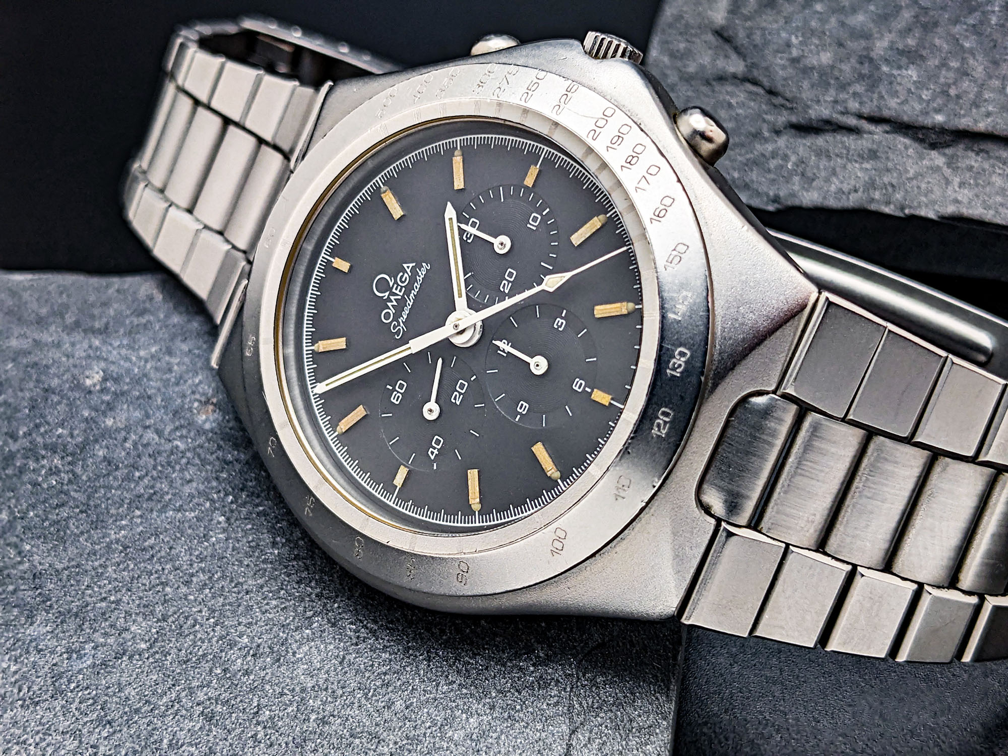
Without context, there’s very little that visually connects the 42mm-wide stainless steel case of the Omega Speedmaster “Teutonic” to the familiar Speedmaster Professional. The overall form is smooth, simple, and organic, with a matte-blasted finish that can be mistaken for titanium at first glance. Each case element flows seamlessly into the next, but the design is far from lacking in nuance. There is a subtle, rounded chamfer running the length of the case sides and up to the tips of the seamlessly integrated crown guards, creating a soft visual highlight when viewed from oblique angles. The impressively slender, tapering case sides add light brushing for a touch of contrast on close viewing, and the bullet-shaped pushers help to push the overall design further into its own distinctive stylistic territory while remaining easy and satisfying to use. Omega’s use of a sloping, engraved tachymeter bezel here instead of the classic Speedmaster’s familiar black insert is another fascinating touch, with an impressively detailed engraved inner ring acting in lieu of the dots on the traditional Speedmaster tachymeter scale. These bezels were originally filled with black paint to aid contrast on the narrow engraved numerals, but over time nearly all examples of the “Teutonic” have seen this paint wear away to create a ghostly, minimal look. Around back is one of this design’s greatest mysteries. All variants of the “Teutonic” are equipped with a press-fit solid caseback featuring Seamaster badging. This case certainly has no added water resistance over the notoriously low-depth Speedmaster Professional case design, so it’s unclear why Omega chose to brand this with Seamaster nomenclature, but it is a well-documented decision.
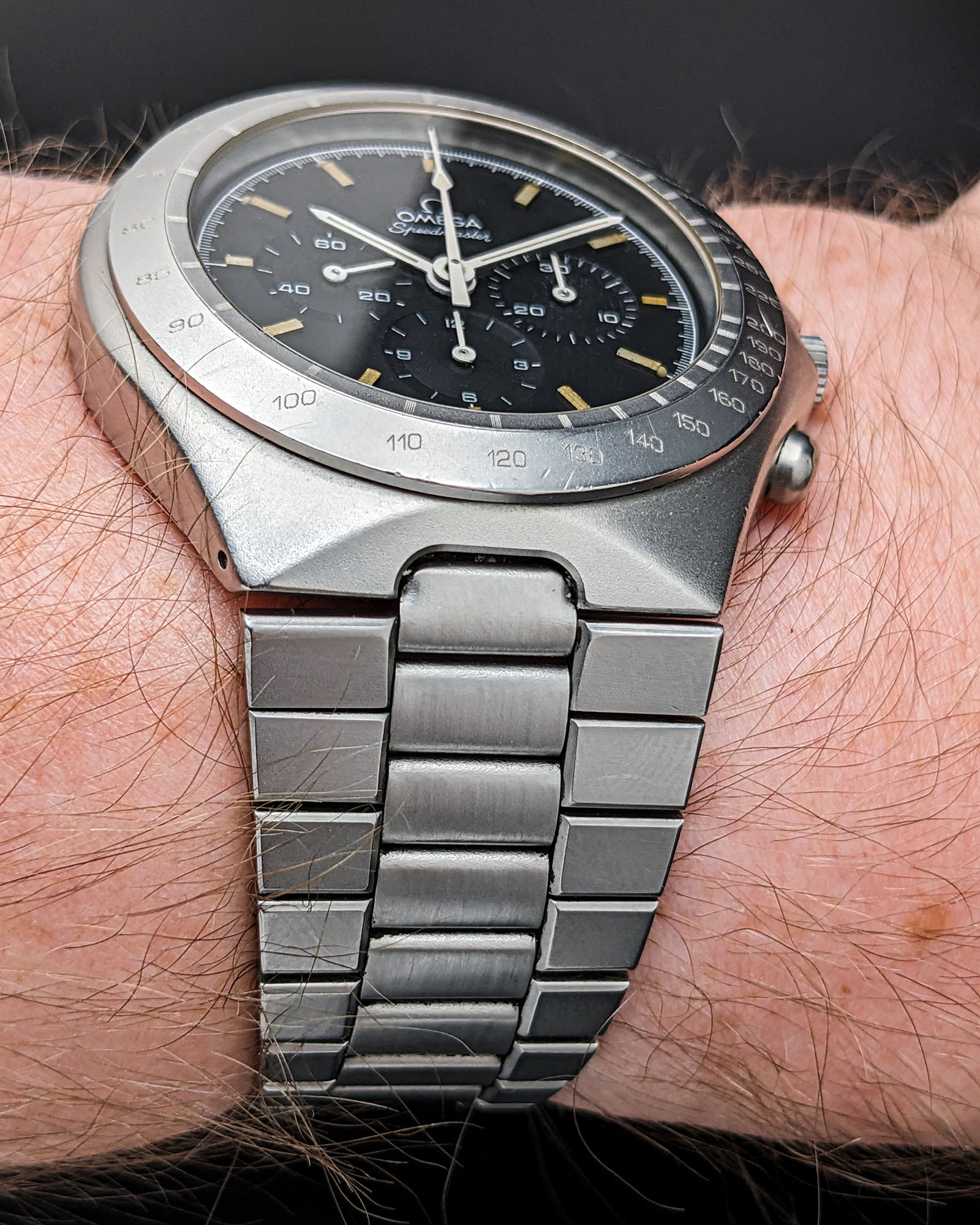
In terms of overall wearing experience, this smooth ‘80s-futuristic case is worlds away from the traditional Speedmaster Professional case design. Despite similar overall proportions, the slimmer mid-case, tapering integrated lugs, and broader steel bezel work to create a more slender, compact profile on the wrist. However, like most integrated bracelet designs, the broader bracelet ends do work to give the design a bolder wrist presence that tempers this effect somewhat. Of course, no discussion of an integrated-bracelet case design would be complete without discussing the bracelet itself, and the Speedmaster “Teutonic” offers an impressively holistic execution here. The dramatically tapering outer links flow seamlessly into the integrated lug structure, continuing the case’s matte finish and adding sharply chamfered edges for a dynamic look in changing light. By contrast, the recessed center links continue the rounded, organic visual style of the main case body while introducing contrasting brushed finishing. It’s a pairing that works to highlight the nuances of the case shape while providing a louder wrist presence than a standard stainless steel bracelet design.

If the case and bracelet of the Omega Speedmaster “Teutonic” are all focused on radically rethinking what a Speedmaster can be, the dial is all about minor updates to the established formula. It’s a pairing that makes sense on some levels, preserving a visual lineage to the models that came before, but the combination of the dramatically different exterior with a deeply familiar dial may prove jarring to some tastes. The matte black dial surface, three recessed subdials, clean subdial scales, and lumed stick handset are all Speedmaster mainstays, and Omega preserves the line’s focus on functional legibility here with a pared-back presentation. Even the traditional “Professional” text beneath the 12 o’clock Speedmaster emblem is gone here. The “Teutonic” does add its own spin to the formula, however, in the form of applied gold-tone indices. With such an instantly recognizable backdrop, these minor tweaks do have a noticeable effect on the overall presentation and help to position the “Teutonic” as a more refined, style-forward alternative to the classic tool watch Speedmaster look.
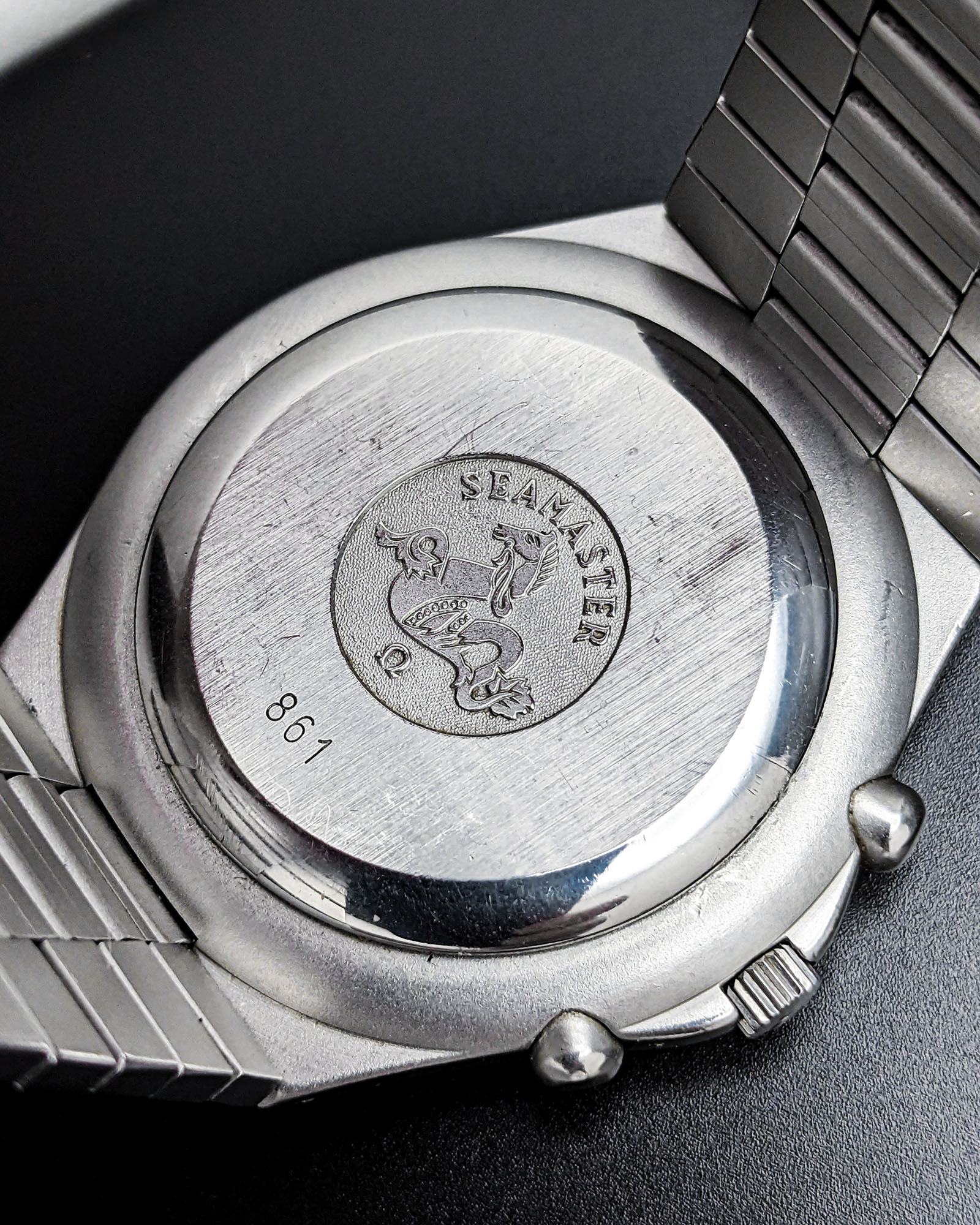
As with all hand-wound Speedmaster models of this era, Omega powers the Speedmaster “Teutonic” with its in-house Caliber 861 hand-wound chronograph movement. Although it may lack some of the romance and complexity of the earlier Cal. 321 movement, the Cal. 861 formed the backbone of the Speedmaster line for decades, from 1968 until the introduction of the updated (but still Cal. 861-based) 1861 movement in 1996. Over these years, the movement has proven its worth many times over as a reliable, robust chronograph powerplant, although the cam-lever chronograph actuation system may lose points among die-hard chronograph purists.
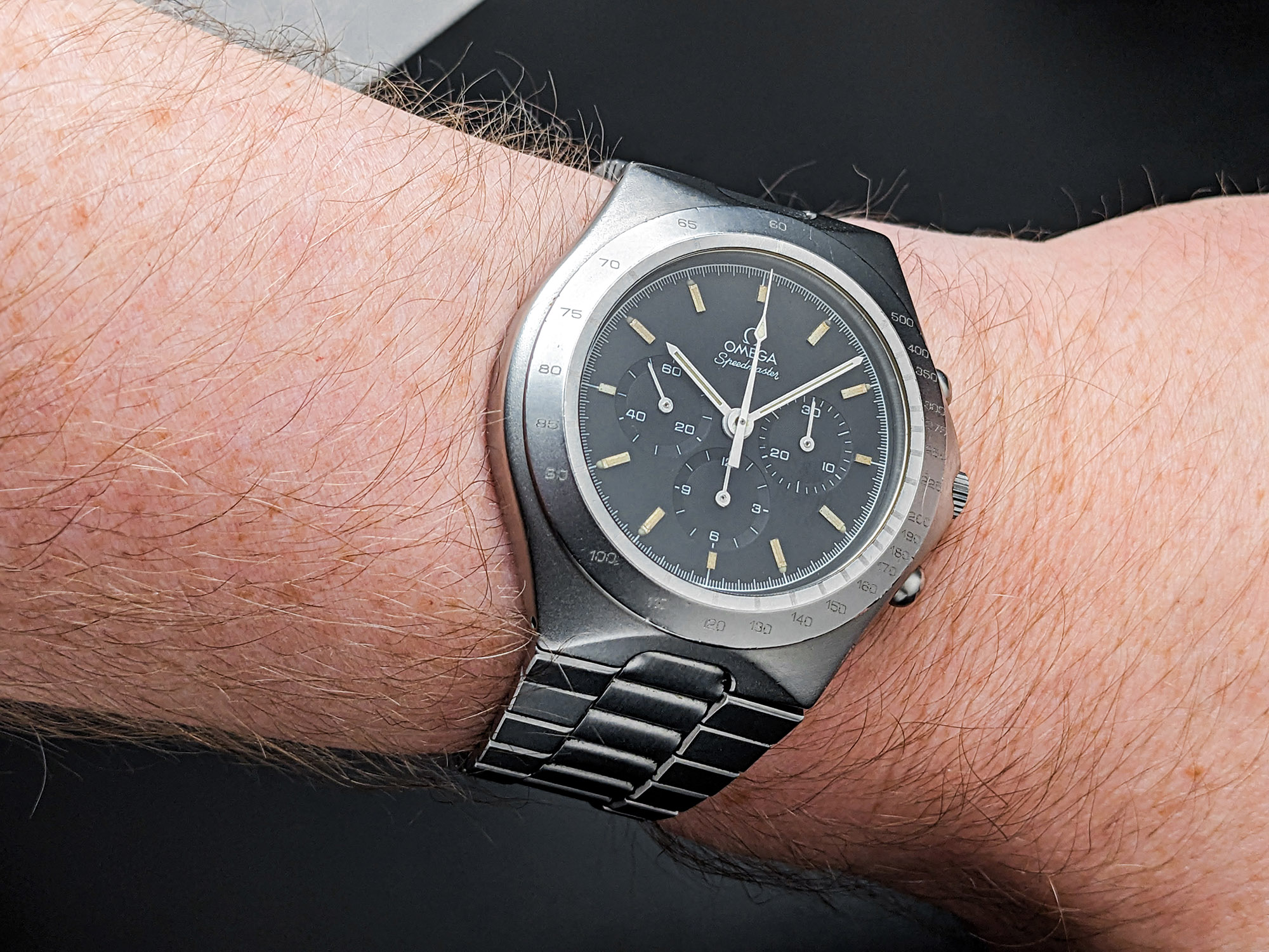
Although its time may have been brief, and the vast majority of its potential stylistic revolution never came to pass, the Omega Speedmaster Teutonic remains a captivating snapshot of a moment where the brand might well have created a radical new identity for itself. In addition, even as vintage Speedmaster prices continue to climb, the “Teutonic” remains one of the most accessible and charismatic ways into classic Speedmaster ownership, with miles more personality than many more highly sought-after references. At a moment where truly adventurous design is spread thin across the industry and brands seem intent on preserving the look of the past, the Speedmaster “Teutonic” is a refreshing reminder that even if it doesn’t always work, changing a brand’s visual DNA can produce some genuinely fascinating results.

