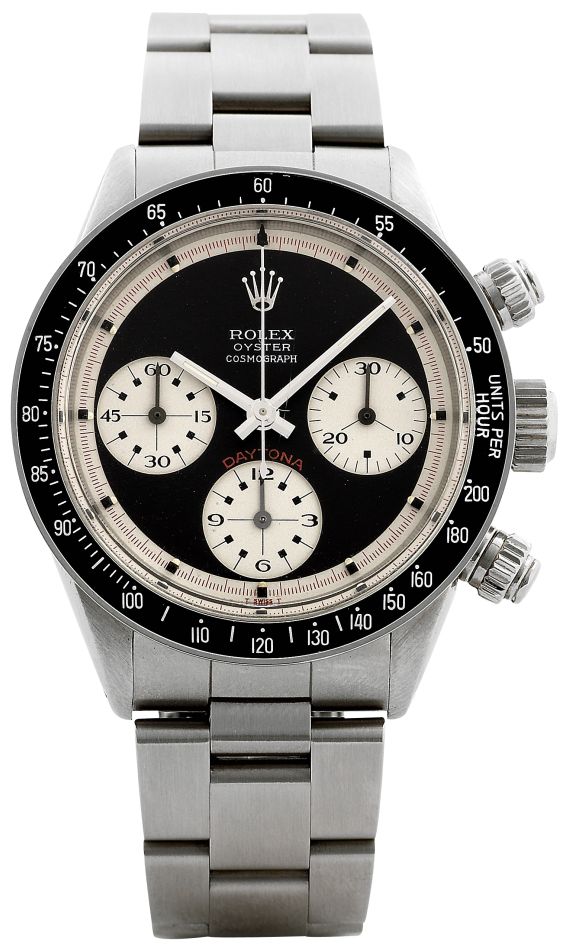
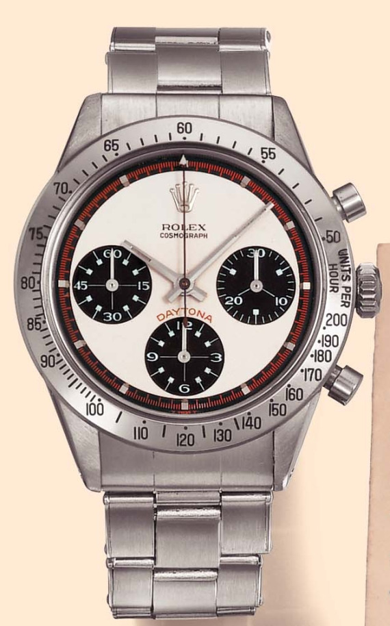
This is not a technical article or about any new watch release. Instead, this is about a look – a good look, but a look that you don’t need to be a watch lover to understand or appreciate. It isn’t just a look, it is part of watch fashion psychology, and something that draws people some refer to as that “accessory on your wrist.” In fact, the reason why I used the term “idiot’s allure,” to describe the concept is because someone who knows nothing about watches will be attracted to this type of design. I am using the Rolex Cosmograph Oyster Perpetual Daytona watch (last time I will use this ludicrously long name for the timepiece). Now, you aren’t an idiot for liking these Rolex Daytona styles, but it doesn’t take a special person “in the know” to appreciate the look. The only difference is that people like you and me perhaps enjoy these watches for different reasons.
Why is this even a question you ask? Who cares? Because I am always interested in why people like the watches they do. Why are Rolex Daytona (or most of their watches for that matter) designs so timeless? Why do people like busy watch faces? Why do so many people buy chronograph watches that never use them. I would venture to say that the majority of Rolex Daytona watch owners use the chronograph function MAYBE once a year or less.
Forget for a moment that you know anything about Rolex, about the legendary Daytona, or versions like Paul Newman Daytona which is among the pictured. Focus only on the contrasting colors of the dial and the existence of the chronograph subdials. This is very important – not just that there are subdials, but that they “pop” out a bit. this is best achieved on the Paul Newman versions. There is also the almost perfect symmetry of the watch – that would be perfect save for the text and numeral differences. My first theory is that simple two-tone or other contrasts in just a few colors are the west way to create visually attractive watch face. Start to get too many colors on the dial and people might think the design too busy, too cohesive – though at the same time one color can make a watch dial look flat or boring from afar. Each of these Rolex Daytona watch perfectly captures this idea of simple contrasting colors – here in black and white. New or old, this look is timelessly well done in this range of Daytona dials. The best part of the color system is that the watch look good from inches away or from across a restaurant.
So why does it look so good? Well part of it is what i think is the brain’s ability to perceive complexity or “multi-function” in small spaces. A Rolex Daytona watch case is 40mm wide with the actual face being a bit less. This is all the room that Rolex has for a design, which is often viewed from third party people afar. The watch needs to be recognizable and readable, which I think is simply done easier in just two colors. Otherwise the brain begins to bleed shapes and design. Part of the success of this two-tone contrasting look is the historical success of these designs simply being the easiest to mentally decipher. If the brain could process shapes more adeptly using more colors in such a small space, then all this would be moot – but it is not.
Then you have the allure of the chronograph and its subdials. Most people don’t really care too much about the chronograph. Yes, some of us do, but for the most part, if you are going to be timing anything these days, your first inclination is a digital watch. Instead it is what I believe is the perceived notion of the chronograph watch due to the subdials. Let’s face it, people love subdials (dials within dials are cool!), and in its tri-compax array, no one does subdials better than Rolex in the Daytona. Subdials allude to function and purpose. That the watch on our wrist is an actual instrument as opposed to just some timepiece. I’ve heard people who know nothing about watches look at subdials on a timepiece and remark “they make the watch look like it does a lot.” Really sophisticated, I know – but there is a worthy point there. The concept being that Rolex did a good job in making the watch look like more than it is. Yea, the watch doesn’t even have the date, but it still looks to a lay person like is a complex timing instrument. Hell, it even has a tachymetre scale. Most watch lovers don’t even know what that is, or how it work – but looks cool. And that additional ring of numbers that is so prominent is an important part of the “functional attitude” that Rolex imbues the Daytona watches with – it really doesn’t matter than no one uses it, or looks at it.
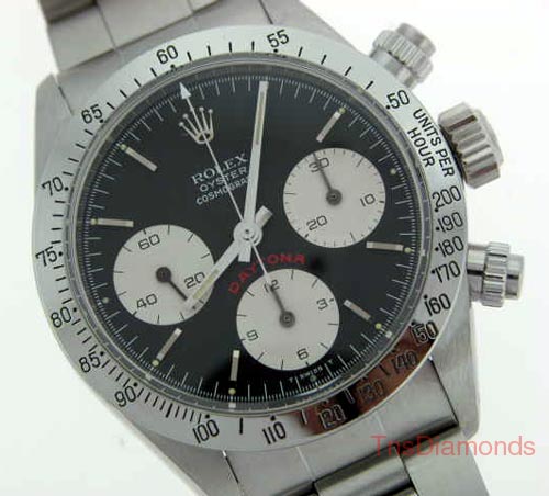
This same concept can be transcended to the screw-down chronograph pushers. Now, these are admittedly more functional on an everyday basis, but still add that cool “technical” look. Sure they are used to help increase water resistance in the ol’ “Oyster” watch case, but they just help with that “this watch probably does something cool look.” There is also the attractive but simple three-link metal bracelet. the design is purely functional and not distracting. Nothing to take away emphasis from the case. The beauty of this classic design is not in the quality or reliability of the watch, but rather what it makes people think. That is why people are willing to pay so much for this watch. because it easily appeals to people who don’t know anything about watches.
Honestly I love the Rolex Daytona collection of watches. I think they could be sized a bit bigger these days and perhaps add a date disc, but then they wouldn’t be Daytona watches. Still. I don’t feel like a connoisseur because I like the Daytona watches. I like them, and the guy who wears too much gold jewelry who wants to add to his watch collection of Breitling watches likes the watch too. So this article was about two things in the end. First, why everyone and their best friend likes the Rolex Daytona, and two, a bit about why those elements are so easy to enjoy. It isn’t about idiots, or the love of shiny, shiny things. Going back to the basics, Rolex has always succeed in following the principle of KISS, or spelled out as “keep it simple stupid.” The alternative is a busy watch with too much hidden impressive points that requires a skill level like mine to appreciate, or a three week course at your local “horology appreciation class.” And the latter doesn’t really exist.
See Rolex Daytona watches on eBay here.