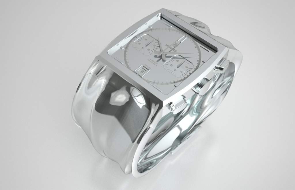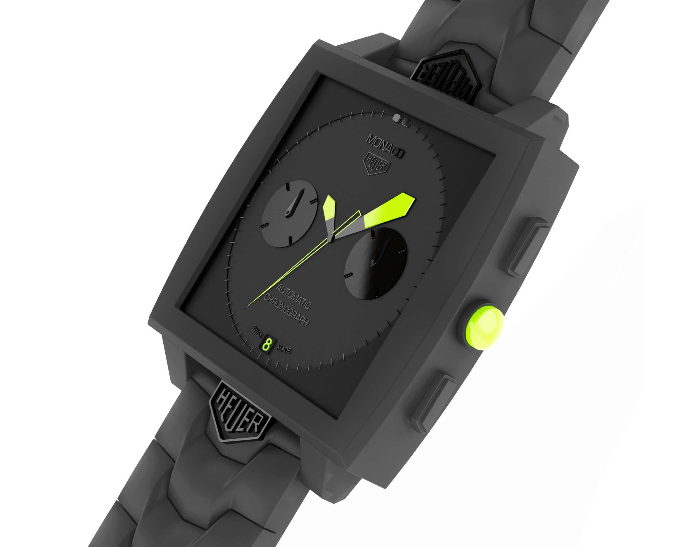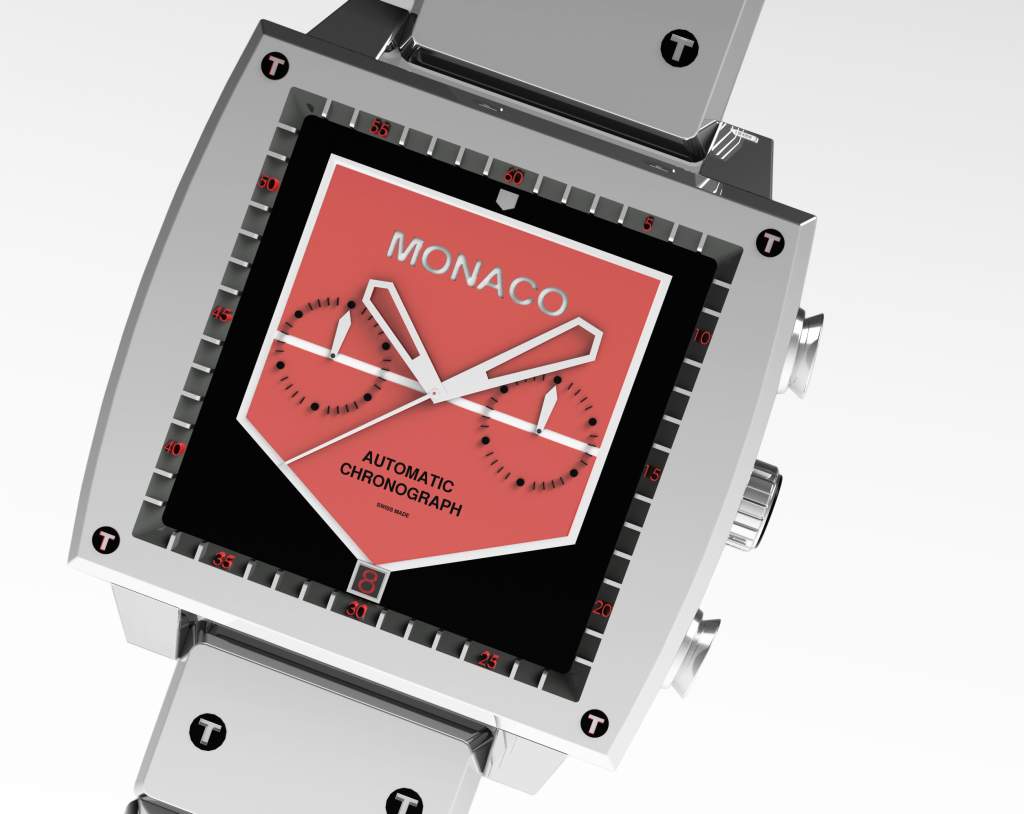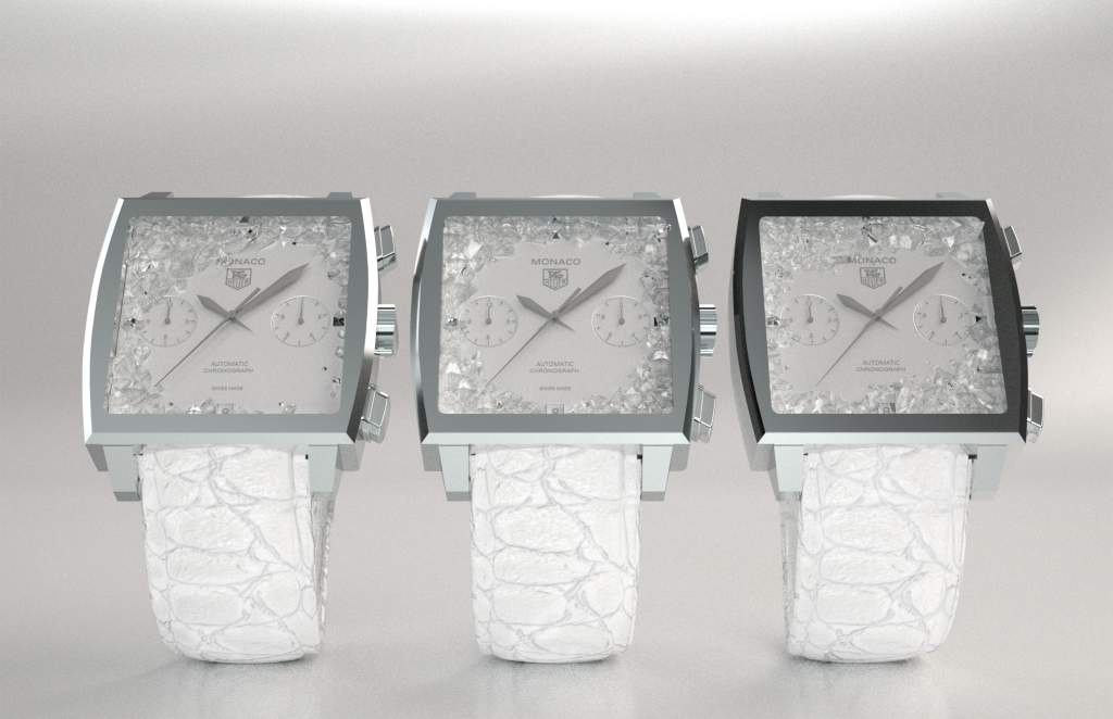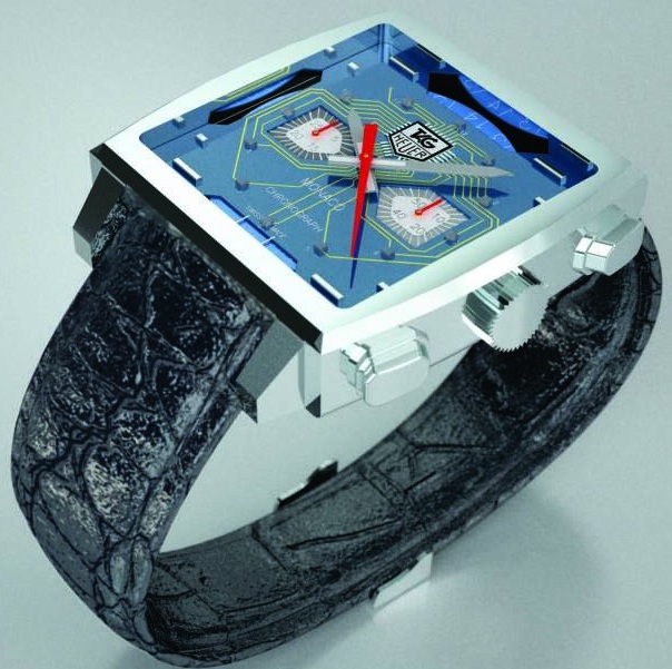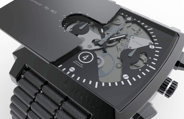
A few months ago Tag Heuer began an interesting project with the Parsons New School For Design (worked with the New York City campus). The project was called “The Art of Watchmaking.” Silly, because the idea was to design watches, not really make movements. Anyhow. The plan was to have design students re-imagine the iconic Tag heuer Monaco. Not only would this project be fun and come with good media, but it could potentially assist Tag Heuer in future design directions its takes the classic model. While I don’t know the specific rules the students had, it looks as though their own requirement was to maintain the Monaco case shape.
Student groups were to compete against one another, with each group’s result being a few designs. Tag Heuer would reserve the right to actually produce the watches. Produce them if they liked the watches of course. The pictured three watches were the winning models. These were the best. Will Tag Heuer make them? Does Tag Heuer want to make them?

Probably not in my opinion. While interesting, I think there is an important lesson to be learned here. Among those lessons is that these student seem to not really have a grasp of good watch design – and why would they? They never learned. Forget the fact that aside from the case, these timepieces don’t really have any manner of Tag Heuer design DNA. They also feel a bit flat and overly “CADed” (too reliant on computer aided design). I am not attempting to be overly critical about the result, but rather feel that Tag Heuer might have not been thrilled with the result to choose this trio. Each of the watches in this trio have some excellent parts, but together don’t make watch i think would be work making.
Interestingly enough, I feel that the straps on each of the designs is best. It looks as though those elements are clearly where the students put most of their effort – or perhaps cared for most. It might also be a matter of personal familiarity. The idea of a cool, comfortable strap might be more of a “hits-home” concept than that easy to read, yet attractive looking watch dials that fits into the look of a brand know for their polished looks. At the same time, I think that many Tag Heuer watch designs are so good, they set a pretty high bar for most people to match.
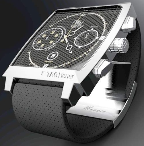
The watch dials that the students created are interesting, but don’t really do it for me. They really seem a lot more like design concept than something a watch maker would be serious about. The black sliding shield over the top watch makes no sense to me. Looks like when closed it just offers a view of one of the subdials. From a design perspective that might be cool – but it offers nothing of practical interest.
Tag Heuer just might use some of these ideas for future watches, but I think that for Tag Heuer to produce any of these watches will be a long shot. They might, but I am not sold on it. Tag Heuer’s intentions in this design experiment were good. I think that ideas like this do in fact help reveal great concepts and design directions. Though you can just give watches models to design students and hope for them to design “the next best thing.” When it comes down to it, watch design required repetition, skill, maturity, and lots of experience. Novice designers who lack a foundation in watch design just might not be the best suited to help a landmark name in the watch industry improve or modernize a classic.
UPDATE BONUS: See images below in the image gallery of the second and third prize winners from the Tag Heuer Monaco design contest.

