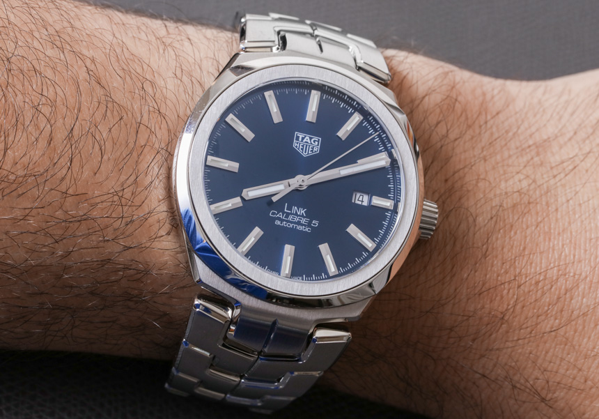
Thoroughly updated for 2017, the TAG Heuer Link continues to be the sporty Swiss watchmaker’s answer to a men’s jewelry-esque “business” watch. In its newly evolved form, the Link gains a more distinct form that is both more aggressive than previous generation models and designed to catch a lot more attention. Even though there are watches in the same category as the Link at lower prices, in a lot of ways, the Link offers detailing and aesthetic touches you’d often find in much more expensive watches. Value certainly seems to be on the side of this new Calibre 5-equipped TAG Heuer Link Men collection (which aBlogtoWatch debuted here).
The Calibre 5 is TAG Heuer’s name for the Swiss Sellita SW200 automatic. Visible through the sapphire crystal caseback window, the mostly unembellished base automatic mechanical movement powers the watch at 4Hz (28,800bph) with about two days of power reserve. The movement is basic but sufficient for the target demographic who wants a Swiss watch with a Swiss movement.
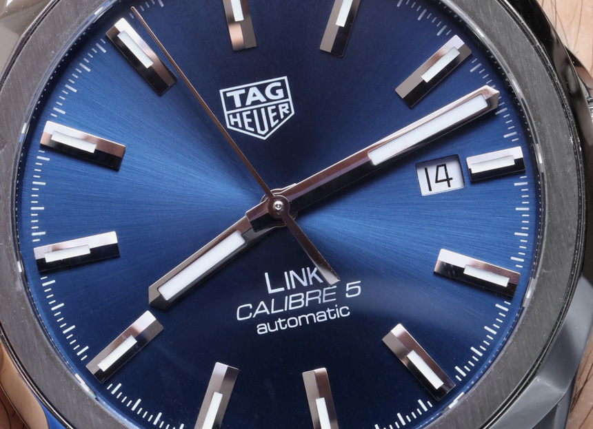
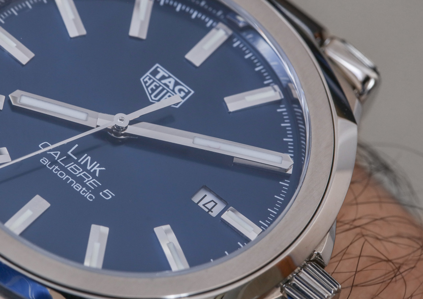
Over on the dial we see a remarkably clean and bold face (available in three to four different colors including blue, black, and white) that almost surprisingly (in this day and age among watches of this ilk) focuses on good proportions and legibility. With that said, the dial is not without its sense of attitude and personality. The polished hands and matching hour markers feel as large as they are reflective. Not reflective in a serious legibility harming way, but rather in their ability to garner attention as anything shiny would.
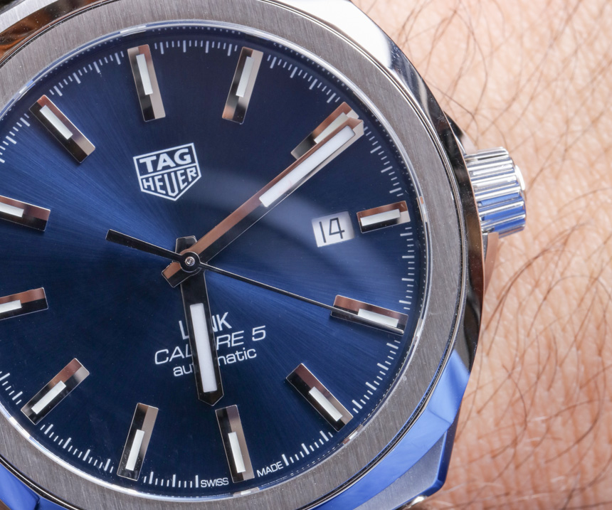
Being effectively shiny as a men’s item is something that TAG Heuer got right in the Link, and in many respects, I can’t think of too many other truly contemporary men’s dressy business bracelet watches that are this boldly shiny and yet still elegantly tasteful. The hour markers and hands can afford to be so big because the rest of the dial is relatively clean and uncluttered. I would however have liked for the date disc’s color to match that of the main dial (though it does on models like the Link with the black dial).

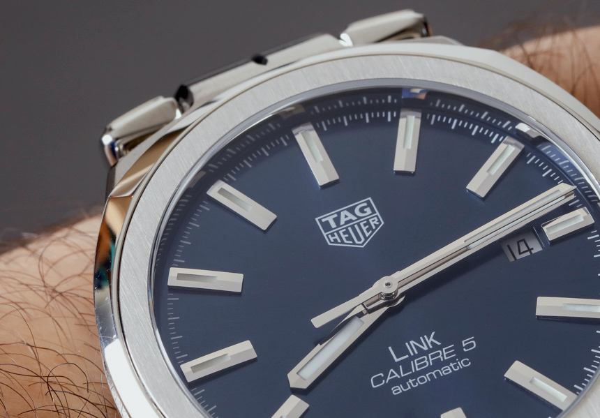
I would have also liked for the 12 o’clock hour marker to be somewhat different in design from the rest of the hour markers. This is a common practice which is valued because it helps the viewer’s mind orientate the dial when looking at it from different angles. Having a distinctive-looking 12 o’clock hour marker just overall helps with legibility, but also orientates the design so that it has a proper “up” and “down.” It might have been sufficient for them to simply make the 12 o’clock hour marker a bit wider, or even an applied version of the TAG Heuer logo. Also given the size of the hands and hour markers, I bet this watch dial would look cool with tritium gas tubes (OK, now I am just going outside of what the brand would even do).
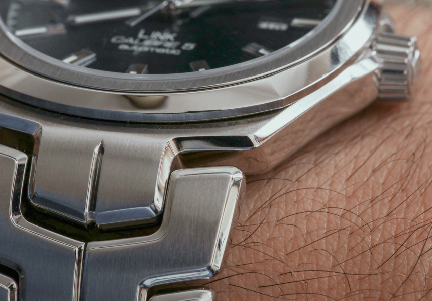
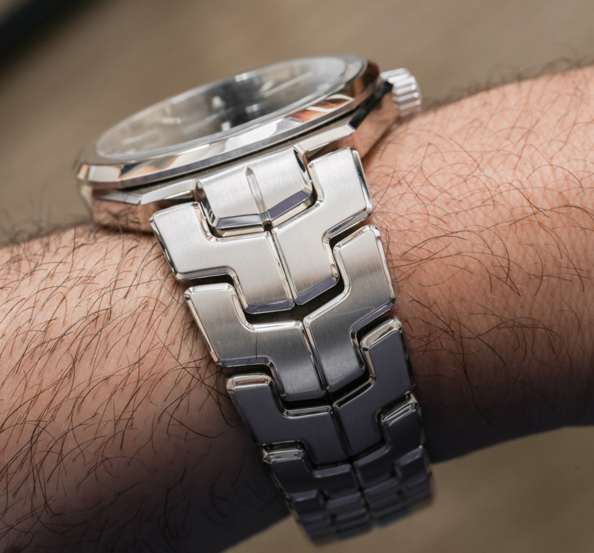
Overall, I applaud TAG Heuer on their ability to stay on task with the dial of the Link Calibre 5. It is sporty, legible, attention-grabbing, and otherwise, as restrained as possible. The case, which is 41mm wide and water resistant to 100m (not a screw-down crown) is in steel, and very different than previous generation Link models. The case is actually three distinct shapes all somehow rolled into one. The Link case is round, tonneau, and cushion-shaped. How did that happen? This is because the dial is round, the bezel is cushion-shaped, and the case itself is tonneau, with wide lugs that integrate directly into the bracelet. I know for certain that the way the Link appears on the wrist is very different than previous ones and this will make some fans a bit standoffish at first. To those people, I would urge patience and let the new design grow on them. This might be a new personality for the TAG Heuer Link, but it is a welcome one with a more spirited voice and sense of purpose.
