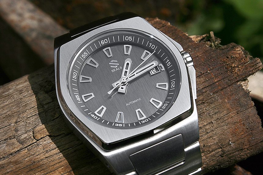
Once in a while you luck out and get to review a watch you’ve already seen and been interested in, and this time it was the Seals Watch Co. Model A. I had originally taken note of this watch when stumbling upon their original Kickstarter campaign back in 2014. But, being a skeptic of crowdfunded watch projects, I sort of held my interest at arms length while still keeping tabs on Seals Watch Co. and the progress and development of their inaugural creation. After a while, it had become apparent that the design had won me over, yet what about the execution? It was this long lingering curiosity that made me pounce at the offer to see (and review) one myself.

As a microbrand on Kickstarter, the Seals Model A stood out to me like a beacon of hope amongst a sea of “samey-same” minimalist watches I’ve seen a hundred times over. Not to say that there is anything wrong with Bauhaus or Dieter Rams, but the bold case of the Seals Model A was a refreshing sight when I first came upon it. I looked over the page, scoped out process renderings and development news on social media, and thought to myself “This watch is really cool! Too bad it probably won’t get funded though.”

Well, I am happy to say my cynicism was proven heartily wrong, because the Seals Model A did not disappoint its backers, and it definitely did not disappoint me when it arrived. When the package came to my door, I wasted no time in getting through the box and branded watch roll to reveal the long-anticipated Seals Watch Co. Model A.
The configuration you are looking at is the 316L stainless steel case with slate grey dial. This watch arrives on an alligator textured leather strap by default, but this review will focus on the JacobStraps upgrade and the recently released 316L steel bracelet. I did strap on the watch with its default band, and it was completely reasonable for a watch at this price point… But back to the task at hand!
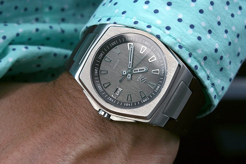
One of the things I like the most about the Seals Watch Co. Model A is that it took something I typically have an aversion to — integrated straps — and made it a feature that I really respond to. Stylistically, the case sort of falls within the realm of the Glashutte Original Seventies or the IWC Ingenieur. Both are certainly well-designed, prestigious, and receive plenty of fanfare, but for some reason I don’t respond to them personally. Perhaps this Seals Model A could act as a “gateway watch” and stoke a newfound desire/obsession? Maybe for some, but for me it stands as an anomaly of appreciation, and that adds to the fun.
I especially love how the integrated leather strap works with the lugs, which I am also usually not a fan of. I’d typically only want to see a steel bracelet with this kind of setup, but I think the leather just works. Funnily enough, the original intent for the Seals Model A was to only make it available on a steel bracelet, but more on that later.
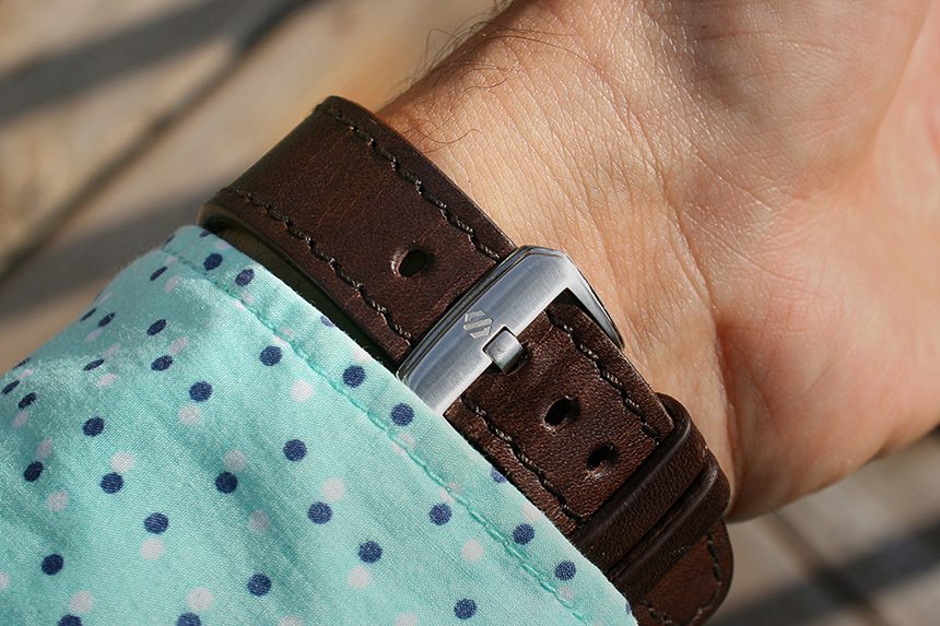
Anyways, if you saw my review of the Ophion OPH 960 watch a while back, you may recall that JacobStraps makes a great bit of leather, and this strap upgrade is no exception. I have the chocolate brown calf leather upgrade here, but you can snag yourself an alligator strap for just $150 USD. Either way, the JacobStraps upgrade is something I definitely recommend as it really makes the watch feel more substantial. Plus, the stitching quality and material itself is definitely superior in both a visual and tactile sense. For me, it is also a better fit on the wrist, as the default strap is a bit longer on the hole side.
This upgrade is well worth it, and with a proprietary lug system, the Seals Model A will make it hard for you to find replacement straps elsewhere. A point of contention for some, to be fair, but personally, I feel it’s a fair trade for the style of case and lugs. Also, if you would like to avoid replacing leather entirely, then perhaps the steel bracelet would be the upgrade for you.

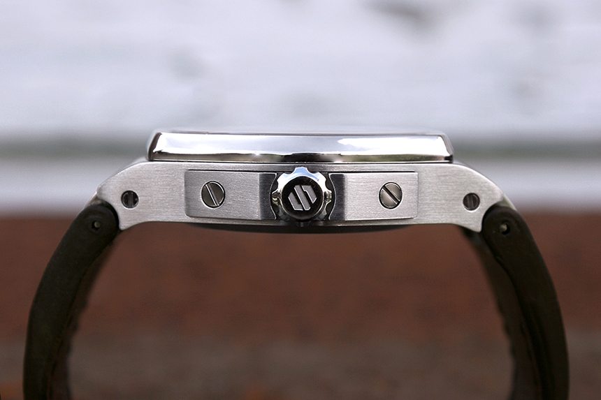
Another thing I really love about this case is the crown and crown guard. The screw down crown is a bit thinner than you would expect, but sits flush with the guard and I love the visible slot head screws that affix it to the case. It’s a small detail, but it just adds to the industrial sort of feeling of the case. Also, the two-piece case looks more substantial than it actually is, which is fantastic because it fits under your shirt cuff and makes the Seals Watch Co. Model A more versatile than you would expect. The 316L steel case is only 12.2mm thick and 41mm across (excluding the crown), but the clever hexagonal configuration adds visual heft without compromising wearability.
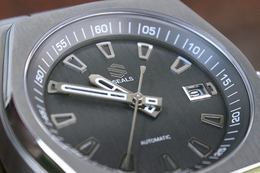
The hour markers on the dial also appear quite substantial, and the shape of both the hands and hour markers build out the overall design of the watch nicely. The dial is bushed in a straight vertical grain which creates a nice contrast to the bead-blasted chapter ring on the outside. All of this detail is clearly visible through the flat sapphire crystal with anti-reflective coating on the inside.
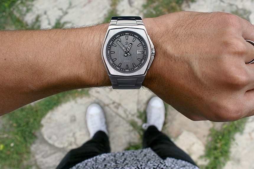
One feature that may irk some people is that the lume is painted directly on the steel rather than being suspended in the middle. I had actually thought that the lume was just a pad printed, non-luminescent feature to tie in the hands with the white type on the dial. Late one night, I was actually caught off guard by the presence of a somewhat dim glow from the face of the watch.
It is a valid criticism to say that this isn’t the most functional use for Super-LumiNova. This is partly due to it being painted directly on the hands but also because there is no lume on the indices either, which does affect legibility in the dark. Strange? I would be hard pressed to disagree, but for me this wasn’t a deal-breaker. Personal bias trigger warning: I really like this watch overall, and therefore, I am willing to forgive the weak lume application.

