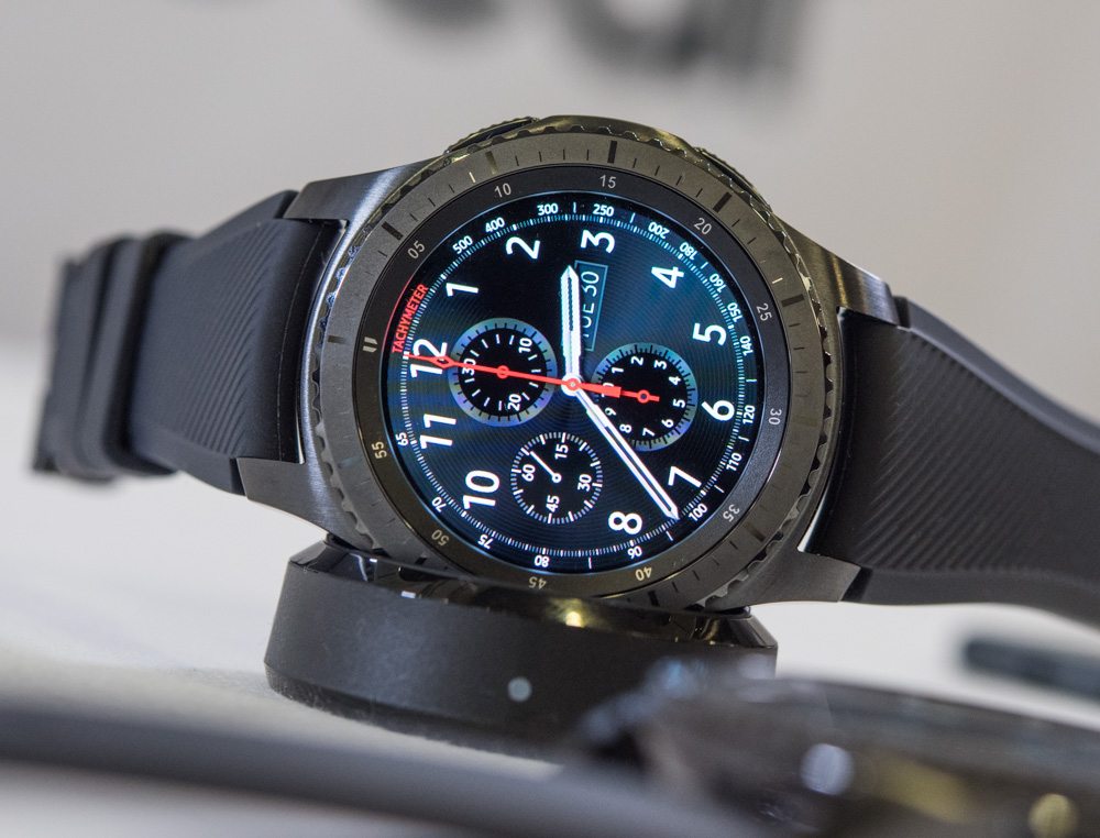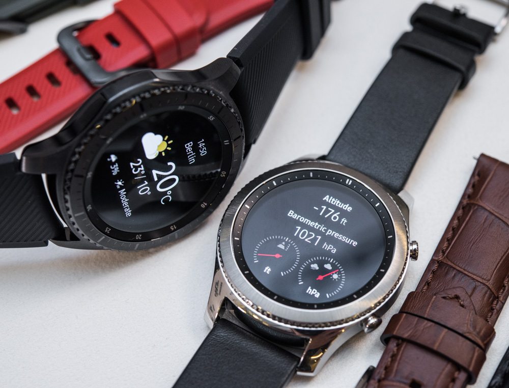
Allow me to take the opportunity, while writing from the Samsung Gear S3 product launch event, to once again quickly muse on the topic of smartwatches. Contrary to the sentiments of many of my colleagues, I am pleased to see the lines between “smartwatch” and “watch” blur. I’ve seen the “watch future,” my friends… and it is closer than you think. Moreover, my prediction is that sooner rather than later consumers will begin to use these two different terms less as smartwatches become the norm (and are just called “watches”), and all those that don’t offer modern functionality might be watches that get a more descriptive title given their more niche status (I really hope it is not “dumb watches”).
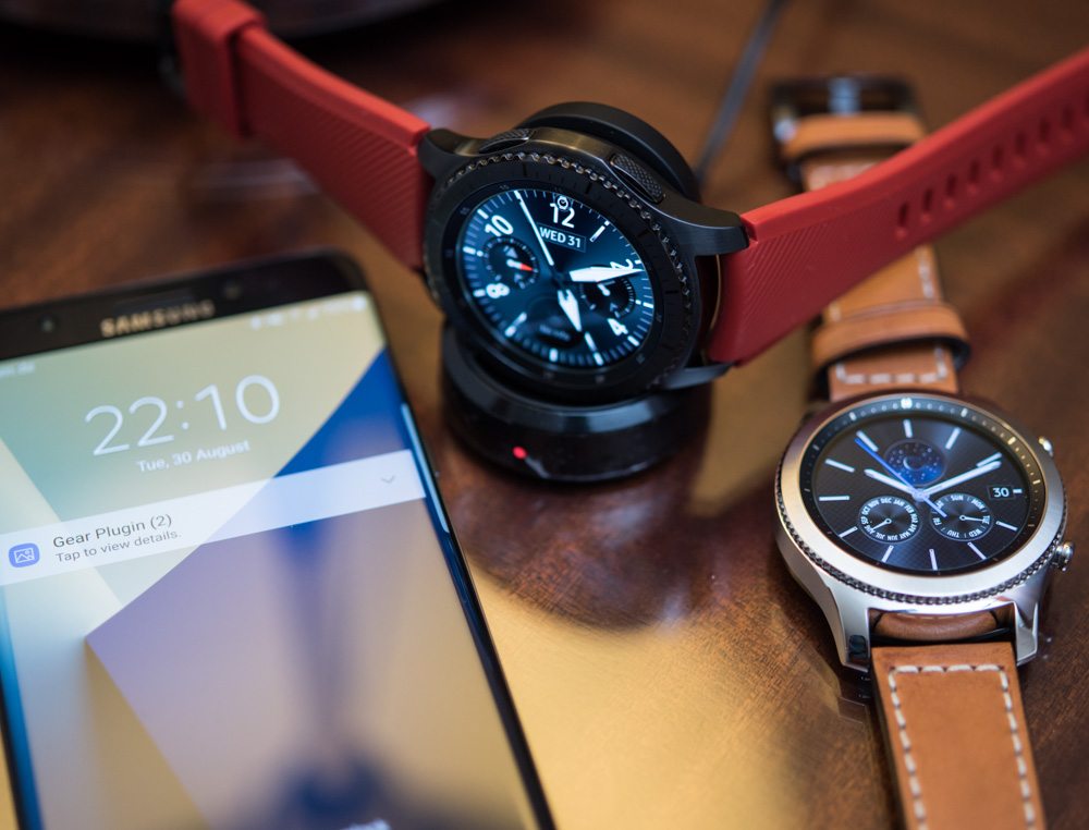
Today in Berlin, prior to the electronics trade show IFA, Samsung releases their newest smartwatch and the seventh such device in their collection with the Samsung Gear S3 – and this time around, I’m actually helping Samsung to launch it by being part of their Unpacked event. Last year around the same time, Samsung released the Gear S2 which, for the first time, saw the Korean electronics giant adopt a round case design as well as implement a user interface navigation method that involved rotating the bezel – they call it Circular UX and it works pretty well. While the S2 will continue to be sold (for at least the time being), the Samsung Gear S3 offers a sharp upgrade in terms of a very key element of the device: how it looks on the wrist.
Developing The Samsung Gear S3
Samsung chose to work with Swiss watch industry veteran, personal colleague, and interesting guy all-around Mr. Yvan Arpa on the Samsung Gear S3. While Mr. Arpa is known around aBlogtoWatch for his extremely avant-garde watch brand Artya (and before that, Romain Jerome), he is actually quite capable of producing more conservative watch designs. For Samsung, he helped ensure that, visually speaking, the Samsung Gear S3 would look much more like a “real watch” on the wrist. Much of this was making the case shape, materials, and finishing something that those familiar with more traditional watches would find both familiar and immediately inviting. Whereas some smartwatches are clearly approached from the perspective of being a wearable gadget for the wrist, with the Gear S3, Samsung wanted to borrow success from lessons the traditional watch industry learned long ago. And to be honest, in my opinion, they did a really nice job.
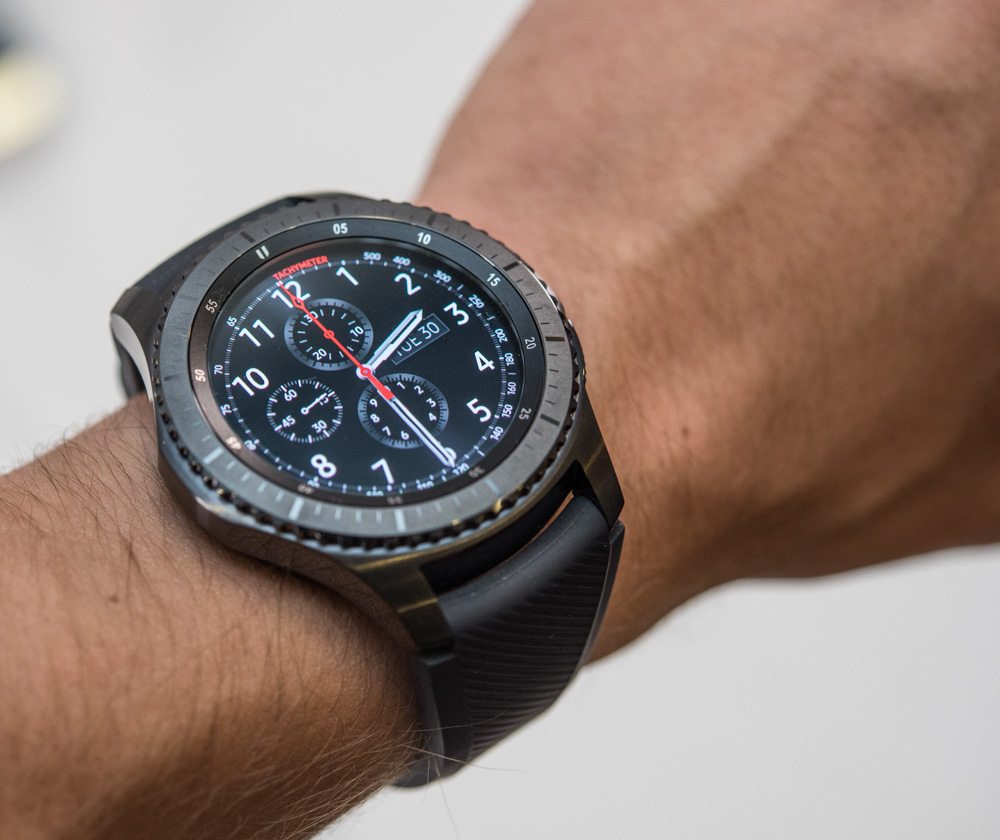
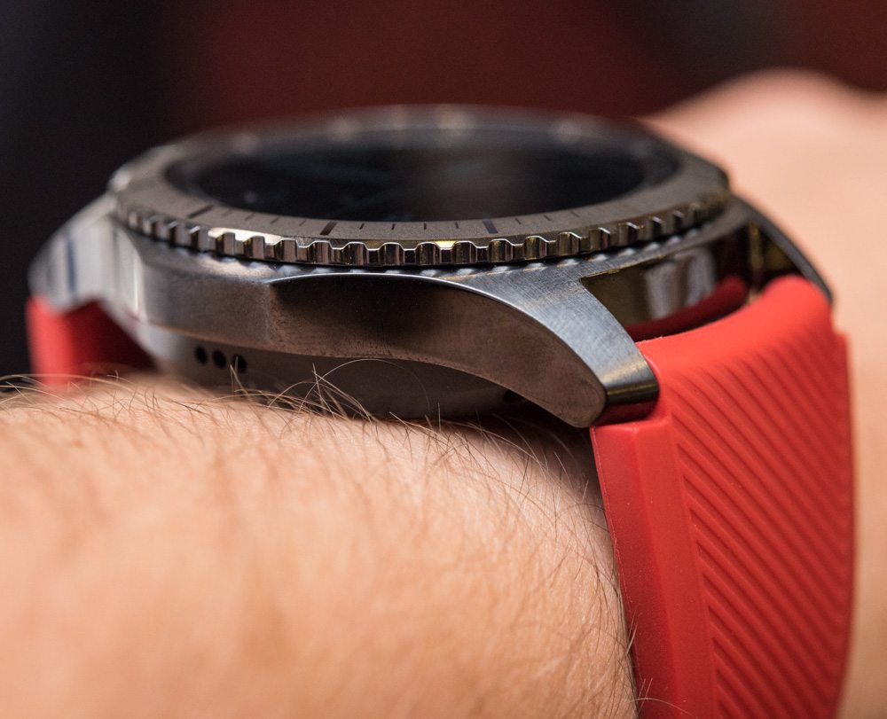
Samsung’s approach to being inspired by the several-hundred-year-old watch industry is distinct from that of Apple with the Apple Watch, even though it is true that both companies have been smart to seek inspiration and guidance from an industry which has managed to keep timepieces relevant and desirable even long after they ceased being necessary tools. What the traditional watch industry has that tech companies often lack is the ability to produce timeless designs with materials and finishes that are both inviting to the eye and to the touch.
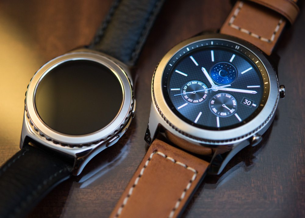
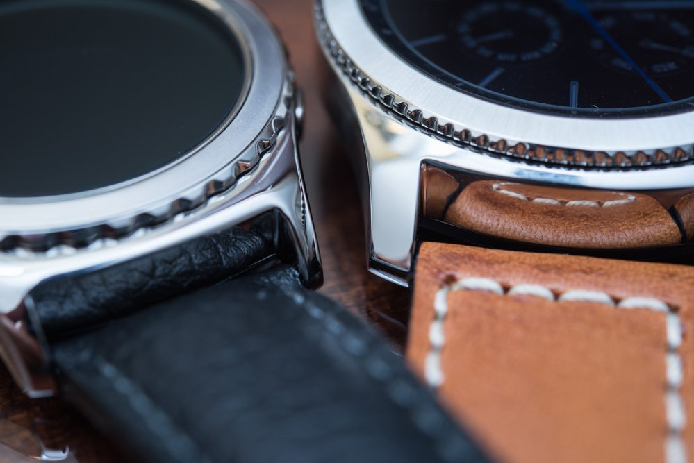
Notable differences: the new S3, right, looks more refined and grown up both in design and execution. See here the size, shape, and finishing of lugs and bezel.
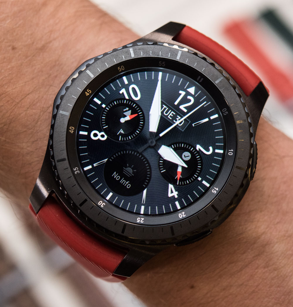
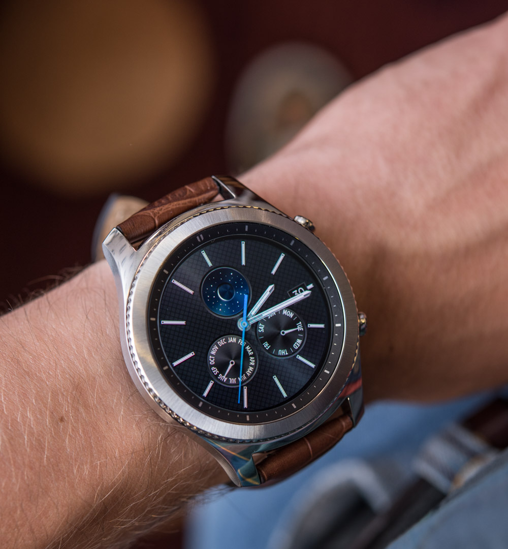
Put the Samsung Gear S2 and S3 side by side, and you learn a lot of things about where Samsung decided to go with its newest smartwatch product. You can tell that both products are of the same ilk, but the Samsung Gear S3 is worlds apart in how much it appeals to me as a fan of traditional watches. The roughly 46mm-wide case of the Samsung Gear S3 is produced from grade 316L steel (the type of steel used in the utmost majority of decent-to-high-end steel wristwatches) with a mixture of brushed and polished surfaces, along with a case shape that traditionalist watch lovers will find immediately appealing.
Case Proportions & Design
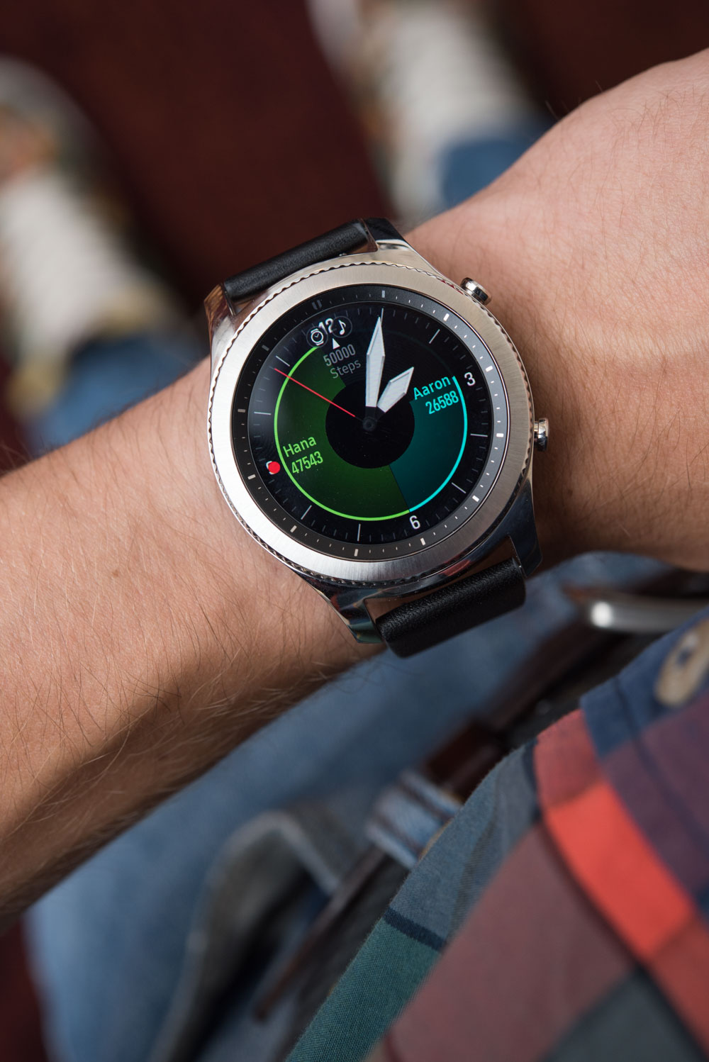
On the wrist, the Samsung Gear S3 is large (and looks even larger on my small-ish 6.75″ wrist – co-editor David), but in many ways because it needs to be. Arpa was keen to ensure that the Samsung Gear S3’s case was proportionate – and to make sure that the case does not appear too thick, he designed the lugs, color contrasts, and finishing to help reduce visual mass. Some clever design tricks include the placement of the lugs not at the very end of the case, and coloring the bottom half of the Samsung Gear S3 case in black so as to draw the eye’s attention to the upper, thinner portion of the case.
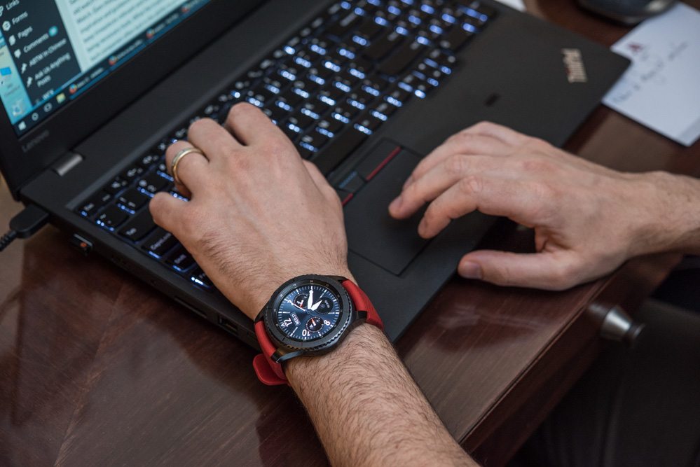
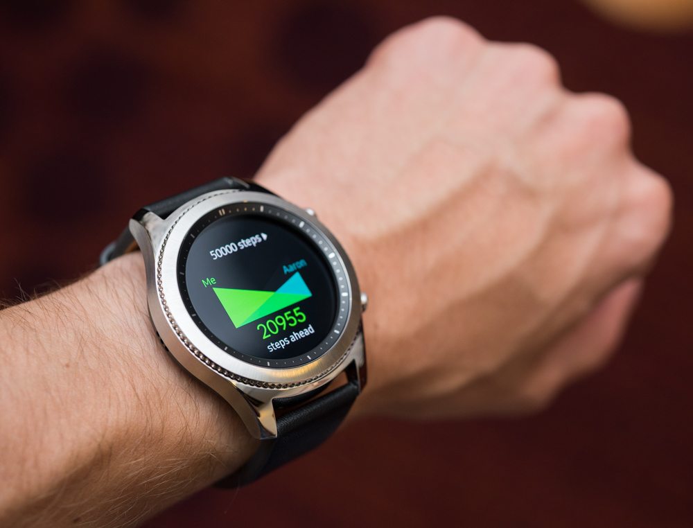
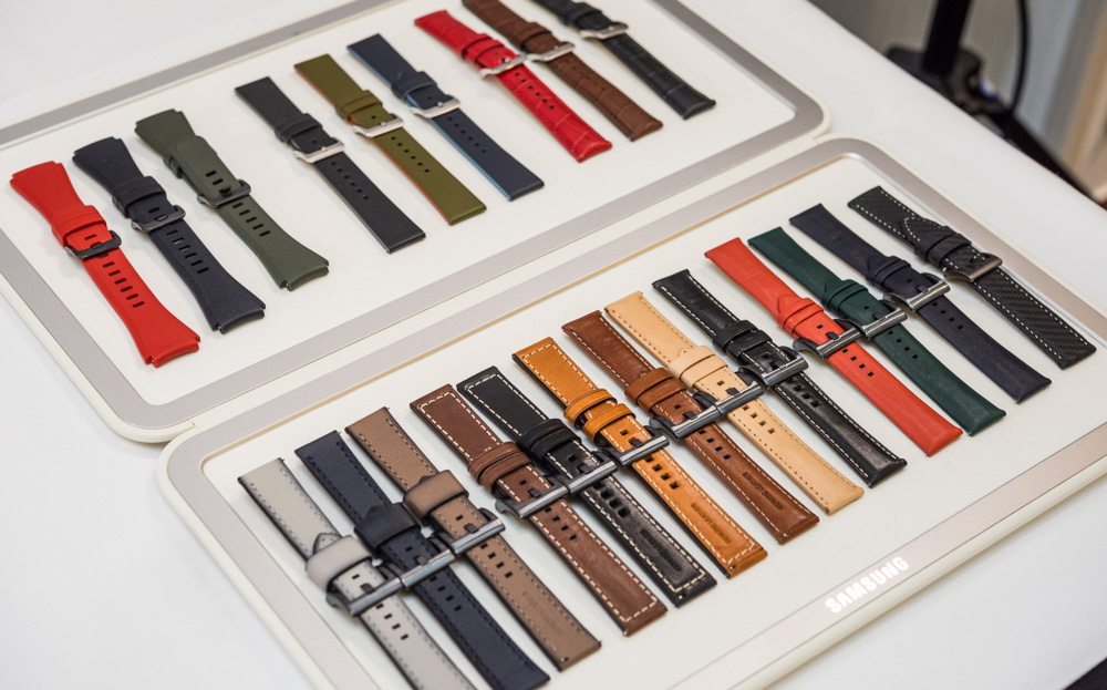
The Samsung Gear S3 is large, sure, but it isn’t crazy large, wearing smaller than the Casio WSD-F10 smartwatch and probably about the same as the TAG Heuer Carrera Connected. With the right strap, the Samsung Gear S3 is really comfortable, and it has been designed to work with any standard 22mm-wide watch strap out there (even though Samsung will have its own official variety of straps for people to choose from).

Samsung will offer two distinct versions of the Samsung Gear S3 known as the “Classic” and the “Frontier.” The former is offered in a natural steel case with more polished elements (the dressier model), while the Samsung Gear S3 Frontier is in all black tones with a more outdoorsy, edgier look – they both have 316L steel cases. Although the two Samsung Gear S3 cases have different pusher and bezel styles, their functionality and all internal components, save for standalone LTE connectivity (more on that in a bit), are completely identical.

