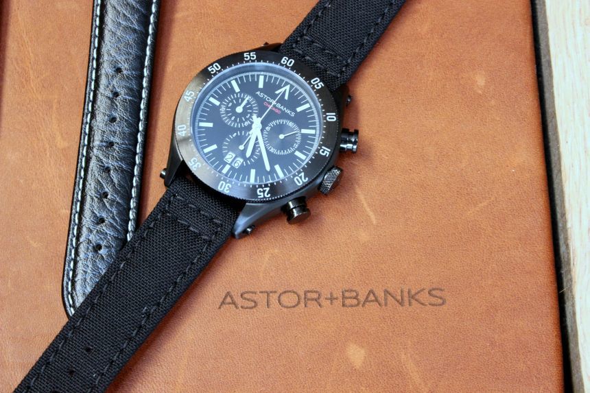
There is a variety of new watch brands popping up here in the States, covering a wide swath of options when it comes to the styles you might want to strap on to your wrist. Astor+Banks is one of the newest brands I have become acquainted with through their first line, the Astor+Banks Chrono.
As it worked out, the brand has its office/workshop space not too far from my office, so I swung by there one evening to have a chat with the founder, Andrew Perez. In our talk, Perez really came across as just another watch guy who had an idea of a watch he could create, and where it might fit in the wider landscape.
One of the unique things, especially for a young watch brand these days, is that there was no thought of going in the direction of crowd-funding to get the Astor+Banks Chrono off the ground. The company itself is privately backed, and it allowed them to focus on different channels of distribution. While you can pick up an Astor+Banks Chrono or Chrono S on the Astor+Banks website, you will also find it popping up in independent clothing stores around the Chicagoland area.
For those who are in the area, though, you also have the option of stopping in their space in the Loop. It is a great dual-purpose area, with a smaller reception spot for talking through the watch, and then a few different workbench type of areas where you can see things in progress (there is another one in the back, but that is where the “skunkworks” is, and most folks will not see that section). If that is not local enough for you, just consider the name of the brand – it is derived from the cross-streets where Perez lives.
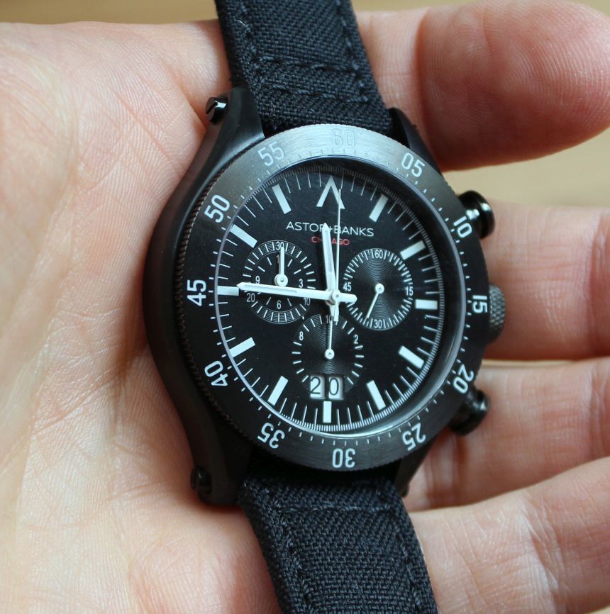
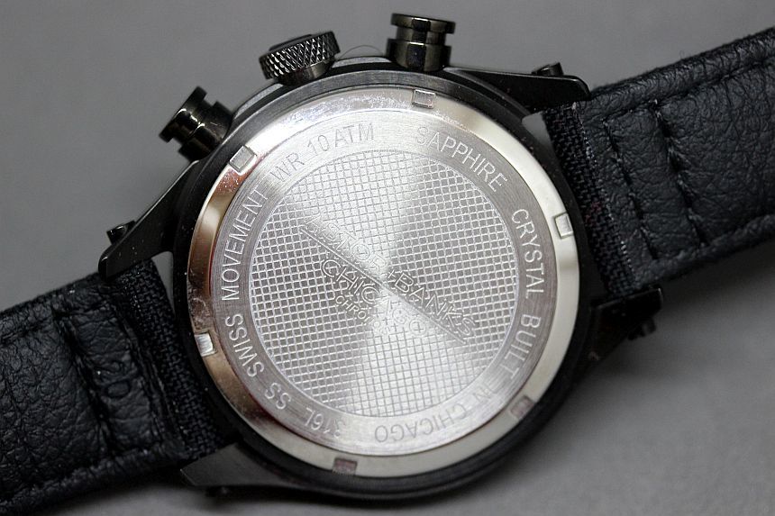
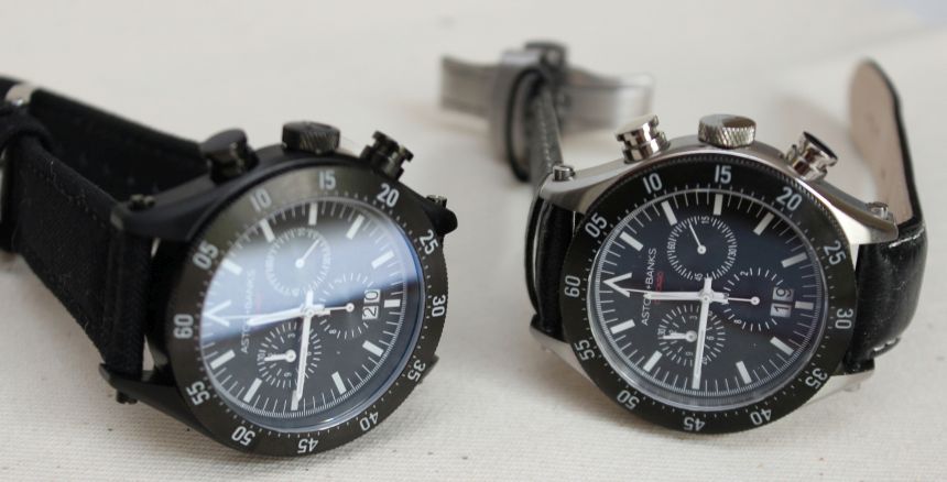
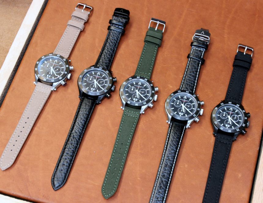
So, what of the watches themselves? While I saw the full array of strap options when I visited (and you will see those in the images), I spent a longer amount of time with a Astor+Banks Chrono on a black leather with deployant clasp, and an Astor+Banks Chrono S on a canvas strap with a standard thumbnail buckle. As to the difference between the two watches, there really is only one – the finish on the case. While the Astor+Banks Chrono is in a stainless steel, the Astor+Banks Chrono S comes in a black PVD finish. Past that, things really are identical – inside the 44mm case is a Ronda 5050.B movement and up top is a sapphire crystal (with AR coating on both sides), a screw down crown helping to net a 100m WR rating (the chrono pushers are not screw-down), and 20mm lugs for the straps to slip in to.
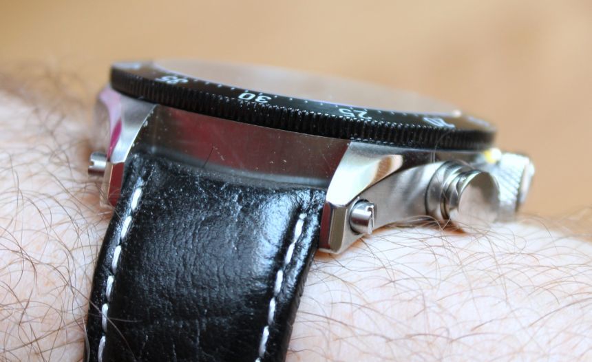
Those lugs have a little detail that you are likely to pick up on right away. At first glance, you might think that the lug bars are not properly (or fully) screwed into place. As it is, things are locked down tightly. As Perez explained it, it is a way to put some visual interest in the area, and (my opinion) a way to get some visual bulk to the slender lug space. And as long as we are talking about that area, it makes sense to talk about the straps. As you can see from my pictures, you have got quite a few different options, depending on the strap material (canvas in three colors, or black leather) and closure (thumbnail buckle, or deployant clasp with color matched to the case).
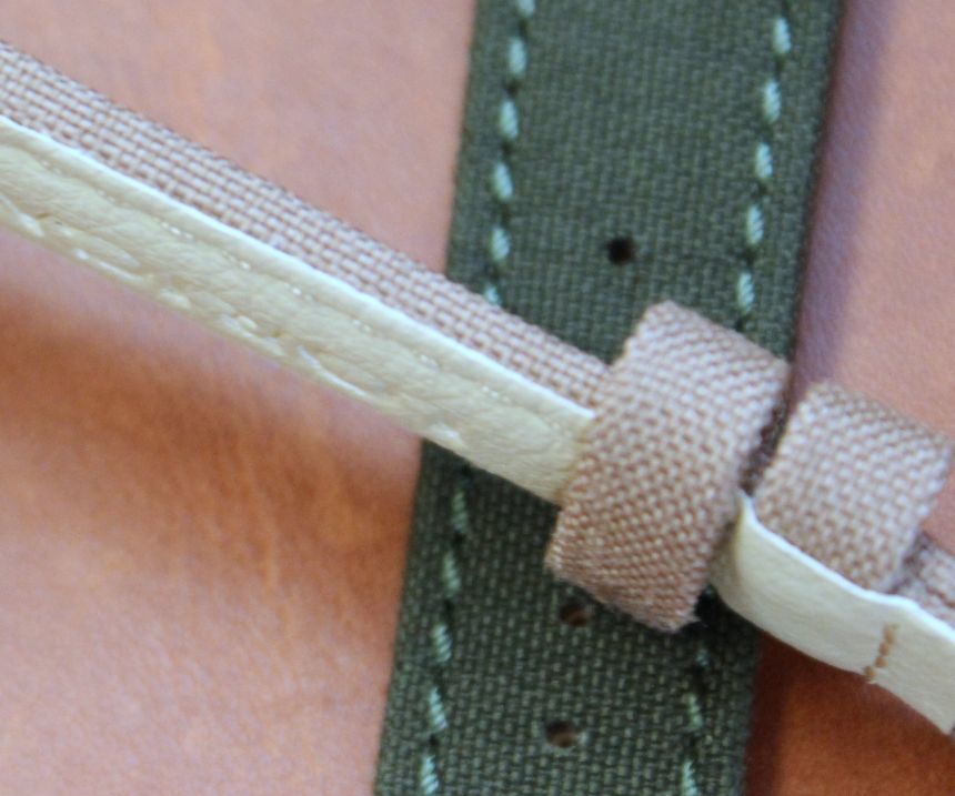
The leather strap was nice enough, I felt, and has a nice “crinkled” texture to it that makes it look a bit more worn-in. For me, personally, the canvas straps are the most intriguing. These actually have a nice weight to them. Unlike some other straps like these that you may have run across, the edges are completely finished (and rolled over to the leather backing). What this means, aside from having a sturdy strap, is you will not get the frayed edges you sometimes see when you have just got canvas applied on top of leather. Now, for some watches, that is a good look (and, full disclosure, I have got a strap like that that I particularly like). In this particular usage, you are going to get a textile strap that looks polished and complete, for the life of the watch.
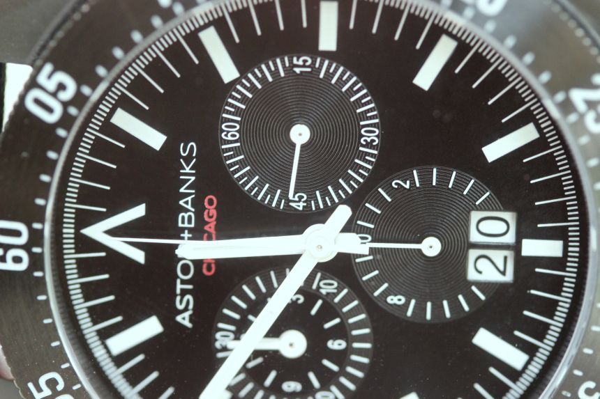
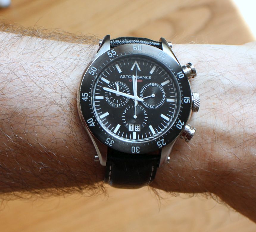
Speaking of which, I probably should direct your attention to the dial area now. On the whole, the watch gives me a sort of vintage Speedmaster vibe, due largely in part to the white, stick-style handset spinning around over the three registers. Then again, you would not have the that logo up at 12 (which also appears on the crown and buckle), nor would you have the large date display.
I have a feeling that the date display is going to be one of those elements that will divide some folks. For those who just like that it is easier read, it is a welcome addition. Others, however, may take issue with it “cutting into” the register, and the fact that it is inverted to the colors of the dial. I personally do not have an issue with this particular dial cutout. And yes, I would have liked to see white-on-black for those date wheels, but the black-on-white they have gone with works pretty well with the dial as a whole.
