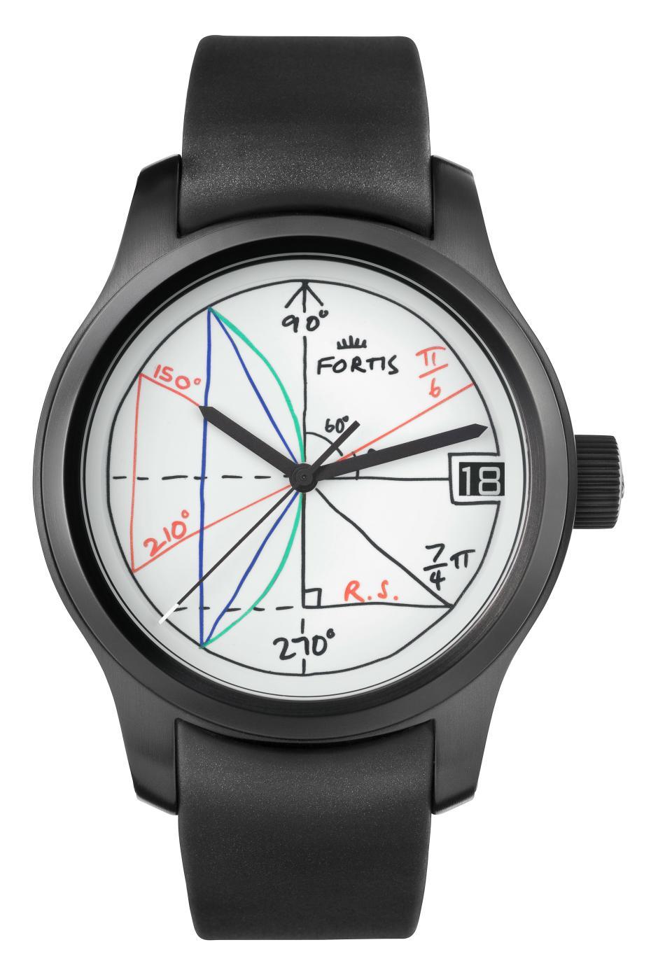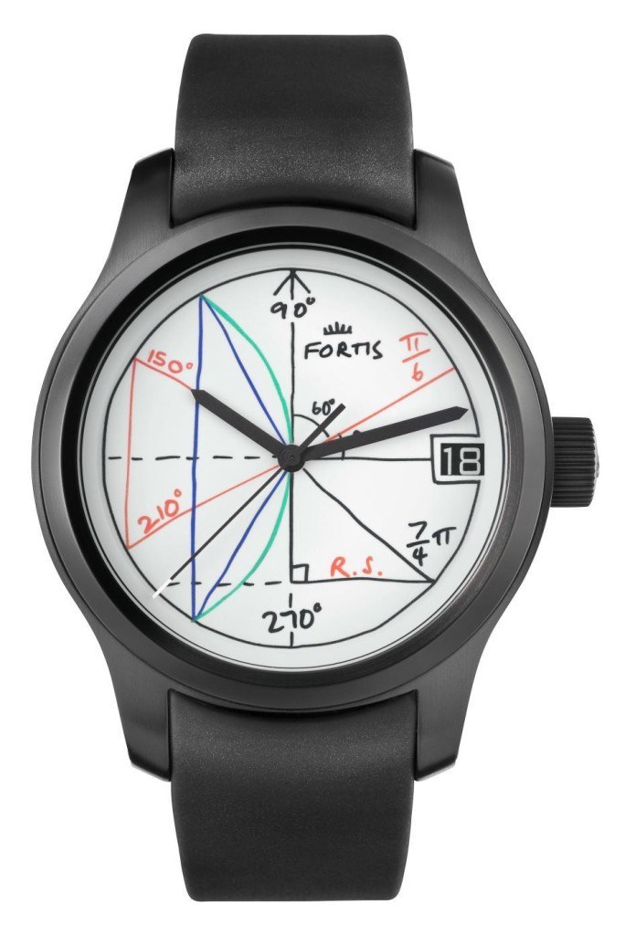
When it comes to the so-called “art watches,” there are a few brands that I would offer up as creating watches of this nature. Funnily enough, until today, Fortis was not a brand that I would have put into that category. As it is largely a dial-based sort of effort, though, it would not be a surprise to see, well, any brand create something like this. That said, with the help of Rolf Sachs, we now have the Fortis 2pi available for us.
Apparently, the Fortis 2pi is part of the Terrestis collection which was recently introduced, but of course, this model is something of a different nature. Looking at the dial, you see what looks almost like a whiteboard with various geometry-related things scribbled down, with two pi symbols showing up as part of calculations that one would expect to result in approximations for the angles at the 2 o’clock and 5 o’clock positions. Nevertheless, they have other lines and curves in play, which add some additional color to the dial. In all of that, I think my favorite part is actually the logo, and how it looks like it was just drawn on the board that way.
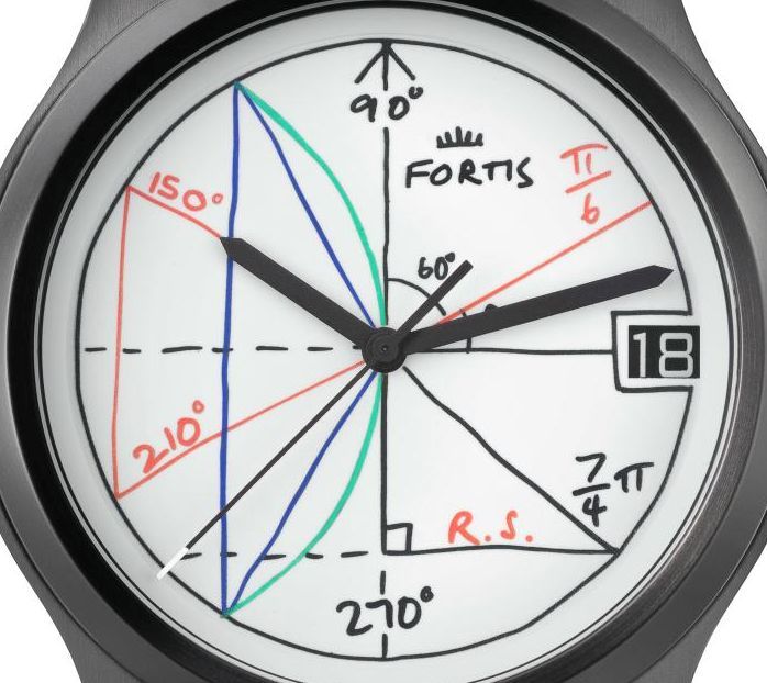
The one part that feels slightly disjointed is the date display. The crispness of those digits is a stark contrast to the hand-drawn nature of the dial. While I realize printing up one-off date wheels for a 150-piece limited edition would be no small undertaking, I think had they done that, it really would have helped out the look. And this would also give them a chance to use a white background – like the dial – to continue the whiteboard theme. It feels funny to call out a date wheel in this manner, but for something that is more aesthetically driven (as an art watch should be), those sorts of details need attention.
Tucked into the 42mm steel case of the Fortis 2pi you have the F-2014 movement which is based on the ETA 2836-2, so you will have all of the reliability and durability you would normally expect from a Fortis watch; albeit in a package that looks something more like what you would find coming from the bargain bin. And that, for me, is where the watch does not sit right. When you look at what the brand produces, the Fortis 2pi just feels out of place. Even if you just narrow your view to the Fortis Terrestis collection, it still feels like a bit of a misfit to me.
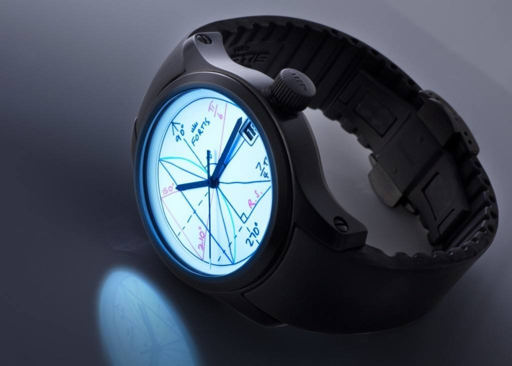
And this is not because of a colorful dial. Well, actually, I think it is due to that dial as it’s paired to the case. The case itself feels fairly plain, especially against what is done on the dial – that, for some, may sound good and there’s nothing wrong with that, but to me, judging from the images, it comes off as a misfit for an established brand like Fortis. So, how could they shake this feeling? I think the answer lies in the case itself: if they want to keep the black PVD finish, why not treat that like a chalkboard? Get some markings to mimic chalk that hit the bezel, lugs, and go onto the side of the case. Or better yet, switch over to a white (ceramic?) finish, and then you can have the same dry-erase marker look continuing on.
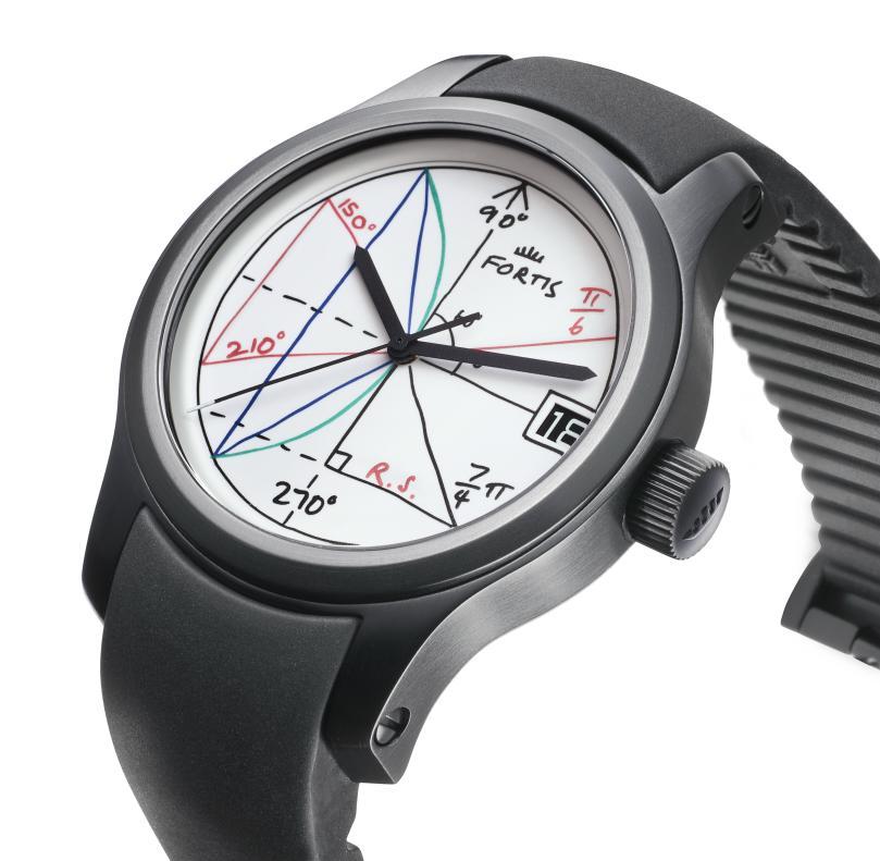
Whatever the approach might be, I think the case (and its finishing) is really the key to making the Fortis 2pi a much better art watch, and move it away from reminding me of something that a simple dial swap occurred on. In other words, I hope to see this as an overall design that escapes the confines of the dial. Then, yes, the Fortis 2pi would definitely stand out from the collection, but it would stand out in a way that really makes you take notice of this artistic (and mathematical) expression. To take a different approach, the black, chalkboard-like case may work when viewed “in the metal”, as it highlights the funky, lumed dial. If you take a kinder view of the Fortis 2pi, you can pick up one of the 150 copies for just shy of $3,000. For more information on the watch (or the rest of more conventionally-styled Terrestis collection), head on over to their site. fortis-swiss.com

