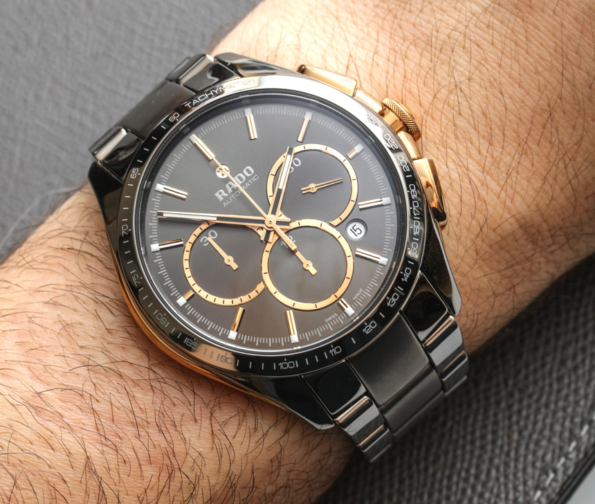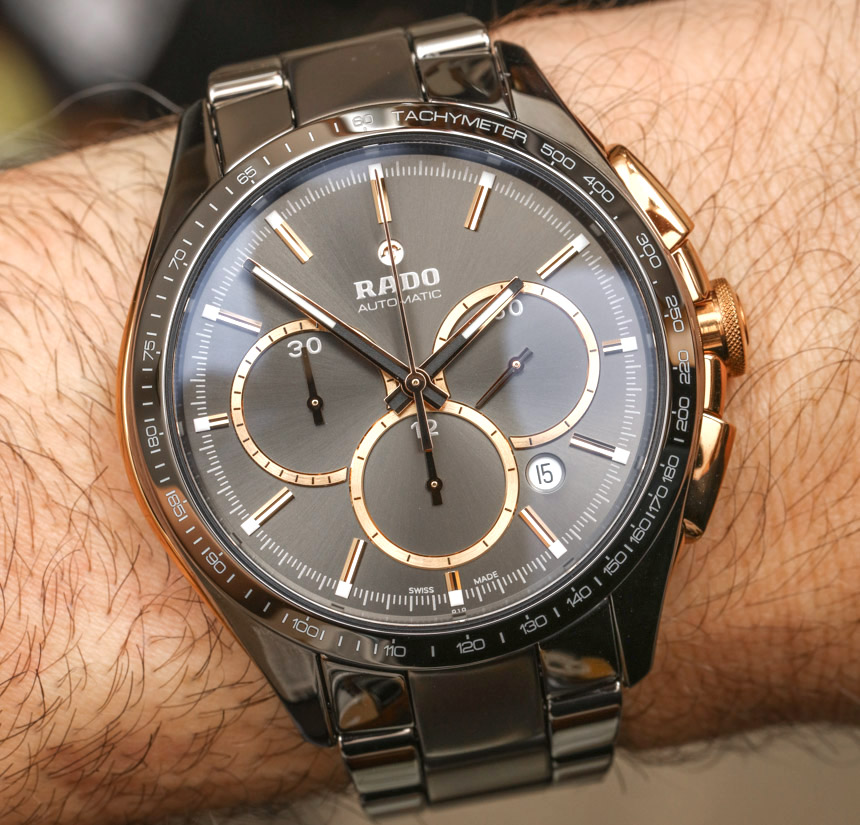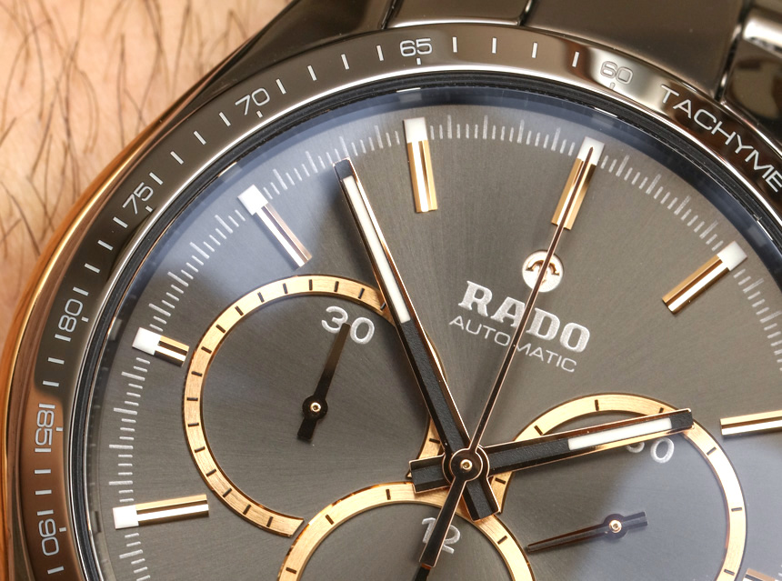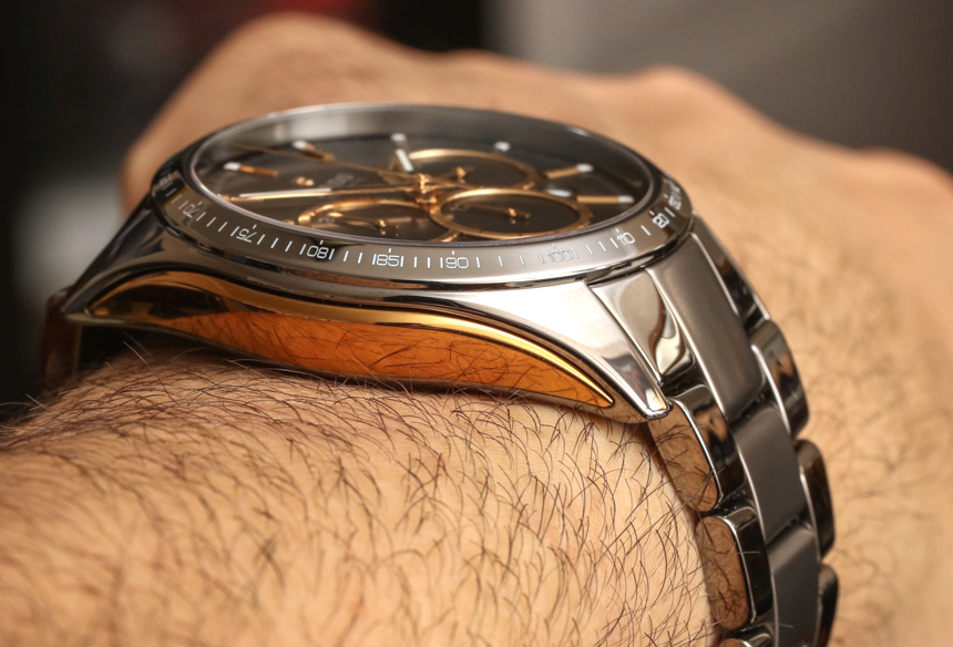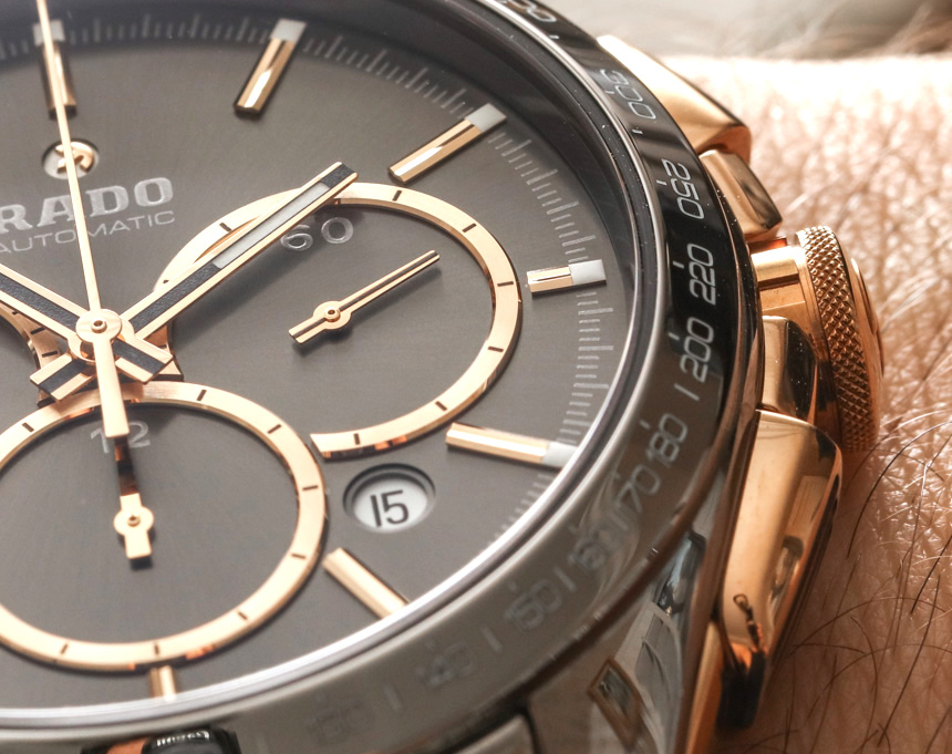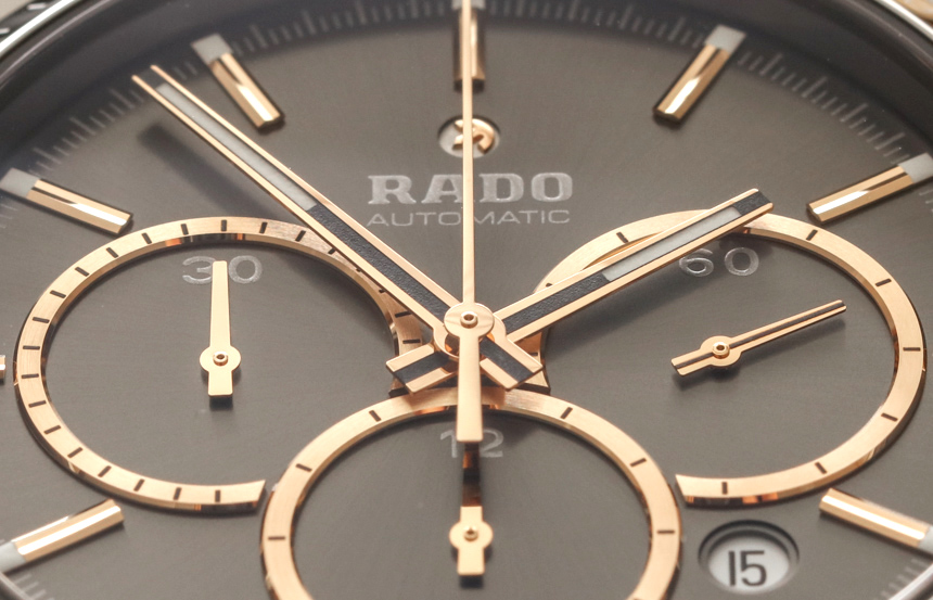
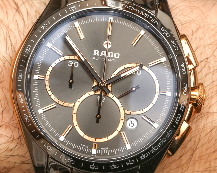
The dial leans a bit more to the artistic versus legible side, but that doesn’t mean all the elements aren’t really well done. Fit and finish is very good, and my only gripe is really the date window. A small round window shows a view of the stark white date disc which distracts from the elegance of the design, at least in my opinion. Rado probably should have found a matching date disc color to match the gray tones of the dial. This element won’t bother most wearers, I am sure, but it is a small area upon which Rado can improve. There are small bits of luminant applied on the periphery of the dial, as well as on the hands. I personally would have opted for more luminant, but overall the dial is handsome, albeit more youthful and edgy in design compared to more classically traditional watches out there.
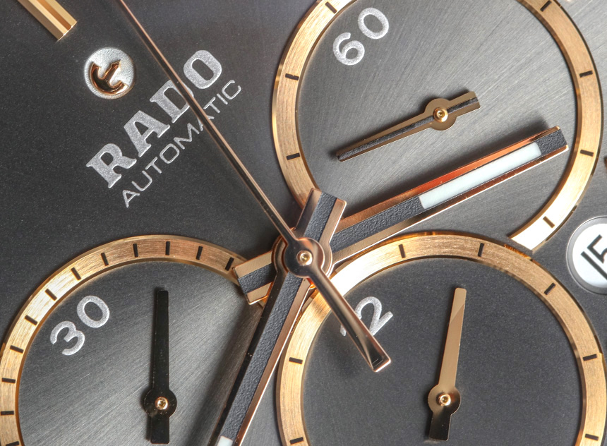
One of the more quirky design elements on the dial is the Rado logo. Above the logo text is a small anchor which is designed to act like a rotor. While it isn’t the most fluid motion in the world, the small anchor logo actually moves around, attempting to mimic the motion of the automatic rotor in the mechanical movement. This isn’t the first Rado watch to have this feature – which has been around for decades, as far as I know.
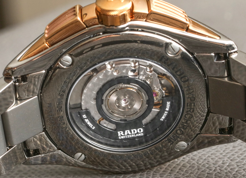
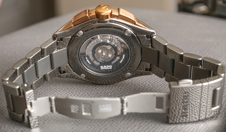
The case is water resistant to 100 meters and is sandwiched with sapphire crystals – over the dial as well as over the movement. Inside the watch is a Swiss ETA 2894 automatic chronograph movement which is nicely decorated and given a custom Rado automatic rotor. This movement has about two days of power reserve operating at 4Hz (28,800bph). The chronograph pushers are nicely designed into the case along with the crown, making for a strip of rose gold-toned elements on both sides of the case to match the accent colors on the dial. Around the bezel is a tachymeter scale engraved into the ceramic which adds an additional sporty element to the design.
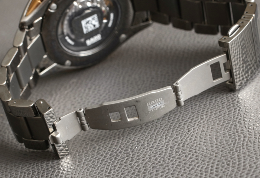
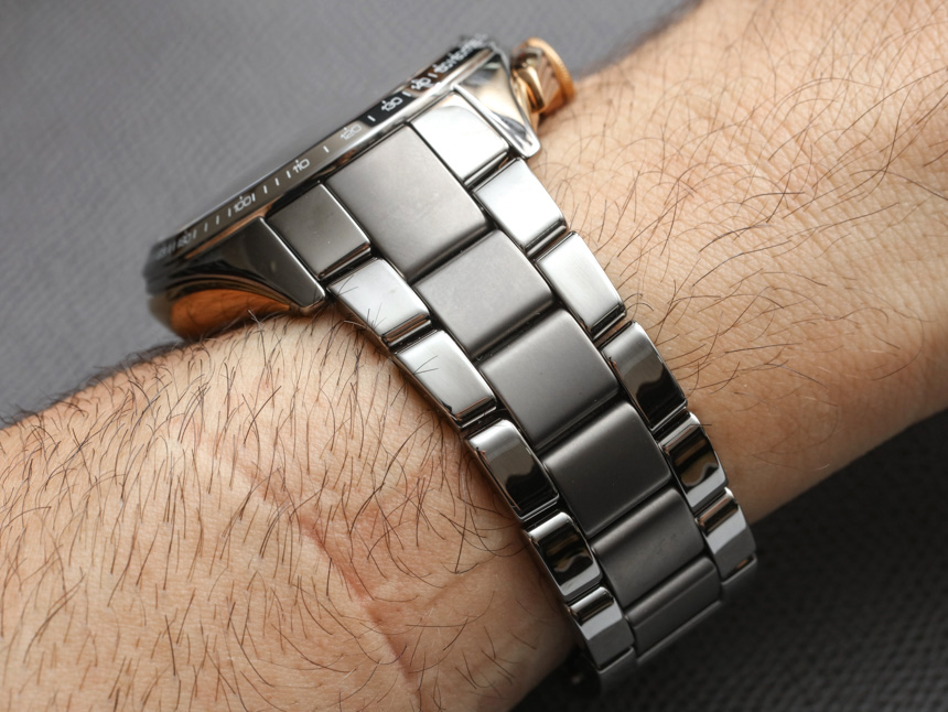
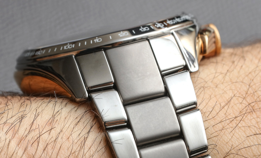
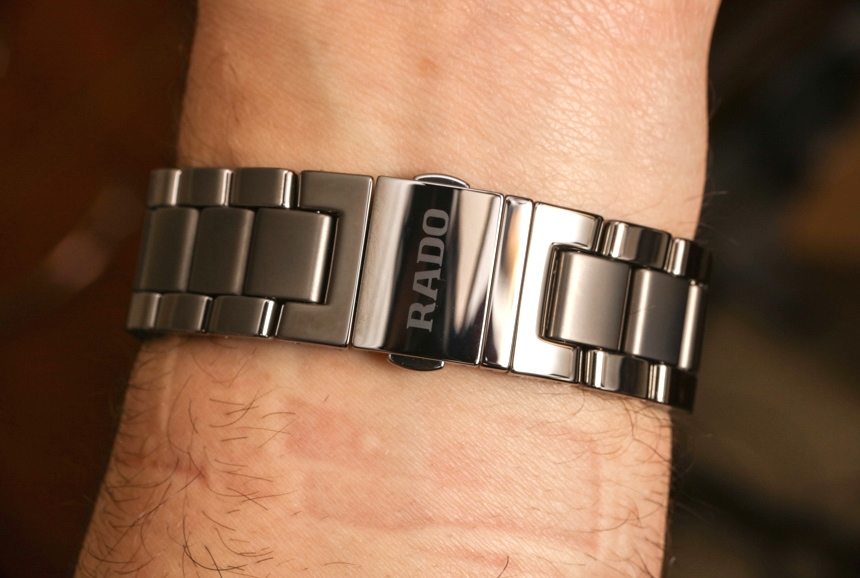
Attached to the case is a matching ceramic bracelet which is quite comfortable. The outer links are polished while the center link is brushed, adding a slightly more dynamic if not masculine quality to the design – which is important as “overly glossy” watches can come across as feminine sometimes. The bracelet is closed with a sort of part butterfly clasp, part traditional locking, folding deployant. Basically, there is a small extra section of the deployant which opens up allowing the watch to fit over your hand onto your wrist. It would be too small to fit without this extra opening element, and with a larger folding section the deployant would be too long under your wrist making for an uncomfortable fit. I do appreciate this attention to detail in bracelet and deployant design by Rado ensuring both ergonomic comfort and welcome aesthetics.
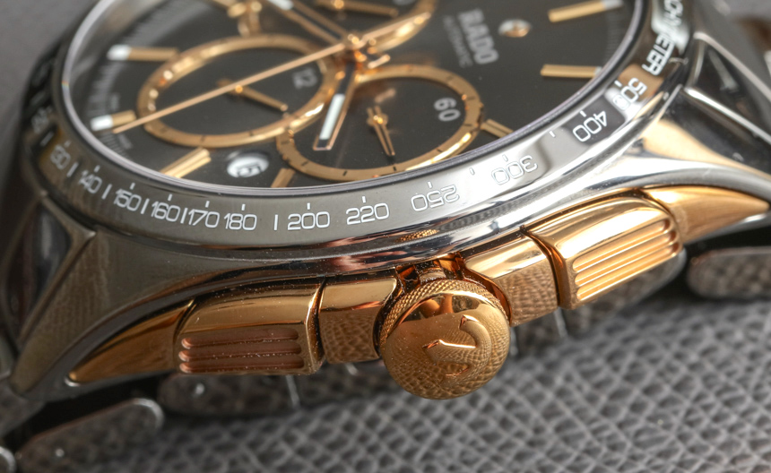
It is easy to mistake one Rado HyperChrome Automatic Chronograph watch for another. This particular model is the reference 01.650.0118.3.010 (aka R32118102) which is gray. I actually mistook it for the brown model at first, as gray ceramic can sometimes look a bit brown in various lights. The brown one is actually a lot more richly brown, and you need to appreciate that there are other gray tones in other models of the HyperChrome collection. My best advice for someone interested in the HyperChrome collection but undecided about what color style to pick, is to see them in person as the colors react differently to light, and looking at the marketing images is not always the best way to choose in this instance.
I do like to recommend Rado as an entry-level luxury watch for people who love design and want something a bit bold. I see this as the type of watch that will enhance the lifestyle of a lot of younger people, given that it doesn’t feel too serious, even though it is a “real watch.” For what you get, the price isn’t too bad, even though at a lower retail price I think that Rado would open itself up to even more buyers given the age appeal of the Rado HyperChrome Automatic Chronograph collection. This reference 01.650.0118.3.010 and other similar Rado HyperChrome Automatic Chronograph watches in other colors have a retail price of US $4,800. rado.com
Necessary Data
>Brand: Rado
>Model: HyperChrome Automatic Chronograph (R32118102 / 01.650.0118.3.010 as tested)
>Price: US $4,800
>Size: 45mm wide
>Would reviewer personally wear it: Yes, but would have done so a lot more when I was in my early 20s.
>Friend we’d recommend it to first: Young adult watch lover interested in “good watches” but that wants something a bit more edgy and spirited as opposed to something more conservative and classic.
>Best characteristic of watch: Ceramic parts are very nicely rendered, especially with the various finishes and colors. Good variety of color choices allow for some degree of style personalization. Comfortable to wear on the wrist.
>Worst characteristic of watch: Dial going be a bit more legible with higher-contrast hands. White date window is a bit distracting from the overall symmetry of the dial. Might be a bit too expensive given budget of ideal wearing demographic.

