When it comes to watches that aren’t strictly sold on the merits of the movement and function, you’re often left with what can be dismissively called a fashion watch. In my way of looking at things though, there are plenty of good reasons for opting for something that’s driven by form rather than function. I’d just recommend that you’re ensuring you’re getting a design that’s pleasing to the eye and if possible, adds some sort of a twist to the basic quartz three-hander design. Fortunately, that’s what we’ve got today.
Project Watches is run by Jack Markuse, who has worked for the last three decades to marry architecture and design in the products we use every day. Starting in the early ’90s, they turned their eye towards watches. This has led to a variety of collections, including watches that were directly inspired by buildings. Nothing so special, right? Well, those watches were actually designed by the architects of those buildings – so it’s not just some loose association for a quick sell. This is just a quick overview of their history and some of the products. For more information, head on over here.

It’s not just architects designing their watches, though. There are people from other fields (not traditional watch folks) coming up with their own unique vision for what a watch can do. And that brings us to our review piece. The Nadir was designed by Damian Barton, who is a designer, but not in the traditional sense we’d think of with watches. He started off as a furniture designer, and of course has gone on to other things(full bio). Needless to say, he’s not a traditional watch designer, which means we get a watch that isn’t traditional either – it’s a good mashup, in my opinion.
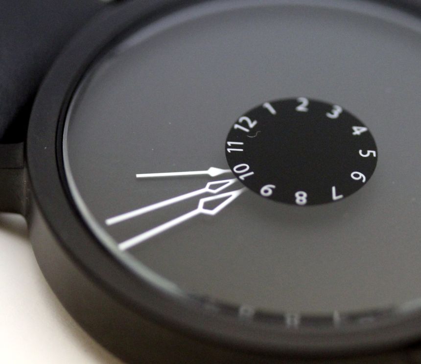
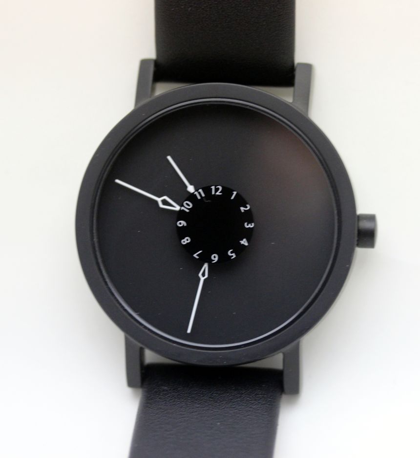
So, why Nadir? For those unfamiliar with what the nadir of something is, here’s the definition from Merriam-Webster. Using that theme, the watch has time as its nadir, represented by the small disc with the numerals in the center of the watch. The hour, minute, and seconds hands all point to that small disc, rotating around it as you would normally expect.

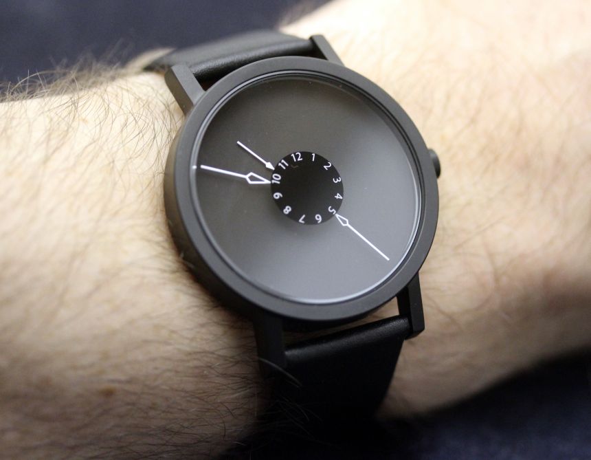
Now, if you’re like me, when you first glance at this watch, you’re figuring there’s going to be a lot of squinting going on to read this watch. And that carries some truth, until you realize one very basic thing – you don’t have to look at that central disc to read the time. The opposite ends of the hands still indicate (on the unmarked portion of the dial) what the time is. So, for “at a glance” you can utilize the outer portion. For a more precise read, then you can take the time to focus in on the center.
Once I realized that, it freed things up for me a bit in terms of how I perceived the watch when wearing it. It allowed me to appreciate the design – which, while stark, is still rather interesting. The white-on-black color palette is easy on the eyes and blends in with just about any setting. Should someone pay closer attention to the watch, they’ll no doubt start asking questions about those reversed arrows.

