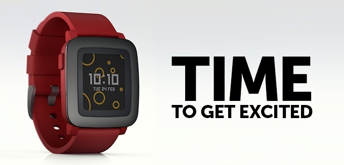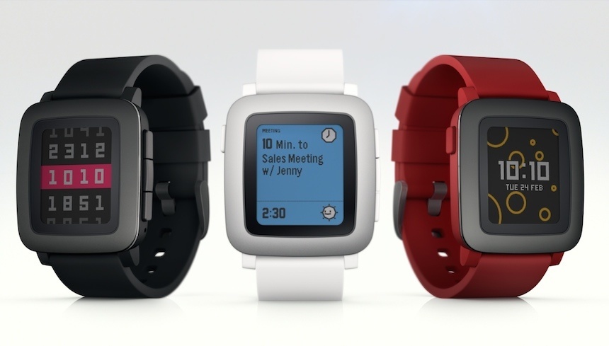
The original Pebble, released in 2013, was among the first widely accessible, and indeed hugely successful, smartwatches on the market. Its bulky, uninspiring rectangular case, black-and-white screen and nerd-friendly user interface did put many off. Today, a promising new replacement has been announced: the Pebble Time. It is, as you would expect, more refined in every way, from overall design, through user interface, to the ever-so-important display.
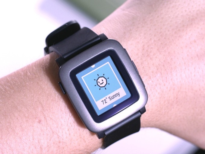
With the Apple Watch being released in less than two month’s time, and with other renowned companies like LG, Samsung and Garmin coming out with ever-more-refined and ever-less-compromised smartwatches, many considered Pebble to be out of the game. Their answer to those claims is the Pebble Time, which they like to refer to as the “awesome smartwatch, no compromises.”
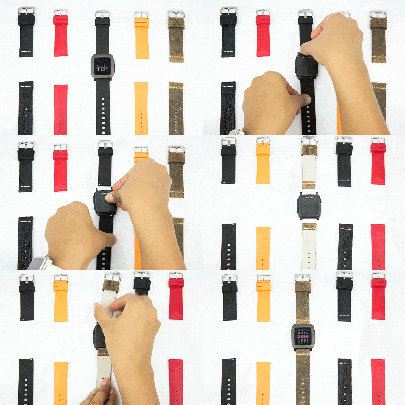
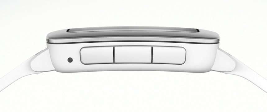
Let’s start with the overall design: the Pebble Time is 20% thinner than the original, being a truly slim 9.5 millimeter thick. The case, available in black, white or red, is water resistant to an extent that it allows a quick swim or shower, and its metal bezel secures a scratch-resistant Gorilla Glass – a manufacturer whose name may sound familiar from Android smartphones. The case has a slightly curved profile, made complete by stubby lugs that will allow the watch to look decent and wear comfortably even on very thin wrists. The lugs are now 22 millimeters apart – and the supplied straps come with a quick-release pin allowing for their easy, tool-free removal – so changing to aftermarket straps should now be easy.
Behind the cover of Gorilla Glass is a new, colorful, always-on e-paper display, replacing the old – and rather underwhelming – black-white screen of the original. The display is where the Pebble differed most to nearly all other smartwatches on the market: offerings by Apple, Samsung, Sony and many others use LED screens – similar to what you would find in a phone – which drain the battery so much that they have to be turned off when not in use.
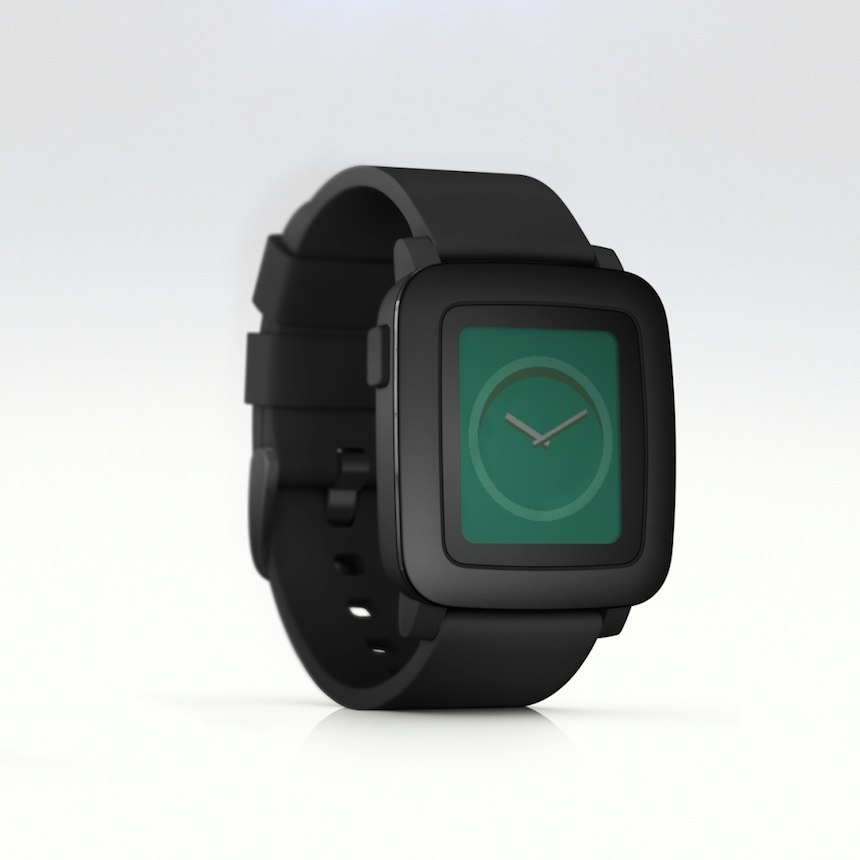
The e-paper screen is however always on, and while the backlight is turned off at times, the screen still displays the time or any other information in a visible way. That means that unless circumstances necessitate the use of the backlight function, you are just a glance away from the information displayed on the watch – no need to be turning the screen on. Last but not least, the screen plays a major role in allowing the Pebble Time to boast up to 7 days of battery life – while the OLED LCD screened models of Apple, Samsung and others will barely last a day in most cases.
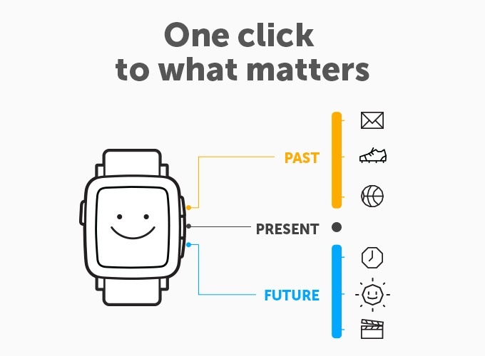
The screen now also features rather impressive, colorful and perfectly fluid (30 frame per sec) animations, lending the user interface a much more modern and high-end feel. Speaking of which, the interface is developed in a way that is reflected in the new model’s name: Time. Based on how Pebble describes and illustrates its new system, the interface will provide a layout of information in a timeline kind of way, meaning that you will have to look for the information based on whether that information is related to the past, present, or future.
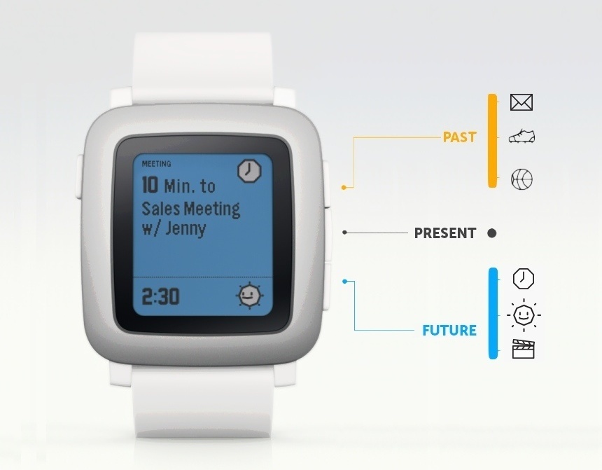
To give you an example, you would look up the results of yesterday’s football game by scrolling up in the interface towards the past, momentary weather or actual meetings and other notifications are in the present, while the 5 day weather forecast is in the future. There is no touch screen, switching between past, present and future is possible using the three buttons set into the right side of the case. Once you get the information you were looking for, you can expand that app and see more details. A microphone has also found its way into the Pebble Time, so that now short voice replies can be sent or quick notes and reminders can be set without having to reach for the phone. Unlike AndroidWear devices (like the Moto360, LG G Watch R and others), here the microphone will not be used to control the watch: it is strictly for dictating short replies or reminders.
The watch will be able to connect to iOS 8 on iPhone 4S and newer, as well as all Android 4.0+ phones, including Samsung, LG, Sony, HTC and others. The connection will be established via BLE, i.e. low-energy consumption Bluetooth so that the watch can receive notifications and other data from the phone as well as send the data it compiled with its movement and activity tracking sensors.

All-in-all, Pebble’s second generation smartwatch promises to be a rather competitive package. To sum it all up, it features a slimmer case, extended functionality, much refined screen, seven days of battery life, an interface that seems to be considerably more user friendly than before and a competitive starting price of $179 on Kickstarter – suggested retail will be $199 and the first shipments will be delivered in May. Sounds good, and not just for us: although the Pebble Time fund-raiser campaign on Kickstarter has just been launched today, it went on to set the new record by raising $1 million in less then 30 minutes; still into its first day, the campaign already has nearly 30,000 backers and over $6,2 million pledged. See the campaign and all details at kickstarter.com

