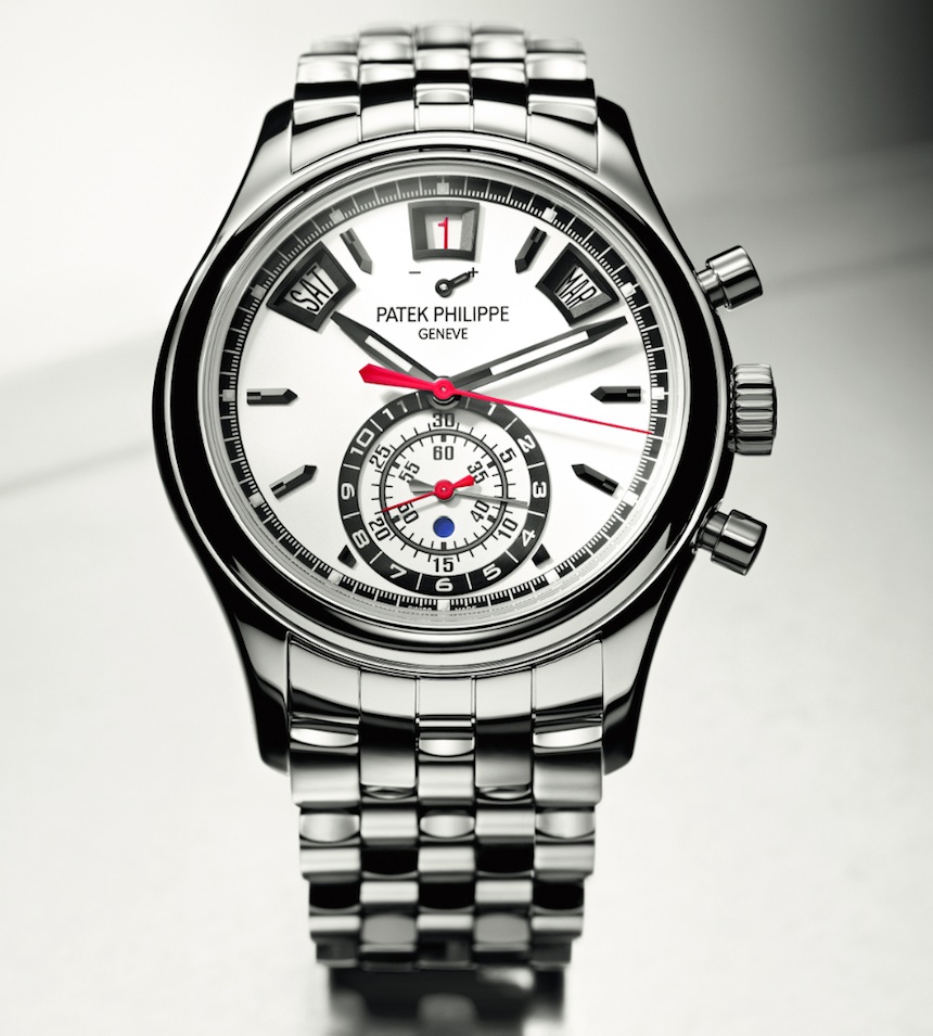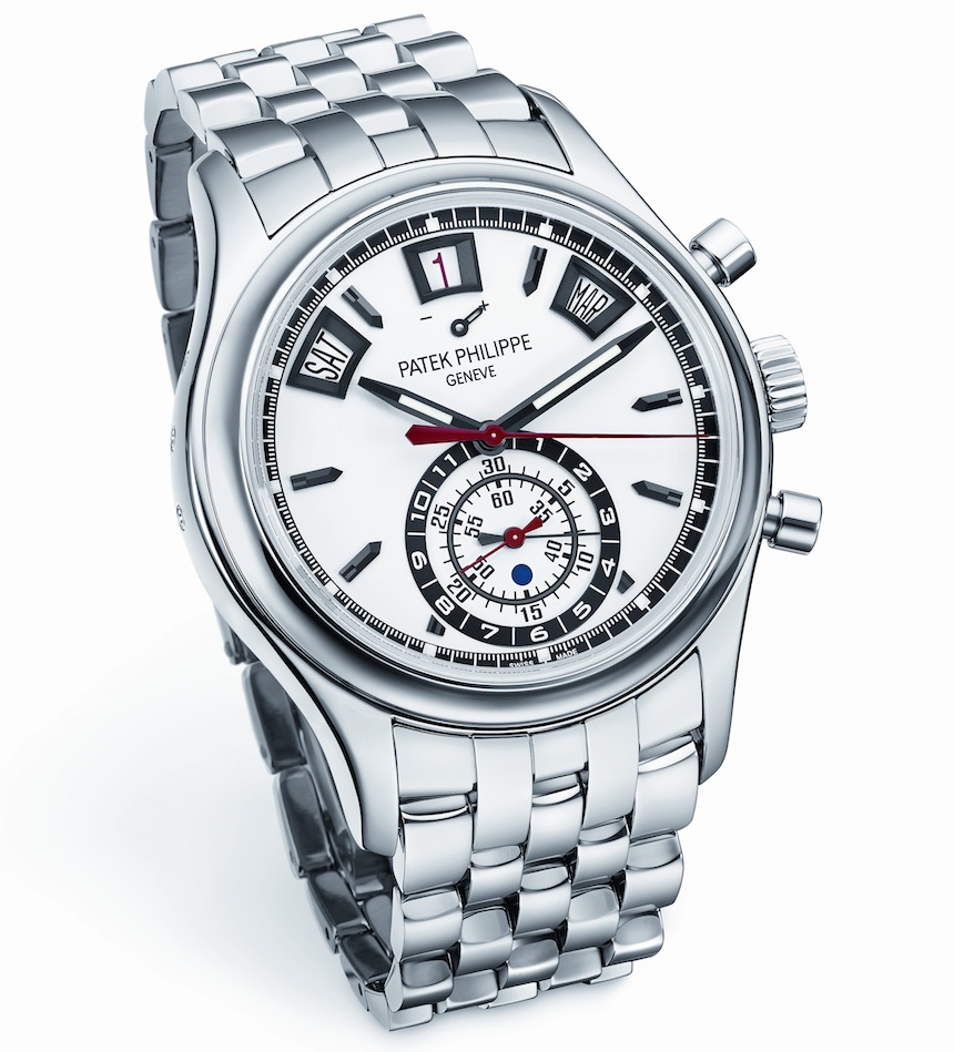
For top-tier brands like Patek Philippe, exotic materials such as gold, in all its hues, and platinum are almost exclusively used when it comes to their more complicated models, while steel is primarily reserved for the sportier and/or simpler pieces, like the Nautilus and the Aquanaut. The irony this creates is that once steel–this most ordinary material–is coupled with a flagship reference, it immediately gains a status of desirability, due to it being systematically ignored in the past. In this environment exotic pales into usual, and ordinary becomes special. At Baselworld 2014, Patek Philippe has announced that it terminated the manufacturing of its very complex–and equally desirable–annual calendar automatic chronograph Reference 5960 in any and all precious metals, and from now on will offer it exclusively in stainless steel. That is a bold decision to make, and one that likely caught even the brand’s more cult followers off-guard.
As we were undertaking the research for our article about Patek Philippe’s rarest and most expensive watches ever, we clearly saw that a previously ignored or scarcely available material can play a key role in multiplying the value of just about any reference. Whether that will be the case with the 5960/1A and the other piece Patek announced in steel (namely the 5990/1A), only time will tell, but for now let’s see step-by-step what this 2014 novelty offers.

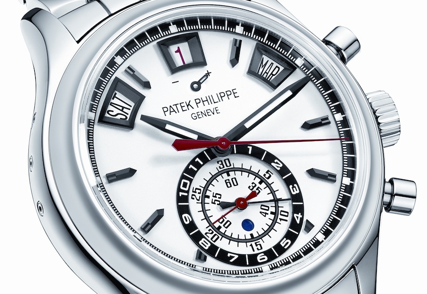
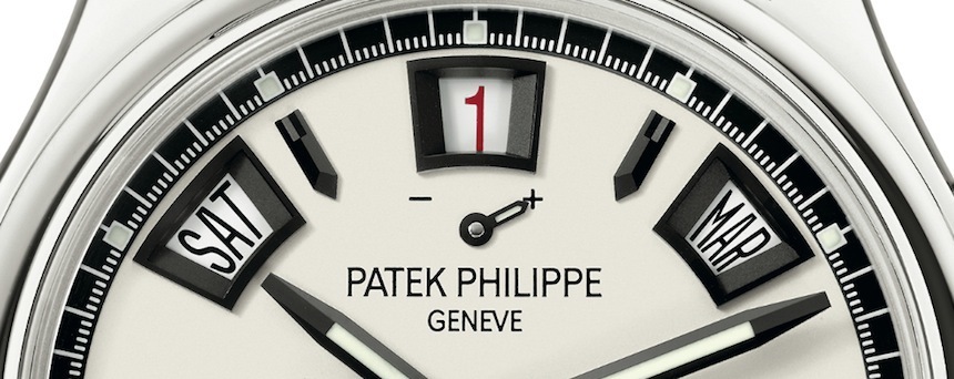
The 5960 is an important reference in Patek history as it was the brand’s first in-house automatic chronograph–an important achievement in any brand’s lifetime. It offered a rather unusual “mono-counter” layout at 6 o’clock with indications for the chronograph hours and minutes, as well as a day-night indicator, while in the upper circumference of the dial it featured three apertures for the date, day and month displays of the annual calendar. As far as aesthetics are concerned, this new steel version offers a number of subtle, yet effective changes over its more precious predecessors.
In essence, the result is a somewhat more casual, dare we say sportier appearance, something that is a fairly unusual sight in the case of a reference which albeit always had some modern flair working for it, had also always stayed on the more formal side of things. The fonts used for the numbers of the chronograph subdials have been changed from the previously rather formal, and certainly more restrained-looking style, to a more modern alternative, which with its luminous paint definitely plays an important role in spicing things up quite a bit. The hands were redesigned too: done in black oxidized gold, they feature three facets to match the hour markers and also have a healthy amount of luminescent coating to improve legibility under dark conditions.

Furthermore, all date apertures are now surrounded by distinctive applied frames, also in black oxidized white gold, while the chronograph’s display also sports black appliques, designed to further enhance the depth of the dial, and also to add some “visual heft” to the subdials. Speaking of which, as a slight yet considerable difference on the steel model, the chronograph’s hour counter has been moved from its previous location to the circumference of the subdial, while the two 30-minute scales of the chronograph have replaced it on the concentric circles of the subdial. Again, a subtle modification, but one that lends the entire chronograph-section a more balanced look.

