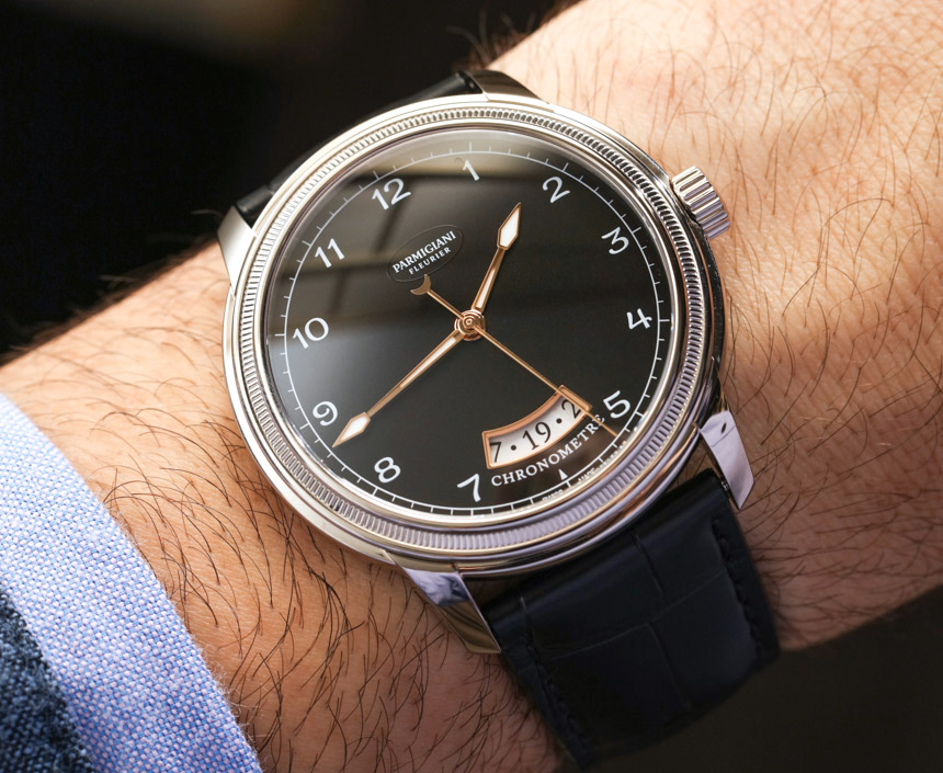
At SIHH 2017, Parmigiani released an interesting and subtle “new” watch with the Toric Chronometre. It is actually a modernized interpretation of the first watch that Michel Parmigiani designed in 1996. The 2017 Parmigiani Fleurier Toric Chronometre is a bit larger, but in many ways is said to be a very faithful manifestation of Mr. Parmigiani’s original vision from the mid-1990s. Don’t forget that the brand began as a function of Michel’s vision, combined with the monetary support of his “patron,” the Sandoz family.
Given the penchant for whimsy and flair that I’ve come to appreciate from Parmigiani, the Toric Chronometre is a resolutely sober watch. It does very much feel like a product of the 1990s. By that, I mean a very sensible and to-the-point dial mixed with some light aesthetic flair, as well as the style of most of the work in the case. In many instances, this is a formula for a rather nice watch. These days, however, where “brand identification” is very important, this is not always what a consumer is looking for.
Brand identification, as I refer to it here, is the notion that you can recognize the company that made a product just by seeing the shape or design of that product. Many watchmakers either explicitly or implicitly ask themselves whether or not they can recognize their own products when seeing them on someone’s wrist from across the room. If the answer is “yes,” then a brand has achieved a high degree of brand identification, if the answer is no, then often times brands are left with products that do not have “brand” appeal. Though this is really a larger topic for another conversation.
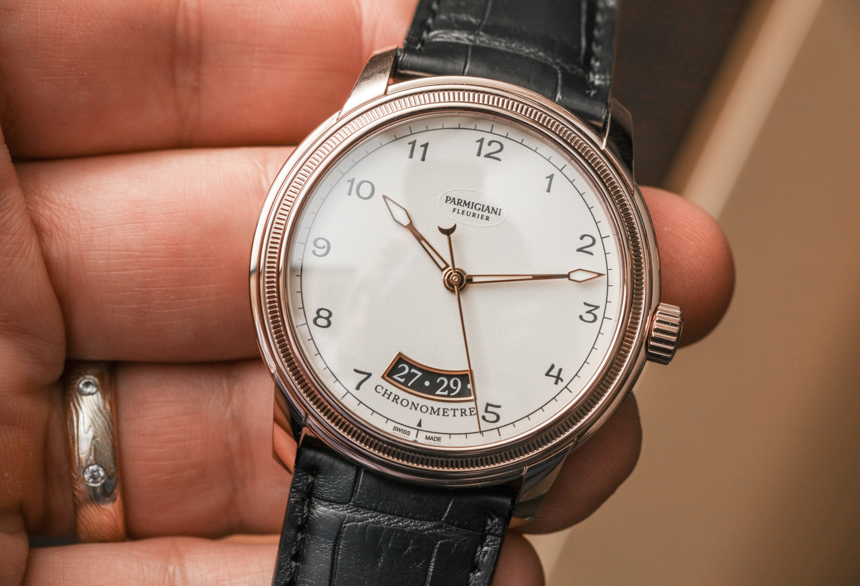
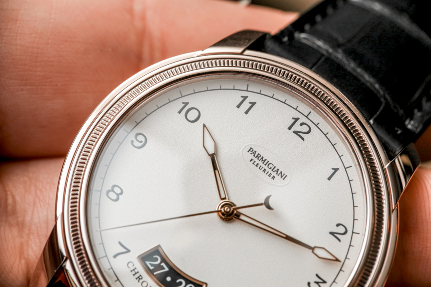
With the distinctive look of most Parmigiani timepieces, I asked myself how much the 2017 Parmigiani Toric Chronometre looks like a Parmgiani of today. The case does, for sure, though it needs a close inspection to identify. The dial is a qualified “yes,” since it uses brand elements such as fonts and other aesthetic touches, but is at the end of the day a rather straightforward time+date dial with Arabic hour numerals. That being said, the legibility is very good.
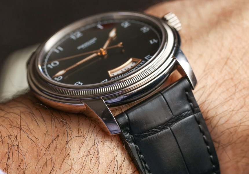
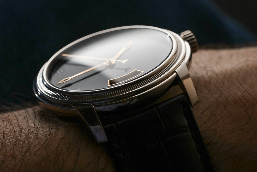
Mr. Parmigiani himself is typically found speaking about architecture – a great passion of his. The Parmigiani Toric Chronometre (like many Parmigiani watches) is, among other things, inspired by ancient Greek architecture. The case itself is remarkably complicated in form, even though it looks simple from a distance. The bezel, case middle, and lugs are each their own distinct visual elements and have been rather harmoniously blended together. It is actually among the nicer “simple” round-case watches out there. I have to say that while Parmigiani’s dial design appeal is a bit of a mixed bag, the brand’s cases are mostly very appealing to me.
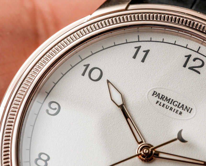
At 40.8mm wide (and 9.5mm thick), the Parmigiani Toric Chronometre wears comfortably and modestly as a modern dress-style watch. As stated, the intricate details of the case such as the knurled bezel and side profile need a closer inspection to be fully appreciated. I think it serves as a very nice frame for the functional dial.
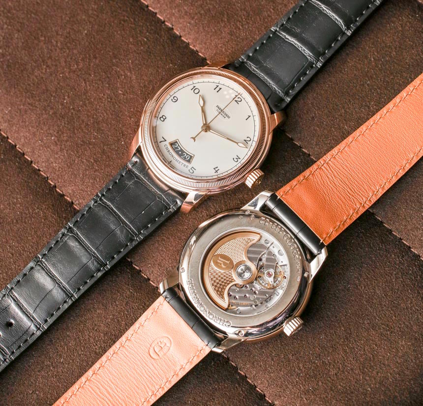
Parmigiani offers the case in either 18k white or red gold. Each gold version is available with either the black or white dial colors. All models have gold hands, which I think is a nice touch. We also see an “open” date window. I am usually not a massive fan of these, but the execution is not bad here and seems to give the date (located above 6 o’clock) more than a passive purpose for the overall design. Under the date window is the “Chronometre” name of the watch on the dial, which is a design detail that I don’t mind.
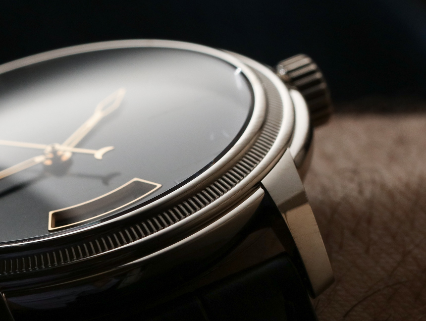
Dial proportions on the Parmigiani Toric Chronometre are pretty nice, if not very classic. A more modern interpretation of this dial would have easily had the hour numerals be larger in size. Not that one way is better, but it sort of reminds me of all the little tweaks Rolex has done to its Submariner over the years, as the sizes of the hands and hour markers have shifted in subtle ways. What consumers prefer is often a very personal choice. With that said, the Parmigiani Toric Chronometre no doubt has a lot of “white space” on the dial – the appeal of which is going to be very subjective to the consumers.
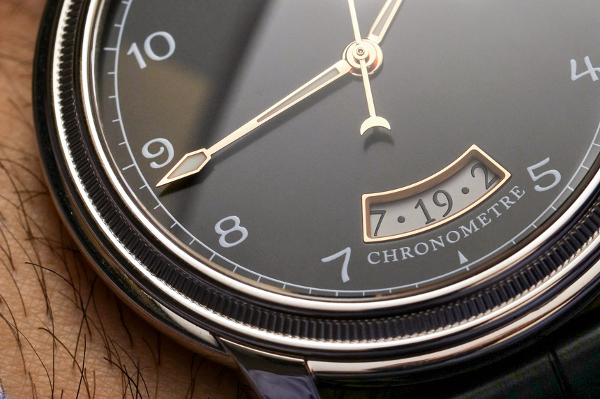
When it comes to sheer details, Parmigiani has always earned top marks. As I said, even the fonts for the hour numerals (as well as the date numerals) are on brand. Then you have the distinctive hands (with lume-painted tips) and the crescent moon counterweight on the seconds hand. You also have the contrasting colors between the date disc and the dial – which add character, and no doubt some aesthetic controversy. These are all small details which help upgrade the overall experience of an otherwise simple watch. At times, the dial looks so sober it feels like a vintage military-style watch – albeit one clearly for use by an officer (of high rank).
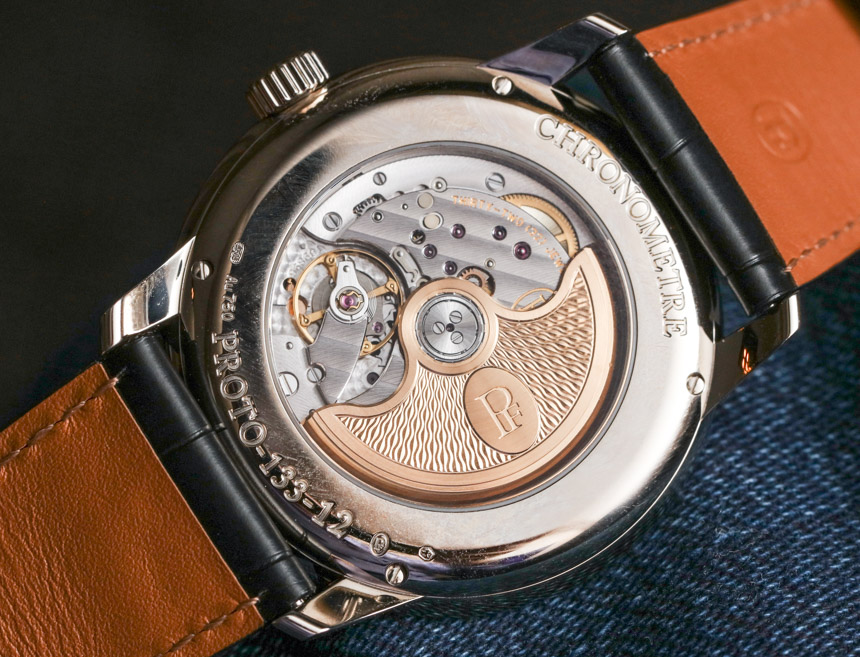
Inside of the Parmigiani Toric Chronometre is the in-house made Parmigiani caliber PF331 automatic movement. UPDATE, the PF331 is COSC Chronometer-certified (even though I previously said it was not since the information from the brand did not make this clear), which helps support the “Chronometre” part of the watch’s name. Visible through the sapphire crystal exhibition caseback is the movement which features a very high level of decoration by Parmigiani. Their movements do have a considerably high-end feel for something that is produced in this manner.
