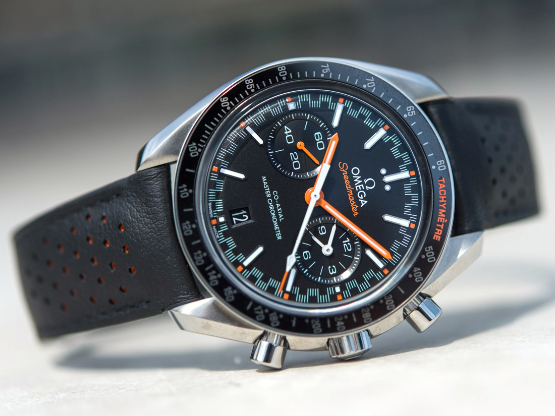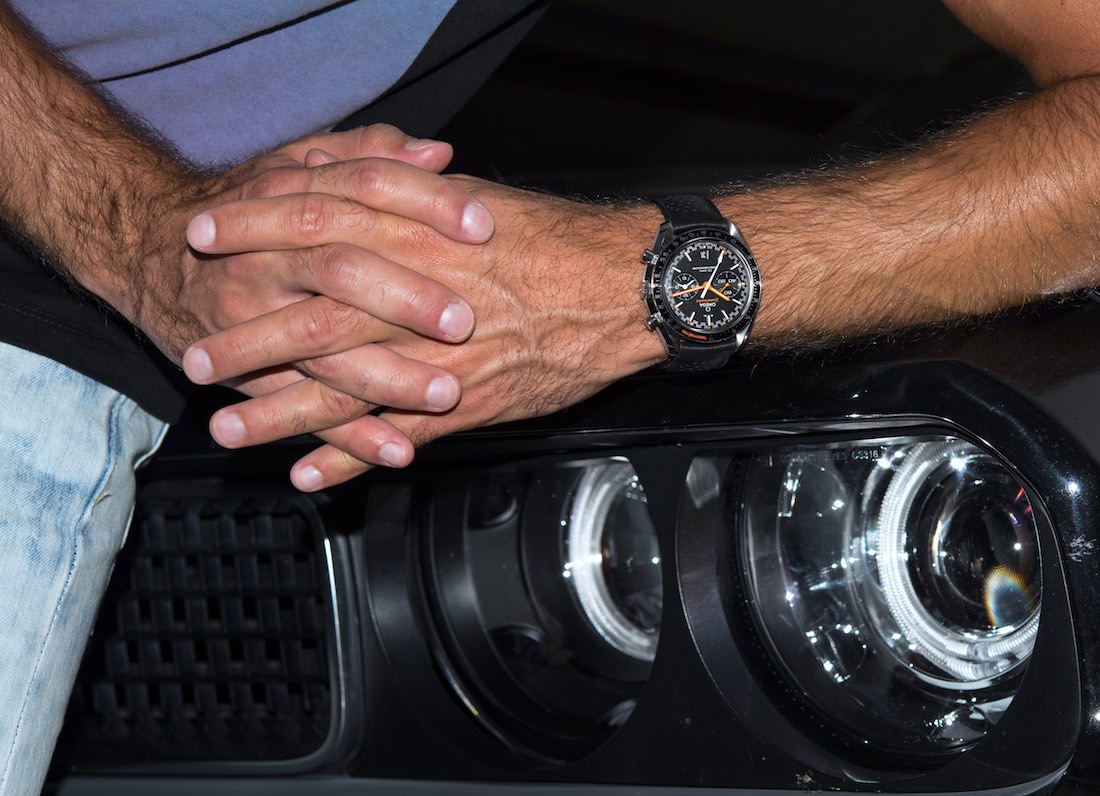
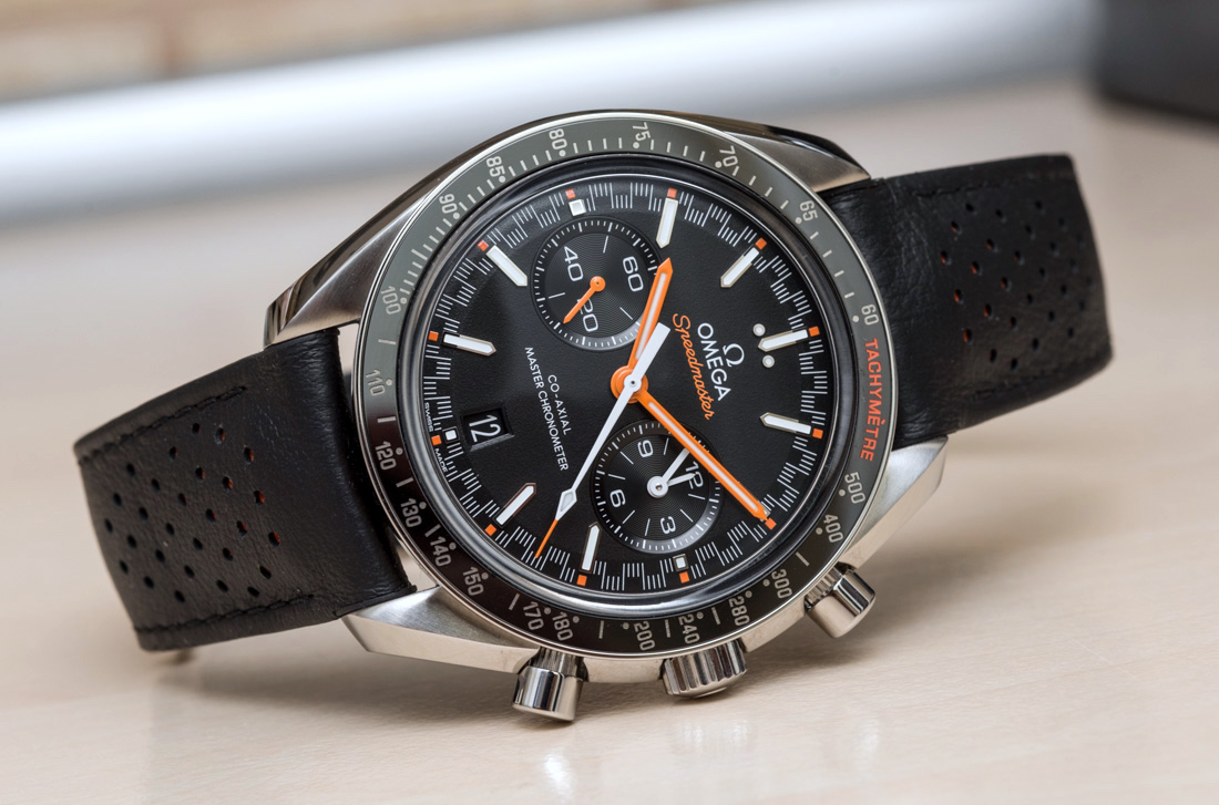
Since we’re talking wearability, we should also talk basic, but essential stuff, like wearing comfort. The Omega Speedmaster Racing Master Chronometer reference 329.32.44.51.01.001 comes on a black strap the material of which, at the time of writing, Omega does not publicly say anything about – not in the Baselworld launch document, nor on their site. The strap is not marked as “Genuine Leather” and although because of its color and texture I presume most (including myself) would call it a leather strap after first sight and touch, upon closer inspection it actually has a strange, rubbery feel that makes me think it’s not leather.
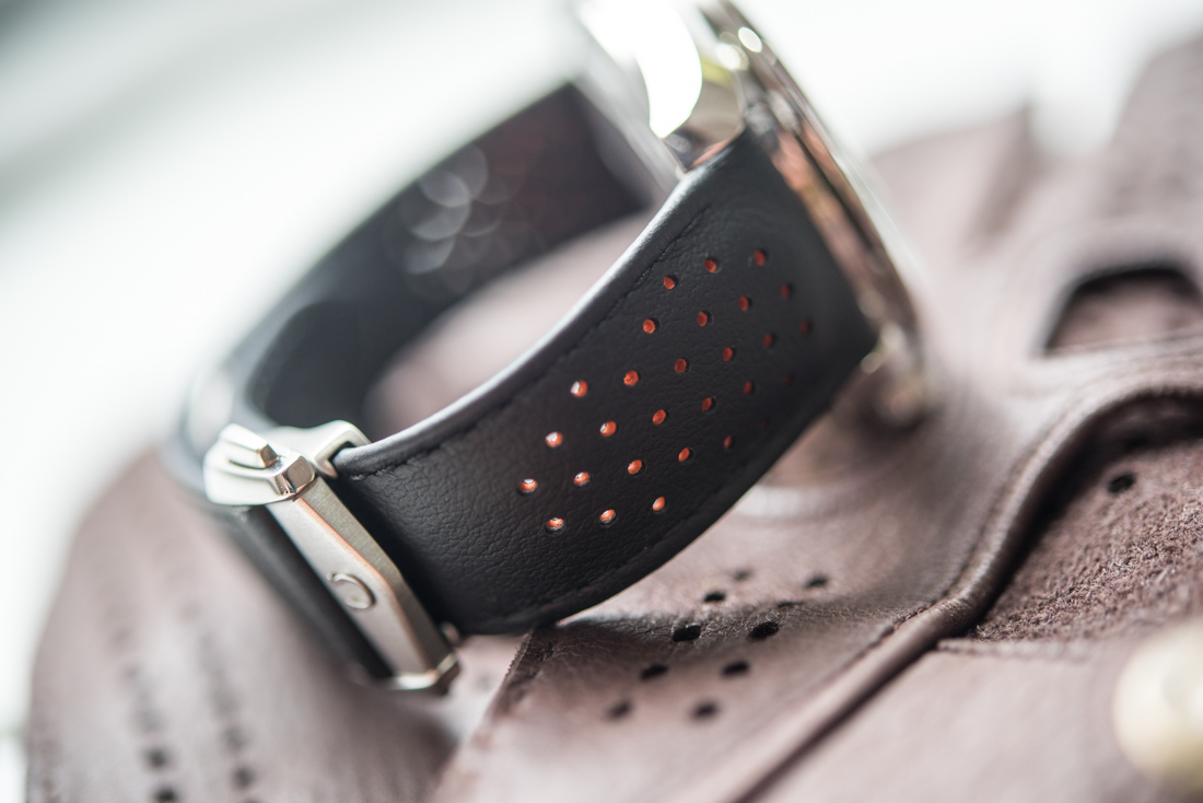
It is soft to the touch, but more like very supple and lightly textured rubber than any type of real leather. Therefore, even if it was genuine leather, it must have received some strong surface treatment that changed its feel. Having had this watch for about two months and on the wrist very often, I don’t have great concerns about the durability of this material, but I do wish it was genuine leather. It works fine in our age when car interiors are plastic and yet are somehow desirable (think of alcantara, for example) – but I do prefer the durability and patina of real leather.
On this note, I know some people can destroy a leather strap in a year, but for me they always last several years, so how this rubbery strap holds up will also depend on how you handle it. It has held up against water, sweat, heat, and other elements so far.
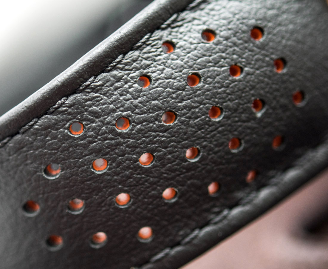

There are machined perforations on the strap – based on original images I thought these were just in the upper, black layer, but in reality they go all the way through the strap. You’ll be surprised how much of a difference these small perforations can make: not even in heat exceeding 40°C (104°F) did I ever find this watch uncomfortable. The strap never stuck to my skin and I didn’t sweat much underneath it. In the middle of the strap is an orange rubber padding that peeks through these perforations and works nicely with the dial’s orange details.
The comfortable strap is attached to a single-folding buckle that closes with a reassuring click if you attach the strap correctly – if the pin doesn’t go all the way through, the strap will keep it from closing. You just have to get it right once and then it will open and close just fine.
Racing Dial & Legibility
The racing dial has been around since 1968 and while I think it looks cool, I cannot agree with Omega when they say “it is generally accepted that this ‘Racing’ style was added to make the chronograph easier to read.” I mean, it may have been added with that goal in mind, but it didn’t quite work for me that way. This is the first racing dial Speedmaster that I got to wear for an extended period and so the first time when I could realize how difficult it is, for me at least, to read not only the chronograph seconds, but also the running time minutes with great accuracy in between the applied markers.
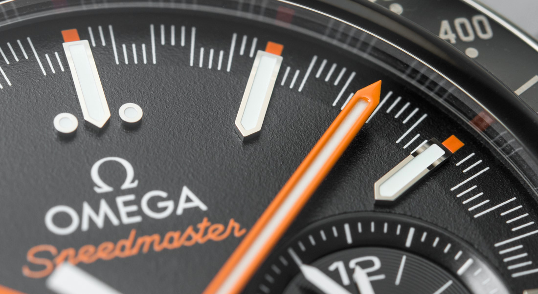

The problem that I have with the racing dial is that the funky minute/seconds track on the periphery of the main dial has its subsequent indices share the first and the last mark, so my eyes (or brain, rather) cannot tell where one minute ends and the other begins. I am ready to admit that it could be just a bad wiring in my brain, and if I really wanted to, I guess I could tell where each section ends and begins (at the longer marks) but, for some reason, the minute track just did not add up for me when I tried to read it at a glance.
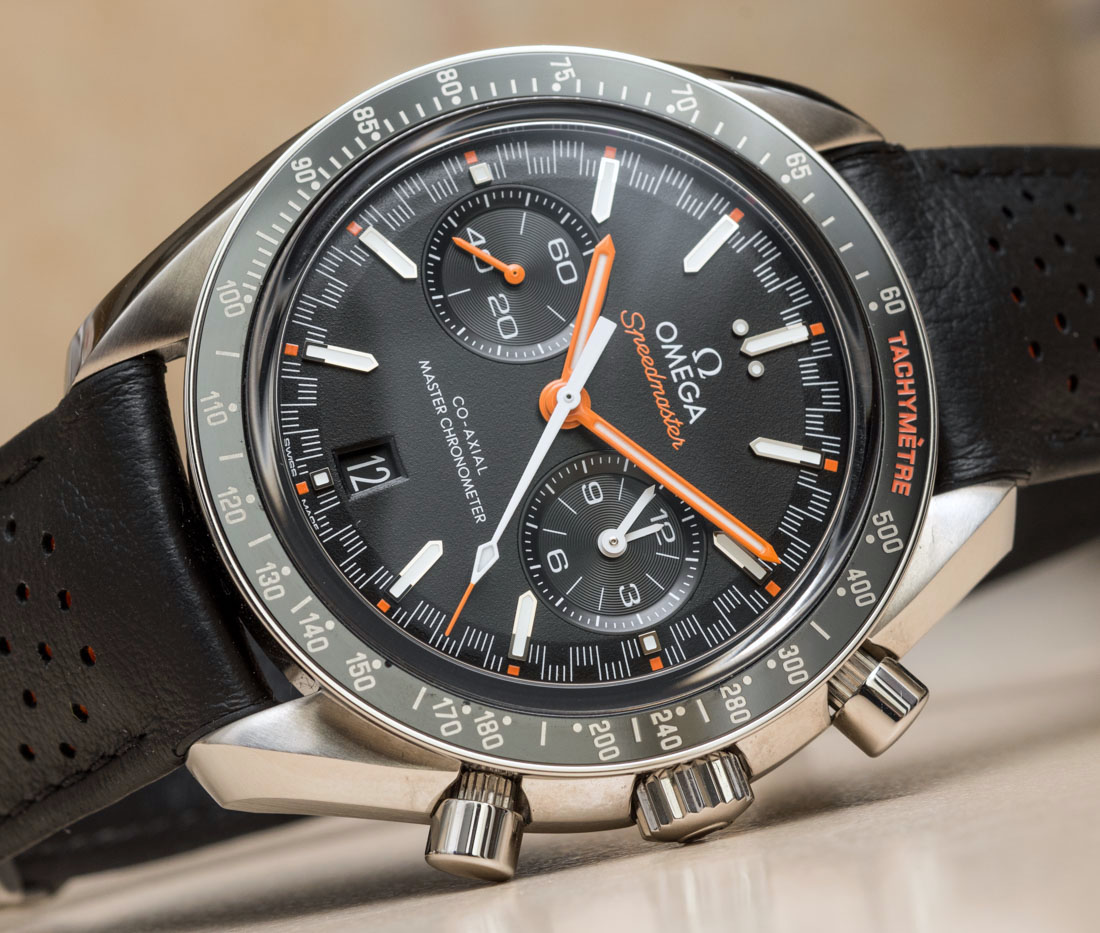
This, controversially, doesn’t mean that I don’t like it. This, I think, is one of the coolest and most beautifully balanced dials Omega has done, thanks to a clever dosing of colors and a yet more ingenious choice in textures for the dial and hands. The double-tier seconds track pulls the entire dial closer together, making the 44.25mm watch look smaller and more balanced to the eye. Furthermore, it adds a sporty element that works really well against both the track of the tacyhmeter scale as well as the long, arrow-like, polished, applied hour indices.
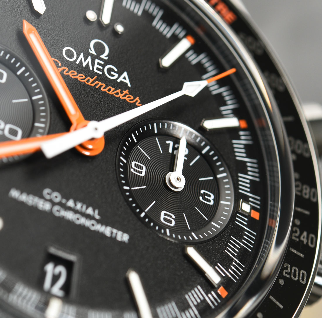
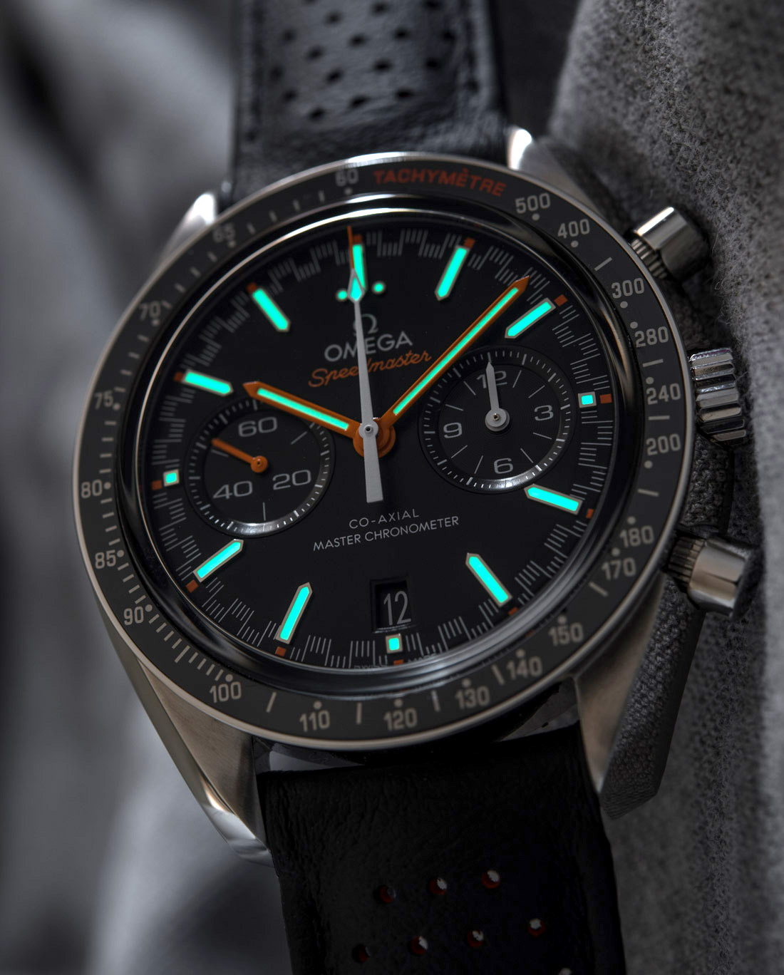
The orange accents are an even more subjective design twist of the Omega Speedmaster Racing Master Chronometer, but these splashes of color are distributed in a very sensible and tasteful way. The running time’s indications are in orange, while the chronograph’s three hands are in white – makes sense. The orange tachymeter text of the bezel, the Speedmaster line, and the small orange pips by the hour markers create a sublimely balanced look. The crisp white Omega logo just jumps off the dial.
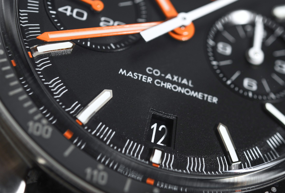
The date window is above the short, lumed block of the six o’clock hour marker. The shape, size, font style, and color combination render this one of the most sensibly and least obstructively done date windows – making this one of the very few occasions where I never once wished that it wasn’t there.
Overall legibility is great, the almost perfectly flat sapphire crystal has AR coating on both sides, while all the hands, thank goodness, are properly sized. Omega has also enlarged the 3 and 9 o’clock sub-dials a fair bit when compared to previous models so they finally look just right and are way more legible than they had been before.
Design & Execution
The case, as I said, remains 44.25mm-wide and is crafted from stainless steel. The bezel on the Speedmaster Racing Master Chronometer reference 329.32.44.51.01.001 is ceramic with a brushed Liquidmetal tachymeter scale and a spot of “Tachymètre” orange text to match the orange elements of the dial and strap. I’ll say I’m still not a fan of random French words on watches where every other bit of text is in English – or vice versa.
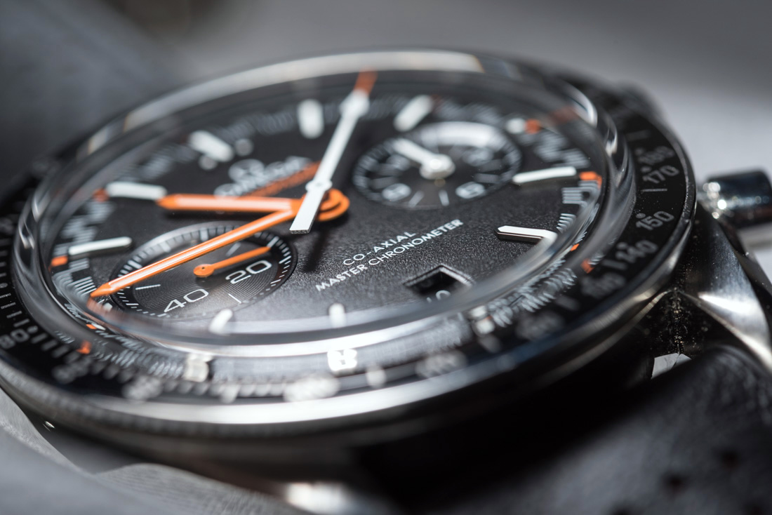
The box sapphire crystal extends about two millimeters above the plane of the flat bezel and after a gentle curve on its periphery, it is almost perfectly flat throughout. Omega added a very thoughtful element to the bezel by wrapping the ceramic into steel and by keeping the sapphire crystal low and closer to the inside. This step-like design and the softer steel frame of the bezel will keep your fragile (but extremely scratch resistant) ceramic bezel insert safe from impacts from the side. Ceramic is notoriously hard but, as a direct consequence, is also notoriously fragile, so this framed bezel not only looks good, but will also save you a several hundred dollar repair bill.
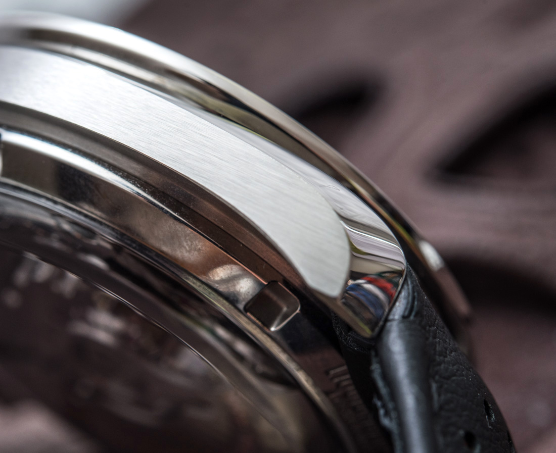
The polished edge that runs across the side adds a touch of refinement, rendering the Speedmaster Racing Master Chronometer an ideal fit for everyday office wear. It isn’t a funky-looking tool/racing watch that only aficionados will get – it’s an objectively versatile, modern, but restrained looking watch.

