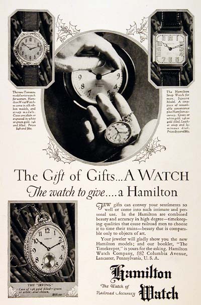
It is charming when you have someone who doesn’t know a lot about watches do an article on the watch industry. That isn’t to say that the journalist erred in their reporting, but rather that there is a degree of naivete to the tone regarding the topic of discussion, which is watch advertising. A lot of people correctly point out that there is a lot of consistency among watch advertising. You see the hands in the same orientation most of the time, and the date often has an “8” in it, or is at 31. The orientation of the hands is usually at about 10:10. There is nothing at all significant about this time, it is all aesthetics any symmetry. Two hands pointing up in a more or less symmetrical position just seems to look better.
The article points out how watch ads of old basically had the hands in the opposite position pointing down. It was then decided that hands pointing down, just look “down,” and the trend was then to place them pointing up. The whole point of any watch ad is to make the watch look as presentable as possible without obstructing the name of the brand or any of the functions. It is just that simple. Though I admit to being among those people who stare at watch ads too long and point out odd little inconsistencies or oddities.

The New York Times article is well done, and worth the read. Note that you’ll need to sign up (free) with the New York Times online to read the article, but it is worth it for the content. It is the New York Times after all. I like the interviews with a few industry people and references to some watch industry lore.
Via The New York Times.
See watch advertisements on eBay here.
