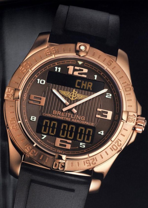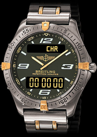
Originally released almost two decades ago now, the Breitling Aerospace is a wildly popular model that underwent a series of minor visual updates over the years. The watch has recently sort of been off the radar as Breitling focused on other watches – especially those mechanical ones with higher profit margins. The turn in the economy has allowed (forced) them to re-shift their focus on some of their more reasonably priced luxury instrument watches. At Baselworld this year they released a brand new Aerospace model (actually two watches that share the Superquartz (thermoline quartz) movement, but only one called the “Aerospace”), what recaptures some of what people loved in the original – but maybe not enough. The functions are the same, and so is most of the appeal, but the design seems to be getting less “professional” and more formal.

You’ll notice that the new Aerospace has a much more decorated face. The original model had a face that was more bare, but helped to emphasize telling the time and the various functions of the movement. The new watch has lots of texturing and decoration on the face which I don’t know if I like. I mean it looks nice, but does it belong there? I think that Breitling should have tried to recapture the “cool tool” functionality of the original Aerospace watch. There is also an odd mixutre of modern and classic design elements to the face. The minute marker ring on the outer part of the dial is totally retro looking, while the hands and LCD panels are modern. The look is just sort of confusing to me. Then again, this is a limited edition 18k red gold version of the watch. It is entirely likely that Breitling released this limited edition of 100 pieces watch before a different release of a titanium version that will be more like the original. The numerals on the new 2009 Aerospace don’t look appropriate and would look better on their other non-quartz mechanical watches. I really like how they utilized 12 Arabic numerals, but the design of the font just doesn’t do it for me. I want to see something that looks like what 2009 aerospace technology would seem like if you turned it into a font. Would it look like a dilapidated space station that no one wants to put money into? Perhaps it would be in Chinese? Who knows these days.
Curiously enough, Breitling went ahead and gave the watch a rubber diver’s strap. Something that for me is always a big “no no” with gold watches (most of the time). No doubt leather straps and metal bracelets will be available. The functions of the special Superquartz have always been impressive, but all must be operated via the single crown that is pushed, pulled and turned to operated the functions. They include a minute repeater, chronograph, timer, second timezone, and alarm. The Superquartz is an extremely accurate quartz movement that has further been Chronometer certified. Another little qualm I have is that they changed the style of the hands. The minute hand always had a counter weight, but the hour hand did not, but now they both have it. Am I being too conservative or did the original design just look more interesting and functional. While there are lots of design merits to the new 2009 Breitling Aerospace it just ends up looking like another generic Breitling watch with the Aerospace name and look to it. I will wait for the titanium version when ever it arrives to make the final judgment on this new look.
See Breitling Aerospace watches on eBay here.
See Breitling watches on Amazon here.