Welcome to a new look and feel for the aBlogtoWatch watch blog website. We enter what is perhaps the fifth overall version of the site and the second major design to use the aBlogtoWatch.com (versus older aBlogtoRead.com name). One of the notable small changes is that the new version of aBlogtoWatch removes the “formerly aBlogtoRead” label we once had in the header. Even though many industry people still like to call us “aBlogtoRead,” the name is part of our history. With the new for 2014 aBlogtoWatch website we offer a lot of improvements both visually and behind the scenes.
Before discussing what’s new and helping to orient our audience to the new experience I’d like to offer thanks. None of this would have been possible without our dedicated technical and assistance team that includes technical lead Kristin Kramer, talented programmer Keith Freedman, master art director Matt Smith-Johnson, and master of social media and jack-of-all-trades Zen Love.
I also want to thank our entire writing staff and contributors, as well as select members of the watch industry who provided their valuable time and feedback. Last but not least I’d like to thank each and every aBlogtoWatch audience member no matter how often you visit the site for giving us the opportunity and motivation to continuously improve what we hope continues to be the best place to enjoy timepieces.
New Look


We can’t even begin to discuss what is new under the hood. As web technologies change so must we. At launch the new aBlogtoWatch will no doubt still have some bugs. Some we are aware of and some you’ll help us discover. That is just the way it is with websites, but overall the new aBlogtoWatch is meant to be more modern, fast, and friendly to use across all platforms. For a long time we’ve been promising a dedicated mobile version of the site. We launched one a few months ago but it was never meant to be permanent. At launch the mobile version of aBlogtoWatch still isn’t ready due to ongoing testing and development, but it will come very soon. With those disclaimers out of the way allow me to introduce what we feel is the best looking environment we’ve ever created.
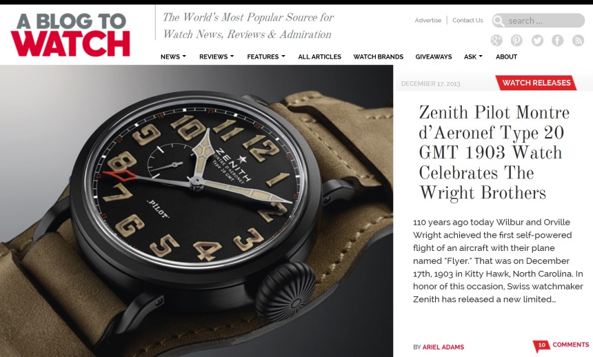
The new aBlogtoWatch begins with an updated logo. Clean and modern, we feel that it represents what is really a brand unto itself now more so than ever. One of the most important elements going into the redesign was a focus on doing everything possible to maintain the integrity and value of our content. We want aBlogtoWatch articles to be both honest and friendly to look at. This should be a place experts or novices feel comfortable, but at the same time we need to acknowledge that aBlogtoWatch is often about discussing high-end collectibles and items of passion for sophisticated consumers.
To do this we attempted to upgrade the look and feel of aBlogtoWatch, borrowing from elements that we’ve long appreciated in places such as quality print magazines – which have been able to emphasize a lot more creativity being static versus dynamic as most websites tend to be. We hope that the experience of reading articles on aBlogtoWatch will be as good as the articles themselves.
Discover More
One of the most complicated features we built from the ground up is a lot of new search functionality. Sure the handy search bar will always be where you want it in the top right-hand corner of each page, but that assumes you know what you are looking for. Whether you are browsing ALL ARTICLES, delving into FEATURES, or researching REVIEWS, you’ll find a new assortment of search options and filters to help you find what you are looking for – faster. aBlogtoWatch has almost 3,400 published articles as of the launch of the new for 2014 website and it is our goal to help readers discover content they didn’t know existed but really want to see.
Part of helping our audience discover more content was about re-thinking the basic layout of each page as well as the navigation structure. Topical areas can be narrowed down a lot more to help new and existing users discover tools and guides that will assist them in learning about or buying watches. One of the areas that we will continue to focus on and build out is our WATCH BUYING GUIDE. That’s because we’ve experienced a lot of demand for it, and want to make sure that we service our audience with tools they need to become just as knowledgeable as we are.
Streamlined Experience

Designing a place for people who come here regularly as well as those who visit once in a while is a challenge. On the one hand we don’t want occasional visitors to miss out on important articles, but we also don’t want our most loyal fans to sift through content to find what is new. As I discussed above, one of the goals of the new aBlogtoWatch was to help people discover and enjoy content more easily. In the last version of the aBlogtoWatch website we experimented with a homepage that used carousels to highlight some of the latest articles. For the 2014 site we return to a more traditional “blog” style, but done in a more aesthetically pleasing manner.
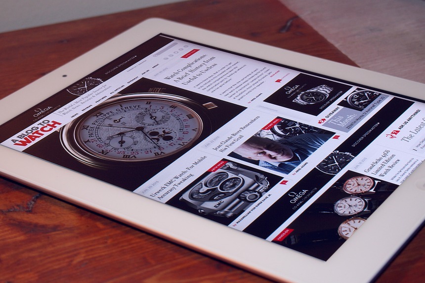
Starting from the home page you can scroll down and then click to see previous pages where up to 11 articles per screen will be tiled with images and some article summaries. We’ve adopted the more modern “tiled” approach that helps bulk content together in a way that doesn’t feel too crowded or ordinary. This gives each page a truly unique feel with a mixture of beautiful watch pictures that help browsing and selecting articles to read comfortable and rewarding.
Feedback Welcome

Some of the new aBlogtoWatch website is not totally complete at the time of launch, and that is something we are aware of. A lot of testing and last minute changes will occur naturally over the next few weeks, and we don’t want you to be concerned if something is broken. Having said that, your feedback is useful to help us identify problems and bugs. If you’d like, CONTACT us here. One issue we are aware of – the comments since December are not showing up – they are in the database, we just need to do a sync with Livefyre to pull them back in. So, you are still eligible for our contests, we have your comments if you entered, and soon you will see your comments come back in.
While it sounds cliche, it is totally accurate when I say that aBlogtoWatch has some of the most amazing audience members we could have ever hoped for. Men and women from all around the world regularly comment, e-mail, or participate in conversations here and on aBlogtoWatch social media channels. We are proud that you keep coming back and want to make sure the experience is on par with your high expectations. With all that said we once again welcome you to a brand new aBlogtoWatch experience where the “watch passion” continues.


