Sometimes, change comes quietly. The Mutewatch may not have grabbed as many headlines as some of its competitors, such as the Pebble, the Phosphor or the iPod Nano watch. Still, over the past seven years, it has grown from a futuristic geek-toy (former Apple-CEO Steve Wozniak was one of its first public advocates) to a celebrated “in brand”. At least in Europe its colorful plastic look and minimal design aesthetic, strikingly similar in style to the immensely successful Urbanears headphones, have caught on with the trend- and tech-savvy public in a big way. Without a single doubt, this success is less due to its technological innovations than its status as a fashion item. And yet, on closer inspection, there’s a lot more to the Mutewatch than meets the eye.
In many respects, the Mutewatch is part of a new generation of electronic accessories and certainly closer to the Fitbit Force than, say, the Samsung Galaxy Gear. This is because neither the Mutewatch nor the Fitbit offer the kind of facilities which have become all but synonymous with smartwatches, such as updates on your email- or SMS-status, weather forecasts or keeping up with the social networks. Instead, they focus on a variety of specialised time tracking options. Whereas the Fitbit is aimed at runners, the Mutewatch has been designed for creatives, public speakers or anyone who wants to fully concentrate on a specific task without being disturbed by noisy alarms or outside distractions.
As you’ve probably figured out by now, it’s all in the name here: The story behind the Mutewatch’s birth is that founder Mai-Li Hammargren was looking for a way of getting up early in the morning without waking her boyfriend with a regular snooze alarm. Its silent (‘mute’) alarm works by causing the case to vibrate, which should, ideally, keep your partner sound asleep and your relationship intact. Of course, there are plenty of other scenarios where the same function will come in handy, too, allowing you to keep up your own working rhythm without disturbing anyone else in your proximity. For these reasons, the Mutewatch has occasionally been described as a ‘time management tool’ rather than ‘just’ a watch.

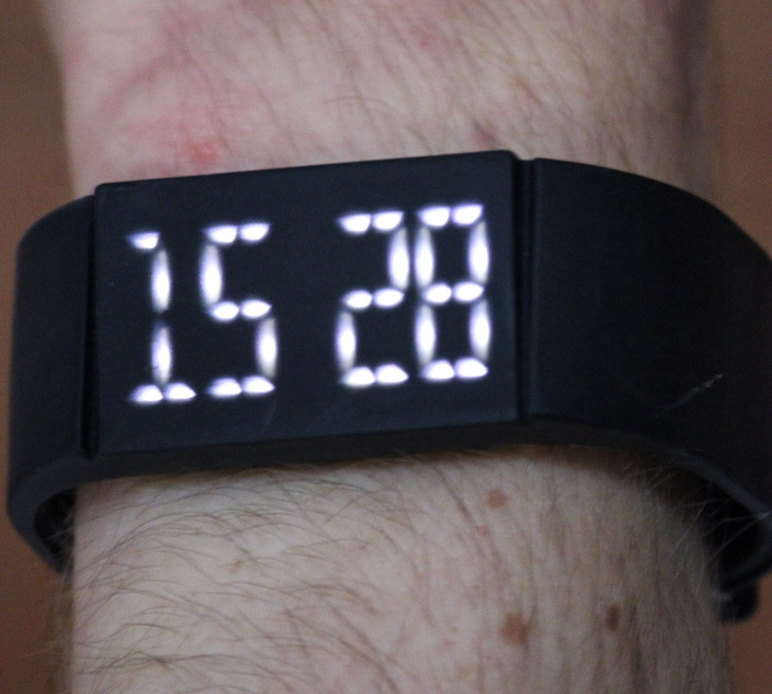
One of the concepts behind the Mutewatch is that it helps you reduce the constant white noise going on around you to focus on what’s really important. Its options are certainly reduced to nothing but the bare minimum: A clock; up to five simultaneous alarms; and a countdown timer are all you’ll get here. That may not sound like a lot. But that’s only because we haven’t yet touched on its biggest selling point, next to the vibration alarm. A unique touch screen with a 100 hz LED display, which doesn’t work with e-ink and is generally very different than the ones built into the aforementioned competing smartwatches. The entire watch, including the display, is of one piece and made from a both extremely sturdy and flexible compound (Thermoplastic Polyurethane, in case applied chemistry is your thing).
So when touching the display, you’ll get a far more direct and organic sensation and a lot more ‘grip’ than with most comparable watches – you can take the latter part quite literally, actually, as the watch pretty much feels as though it’s made of rubber. On the upside, you won’t ever get greasy fingerprints on this display. On the downside, anyone with a preference for more ‘classy’ materials like steel, glass and leather should stay away from it and the Mutewatch is also significantly less responsive than its e-ink counterparts. So you’ll have to exert some pressure to trigger a response from the display. On the other hand, this is probably for the better, as you wouldn’t want the settings to suddenly change by themselves when wearing the watch underneath your sleeve.

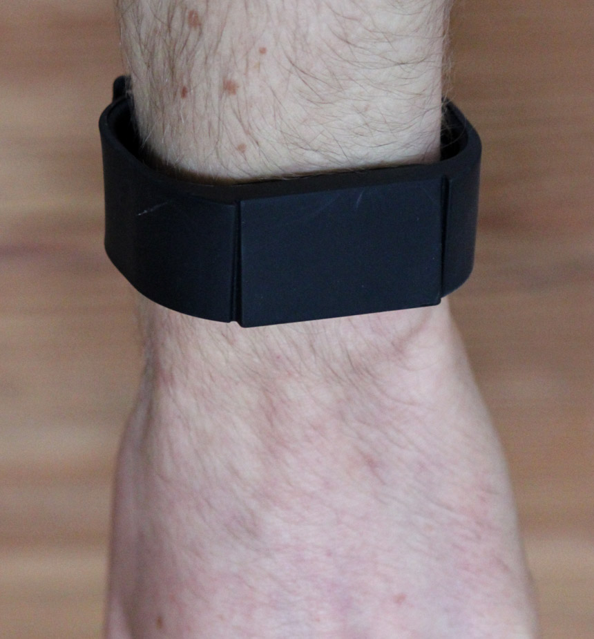
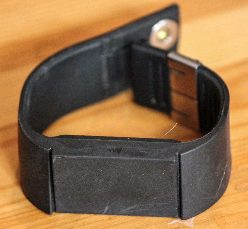
In terms of design, the Mutewatch undeniably makes for a stylish accessory – unless you’re looking for a classic timepiece to accompany you to your next business meeting or date, that is. Other than the tiny silver closing mechanism, the watch is entirely uniform in color, including the digits on the display – with the exception of the black version, which has white numbers – and I’ve seen plenty of people over here matching it with their clothes or headphones. I really like the way the USB connector is cleverly hidden away inside the wristband, too. To distinguish it from just looking like a slightly thicker wristband, the display is tilted in a 15 degree angle from the band, which looks distinctive and also makes it easier to read.
At a mere 40 grams, the watch is very light, but thanks to the robust materials, it feels decidedly heavier than a cheap digital quartz watch and closes tightly around your wrist. Clearly, the Mutewatch has been designed as a futuristic timepiece and doesn’t adhere to the familiar design tradition of watchmaking. But at the same time, it is very functional and, when worn on the wrist, doesn’t actually feel artificial or plastic-y. You need to be aware, though, that although the display is 45mm across, it looks rather small on a man’s wrist due to being quite narrow. Better try it on before ordering it online, therefore…. more »
