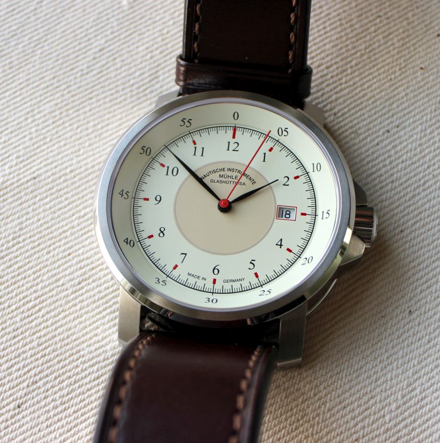
We first brought you word of the M29 Classic from Mühle-Glashütte back in the fall, and I wrote at some length about the various gauge-related references that the model draws inspiration from. I had also stated that, of the variants in the collection, the cream dial on the brown leather strap embodied what they were going for the best. That’s precisely the model that we’ve had sent over for review. Read on to see if the shine is still there, or if it should have stayed tucked away in the toolbox.
So, what strikes you first with the watch? For me, it’s how much dial you see. Or, more accurately, how little bezel there is. For me, when there isn’t a functional bezel, I like to see as little metal as possible around the edge of a crystal – at least when it comes to non-sport watches. On the M29, even though the bezel is narrow, you’ve got two distinct surface finishes. The one that’s on a plane with the crystal has a brushed finish, which keeps reflection down. The chamfered and vertical edges of it, however, are polished, allowing the watch to give flashes of light as you move your wrist.

This quite nicely offsets the vertically brushed finish of the 42mm case (11.3mm thick), and complements the polished finish that the crown carries. In practical terms, this takes what could have been a watch that was very much a “casual only” affair, and elevates it to pass muster in some dressier situations, if the need arises. And this is all with it paired to the simple leather strap. This was a pleasant surprise of the package, for sure.
On many watches, you’ll see a plain, textureless, strap, and immediately assume that it’s some cheaper piece of leather that’s being foisted on us– because many of us have picked up watches with straps just like that. Here, the plain leather strap instead confers a sort of understated luxury. The finish itself is a rich chocolate brown, and has a soft feel as it conforms to your wrist. While I won’t call it a thin strap, it’s not so thick that you feel the bulk under your wrist as you’re typing (as an added bonus, it’s just thick enough to keep the floating keeper in place throughout the day).

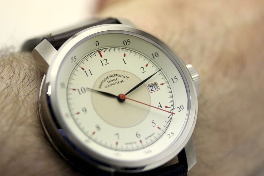
This strap is a perfect complement to the dial as well, with its color palette. I will admit that when the watch first came in, I was a little concerned with how narrow the handset is. Of course, these hands are reminiscent of what you’re going to see on gauges in a machine shop, so they’re thematically appropriate. In practice, their thinness had no impact on readability. This is in large part due to the contrast between the hands and the dial.
There is one thing I’m still torn on with the hands. While the minute hand extends nicely to the edge of the dial (and the minute track), the hour hand is hitting a point that’s a little less defined for me. On one hand, it almost touches the hour track (it’s just barely brushing the numerals). On the other hand, it’s extending past that central, darker, circle. On other watches where you’ve got this sort of prominent center circle (call to mind your favorite flieger), the hour hand keeps itself right around that central circle.
