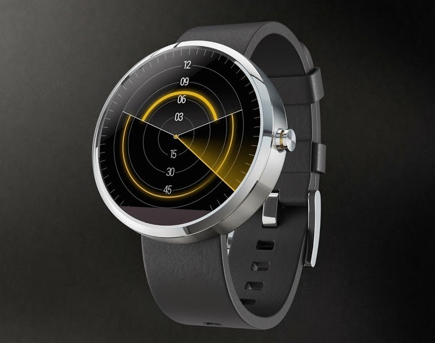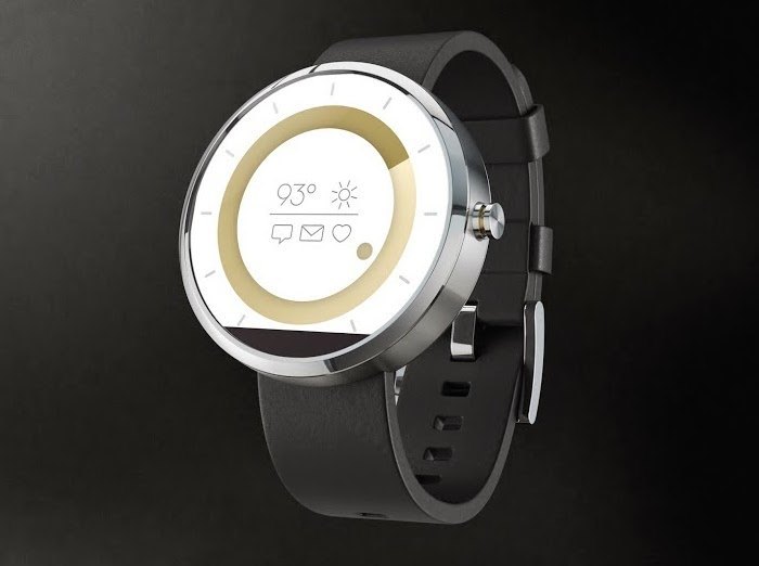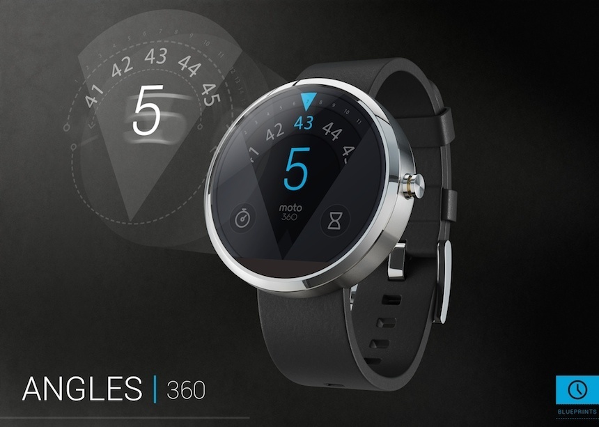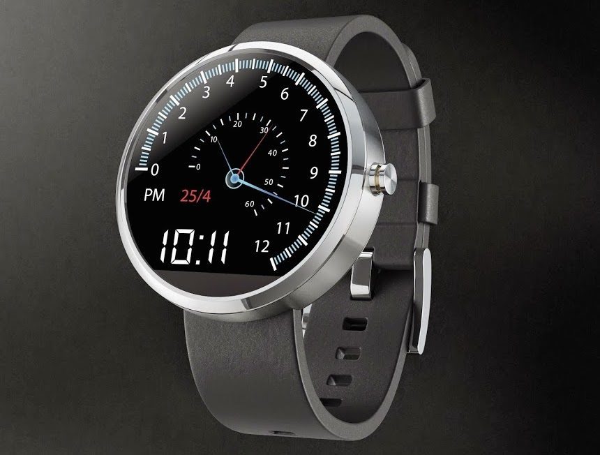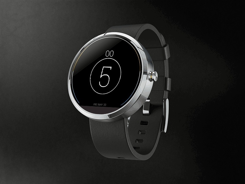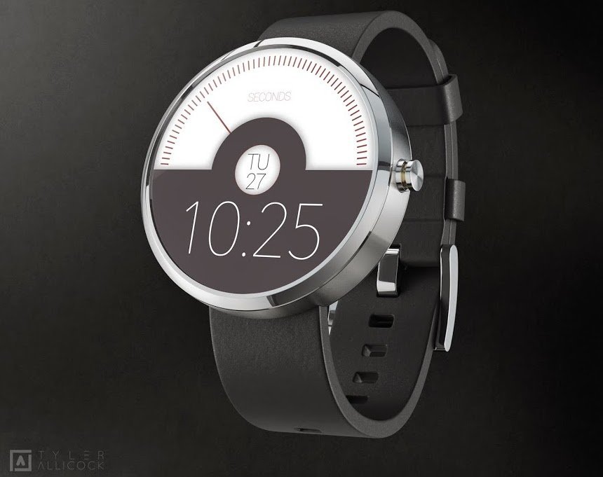
While the idea of the smartwatch does not seem as far-fetched as it did a few years ago, tech world big guns Apple and Google are both yet to make their debut in this extremely potent market segment. Of the two, it was Google that made the first move a few months ago by announcing its Android Wear OS, its operating system tailored for wearable devices, in conjunction with the debut of Motorola‘s Moto360 Smartwatch. We discussed the more than promising concept of the Motorola Moto360 Smartwatch at length here, and now we are reporting about the fascinating results of the Motorola Moto360 smartwatch design contest, where it was the public’s turn to create their own user interface and to show the world their idea of what the face of a smartwatch could and should be.
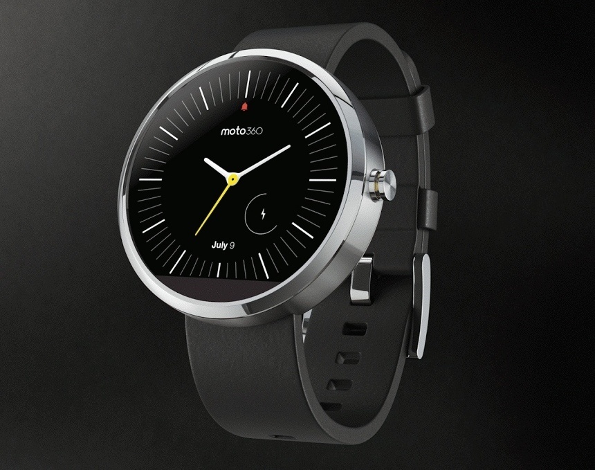
The Motorola Moto360 Smartwatch design contest started on the 21st of May and entries were accepted until June 10. Over this period some 1,300 designs were submitted, despite the fact that, for reasons unstated, only US and UK citizens could enter. Motorola made a photoshop toolkit available that contestants could use to create their own designs, designs which ended up ranging from more traditional layouts to modern and futuristic looks.
From a watch enthusiast’s perspective, the results of the contest are interesting for a number of diverse reasons. For one, the Motorola Moto360 Smartwatch is the first round smartwatch from a major player in the industry, a shape that looks much more organic and wearable than its rather uninspiring rectangular counterparts which we have been seeing so far. The watch incorporates a color display which follows the shape of the case, and it is this display that grants virtually endless possibilities for the designers to create their own watch face without having to care for structural restrictions, such as the spacing of the hands and other basic mechanical principles that apply for mechanical watches. In short, the Motorola Moto360 Smartwatch and its design contest provided a blank canvas for the public, giving us a better understanding of the greatly different approaches that people take when it comes to defining what a smartwatch should look like.
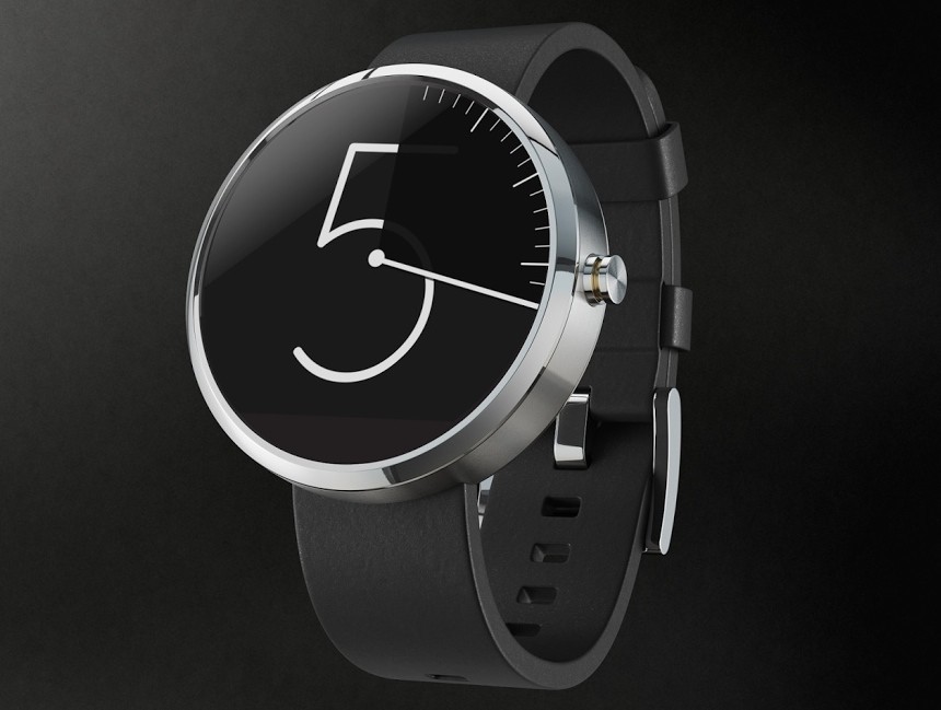
At the end of this article, you will find a gallery that comprises images of the ten best designs that Motorola picked, and until the 24th of June, you can also cast your votes for your favorite pieces at the brand’s Google+ page. Although Motorola is not quite clear on whether or not it will actually incorporate the most popular design in the final product, we are sure the submitted works have given them some great ideas and pointers on what people want.
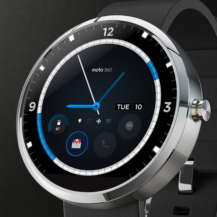
What becomes immediately apparent is that the majority – seven out of the ten plans – feature non-traditional ways of displaying time, doing away with the traditional three-hand layout. This trend implies the general fascination with bold new ways of telling time, often comparable to what we got to see from some ultra high-end watches, like the Opus 11 or the 4N watch – albeit with the Moto360 at a fraction of the price. What you see above is the design with the most likes at this point, and it blends the traditional three-hand layout with some notification icons for emails, phone calls, battery life, as well as status lights for a number of different functions.
The only criticism that we have after glancing over the top ten designs that Motorola selected is that although just about all of them present a relatively new and funky way of showing time, the majority of them fail to include any actual “smartwatch-related” indications, and even if they do, the windows are likely to be too small either for the human eye to see, or for the resolution of the screen that is likely going to be used for the watch.
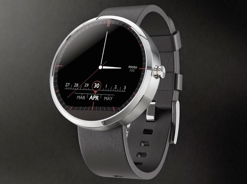
Even with that said, the concept of creating a design contest that is – well, more or less – open to the world is an idea more brands should embrace, especially in those instances when the technological background allows for greatly diverse ideas to be actually included in the final product. On this occasion the top 10 contestants gave us, and hopefully the people at Motorola, some pointers regarding what people might want to see from a next generation smartwatch.
The Motorola Moto360 Smartwatch is going to be released sometime during the summer of 2014, with rumors stating July as the most likely time for its premier, and we are looking forward to seeing – and testing! – what the final user interface is going to be like. motorola.com

