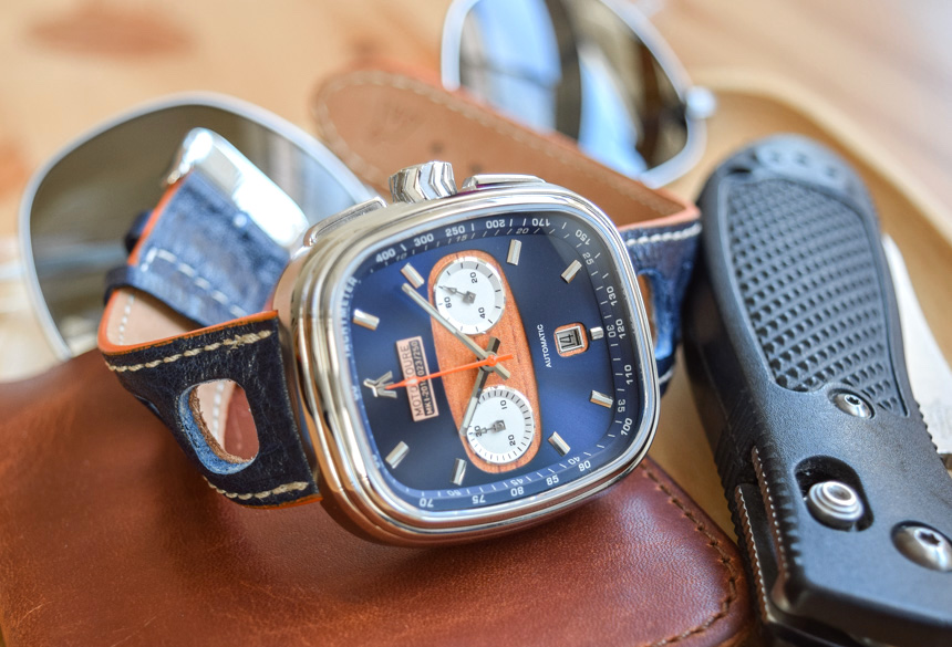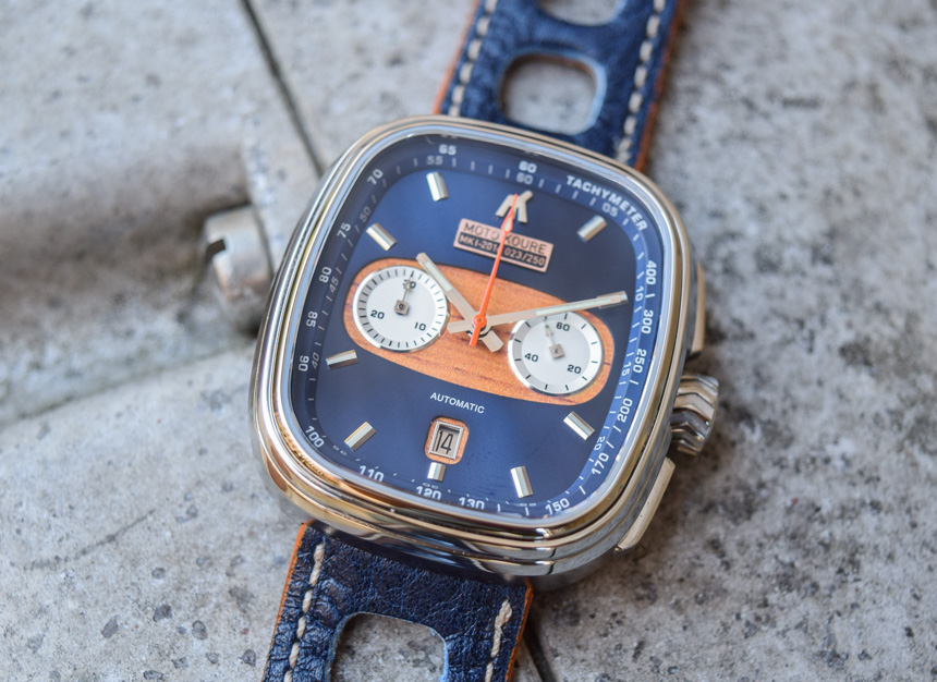
Founded last year, Moto Koure have released two variations of their Moto Koure MK I Column Wheel Driver’s Chronograph, their flagship Seiko NE88 equipped automatic and a much less expensive Seiko VK meca-quartz variant with identical styling. According to Moto Koure, the visual design of the watch was inspired by the luxurious and sporty feel of the Jaguar MK I and MK II cars of the 1950s and ’60s. Eagle eyed watch aficionados will also detect a hearty helping of DNA from the Heuer Silverstone, the successor to the perhaps more storied Heuer Monaco. But how does it fare? Is it any good to actually wear and use? Fortunately, I spent some time with the watch and am here to report back.
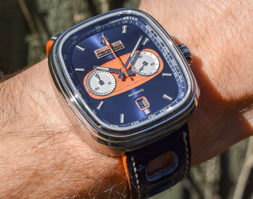
First, if you have kept up with these last five to ten years of micro-brand watch happenings, then you will have likely noticed that the majority of these micros are diver’s watches. More still are either faithful or thoughtfully re-engineered homages to various iconic watches of years past like the 6538 Rolex Submariner or 5513 Military Submariner. However, micro-brands have largely avoided rehashing some of history’s most iconic chronographs, many of which were designed around the automotive racing world of the 1960s and 1970s. Some of this likely has to do with the expense of chronograph movements and the additional costs associated with the production of watches with chronograph functions. This is where young Australian firm Moto Koure and their MK I chronograph come in.
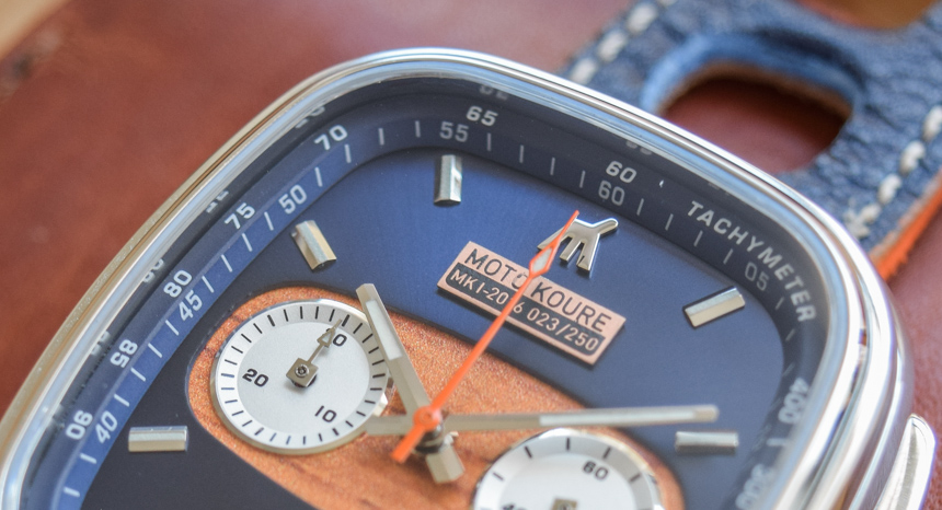
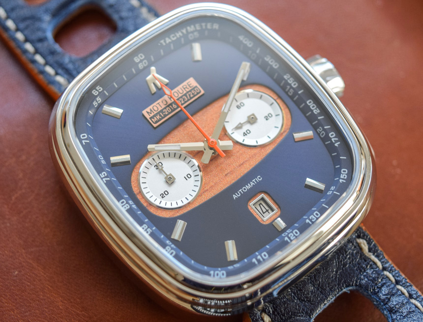
Immediately, your attention is grabbed by the dial, which has an extremely well executed deep sunburst blue color. The hour markers and hands are chromed steel and sport old radium Super-LumiNova although it is in somewhat short supply. The hour marker at twelve o’clock is a decent sized chrome Moto Koure logo. The chapter ring features a printed minute track in white on its angled surface and a printed tachymeter scale on its top to coordinate with the orange chronograph second hand. The most striking feature of the dial is the insert at its center section which runs from three to nine o’clock and is made of wood. Yup, that’s right, wood. This is to apparently harken back to the beautifully finished wooden dashboards of cars of the aforementioned golden era of racing and design.
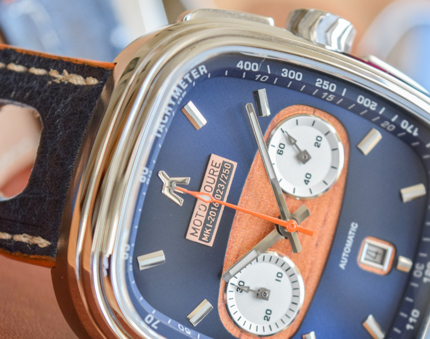
The wooden insert surrounds the thirty minute counter at 9 and the running seconds register at three o’clock. Other than that, there is a large bronze colored applied logo with the Moto Koure name as well as the model name, year of manufacture, and the particular watch’s number in a limited series. Here I have little choice but to note that the word “Moto” on this little applied rectangle is not very well printed and that the “O” is largely missing. Although it’s hard to hold a very small quality control miss against such a young company, the watch’s relatively high price tag of around $1000 US does make you expect to not see something like that. I do want to add that this may likely be due to the fact that it’s a review model and (somewhat counterintuitively) this isn’t uncommon. Moving on, the word “automatic” is printed in white above the date which sits in it’s own smaller wooden surround at six o’clock. All of this lives under a sapphire crystal which has an anti-reflective coating on the inside only.
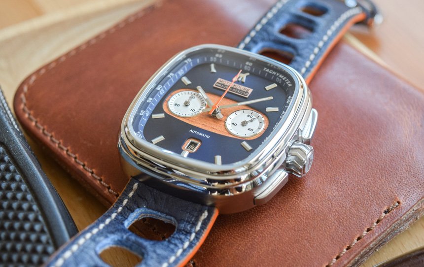
For me, the dial works. There are maybe a few too many things going on, but they are carefully combined and the overall feel of the dial is not overly busy or cluttered like many chronographs. I’d be willing to bet Moto Koure designed more than a few iterations of the dial before settling on its current design. The time is also fairly easy to read which is no small feat considering the squared shape of the dial. The wooden insert is a nice touch and at least for me gives the watch a pseudo-nautical feel and reminds me of old-timey wooden hulled speed boats like those made by Riva. The deep blue sunburst dial is also really well done and changes its tone considerably based on the lighting of its environment. Although there isn’t a ton of lume (old radium SL lume, that is) on the dial and hands, it’s sufficient to read the time in the dark and lasts through the night.
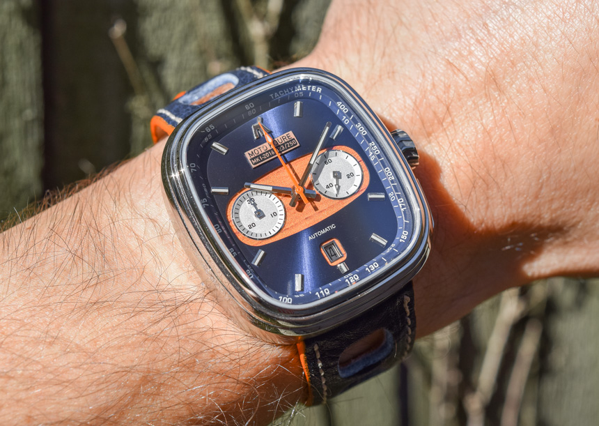
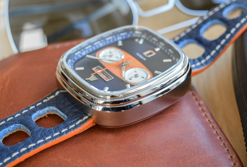
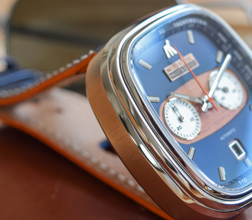
The stainless steel, 40mm x 44mm case is made up of many tiered alternating brushed and polished surfaces which results in a surprisingly tall 15.5mm height on the wrist. The thing would be tough to pull off with a NATO strap or anything which makes the watch ride any higher. This watch is also a bit of a struggle to get under a shirt cuff. The non-screw down crown (why would it be?) is inspired by a racing car tire and is large and easy to operate. The pushers are large, rectangular, polished, and initially very stiff to depress. This is no doubt a condition of the column wheel movement within, more on that later.

