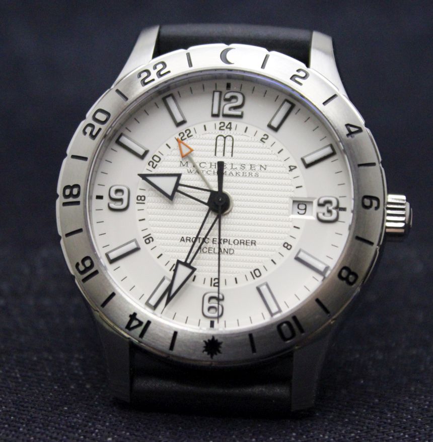
If you’ve been following my articles for any length of time now, you know I’ve got more than a little bit of an affinity for GMT and World Time watches. While I’ve recently explored some of the more complex ways of conveying this data, I can’t deny what first drew me to the segment–just a simple GMT hand. Pair that with another current predilection (white dials), and you were left with one watch that generally came to mind–the venerable Rolex Explorer. At least, that’s how it was for me until I can across a smaller brand from Reykjavík, Michelsen Watchmakers.
First, telling you a little bit about the brand is probably in order. Any time we run across a watch company we’ve not heard of before (especially one that produces in small volumes), we’re tempted to think that they’re “another” microbrand, without much in-house expertise of their own. To the contrary, Michelsen is the oldest Icelandic watch company, founded in 1909 by J. Frank Michelsen, the great-grandfather of the men running things today. At the helm is Frank Ú. Michelsen, a master watchmaker in his own right.; the elder brother, Robert, is a WOSTEP Certified Watchmaker, while younger brother Magnus (perhaps the visible face of the company) handles the marketing. In short–they’re not some flash-in-the-pan company, and they’ve got great in-house expertise (if you’d like to know more about the brand, take a look here).
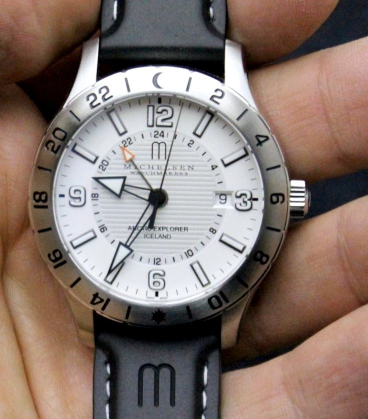
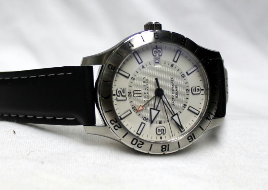
Next, we can move on to what we’re here to talk about–the Arctic Explorer. As I mentioned at the start (and in my Gift Guide blurb about the watch), comparisons to the Rolex Explorer are inevitable. However, once you get past the white dial (other options are blue or black) and the GMT hand, the similarities really do stop. Speaking of that dial, I think that’s where we’ll start our tour, since it’s what first grabbed my attention. What we had in for review is their white dial, which, upon closer inspection, isn’t completely a bone-white finish.
At the outer edges, you do have a smooth, bright white expanse. In the center of the dial, though, there’s a textured finish surrounded by the 24-hour scale. While this is still white in color, it almost takes on a silvery sheen depending on how the light hits it. Both this color and texture shift are a quite nice (and subtle) way to break up the dial a bit. Depending on the angle, it may look white, silver, or even grey (for some reason, it calls to mind the moon for me). Working our way back out towards the edge, you have the aforementioned 24-hour scale. In conjunction with the GMT hand, this is the second time zone you can track, as the GMT hand can be set independently of the main hands (for those curious, the third timezone comes, courtesy of the bezel; more on that in a bit).
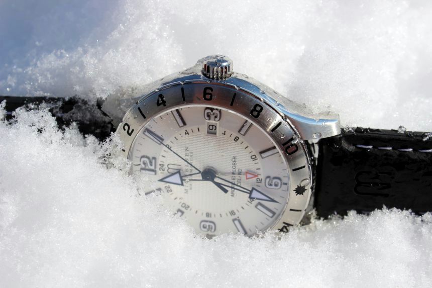
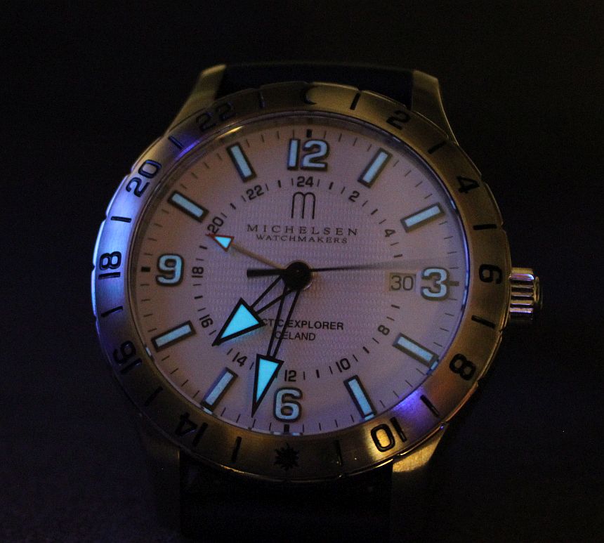
And now we’re back out at that flat expanse–and what better place to mount the applied numerals and indices? These all but fill the available space (from inner to outer edge), which, when combined with how raised they are, creates a very bold visual. Additionally, as these are luminous components, it makes for an extremely visible watch, whether your surroundings are dark or bright. This is made possible by the partially-skeletonized handset, of course. While the inner stems are simple outlines, they are (again) bold arrowheads that point out the time precisely, extending to the edges of their appropriate tracks. Proportions on handsets is one of those things that us watch writers tend to harp on a bit, but here, I think they’re spot-on.
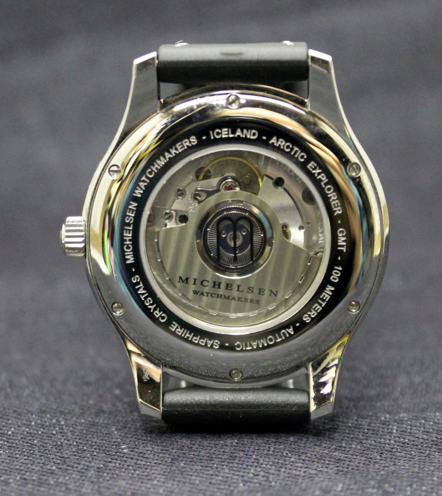
As I mentioned a bit previously, those hands (including the independently-set GMT one) mark out time via two registers on the dial itself (12 and 24 hour), allowing for two different times zones. If you recall, I said you could pick up a third time zone if desired, and that’s enabled by the uni-directional bezel (and it’s 24-hour markings) that surrounds the flat sapphire crystal. Now, if you’re reading any other reviews on the Arctic Explorer, you’ll know that this bezel is often called out as a point of contention.
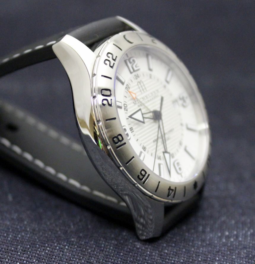
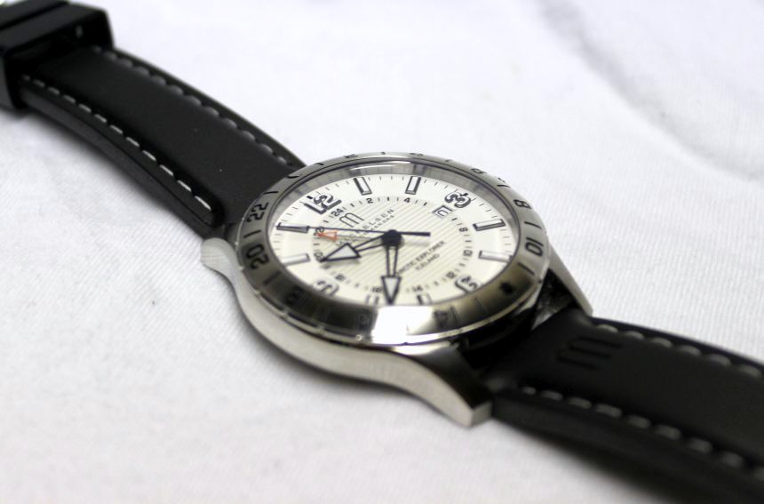
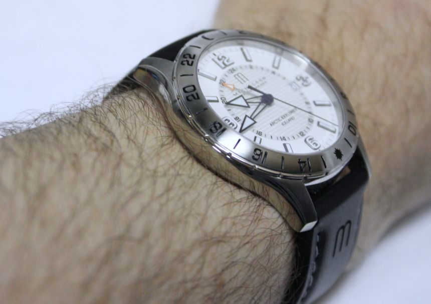
First off, several have not been fans of the tapered design, as it doesn’t really give the grip we’re used to when using a raised bezel design (take a look at your favorite diver, for instance). On the other hand, I actually like the rounded/tapered design, as it gives a much smoother look and feel to the top of the watch. It’s also helpful in preventing accidental resets of the bezel, as there’s no raised edge to get caught on things. This is of note, because, as others have noticed, once you get things turning, this is a bezel that moves easily.
The second main complaint I’ve read about the bezel deals with the fact that it’s a uni-directional one (rotating counter-clockwise), with the issue there being that 24-hour bezels are often times 24-click bi-directional ones, allowing for quick and easy setting. I had some discussion around this with Robert Michelsen, and the reason they went this way is a simple economy of scale for a smaller brand. When developing the Arctic Explorer, they were making a sports watch that happened to be for people that lived in snowy places. As such, they wanted to leave the possibility open for developing a compass-style bezel (for which the regular GMT click pattern wouldn’t work).
This is one of those design decisions that smaller brands often have to deal with–how to enable future revisions (or function changes) to their time pieces, without requiring revisions and re-tooling for creation of components–in this case, it would be the case and bezel that could have been impacted. For my usage, I felt that the diver-style functioning of the bezel worked just fine, as I’m often a “set it and forget it” sort of wearer. Overall, I just really liked the smoothed out style that the bezel offers, along with the stylized day/night indicators that appear on it as well. I’m not discounting the points others have raised. It’s just for me (and perhaps you as well), they’re really moot points.
