I’m always looking for something different – a different look and a different story – for a watch whose design journey began on the road well-travelled, but ended up miles off the beaten track. If the design detour takes in the odd haunted forest, forbidden castle, or a dragon-infested dungeon, all the better. I like new watches to look new, to look like they’ve sprung from a fantasy right onto an open-minded wrist. Enter the MCT Frequential One F110 – a vision in black and a neo-gothic master-stroke.
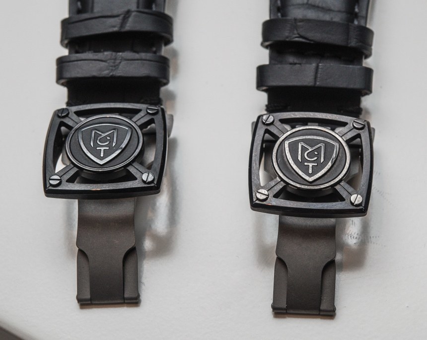
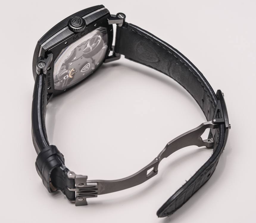
When a watch can be identified by the silhouette of its buckle, you know you’ve stumbled upon a brand creator’s wet dream. The MCT Frequential One F110, which just so happens to be MCT’s “entry-level” model, has a double-deployant, grade 5 titanium clasp that got me excited. It isn’t the most wonderful clasp I’ve ever seen in terms of design or even functionality – it doesn’t work differently or better, it just looks like nothing I’ve seen before. And it looks awesome. It also contains 18 parts. That’s a lot for a clasp. When this much effort and investment goes into the buckle, you know you’re dealing with a serious piece of design and engineering. So if this is the level of attention MCT gave the buckle, what did they do with the watch head?
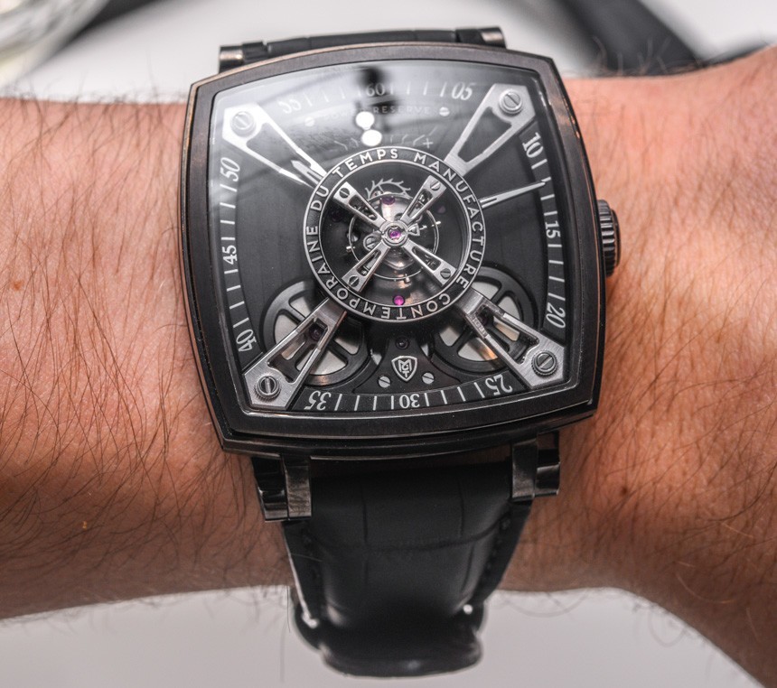
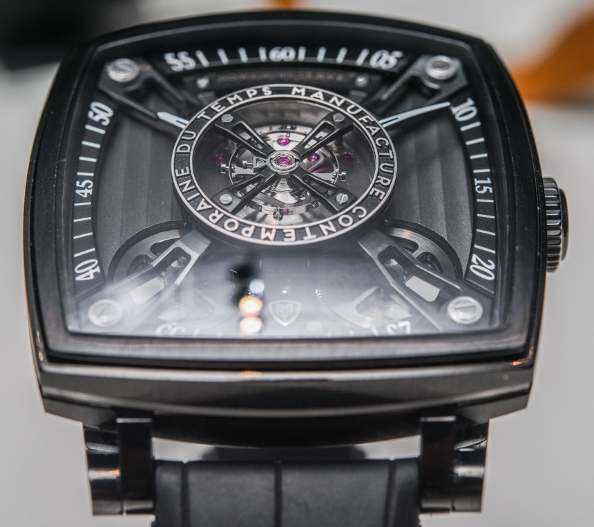
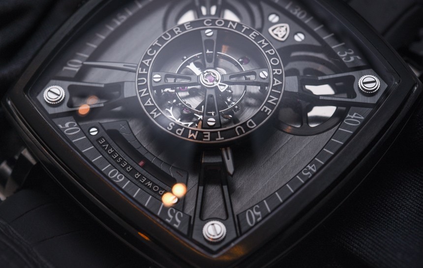
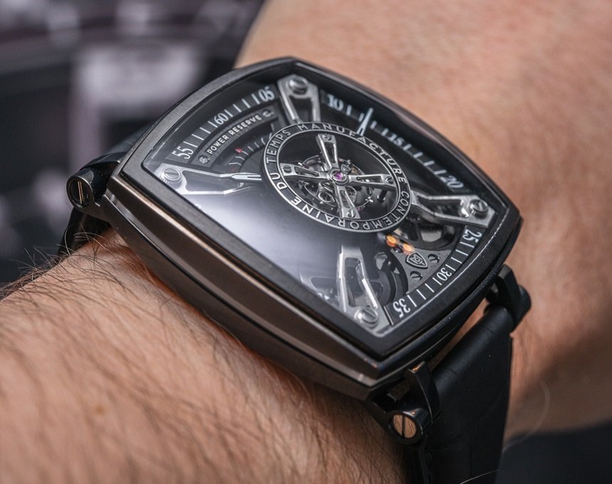
What they did was create an aesthetically stunning frame to display the slow-beat balance wheel in the dead-centre of the dial. This is not a new idea, but it is a feature I truly love. Many of my favourite watches from the last ten years have utilised the balance as the centerpiece. Dropping the train count to 18,000vph also makes sense, as it displays the balance in much more digestible fashion. The slow beat gives you chance to see the spring breathe and the wheel travel throughout the supplementary arc.
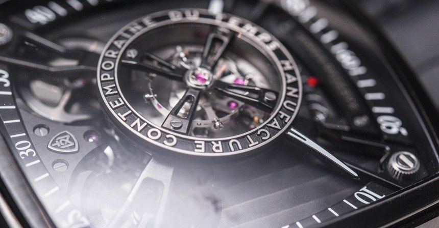
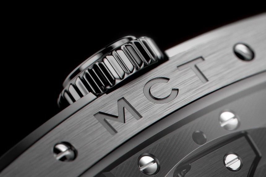
The brand name MCT stands for Manufacture Contemporaine du Temps, which roughly translates into something like “contemporary manufacturing of time,” or “Contemporary Time Factory.” Either way, you get the idea. The brand name itself is a mission statement. Here is a team intent on providing something arresting and, most crucially, something current. Recently in watchmaking, a strange, lifestyle-inspired trend has emerged. Whereas some of the major players in high-end horology are still labouring away to produce fantastic time machines that record and display time in the most accurate and precise fashion, a large group of (mainly) lower-priced brands are taking a relaxed approach to the recording of the seconds, or even minutes in some cases, to carry off, instead, a strong aesthetic that will get them noticed.
We’ve seen an array of single-handed watches (particularly Meistersinger), or watches with creative, evermore artistic time indicators (like Konstantin Chaykin) that are not as precise as we might expect for a watch costing thousands of dollars. But then, the message is the whole point – life is not about the seconds, its about the moments; it’s about beauty in little things and taking the time to appreciate them, rather than having your time taken up by a ceaselessly ticking seconds hand reminding you you’ve got somewhere to be or something to do.
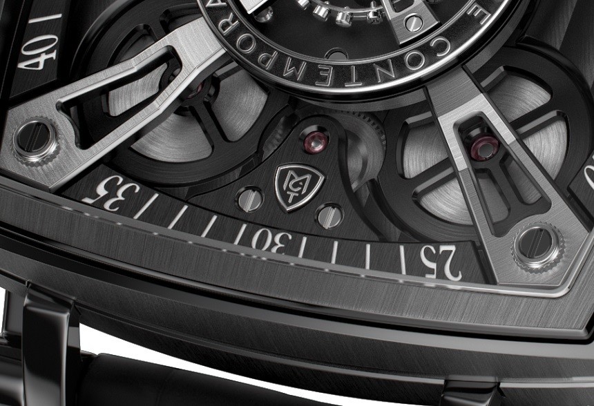
The MCT Frequential One F110 is not as illegible as many of its laid-back peers, but readability does play second fiddle to design. The hands protrude from beneath the prominent balance, centrally mounted, but trumped in importance by the regulating organ that gives them life. Make no mistake, this is an aesthetic treat, but it might take a little getting used to if you’re planning on reading the time with a glance.
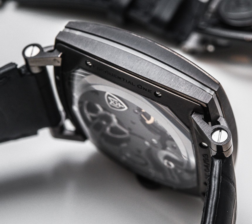
Avant-garde as the time display may be, the 42mm cushion-shaped case is a nod to the past. Again, though, it is fair to say that MCT have been quite creative in their execution of a traditional idea. We live in very accepting horological times – myriad case shapes can find a foothold in an increasingly open-minded marketplace. This case is classed as a cushion shape, although is more reminiscent of a steeply-sloped Tag Heuer Monaco, which I would be inclined to describe as a square.
However, the curvature of the glass (which has an anti-reflective coating on both sides) is quite significant and reduces the height of the case at the centre from 14mm to just 6.9mm at the edges. This unusual case is made even more wearable by the fact it is made of DLC coated grade 5 titanium, keeping the weight down significantly. It’s not a simple thing, though. There are 45 separate components in the case itself (about ten shy of a Swatch watch in its entirety), and it is water resistant to 30 meters. That’s not bad for a case that has a seam of sapphire running through the middle of it…
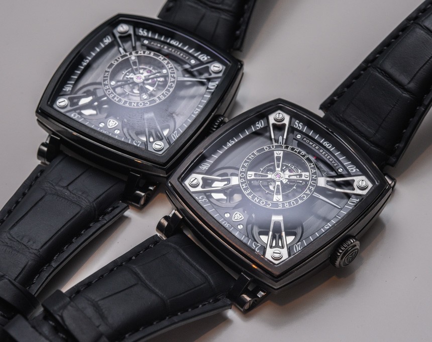
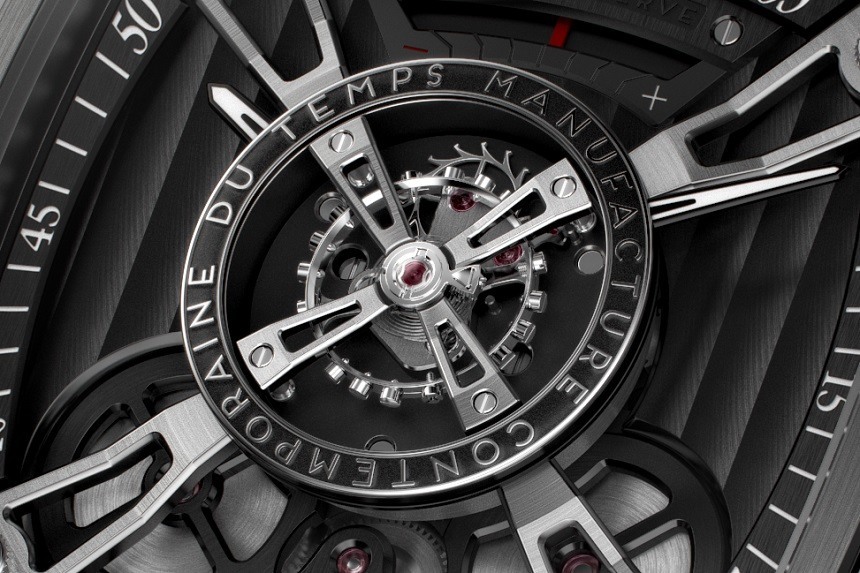
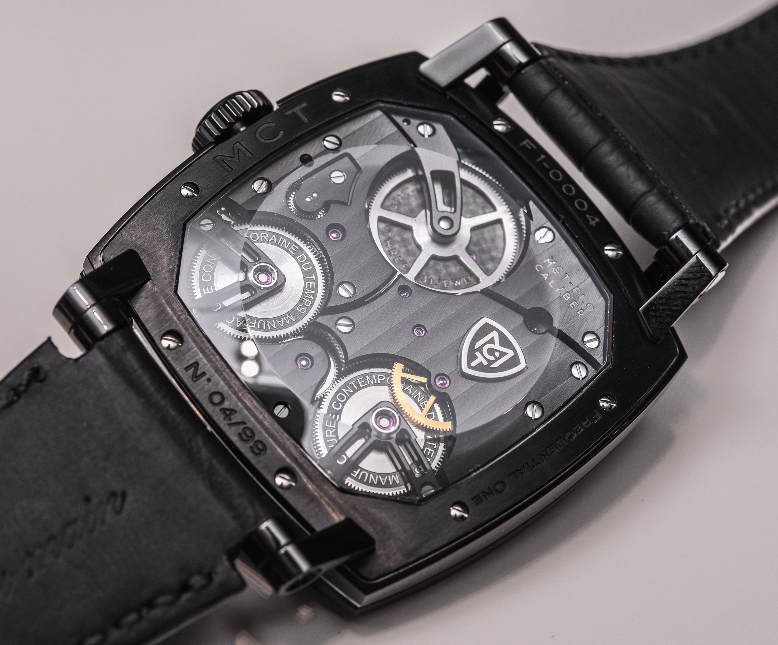
The movement, dubbed the MCT-F1.0 contains 279 components and measures 33x33mm and 10mm tall. The bridges feature a Geneva wave pattern and hand-applied chamfers. There is a power reserve indicator at 12 o’clock, which has been cleverly worked into the design. It’s a welcome touch too, because this is a hand-wound movement, so its helpful to know when you’re about to run out of juice. The watch features two barrels, both of which are visible on the dial side (adding to the pleasing symmetry of the design) and amount to about three days of power reserve.
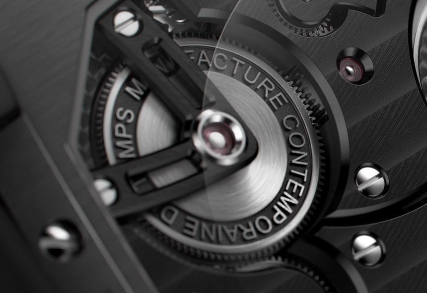
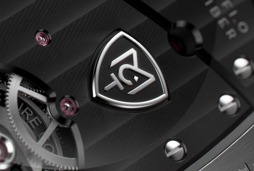
But the ting that really grabs me about the MCT Frequential One F110, is the way the movement and the time display feel totally integrated. Sure, I’ve seen countless skeletonized or simply ‘dial-less’ watches in my life, but this feels a little different. The four, corner-mounted bars that intersect the three dimensional plane normally reserved for the hands, to support the engraved balance bridge that bears the brand name in full are, to me, an amazing angular accomplishment. There’s a lot going on with the dial, but none of it feels forced, and the end result still seems well-spaced. The brand logo – the MCT shield – is superbly rendered and neatly applied to a space that feels too well suited to its location for it to have been accidental. Even with this branding, the warped font of the chapter ring, the contrasting finishes and slow-beat balance in the middle of it all, it still feels calm to me. Maybe the subdued, industrial colour scheme helps keep this watch demure, but it certainly feels like there’s something deeper setting this watch apart from some similar designs.
I think what it probably is, is that this is a watch whose design principles are more often seen in jazzy, entry-level luxury pieces. In this price bracket, watches are often a little more traditional or mechanically complex. What MCT have done, though, is take a design brief that is really current and really cool and thrown everything (including the kitchen sink) at it. What they’ve achieved is, in my opinion, a visually delightful timepiece (available in steel or DLC dial-bridge finishes with matching clasps) that perfectly represents the brand. The fact it carries a CHF 44,500 price tag might well put off potential purchasers who will find plenty of more esteemed names clamouring for their business at this price point, but it is something different, for sure. Something different and something beautiful – not a bad combination for a watch that is full of contradictory elements that somehow manage to work in horological harmony. mctwatches.com

