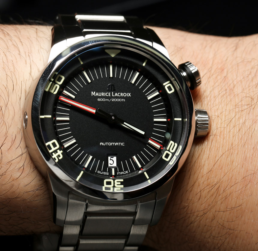
After meeting with Maurice Lacroix at Baselworld 2013, I walked away very impressed with the new Pontos S Diver. I was excited to see their new three-hand dive watch as I knew it was going to be introduced at the show. You see, I am among the many people in the world who absolutely loves dive watches but haven’t quite mustered the time to… you know… actually dive. It is on the list though. So why is it that I am so infatuated with timepieces designed to go underwater? I am not sure exactly, but I do know that dive watches (the good ones at least) seem to strike a great balance between style, utility, and durability. Perhaps those things together make for what I personally want most in a timepiece.
Tool watches appeal to a lot of guys because they are meant to be little durable machines you can take around with you anywhere, and are actually useful on a daily basis. Divers are like little portable submarines. One thing that dive watches are designed to deliver well is legibility. Imagine trying to read a watch dial in murky water. A dive watch needs great lume, easy to see hands and relatively simple dials. Dive watches really evolved into what they are today in the 1950s and 1960s when diving itself evolved. Brands like Rolex and Omega fought one another to make dive watches with the most street cred. They each succeeded and many of today’s most popular dive watches began life in those eras. That fact however is a double edged sword, because today’s watches are still designed like their ancestors were half a century ago. Where are the modern divers that still feel classic?
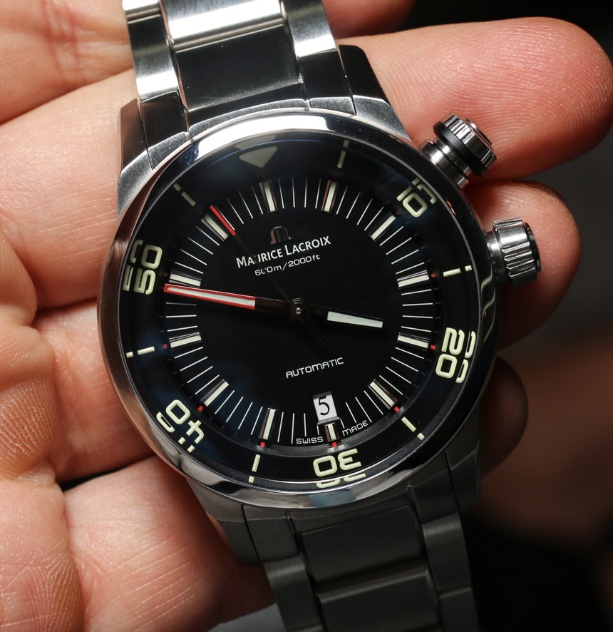
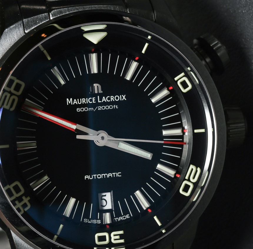
Look through images of today’s dive watches and the newest ones all tend to be very “retro inspired”. That isn’t a bad thing, but I personally lust for the future. We buy high-end watches for quality and design. Heritage and all that is nice, but sometimes I want the watch industry to be a bit more like the car industry and push forward with their designs. To be honest, there isn’t a total deficit of futuristic dive watches, but few of them seem to hit the mark when it comes to having “timeless” potential.
I ask myself if it is possible to use lessons from the past to make a great dive watch that is very “today”? Further, what is it that watch designers in the mid 20th century knew in order to have made so many fantastic designs that still endure today, and will continue to endure for decades? I don’t know, but older designs do have the benefit of the test of time. That means that we only remember the good designs. No doubt the last half century gave us loads of terrible watch designs that we have (perhaps for the best) forgotten. So the question remains, how does a company today make a good contemporary dive watch?
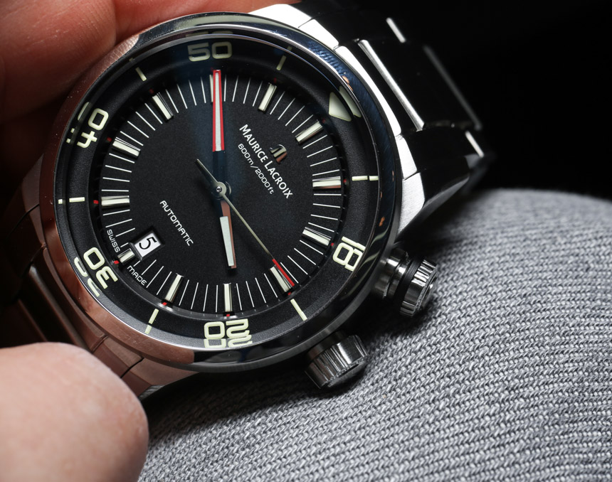
Whatever the answer may be, I think that Maurice Lacroix has at least some of the formula in this new dive watch. There is little “new” in the watch, save for a compelling design that mixes a lot of things we like from the past with an optimistic vision of today. The Pontos S Diver is among the very few dive watches released today that isn’t afraid of living in “the now.” It has a design that speaks today’s language, while recognizing the past, and looking a bit into the future. That may sound a bit pretentious and lofty, but I really believe it. No watch is perfect, but if I were to tell young watch designers which modern dive watches are doing it right, I would point them to this. On top of that, it isn’t wildly priced which means a lot of people can actually fathom owning one.
So a bit of modern history. This isn’t the first watch from Maurice Lacroix called the Pontos S Diver. That was actually the first name of the now Pontos S Chronograph (hands-on here), sometimes just called the Pontos S. This watch was released in 2012, and was updated in 2013 with the Pontos S Extreme versions (hands-on) with the Powerlite cases. As you can see, this three-hand model evolved as a simplified version of the chronograph. Each share a lot in common, including the case size and special crown to turn the inner rotating bezel, though the Pontos S Diver is much more of a real dive watch. The Chronograph has 200 meters of water resistance (not bad at all), but the Diver ups that to 600 meters and throws in a vestigial helium release valve. No one needs that latter function, but in going with tradition, the Swiss simply feel they need to include it for good measure.
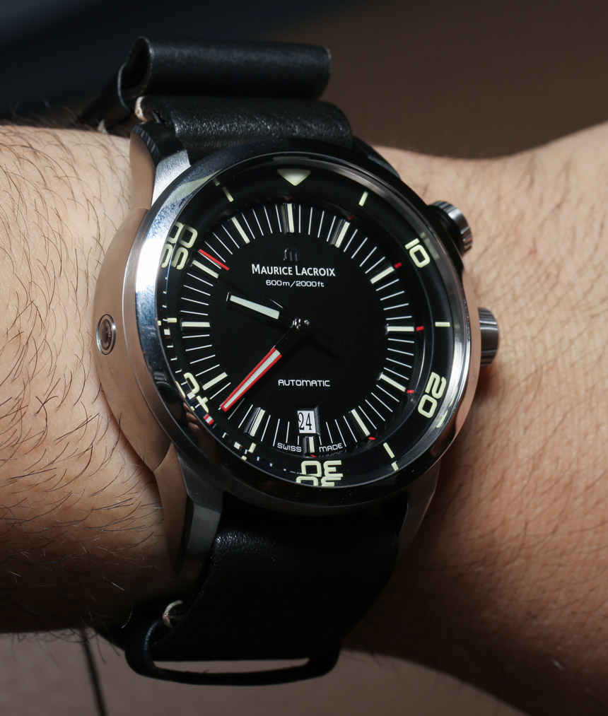
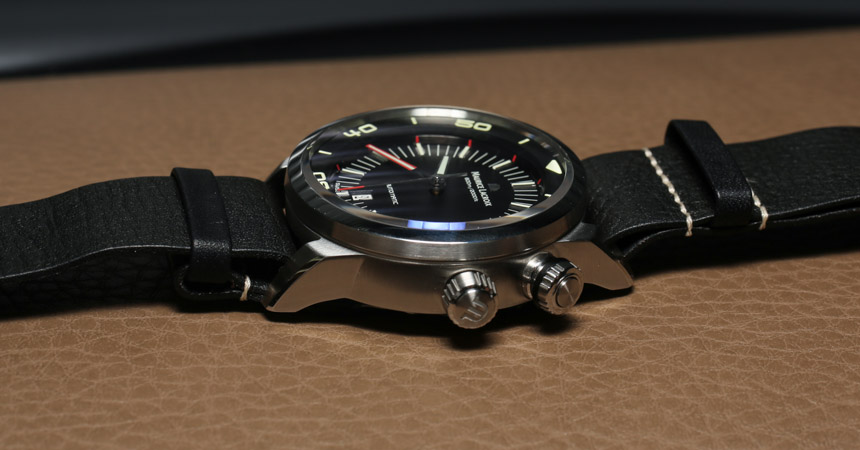
I will be honest in saying that Maurice Lacroix has made me like features in the Pontos S Diver that I don’t tend to like in other watches. Examples include inner rotating bezels, cases with two crowns on the same side, red colored minute hands, and oodles of NATO straps everywhere. Each of these are part of the design, but they are done in a way that makes me not just tolerate them, but appreciate them. Let’s discuss the bezel first. Dive watches have rotating timing bezels that are usually operated from the outside. Some have inner bezels that use a crown to turn. I tend to not love the look of these (just a personal choice), but here, the inner bezel works very well. First of all, when looking at the dial it doesn’t scream “there is a highly contrasting rotating part in here.” The bezel could just as easily remain stationary and look very nice. Second, the system to operate the inner bezel uses a special crown that requires a short press inwards to unlock it and then it can be turned. Often these require unscrewing the crown, which I find annoying. Last, the crown for the bezel is placed in such a way so as to be at the 2 o’clock position while the main crown is still at 3 o’clock. Sometimes watchmakers place the main crown lower at like 4 o’clock in order to be symmetrical. I get why they do it but I’ve just never liked how that looks. For me, the crown layout on the Pontos S Diver is ideal when having two crowns.
At 43mm wide the case size feels extremely appropriate for the widest amount of wrists. With the thinner bezel, the size feels perfect on my wrist. In steel the case is brushed but has nicely polished accents which I really appreciate. This same treatment is used for the bracelet, and lends itself well to creating a look that is classy but also very utilitarian. Modern elements on the case abound. Curves mix with angles in a way common to modern automotive design as well as architecture. This gives the relatively rounded case a fresh “sharp” look that feels very much in line with a lot of the new things we buy. This is also echoed on the dial, which I feel is a good mixture between classic minimalism, and modern lines and type faces. more»
