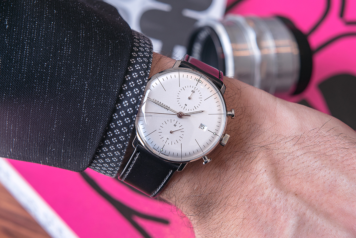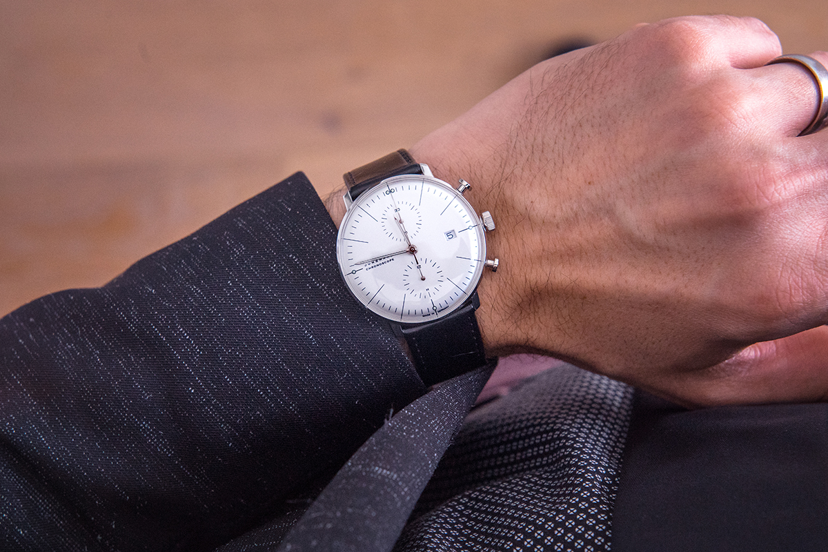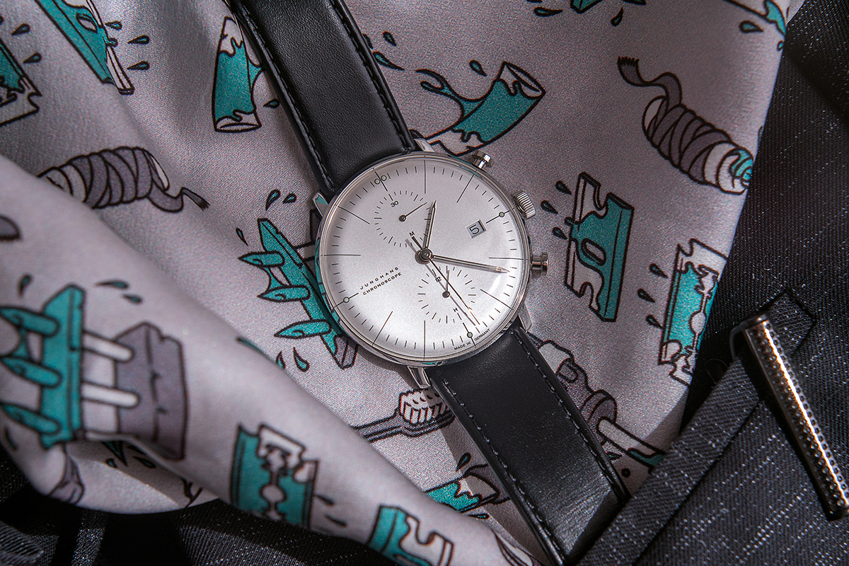
It’s safe to say that any seasoned watch nerd would recognize the Max Bill line from the German brand Junghans. The simple yet distinct design has kept this collection desirable since the first release in 1961. These watches, although not for everyone, are the epitome of mid-century modernism and Bauhaus design. And for once, the previous statement isn’t just marketing fluff. Max Bill was a student at Bauhaus, in Dessau Germany, and the experience was definitely a formative one. Born in Switzerland in 1908, Max Bill would become one of the prime movers within the modernist design movement in Europe. Eventually, he landed Junghans as a client, and his involvement left a lasting mark on the German brand, which is still evident in watches like the Junghans Max Bill Chronoscope.
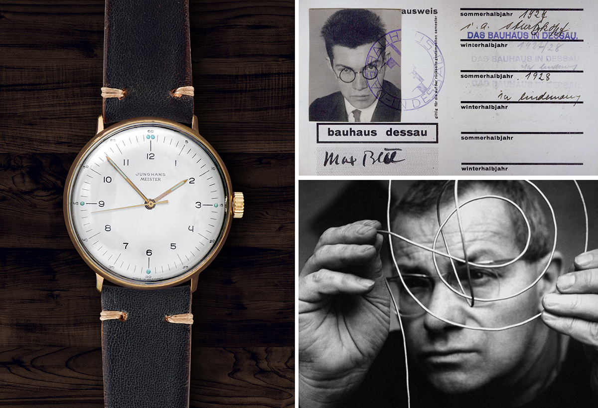
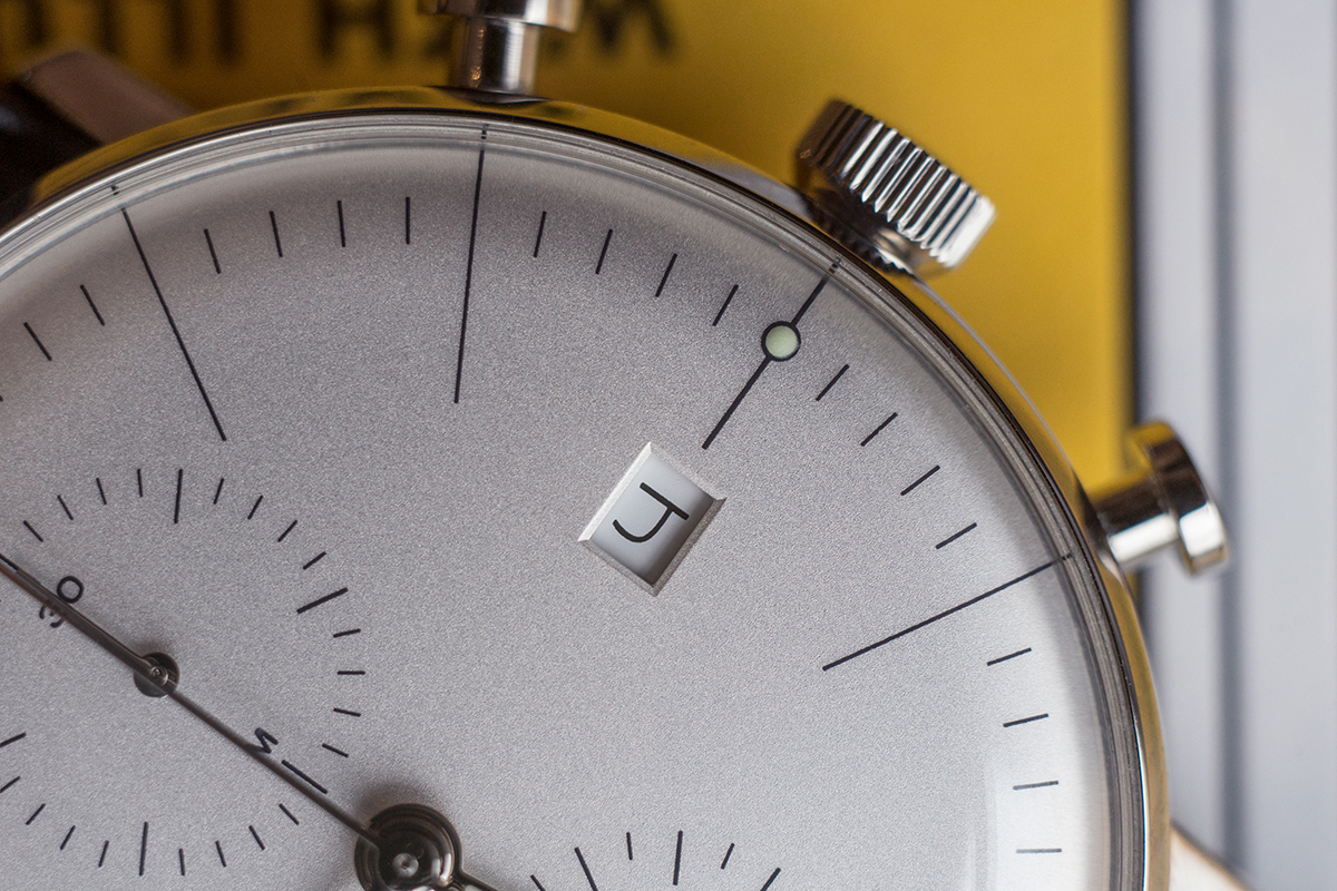
Now to be clear, the Max Bill Chronoscope series was not designed by Max Bill. Rather, these watches are a faithful extension of the iconic three handed watches designed by the man himself. And they are indeed true to the original intent, right down to Max Bill’s distinct rendering of the Arabic numeral ‘four.’
Max Bill was also a professor of design, and I feel the accurate posthumous creation of the Chronoscope speaks to the strength of his teachings. His objective as a designer remains clear, and this watch is living (or ticking) proof of his legacy. As a professional designer myself, I feel a strong connection to this watch and what it represents. It exemplifies an entire movement in art and design, and seems to encapsulate the essence of a rather prolific individual. It’s the kind of object designers dream of creating.
Enough About Art & Design… Let’s Focus On The Watch!
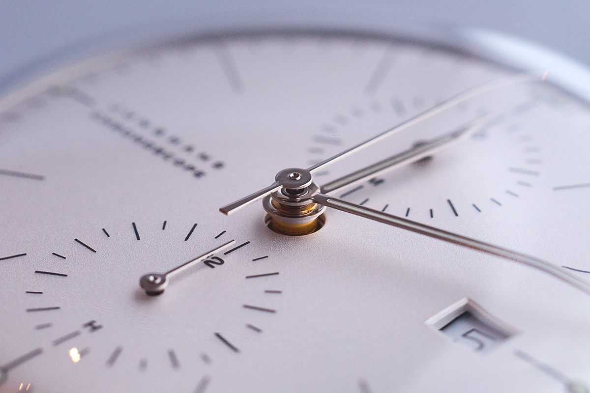
Now yes, I am certainly pre-disposed to be a complete sucker for this watch, but I feel like it deserves the attention it gets. It is powerfully simple, with its ‘flying-saucer’ case and watch face that is 99% dial. These small details add up, and give this thing a quirky presence on the wrist.
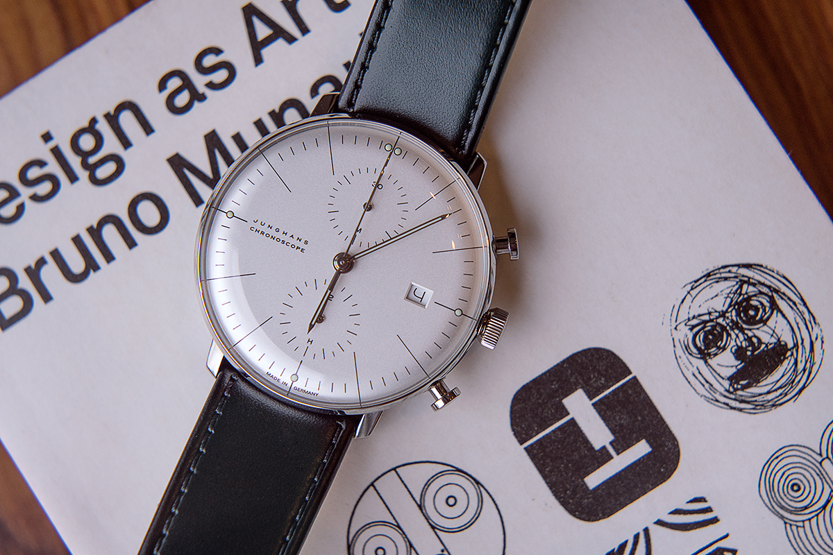
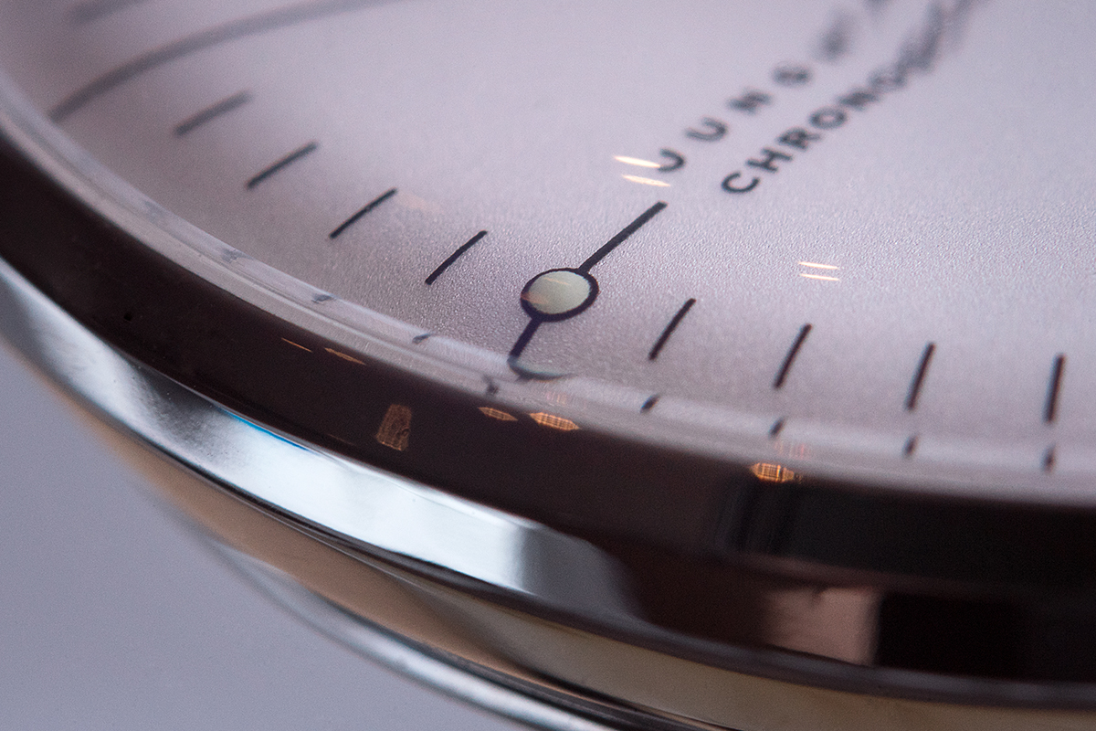
The pushers feel sharp, and their rounded plunger design feels era appropriate. Everything is polished, which made shooting this watch rather difficult, but it contrasts well with the matte textured dial pleasingly. There was one potential downside to the fully polished case, but I will get back to that.
On the inside (although I didn’t open this one up) the Valjoux 7750 uses just about every millimeter of available space. As a result, the Max Bill Chronoscope wears quite well. It fits under a shirt cuff, even with the large domed plexi crystal on top. Additionally, with this particular case-to-movement ratio, you definitely feel the “rotor wobble” that the Valjoux 7750 is known for. Personally, I quite enjoy this movement and have many watches powered by it. It reminds you you’re wearing something mechanical, and it makes my inner idiot savant smile every time it happens. (Don’t judge. We all have our things.)
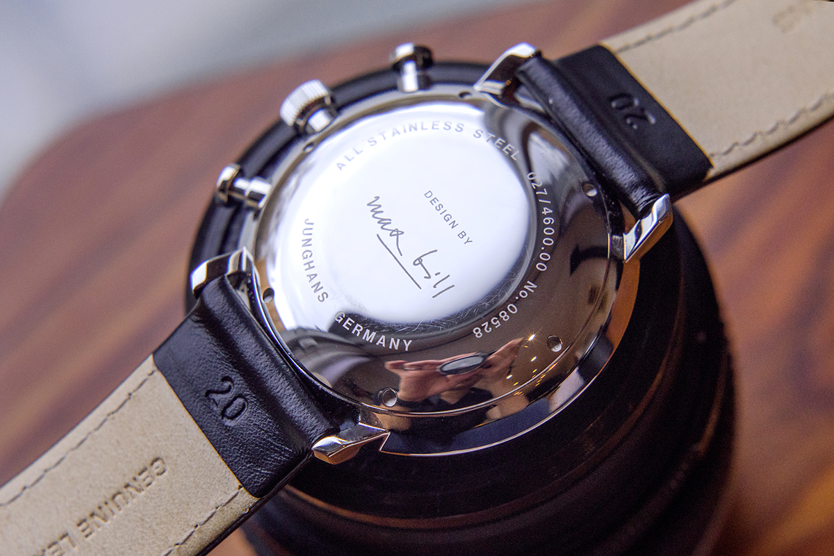
The caseback is closed with an emblazoned Max Bill signature, and as you can see I have already managed to scratch the polished finish on the back. Perhaps, the polished finish and shallow etching on the caseback are my only gripe with this watch. I think a deeper engraving of the signature on the caseback would allow for eventual refinishing. Also, if they went for a brushed finish on the flat portion of the backside, it would help hide the tiny scratches you get from putting your watch on the bedside table every night. Just an added bit of ‘form follows function’ I think would help maintain the longevity of the piece.
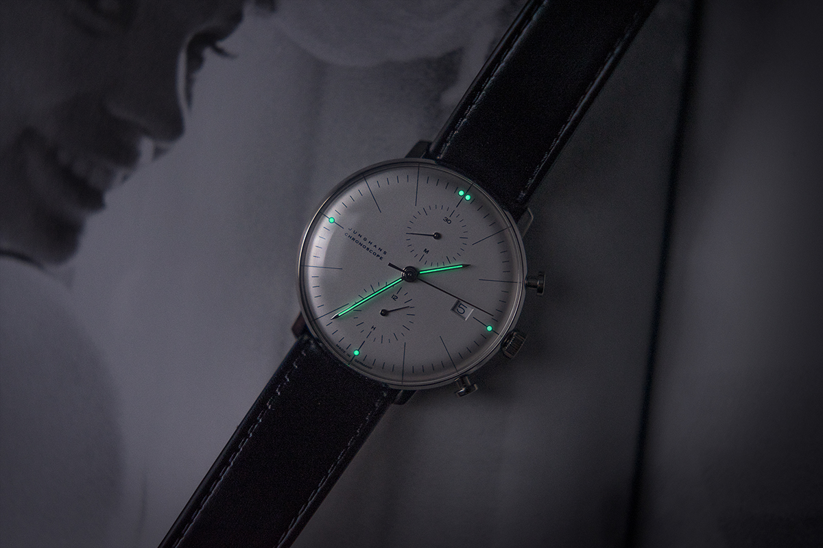
One small thing I love on this watch is the very minimal lume. It’s super faithful to the original 1961 design, and it looks really damn cool when you see it light up. It’s crisp and bright too, and as this isn’t a tool/diver watch, it’s really just an extra bit of fun. Looks neat when you catch a glance of it in the shade.
The silver dial version feels the most ‘mid-century modern’ to me, so that is what I chose to review. It looks like a white dial in stark daylight, but pop indoors and it feels much more grey. I also noticed it picks up the color cast of your present lighting, so under certain lighting it looks quite creamy in tone.

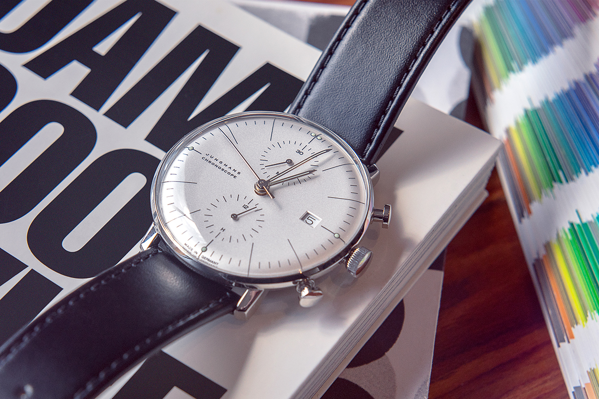
The Max Bill Chronoscope comes with an unpadded classic leather strap, or a Milanese style mesh bracelet. I would love to see this on an aftermarket Gay-Freres style beads of rice, or Bonklip style bamboo bracelet, but the leather does suit it very well. It’s a neutral design, so you could definitely have fun playing around with straps of varying texture and color. It’s a perfect watch for any strapaholics out there.
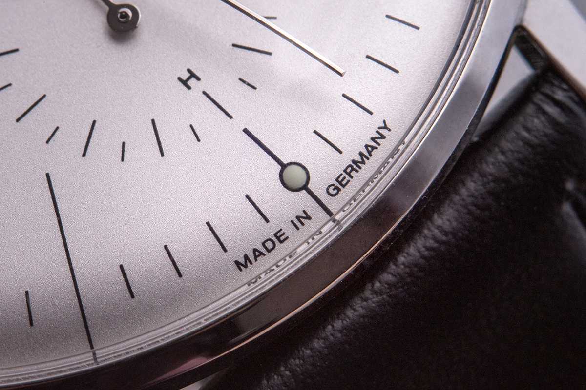
The Max Bill look is timeless, and potentially polarizing in today’s Daniel Wellington polluted market. But back in 1961, this watch and this look were original, and marked the beginning of a new design era. Around 2007, when the Chronoscope was added to the Junghans Max Bill collection, horological blogs and online commentary were in their early days as well. It feels serendipitous that this prolific design would re-emerge during the beginning of the modern mechanical watch craze. I’m also quite sure that coincidental timing helped keep the Max Bill collection top of mind to this day.
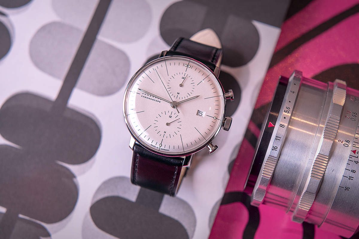
In short, the Junghans Max Bill Chronoscope isn’t for everyone, but it certainly is for people like me. It’s a simple watch with nothing to hide, and I have enjoyed wearing it immensely. The example shown here will run you $1,865 USD, and there are a few interesting variations on the theme for you to choose from. junghans.de
Necessary Data
>Brand: Junghans
>Model: Max Bill Chronoscope, 027/4600.00
>Price: $1,865 USD
>Size: 40mm wide (w/o crown) 14.4mm thick (20mm Lugs)
>Would reviewer personally wear it: Yes.
>Friend we’d recommend it to first: Art-Nerd pals & design fetishists (of which I count myself among).
>Best characteristic of watch: Lots of dial. So simple it’s bold.
>Worst characteristic of watch: Caseback etchings should be deeper for preserved longevity.

