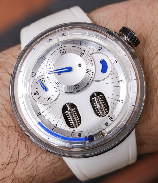
For 2017, Swiss HYT released the H0 collection of watches. The HYT H0 watch (which in standard written practice uses a subscript “0” so as not to have the name of the collection look like “ho”) is a visual reinterpretation of the brand’s original watch, the HYT H1 (which originally debuted in 2012). What is interesting for me to point out is that both the H0 and H1 have the same movement and are “futuristic” looking watches. With that said, each approaches futuristic design in a novel manner, and neither is arguably more futuristic than the other.
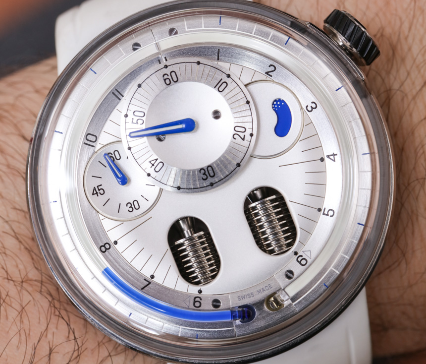
To remind you, HYT began life as the ‘hydromechanical horologists.” If you don’t know what that means, that is OK. The implication here is that all HYT watches use liquid as part of the way the mechanical movements display the time. A sapphire crystal “capillary” tube system is filled with colored liquid. That liquid moves along the tube in indicating the minutes, powered by a bellows system that uses two bellows-style chambers to move the relative position of the liquid. This system has proven to be relatively robust, and visually appealing. As such, you can see the almost total circle of the tube system which runs a long an “hours” indicator track. Other dials are used for the minutes, seconds, and movement power reserve indicator.
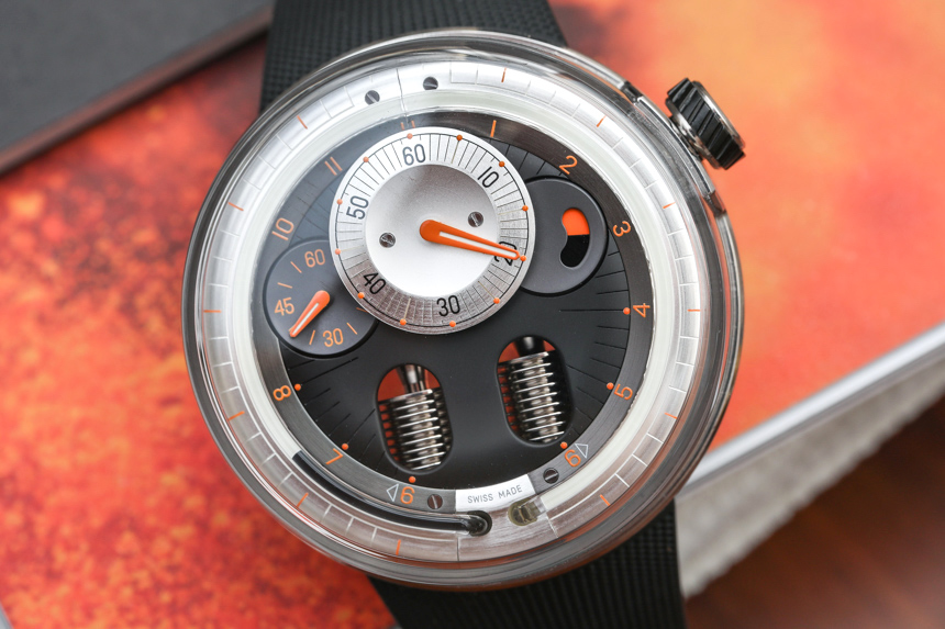
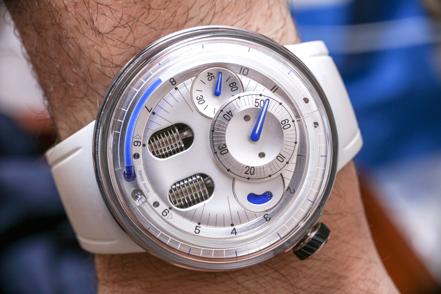
Assuming the dial colors are right, the layout of how the time is displayed on most HYT watches is surprisingly legible as well. At least I found that to be the case on the HYT H0 Silver, which I reviewed along with the H0 Orange for this review. I still don’t know why HYT decide to go with a “0” name. Why not HYT H5 or something like the “H1 Neo,” or something like that? Maybe call it the H1.5. This watch might have a totally new case, but why use 0 as part of the name? Are we going back in time? Is it worth the watch looking like it is called “the Ho?” Regardless of the name, the H0 watch collection feels refreshing, and is a very good use of the technology and visual themes HYT has developed in its five year current lifespan.
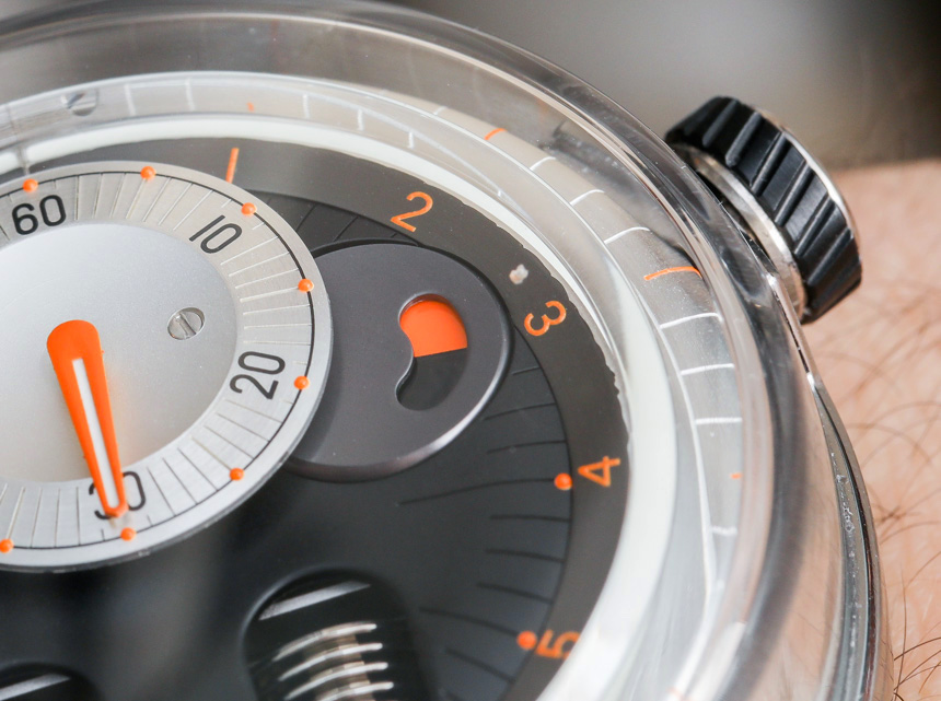
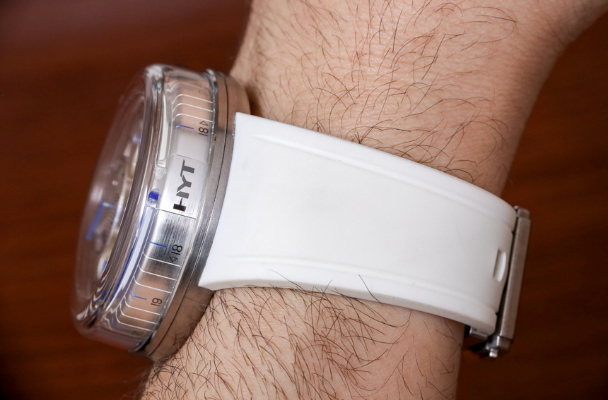
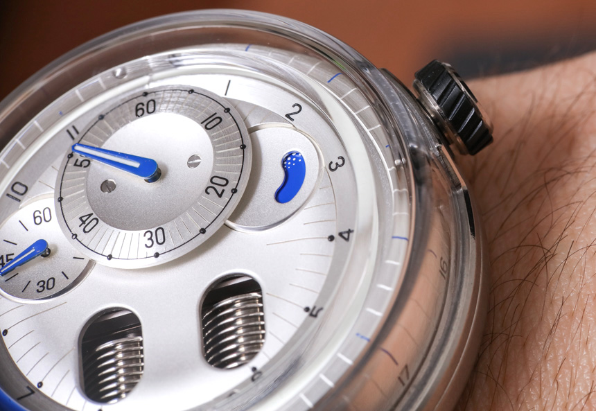
HYT’s own language about the design of the HYT H0 watch is a bit confusing. Part of the design sensibility appears to be related to droplets of water. The other part seems to be a “return to the basics” notion of where the brand started from. Perhaps that is HYT saying that they intend for the H0 to look like what the H1 might have looked like if the brand started differently? I’m just not really sure.

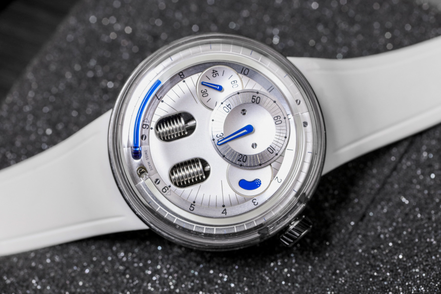
I found a lot to like about the H0 Silver and Orange while wearing them around. I admit to liking the H0 Silver a bit more – but perhaps because it is more legible in my opinion, and the lighter, friendlier colors allow me to feel like this was an item taken from a spaceship of tomorrow. The watches obviously rank high in terms of visual distinction but also wearing comfort. Thus, you can have a rather original watch, that isn’t a pain to wear. Such a consideration is, unfortunately, a common issue in timepieces such as this.
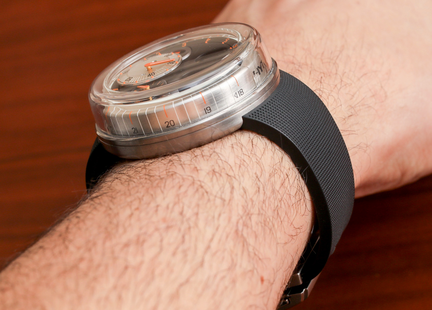

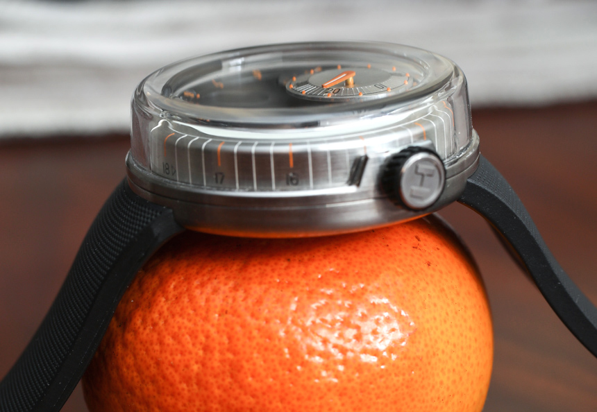
Wearing size is large, but like I said, comfortable. The lug-less case design helps it wear small, but the H0 case is still 48.8mm wide and 17.9mm thick. Most of the case is covered by a bowl-style sapphire crystal, and the case back is satin-finished and brushed titanium. What makes the design more interesting is that the dial of the watch is bowl shaped as well, with the top crystal looking like a very different type of structural device in the H0 as it does in most other watches. Thus, the crystal isn’t just a place to see the dial, but also a significant part of the case construction.

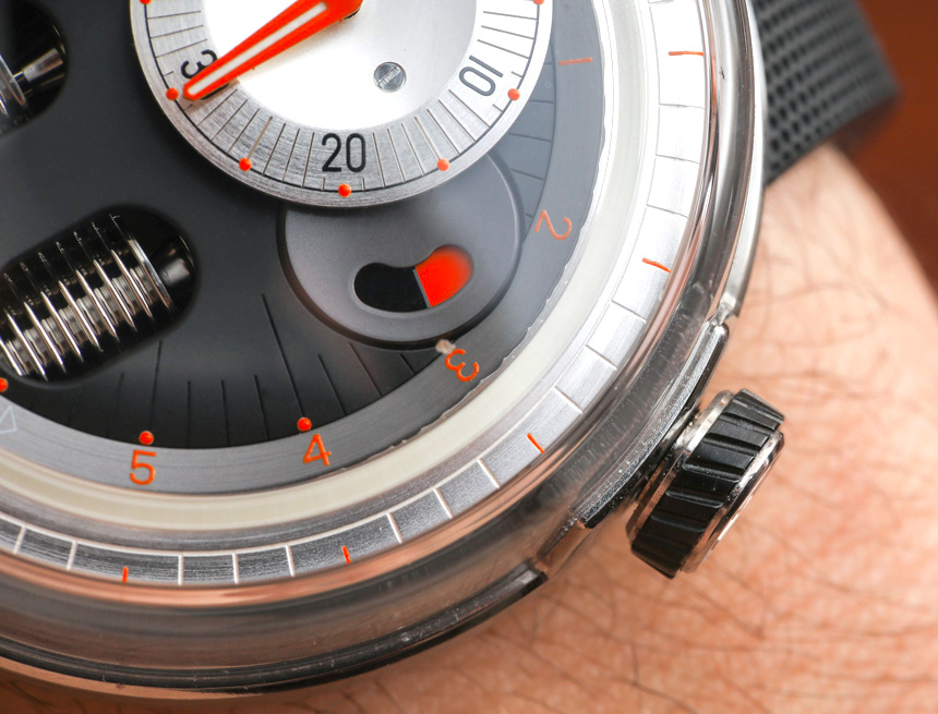
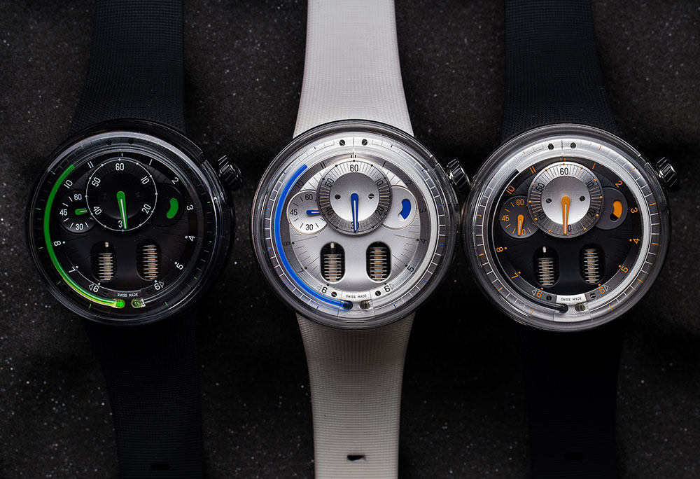
The hour part of the dial which you can read from the side of the case has 24-hour markers on it, which aren’t too useful but offer a bit more functionality. Right on top of it is the sapphire crystal tube which holds the time telling liquid for indication of the hours. In the H0 Silver, the fluid is a lovely blue, black in color for the H0 Orange, and green in color for the H0 Black. The green and blue fluid colors are the most legible. What is also fun to notice is how luminant is applied to the dial. There is a strip of luminant under the capillary tube (which is cool), as well as luminant on the traditional hands.
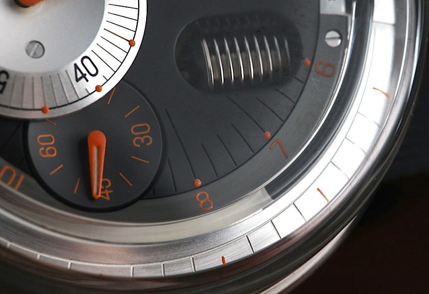
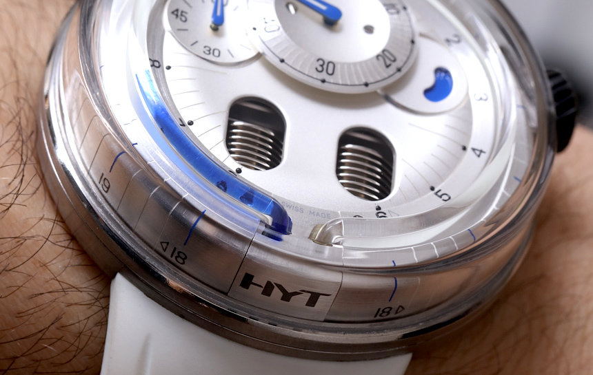
The use of shapes, colors, and finishes on the dial of the HYT H0 is very nicely done. You get a combination of traditional legibility, with a modern look that isn’t distracted by mere whimsical aesthetic devices. The dial very much wants to be an instrument for indicating the time before it wants to be a piece of pop culture futurism. That is important because at prices like this, even the most adventurous of timepiece collectors still want a device that is tool before it is a toy.
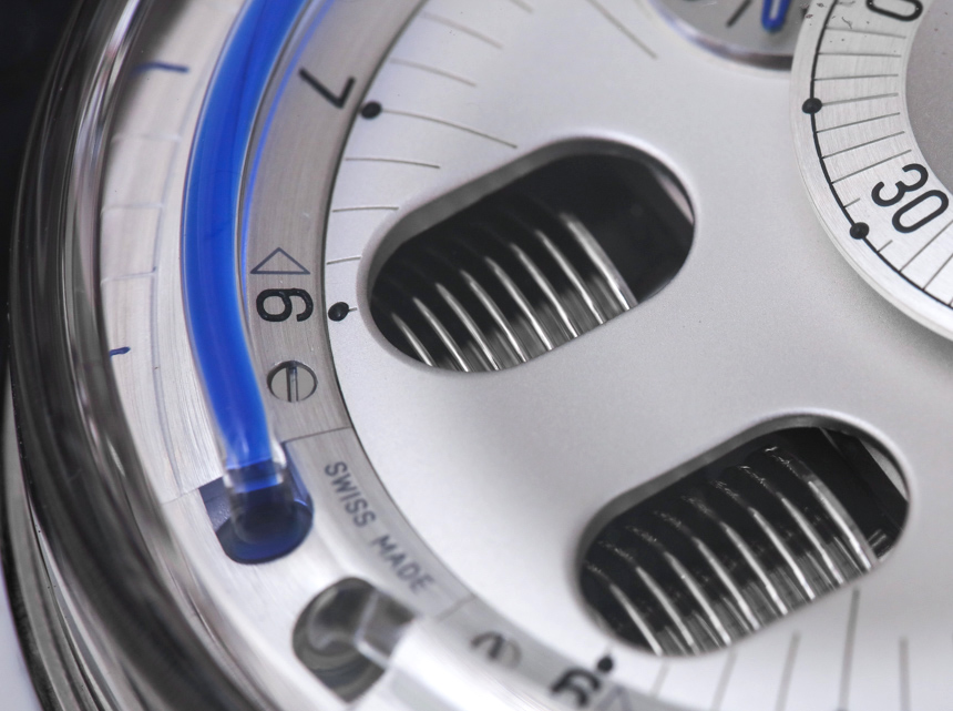
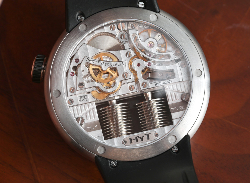
HYT fans will of course like the two oval-shaped openings on the dial that offer a view of the metal billows which control the movement of the hour marker liquid. Changing the time is a slightly slower process than on most other watches, but that is to be respected and understood in the HYT caliber 101 movement that is unlike most traditional wrist watch mechanisms.

