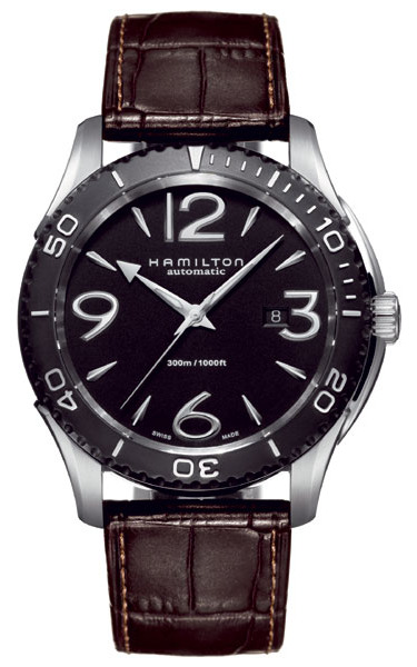
What is different about this Hamilton Seaview Automatic Diver watch? I thought about this question for a little while before writing anything down. I know I have seen the nautical almost art deco themed font used for the numbering before. The font is sort of an amalgamation of everything ocean-worthy and futuristic from 1920 -1970. Gently shaded, the large applied number totally make the watch. Without them it would be just another passable for forgettable Hamilton watch. The watch is pretty big too at 46mm wide, and the relatively small numbers on the rotating diver’s bezel don’t help the large wrist footprint. But that is OK, you want a nice looking watch like this to standout.
While it is has been hit and miss with me in regard to new Hamilton watches as of late, the volume sales leader for Swatch Group continues to push out a few good designs each year. I’d like to think that this is one of them. The case is PVD steel, but not all of it black. The bezel and face are however dark colored, and they play off the steel colored lugs and dial attachments (hands and indexes) really well. Another key feature to the good looks is the brown strap with a little bit of contrast stitching. I wouldn’t have assumed the color combination went together well until I saw the final result. It gives it a very masculine “I don’t care about fashion but still like to look good” design. The crystal is sapphire, and the watch is a true diver with 300 meters of water resistance. Inside is a sturdy ETA 2824-2 automatic mechanical movement that ought to work just fine in this watch. Best part is the price. At 645 euros retail, expect to see a US street price of $400 -$500.
See Hamilton watches on eBay here.
See Hamilton watches on Amazon here. [phpbay]Hamilton diver | Hamilton seaview | Hamilton dive, num, “”, “”[/phpbay]