Ah, Glashütte Original. When I had my first exposure to the brand, I reviewed a fairly simple model, the three-hander (with Panorama date display) Seventies. With that watch, I particularly enjoyed the styling, as well as the understated elegance that came from the layout. So that left me curious–would the same appreciation hold over when the number of complications increased?
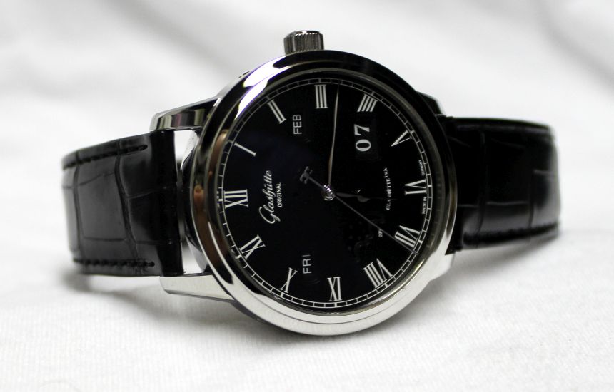
That’s a question I got to answer for myself after spending some time with the Senator Perpetual Calendar The story this watch tells is quite a different one, however. While I won’t go so far as to call it a dress watch, it is definitely not a sport piece. With the Senator, it’s all about marking the passage of time–in a multitude of time types.

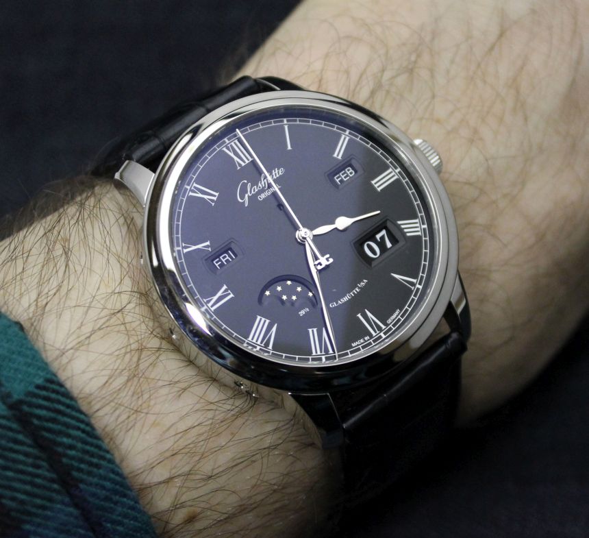
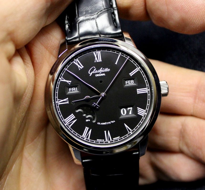
Most familiar (and expected), of course, are the hours, minutes, and seconds, marked out courtesy of the white gold hands. These hands take a mild leaf shape, except for the seconds hand. This is stick-straight, extending out to the edge of the dial, and is topped by the Glashütte Original logo. The hands work in concert with the white Roman numerals to present a sharp (and readable) contrast to the matte black dial.
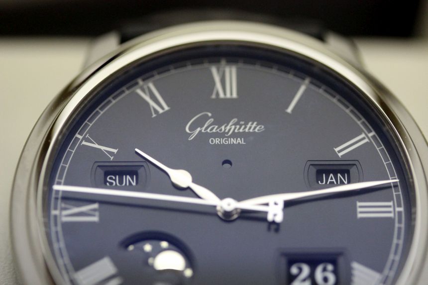
Expanding our view of time brings us next to the day–for which we have two readouts to help us along. The larger of the two would be the panoramic “big” date display over at 4 o’clock. This works as smoothly as any I’ve experienced, and the look is great. For the Senator, this is where we also see beveled “matte and frame” (think in terms of a picture hanging on the wall) look. While this is all done in the dial color, the additional texture (and levels) are both a nice break in the smooth surface, and make for a clean drop down to the display.

The other day-related complication would be the day of the week, which shows up between the 9 and 10 o’clock marks on the dial. Pulling on this thread, it’s easy to see that as long as we’re collecting this much data about time, we might as well know the month we’re in–and that readout shows up on the opposite side of the dial, between 2 and 3.
If we stopped there, we’d have a fairly complete (and accurate) record of the time we’re moving through–but Glashütte Original didn’t stop there. For this to truly be a perpetual calendar, you need to have some sort of accounting for (or indication of) leap years. For this widening view of time (every four years), we’ve got the simplest indicator. There’s a small circle just below the logo at 12 o’clock that turns red when you’re in a leap year. Simple, subtle, and an elegant solution.

So now we’ve got a record of all the elements of time that we’re commonly using day to day. Had they just used these elements, coming up with a balanced display would be rather tricky. To accomplish that feat, a final complication was added–a moonphase display. The polished moon and stars revolve around in a cutout that mirrors the placement (and approximate area used) of the panoramic display. It’s with the addition of this moonphase that the watch becomes balanced and complete.
For me, that was the major pleasant surprise with the watch–how clean, balanced, and well-executed it was for all of the various time elements (five, not including hours/minutes/seconds) that were incorporated. In the hand or on the wrist, the Senator felt nowhere near being a busy, or hard to decipher, piece. Every element is logically laid out and separated, just waiting for you to read it off at a glance.
