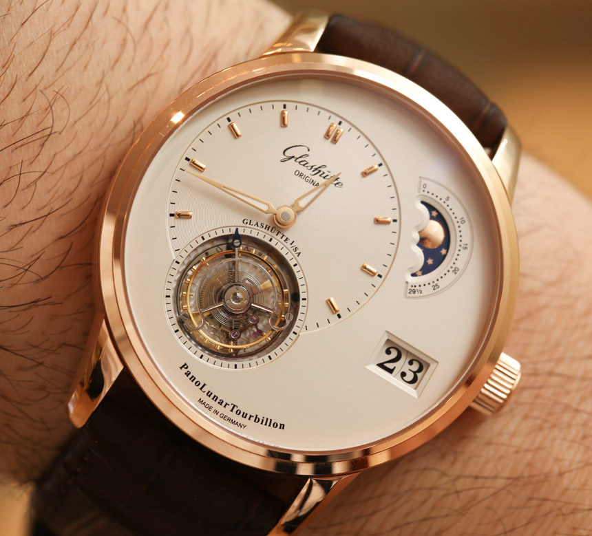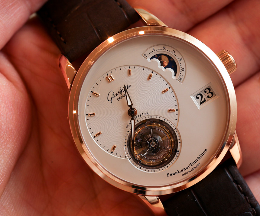
Asymmetric design is a hallmark of Glashutte region watches, a fact that is dutifully celebrated by German watchmaker Glashutte Original. For 2013, they’ve released the exclusive PanoLunarTourbillon, the latest of many “Pano” watches that celebrate the appeal of balanced, yet eccentric dials. The contemporary popularity of these dials probably began with the Lange 1 watches by competing neighbor brand A. Lange & Sohne that were originally released in the mid 1990s. The “Pano” watches from Glashutte Original incorporated this design and have, over the years, offered a wonderful variety of options.
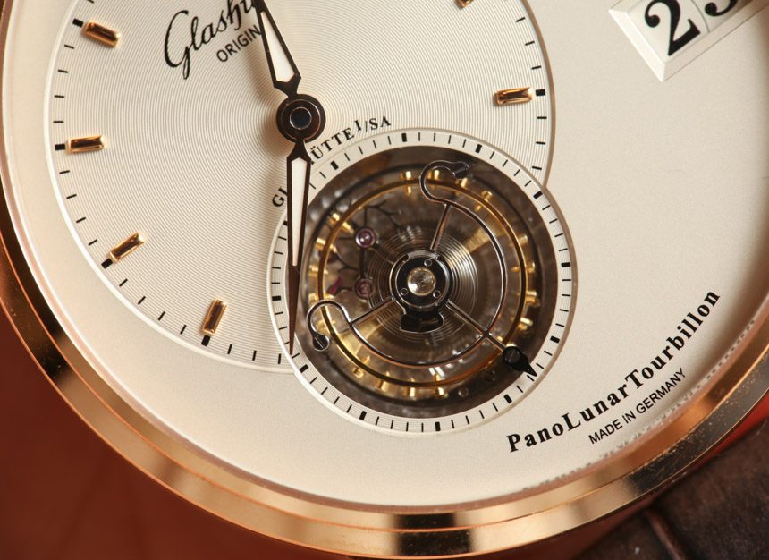
You may have not known this, but the flying tourbillon was developed in Germany (in 1920) and a very beautiful one is represented in this watch. There is something about Glashutte Original flying tourbillons that I really admire. There is a sort of flat compactness to them that make them feel thinner than they are, but you see get a wonderful three-dimensional view. A blued-steel indicator on the cage further reminds you that the tourbillon doubles as a seconds indicator. The tourbillon is really the main attraction on the dial, but thankfully it doesn’t distract much from the other information.


Something a bit controversial on the dial is the actual name of the watch spelled out on the bottom. That isn’t a bad thing necessarily though, but lovers of pure design refinement tend to reject unnecessary text on a watch dial. I’ll say this though, most watches don’t have their model name spelled on them anywhere. I’ve mentioned this before, and think about the implications. If you buy a watch that is newer and comes with all the packaging then it isn’t really a big deal to know the name of the watch. However flash forward in the future when that new watch is now vintage, and the original box and documents may have disappeared. Someone picking up the piece should be able to know what it is called so that they can research it.
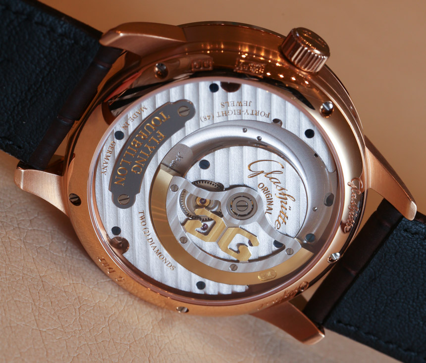
It does tick me off to a considerable extent that many brands don’t think to add that necessary information on their watches. How about just brand, model name, and reference number? That shouldn’t be too hard to fit on the back of the watch right? So let’s start seeing more of that. Glashutte Original seems to be on the proper side of that fence, but it is arguable whether or not the name of the model should be on the dial as it doesn’t add to the overall composition. Having said that, there is enough empty space on the dial to prevent it from looking cluttered.

