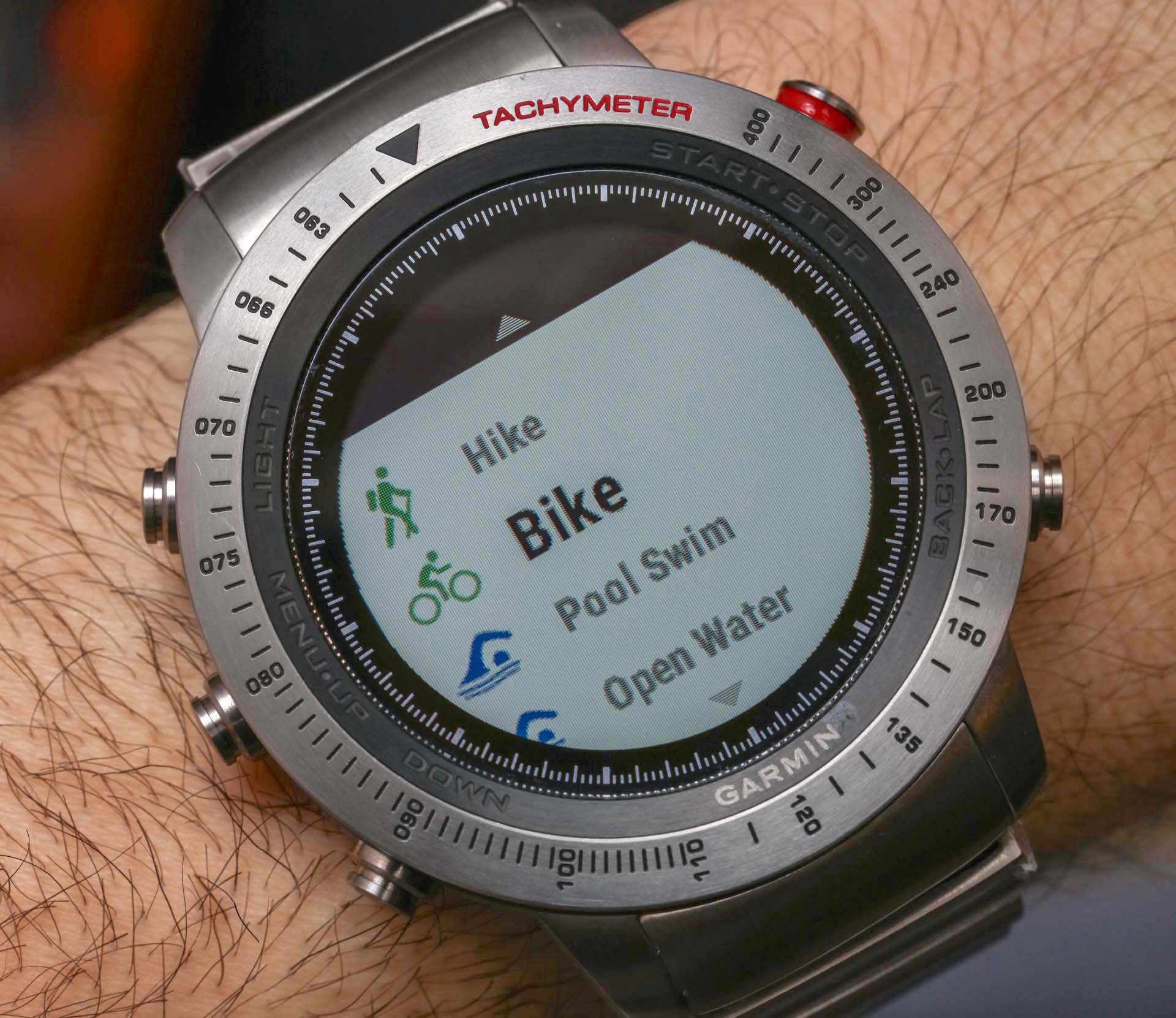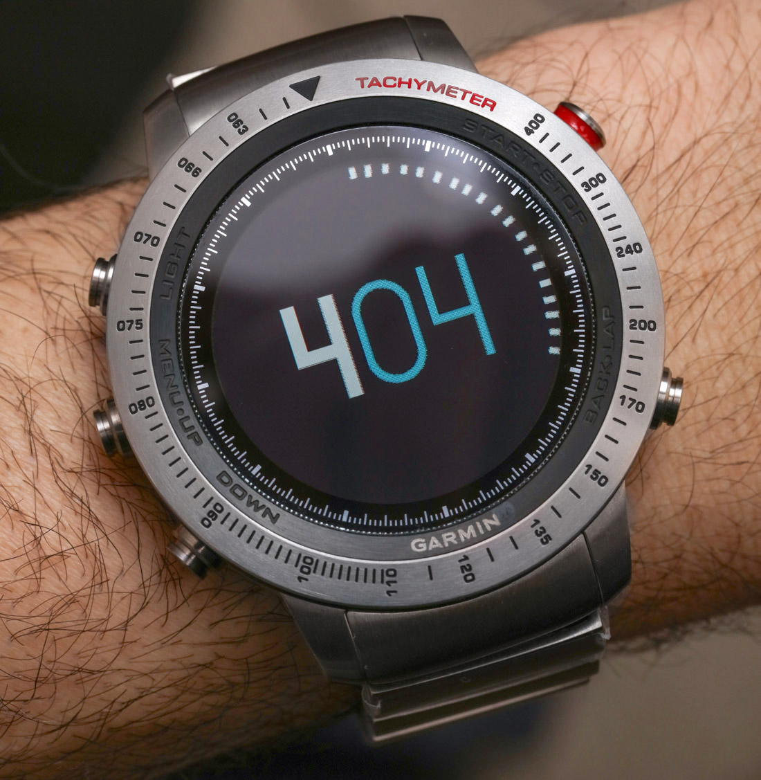
This isn’t the first Garmin watch reviewed on aBlogtoWatch, but it is the first time I’ve personally reviewed one. On my wrist for this wrist time review is the Garmin Fenix Chronos, in particular the titanium model with the matching bracelet. The “Chronos” variant is currently the most high-end version of the larger Garmin Fenix collection, which is currently marketed as the Fenix 5. Though, interestingly enough the number “5” designation is missing from the Fenix Chronos devices (perhaps they are supposed to be more timeless).
In an era when smartwatches are gaining traction each year with consumers, there is still a relative lack of universal standards when it comes to software, hardware, and how to use the devices. Garmin, not being a novice at all to modern connected wearables, uses their own operating system, which means that anyone new to Garmin smartwatches will be faced with a bit of a learning curve. Having said that, I felt that the time required to learn how to use the watch can really pay off for those people who feel that other activity-themed smartwatch systems don’t offer enough options, customization, and features.

Using The Garmin Fenix Chronos & What It Is Good At
Given that my background is mostly in reviewing traditional watches, I will not spend a lot of time talking about the full set of software features that the Garmin Fenix smartwatch collection offers. There are other reviews out there which will do a better job at answering your specific questions about the nuances of its exercise tracking features, GPS, or other finer details of the operating system. I will say that I was impressed by the utility of the Fenix’s operating system, ability to let the user really change the system to their needs, as well as its ability to not make the user feel locked out of being able to customize how they use their device. I say this because often times I feel that in an attempt to make smartwatch software simple and easy to use, users are often left with very limited options if they don’t like how the watch displays data by default.
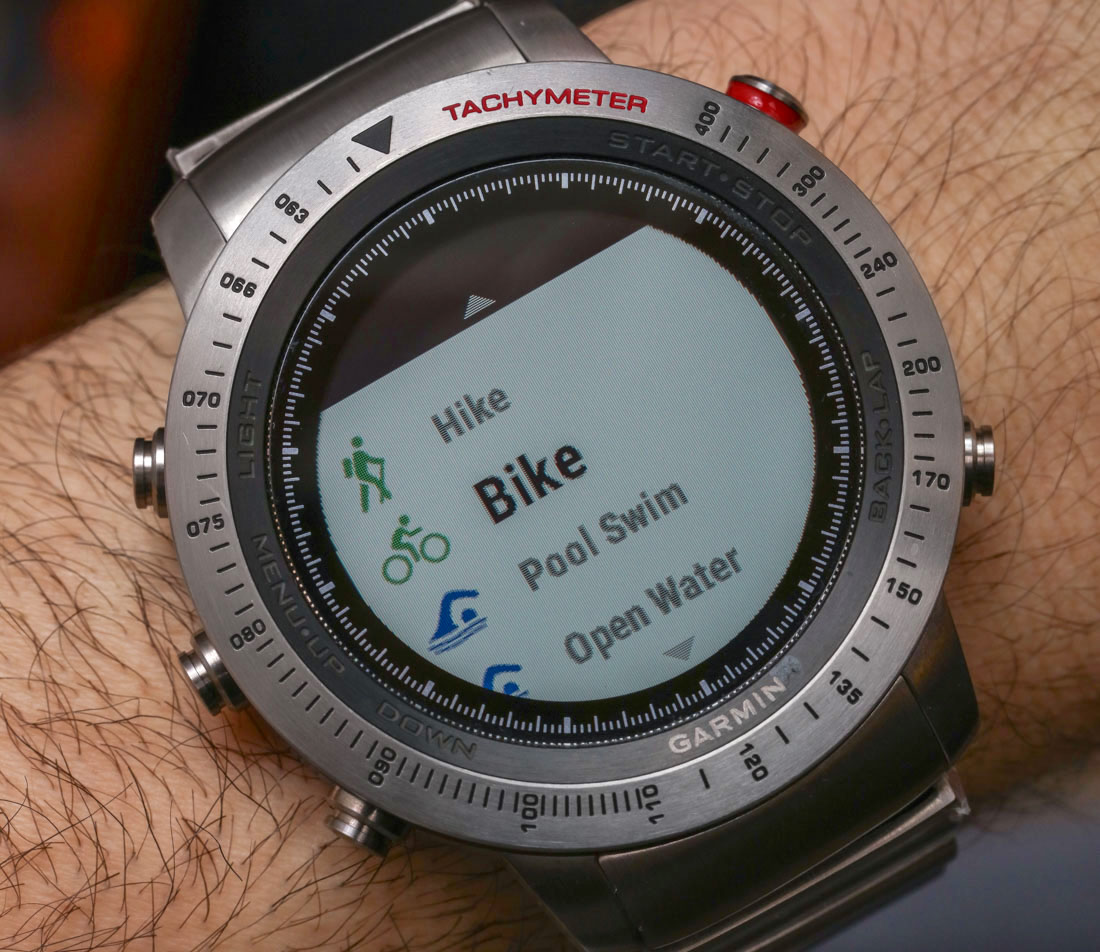
As I pick up the Fenix Chronos in my hand, the digital watch face I selected has a series of red arrows and the term “Move!” I’ll admit that I haven’t worn the watch in a few days and it justifiably thinks I’m a lazy sack of you know what. We do live in an era when our gadgets judge us, and with something as personal as a smartwatch, the message we get about our lifestyles can be either eerily accurate, or amusingly unfounded. Writing this reminds me of when I wore a first generation Apple Watch and it reminded me to stand up while I was currently driving a car.
In order to test the Garmin Fenix Chronos, I attempted to follow the lead of the device’s software organization, which seems to focus on features designed to track exercise and activity. If you aren’t someone that is very active or likes to track exercise performance and duration, then the vast majority of what the Garmin Fenix is good at will be lost on you.
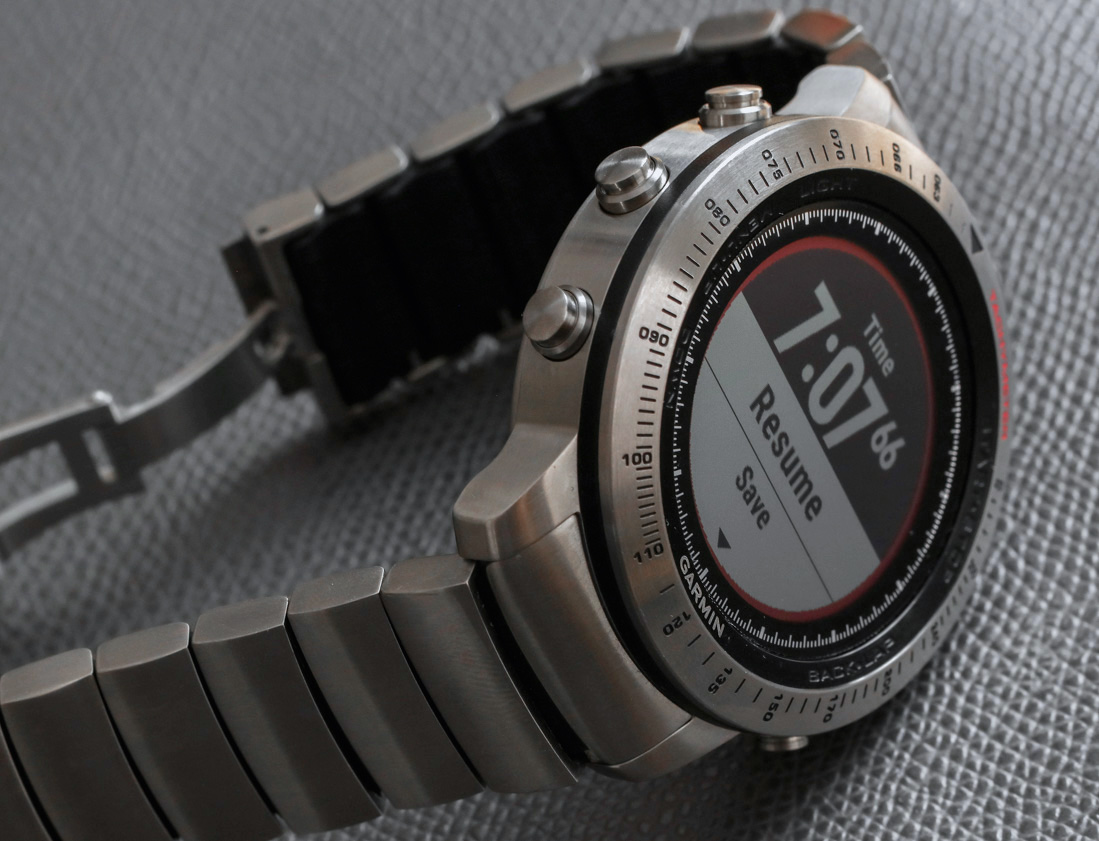
When initially setting up the Fenix software, you have the option of selecting from a list of sport activities that you personally engage in. The list is accessible via the most prominent of the five buttons used to control the device. This short list was very helpful because I was able to select things I do regularly such as cycling and hiking, which cuts down on your need to sort through a long list of options prior to working out. This is one of the many little customizable ergonomic details that I really appreciated about the Fenix Chronos’ operating system.
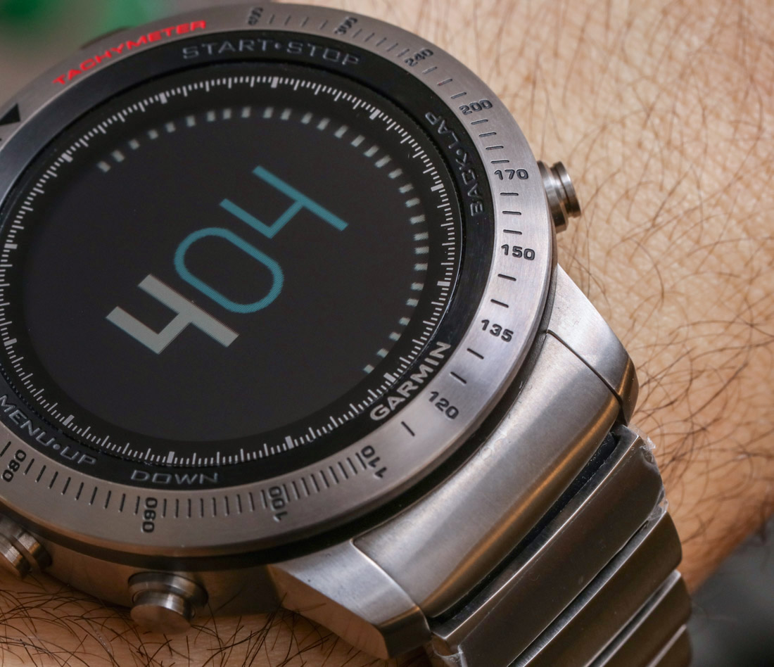
Outside of exercising, the features of the Fenix Chronos are actually quite limited if you compare them to the options available in something like an Apple Watch or a smartwatch running Google’s Android Wear. Does that make the Fenix Chronos a less advanced machine? I wouldn’t say that, but the Fenix Chronos is a more purpose-built tool whereas mainstream smartwatches try to cater to so many different types of users that wearers are often left without a lot of direction on how to use them. Once again, if you are interested in a really great exercise or adventure-themed smartwatch, do put the Garmin Fenix Chronos on your list. But if you are mostly interested in accessing messaging accounts and using your smartwatch as a surrogate phone, then there are other options out there better suited to your needs.
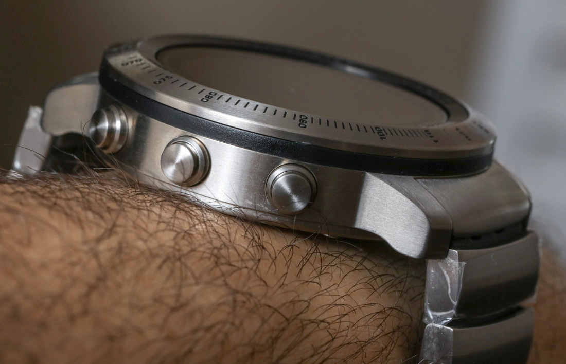
Another major difference between the Garmin Fenix and other competitor smartwatches is the lack of a touchscreen. Touchscreens are so common on smart connected devices these days, that you may very well find yourself swiping at the screen in order to scroll through menu options. I’m not entirely clear why the Fenix doesn’t have a touchscreen, but I suspect it is because of the type of screen they use, which they refer to as a “sunlight-visible transreflective memory-in-pixel (MIP)” display. The screen is 1.2 inches across and for the Fenix Chronos collection it is covered with a sapphire crystal.

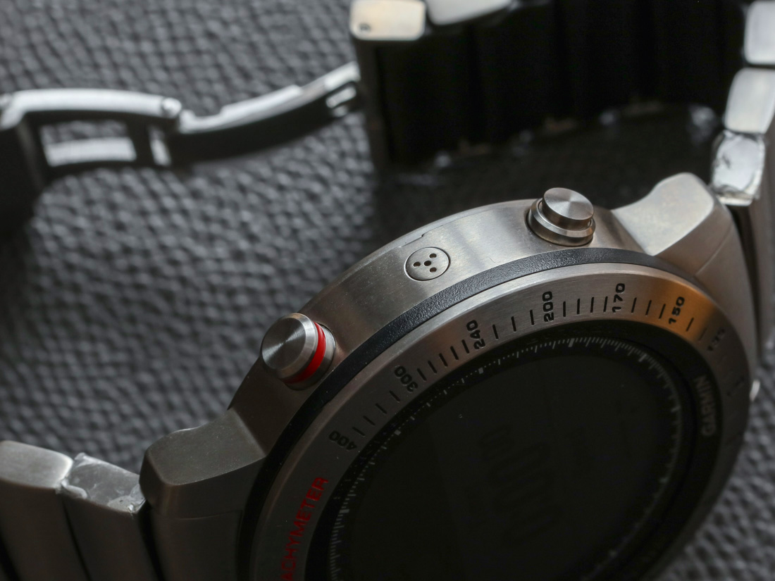
One of the good things about not having a touchscreen is that you don’t have to constantly wipe off fingerprints, which in my opinion is a not an insignificant issue with smartwatches that do have touchscreens. Instead, you need to learn what each of the five labeled case buttons do, and when to push them. This feels a bit decidedly old school, and reminds me a bit of trying to guess how to use a feature in a Casio G-Shock that I am not familiar with. With that said, most of the time the buttons have consistent uses in various settings such as the back button, select button, up and down selection button, and the back light.
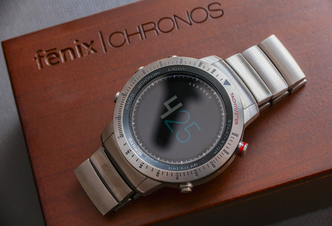
Once you understand the basics of how to use the Fenix software, using its primary features is simple, but I did find that various things were hard to find, or actually absent. For example, I needed to experiment before learning that certain important functions require you to press down and hold a button to access it. The top right pusher is used to quickly access various exercises, while pressing it down and holding it shows you a chronograph-style stopwatch screen. In order to get to a settings screen where you change important things like the watch faces, you need to hold down the middle pusher on the left-side of the case that is normally your “up” selector when scrolling through options.
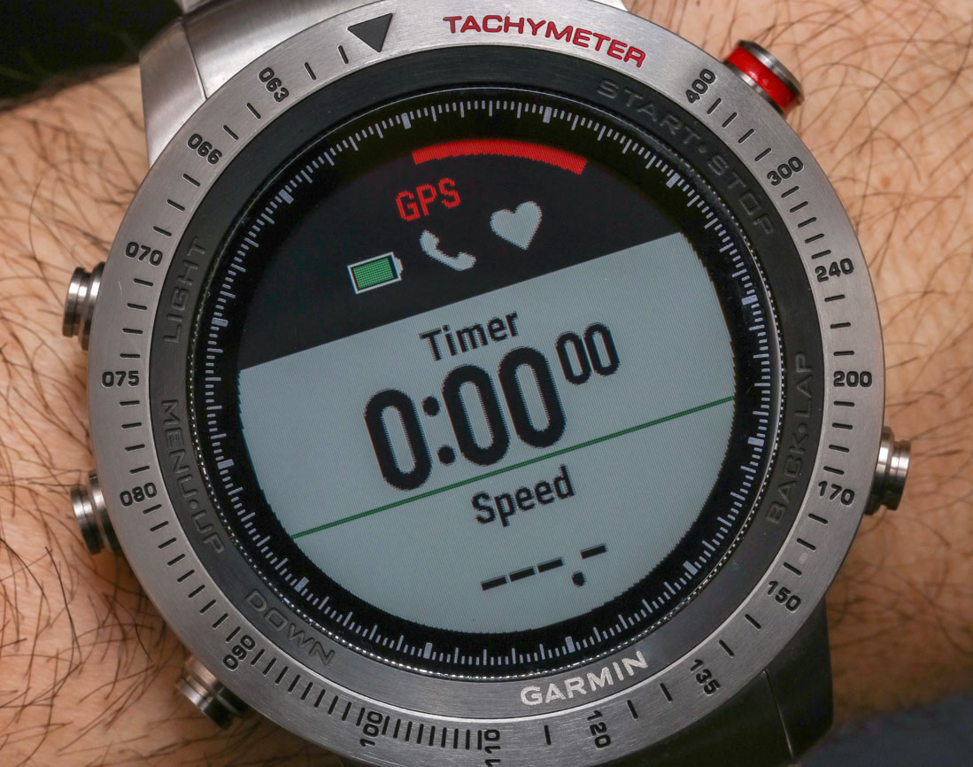
Certain features that I was expecting were not there, such as a map of your current location. Actually, this feature might be available in the watch but I wasn’t able to find it. As I said, my review is based on my wearing experience and what I feel a normal user would do while experimenting with the watch for a few weeks. If you spend a lot of time reading the manual, you’ll probably learn a lot more. Anyhow, Garmin – the company so synonymous with excellent GPS devices – left me feeling a bit disappointed that its GPS watch didn’t seem to have a map. What I mean by this is the ability to view a map of your current location, in order to know what is in the area.

