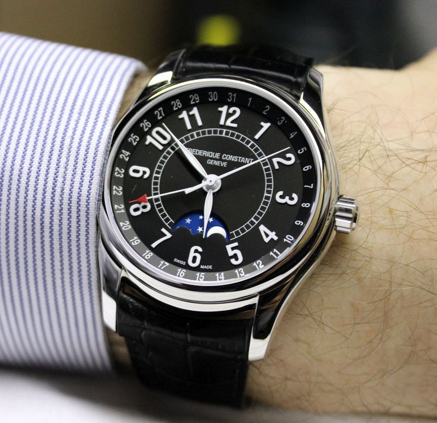
Since coming aboard at aBlogtoWatch, I’ve gotten some great exposure to a variety of finer Swiss timepieces. When the chance to review a Frédérique Constant timepiece came up, I was quite eager to explore the opportunity, as I’d heard (and read) plenty of good things about the brand. It was finally time for me to form my own opinion about one of their watches. While I’ll find myself enjoying a wide variety of styles in watches, what’s considered “classically styled” is sort of my home position. It was fitting, then, that the Frédérique Constant Moontimer that was sent over for review came from a collection entitled precisely that – Classics.
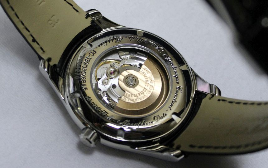
For Frédérique Constant, this particular collection is a place to put new technologies to work, all while maintaining the clean and, well, classic styles that many folks (myself included) are drawn to in a Swiss watch. With this watch, you start with a classic dress watch recipe – take a polished steel case, pair it with a black dial and black leather strap, and you’ve got your base. Want to spice things up a little bit? Then you look to complications – and a moonphase is a tried-and-true method for getting some visual interest on the dial without sacrificing the dressier styling.
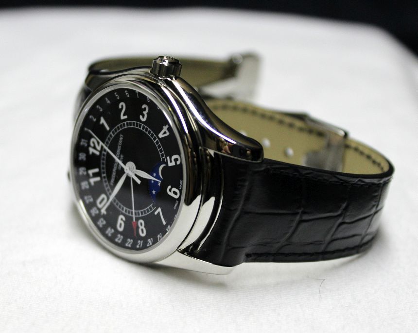
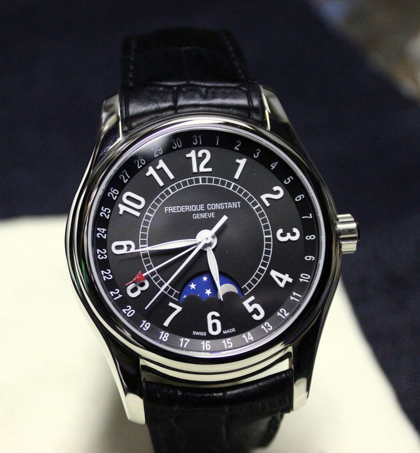
With that basic recipe, countless numbers of watches have been created, and you quite likely have seen a number of them in the wild. What makes the Frédérique Constant Moontimer stand out from the crowd? To paint that picture, let’s go back to the recipe I outlined above. With the case, while it measures in at 43mm in diameter, it actually wears like a smaller watch (closer to 40mm, I’d say) which is of great benefit to a dress piece – you want the watch to complement, not dominate, your overall appearance. I think this smaller “feel” is in large part due to the actual shape of the case – every surface is rounded off, with the only sharp lines really appearing on the inside of the lugs. This gives it a softer look, and doesn’t give a defined outer edge for your eye to grab on to.
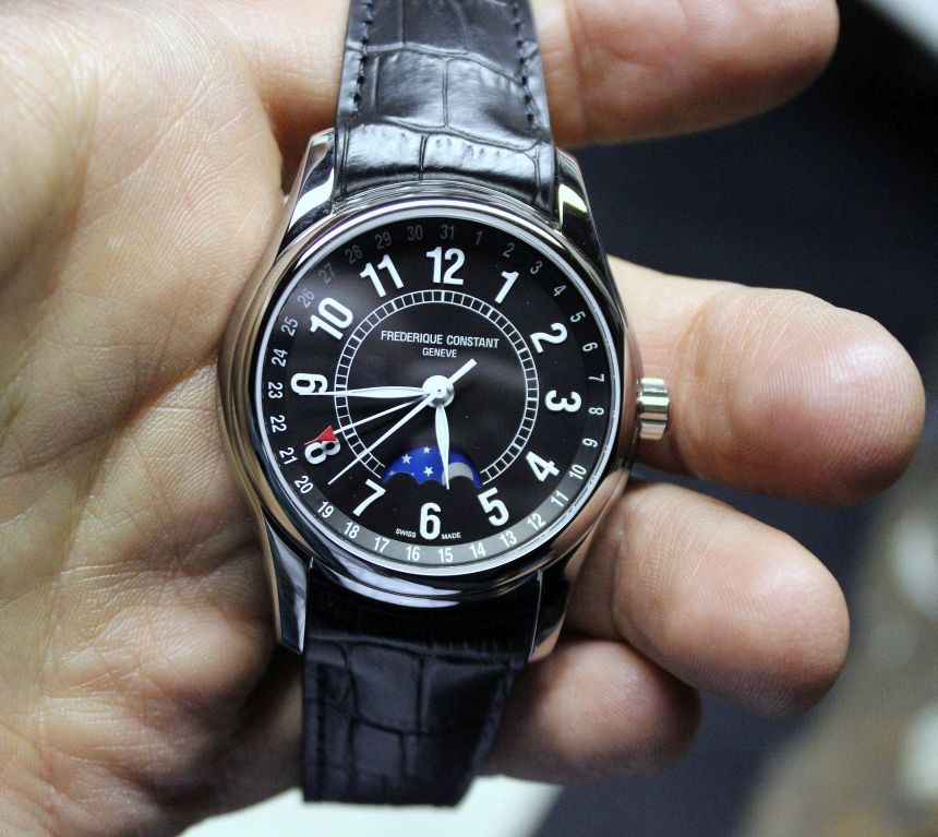
Next, the dial is mixed in. At first, the black dial seems a tad plain – but when you get a closer look at it, you notice that there’s a subtle sunburst pattern in it, which breaks things up a bit without requiring a move to non-matte finish. For me, the best part of the dial came in the form of the applied numerals. I tend to have a thing for applied numerals and indices, given how they can play with light (and shadow) and give dimensionality to a dial. Interestingly enough, when you look at the watch head-on, you could easily think that the luminescent numerals were simply printed on to the dial.
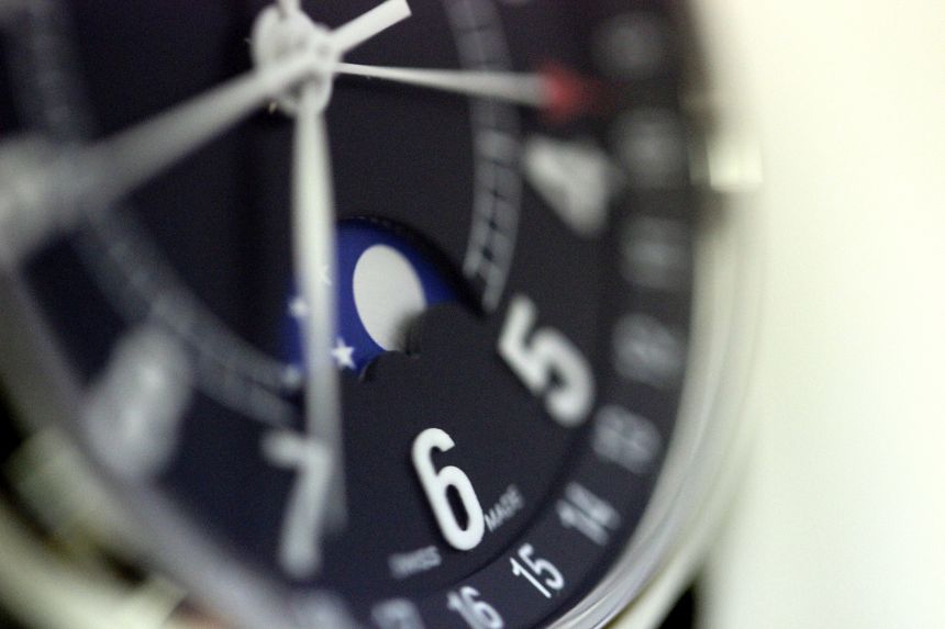
When you tip the watch to the side, though, you realize those “flat” numerals are actually raised up off the surface. This is, frankly, a great effect. Many times, there will be some sort of a border on a numeral (whether polished or painted) that demarks the edge of the applique, and the luminous paint doesn’t actually fill the whole bit. Here, you’ve got edge-to-edge lume, making for great visibility day or night. This of course is setting up the black-and-white scheme that carries through to the date printed on the outer ring of the dial, and the inner “railroad track” that springs from the moonphase.
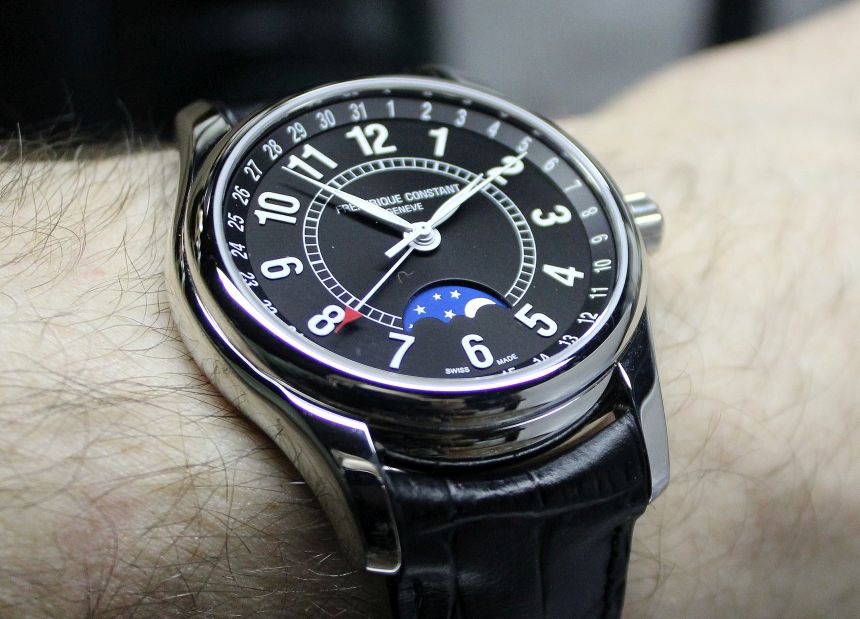
If you recall from the recipe, the moonphase is how you can “spice up” your dress watch recipe. Here, it’s popping not just a splash of color, as well as adding functionality to the piece. Yes, most of us likely aren’t too concerned about the phase of the moon in a day-to-day sense, but it is pretty cool in my opinion that you can have a mechanical forecast on your wrist as to what you’ll see in the sky. The moonphase disc itself is understated to complement the watch. The moon and stars are in a matte finish, and the occlusion of the moon (to indicate the phases) is accomplished by the scallops that are at the bottom of the cutout. As the disc rotates, the appropriate portion of the moon will be obscured, similar to what we see in the sky.
With the moonphase window occupying the dial as it does, you must admit that a standard date window would only serve to sour the overall design. As such (well, it’s my best guess), they’ve instead gone with a central hand (tipped in red, to differentiate it from the seconds hand) that indicates the date via the numbers printed on the chapter ring. This was the one area of the design that I wasn’t as much of a fan of – I think removing that date indication would make for a much cleaner look, without much loss of functionality.
