I love Ferdinand Berthoud. Not the guy, but the brand – I could have never met him as he died roughly 180 years before I was born… The modern Ferdinand Berthoud I love because the brand and its watches form a tiny time capsule that the early 21st century watch industry will leave behind as the textbook case of all that it was about. It’s a combination of: a) 21st century manufacturing capabilities; b) the arbitrary taking of a long-forgotten man’s name in hopes of expedited market trust and enthusiast acceptance; c-d) the realization of one modern entrepreneur’s dream project achieved through individual leadership and e) the resources of a sugar daddy brand. Behold, the Ferdinand Berthoud FB 1R.6-1.
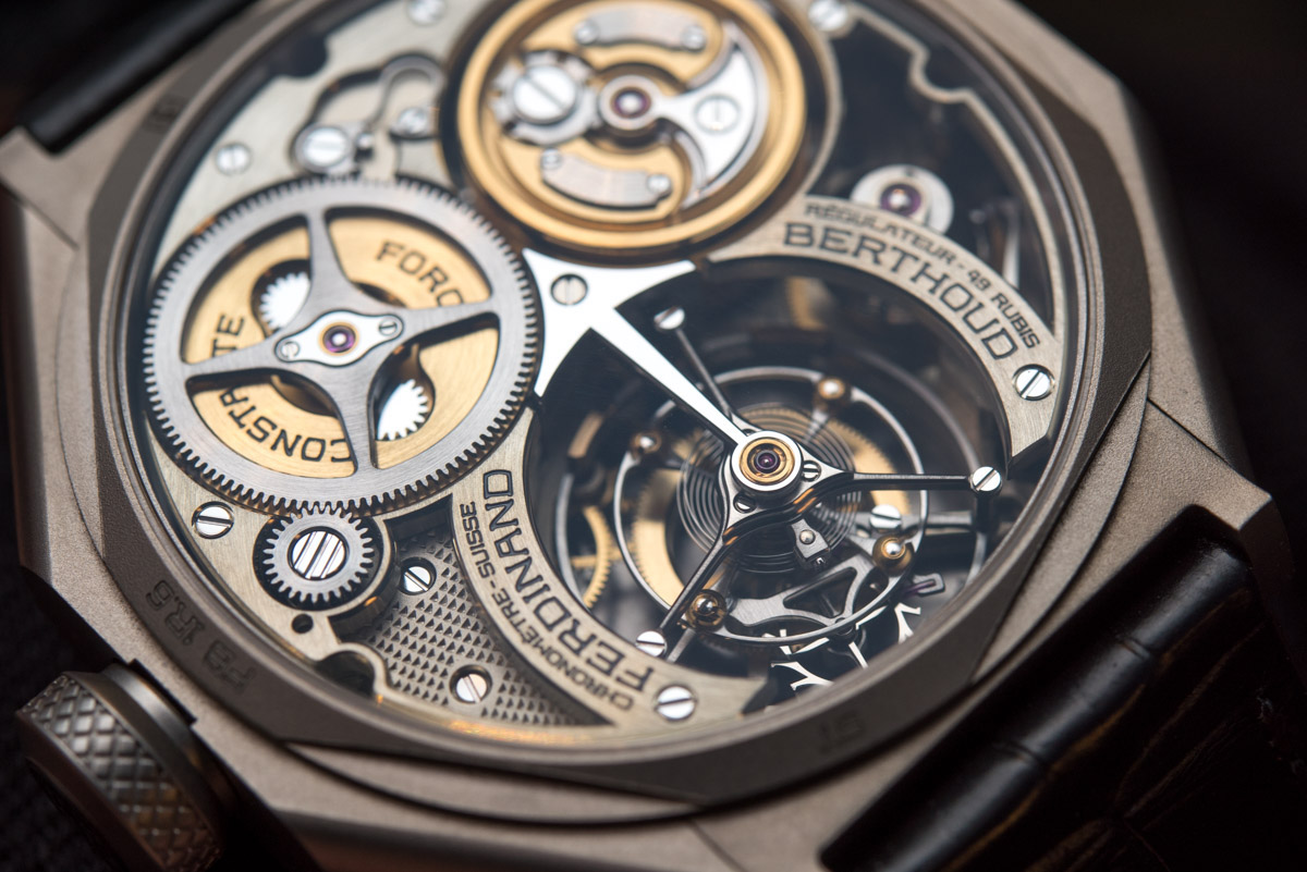
Yes, all that and much more is inside the latest, knowingly odd-named Ferdinand Berthoud timepiece. The Ferdinand Berthoud FB 1R.6-1 showcases modern watchmaking techniques like few others: its quality of execution is as impressive as its column-style, ultra-rare movement architecture or fusée and chain setup. Chopard’s co-president Karl-Friedrich Scheufele, a product- and watch guy like few in the industry, has for long been fascinated by Ferdinand Berthoud’s achievements (even collected some of his works) before starting this ultra-niche offspring of a brand. Therefore, it is indeed the realization of one modern entrepreneur’s dream project and that is all the more true when considering the no-compromise attitude testified to by the exterior and movement design of every Ferdinand Berthoud piece.
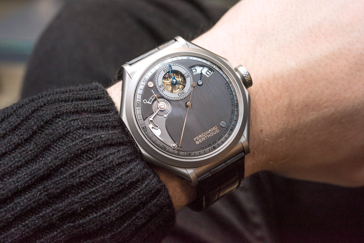
From what I learned in recent years, Mr. Scheufele asserts a very hands-on way of overseeing how products are developed and although there is considerable difference in pricing and styling between regular Chopard, Chopard L.U.C, and Ferdinand Berthoud watches, if you’ve seen enough of them, you’ll be able to connect the dots and see the resulting coherence for yourself. I know I do. Last, a niche, low-quantity brand like Ferdinand Berthoud could have never come to existence without a sugar daddy brand or group to support its first (many) years of development and then the time it takes it to produce the watches customers have ordered – we are some four years after the launch of the brand and they still take it slow because they simply can’t produce these watches en masse. Just how the modern Bugatti couldn’t have come to be without Volkswagen – and that’s what Ferdinand Berthoud is to Chopard… their Ettore Bugatti brand.
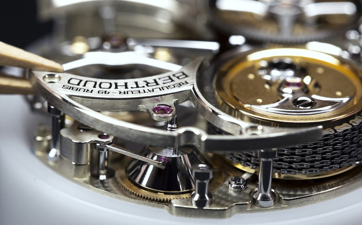
While I’ll try my best to make it worth your while to stick around for this article, I’d like you to know that I have given a more than detailed run-down on the brand, its history (or, rather, inspiration), as well as the many technical feats that are found inside and outside the FB1 in the first-ever article published about the brand here. There’s no point to telling just half the story here and equally none to repeating all of it so please just click on over to learn all about it, if you are so inclined. However, because this particular piece is still something very much worthy of our attention, I figured we’d just take many beautiful images and excite ourselves with discovering the countless fascinating details of the Ferdinand Berthoud FB 1R.6-1.
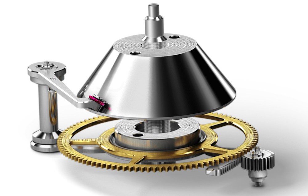
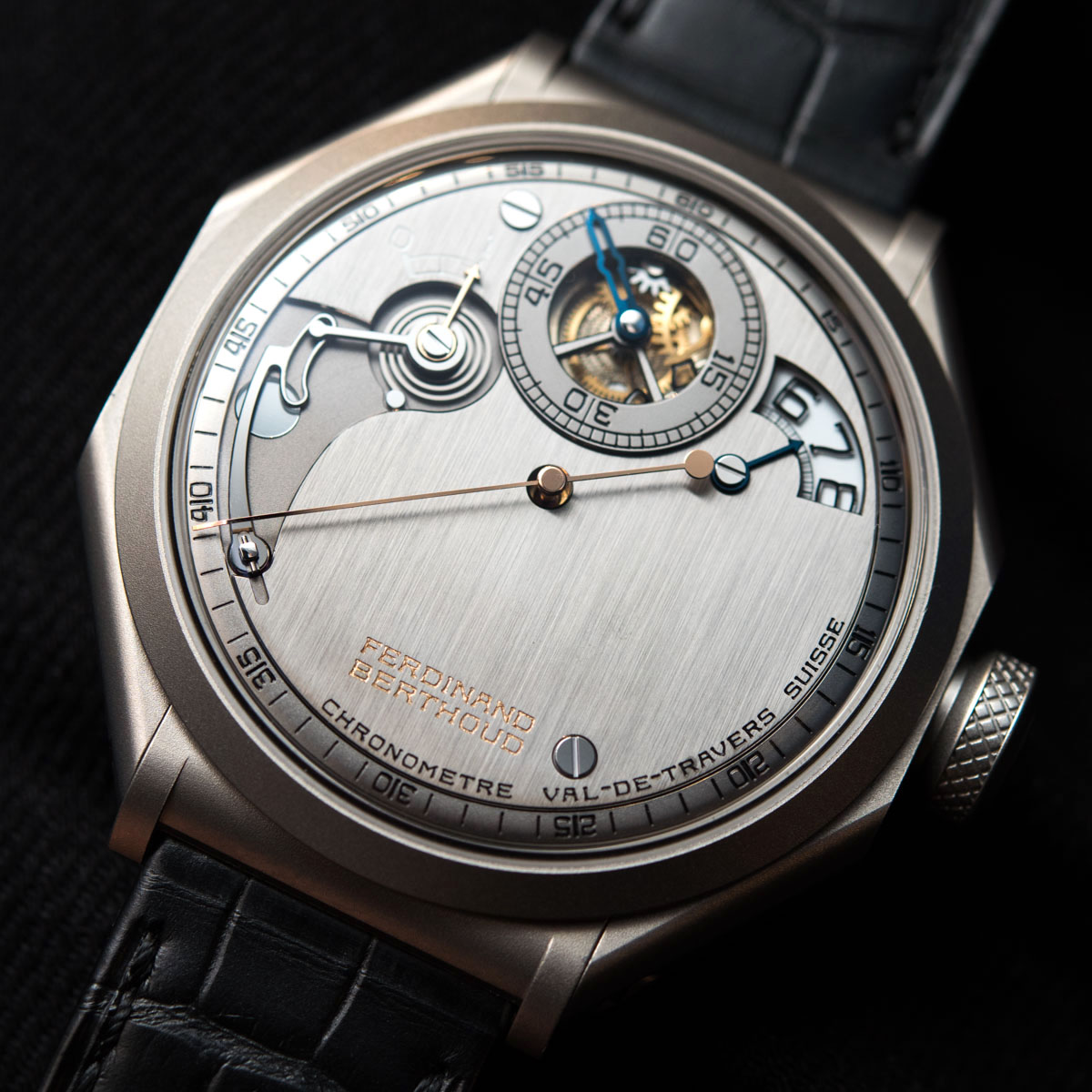
My illogical first pick of such details is the power reserve indicator, located in the top left segment of the black rhodium plated, nickel silver, hand-satin-brushed dial. The brand officially refers to this feature as “extremely sophisticated” and, you know what, it’s one of those rare occasions when I don’t have my Spidey BS senses tingling uncontrollably. This patented mechanism, now that I really think about it, is something I guess literally nobody asked for. Nobody in the world – not even those with a fortune already spent on watches and another one burning their pocket – thought to themselves “yeah, I like watches and all, but I wish they had a weird conical power reserve with a feeler spindle!” And yet, here it is.

I almost dragged myself into a “let’s try and explain in plain English how all this works” but then I remembered I said above that I wouldn’t – so please check out our previous article or, for the full tech-fest description, the brand’s website. For the latter, reader discretion is advised. Let us instead jump to the point that can only be seen through hands-on images or by handling the watch in the real world: the quality of execution. That cam on the left, whose shape is “the result of a number of complex mathematical calculations and various tests,” is a solid piece of metal with beveled edges and a mirror polished top. It’s so fascinating in its shape and so striking in its execution that I guess one could miss admiring the complex, flat spring or how there’s a weird rotating part that connects the power reserve indicator with the aforementioned cam. All this for a power reserve indication about 0.2 inches (or half a centimeter) long.

Then there is the hour display, separated from the minutes sub-dial in a regulator style. The hour markers are beautifully transfer-applied on a glare-proofed sapphire disc – because of course it is glare-proofed! The reason for the use of the sapphire disc is that ensuring the proper size of these numerals necessitated a disc so large that it would intrude the open-worked sub-dial in the center. Things are, for once, rather self-explanatory from here: the black numerals contrast strongly against a textured white background while the central sub-dial looks as open and clean as ever. A cute detail is the CVD-blued metal hand that points at the hour aperture; on a watch with such complexity you probably don’t even realize that this particular piece itself never moves… but it certainly looks like it did.

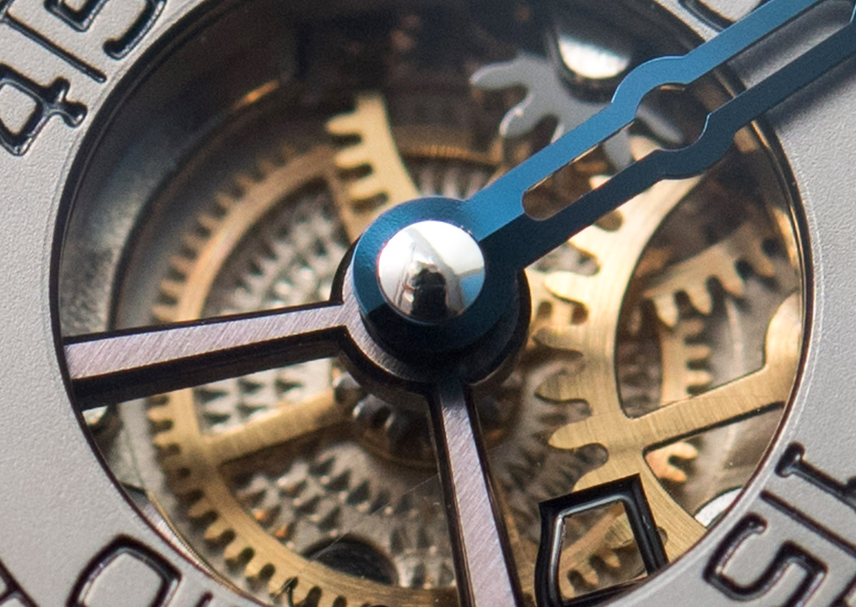
Okay, so these two next pictures are a different crop of the same one photograph. Admittedly, this is as much a praise of the Nikon D810 as it is of the watch, but we’ll focus on the latter. The point here is that when one puts a truly, truly exceptional, ultra high-end watch on, it entertains and amazes in ways one usually doesn’t even see or realize. What one senses is the watch carpet bombing one’s senses with countless details and an ever-changing aesthetic, as different surfaces reflect lights and colors.
The two shots (again, actually from the same one photo) are supposed to show what happens at a macro level on the surfaces of such a watch: the dial is reflecting some weird purple-orange colors from wherever, while the polished pinion of the minute hand reflects the on-camera flash, my hair and a bookshelf behind me. The polished and beveled edges on the two spokes and the polished edges on the extremely small wheels are as much an icing on the cake as are the perfectly painted numerals. And if all this wasn’t enough, just look at the different surface treatments: brushed on the V-shaped spokes, the circular brushed on the top of the wheels, and the bead-blasted on the minute track.
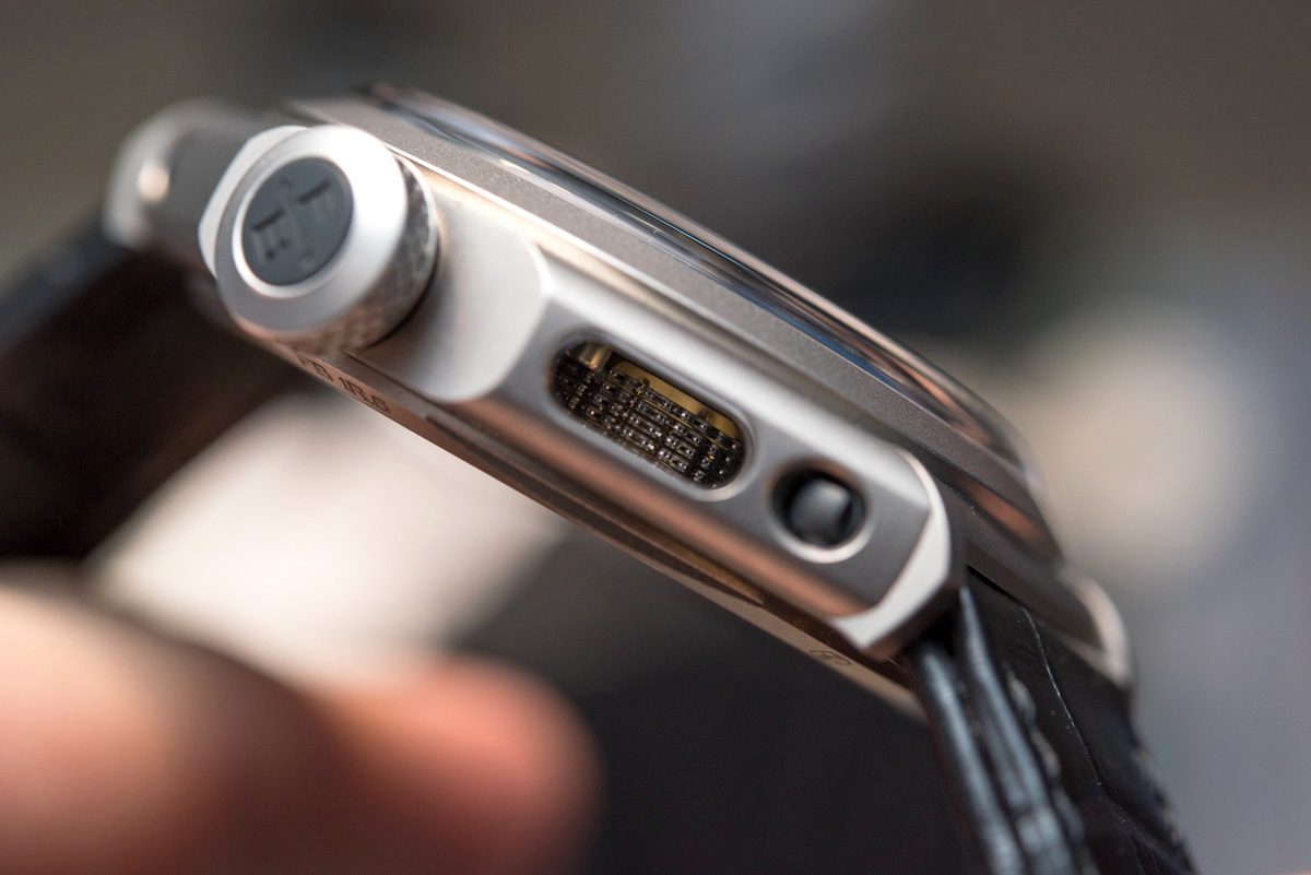
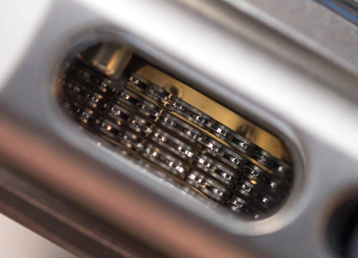
Sticking with the same practice, here you see an oval-shaped sapphire crystal window engineered into the side of the octagonal case, designed to show off the column architecture of the movement and the 474 (!) steel (!!) links and the 300 pieces of 0.3mm (!!!) pins in them. Yeah, essentially this is a microscopic bicycle chain, but it’s one hell of a manufacturing achievement. At this point we are so spoiled that we take it for granted how the links exhibit an alternating polished-brushed finishing.

