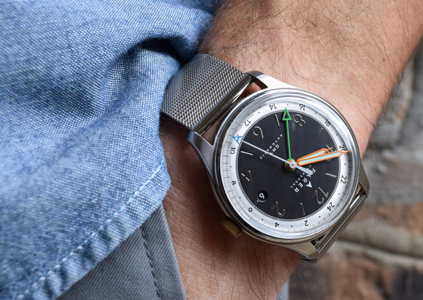
By combining British design with Swiss production and movements at fair prices, Farer have carved out a niche in a micro brand market which is now anything but micro. Introduced through direct to consumer watch sales in 2015 with no less than nine Swiss quartz-powered models, Farer have expanded their range several times. First, Farer added three ETA 2824-2 equipped models, and then very recently launched another new collection of three GMT automatic watches; the Oxley, Lander, and Ponting. In for review here is the black dialed Farer Oxley GMT Automatic, a distinctively styled, ETA 2893-2 Top Grade equipped watch at a price heretofore considered improbable for a uniquely designed, Swiss made automatic GMT watch.
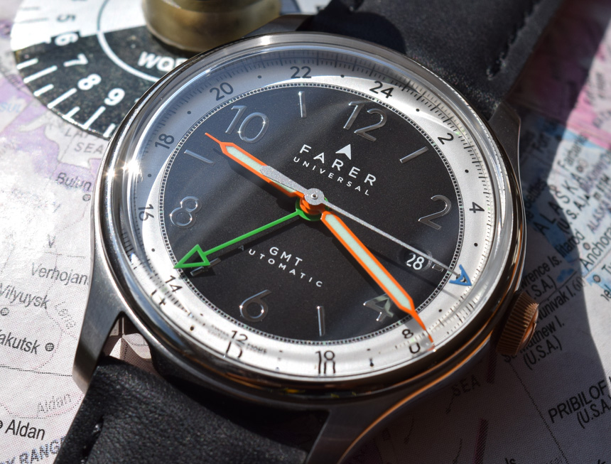
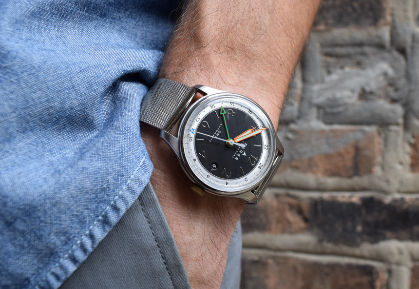
The model I chose to review is the Oxley, mostly because I like how the matte black dial contrasts with the stark white twenty-four hour surrounding. By the way, the Oxley is named for John Oxley, a Royal Navy veteran who later became an explorer and surveyor in Australia at the beginning of the 1800s. Oxley is best remembered for mapping the Tweed and Brisbane Rivers in New South Wales and was almost certainly a hard man who could have put the watch which now bears his name to good use. One can almost imagine John Oxley, having just fought off a fearsome pack of koala bears, squinting in the bright sunlight to check the Oxley’s dial…

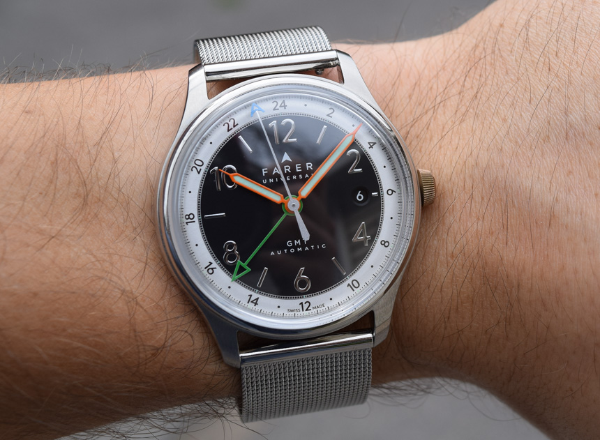
At a glance, the Farer Oxley’s dial is clean, organized, and memorable. There are a heck of a lot of various design nods coming at you from the contrasting white twenty-four hour chapter ring, to the syringe hands, all the way to the applied numerals. Despite the wealth of visual information, the whole thing viewed together is well done and highly legible. It’s one of the most balanced and interesting original watch dials you can get from a small company. This is also a good place to note that, design wise, Farer basically started from scratch with the intention of making a new piece.

The Oxley (and indeed Farer’s whole line) is refreshingly not an homage to any particular watch. What Farer have done is incorporate several base design concepts (primarily from iconic watches of the ’50s and ’60s) into a package which is actually new. It’s as though Farer have written a new book with design characters we are familiar with and fond of. Try as I might, I can’t work the phrase “this watch is inspired by” into this article. Originality like what we’re seeing in this dial design, especially with the use of color, is a beautiful and rare thing in this industry.
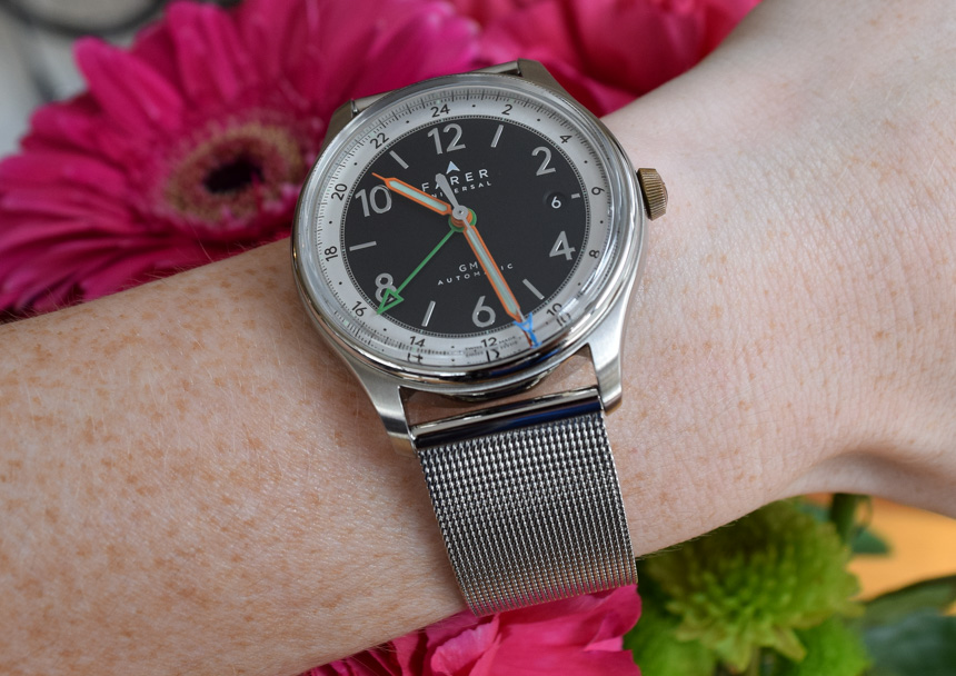
Colors other than black and white, often difficult to artfully integrate into watch design, are sprinkled as if by Salt Bae into the design of the Oxley dial. The narrow, burnt orange syringe hands (filled with Super-LumiNova) are outlined in orange. Second timezone duties are handled with a green hand which is devoid of lume, as you’d expect. Tracking of the seconds is negotiated by a super long white hand with a blue lume-filled tip which looks like it could almost touch the inside of the crystal. For a lot of watches, and indeed a lot of brands, this set of colors wouldn’t all work together harmoniously. On the Oxley, it just does. Some much larger brands have a thing or two to learn here about color’s place in modern watch design. Maybe orange and blue aren’t the only options for your watch dial other than the traditional black and white. Once you’ve managed to look away from the dial, there’s actually quite a bit more with the Oxley which is worthy of notice, starting with the case.
Farer’s full name is Farer Universal and that name has a lot to do with their cases. They are universally 39.5mm in size, fairly thin at around 10mm, and have a uniform 20mm lug width. This universality allows Farer to be a brand for both men and women and shows a more progressive approach to the often narrow watch customer base. In fact, the Oxley has become the watch from my collection which is most likely to be borrowed by my wife and the case size is a big reason.

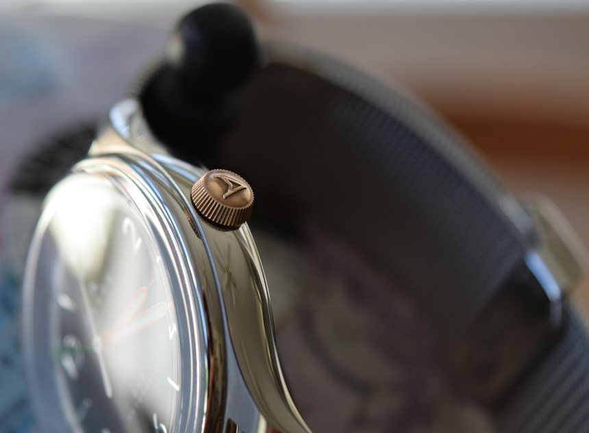
The case itself is a fairly straightforward, rounded shape with polished sides, a brushed top, and a thin polished bezel just under the crystal. Farer’s use of a somewhat more reserved case design allows the rest of the watch, particularly the dial and excellent crystal, to literally and figuratively shine. Complimenting the case is the Farer signed and tapered crown which is unexpectedly made of bronze. The choice of bronze for the crown is an interesting design choice as the crown will naturally patina and give the Oxley even more individuality and character over time. Coming back around to the universality idea, all of Farer’s pieces have the bronze crown.

