A good deal of thought goes into the design of most watches. The result must be a blend of attractive visual elements combined with the features necessary for the watch to adequately tell the time. There is no “correct” way to do this, but the skilled designer must take take both the concept of form and function seriously. A watch falling too far to either extreme can be devoid of appeal.
Recently, the Concord brand has begun an image re-haul. The Movado owned watch brand was due for revitalization. Having had success with the Concord La Scala and Concord Saratoga lines, nothing serious has come out of Concord in about 10 years. In fact the La Scala and Saratoga watches are wonderful designs, attractive and pleasantly unique. Movado however felt the brand needed to be thrust in a new direction. Newly appointed Concord CEO Vincent Perriard has a background in marketing, not watch design. His enthusiasm is admirable, but he has yet to prove himself as a watch branding whiz. Movado has given him the reigns of Concord.
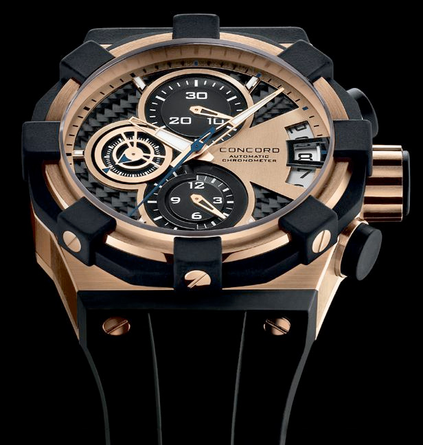
The result of Perriard’s appointment is the C1 “Concept” line of watches. Highly publicized, and with first-class marketing rhetoric, the Concord C1 simply fails to impress me. To be honest, I wanted to like this watch. My hope was that gazing at it long enough would allow for the design to grow on me. My focus has been on the Concord C1 Chronograph with the rubber strap and carbon fiber background, which is actually the least attractive of the bunch. The steel bracelet available is attractive, but nothing special, and the basic models without the chronograph complication are far easier to look at.
Let us first observe the manner in which Concord touts the C1. Emphasis is on the bulky design, thick sapphire crystal, use of multiple materials such as rubber, steel and carbon fiber, and the futuristic boldness with which the watch presents itself. This is a large watch. 44mm wide and over 16mm tall, it would not be considered “enormous,” but it will not stay humbly under a shirt sleeve.

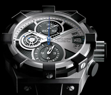
The C1 is bold, I will give Concord that. The watch seriously stands out due to the contrast of colors and materials. Boldness is good, but after the initial novelty what are you left with? The most notable design element of the watch are the 8 large cube shapes on the bezel. The effect is almost a sunburst pattern, and it stands out well, the problem goes to legibility. It seems as though telling the time is an after thought in this watch. While there are 12 hours to be accounted for, there are 8 large elements that look like indicators. When you try to tell time on this watch, your eyes are going to be drawn to the big 8, which unfortunately serve no other purpose that being symmetrically place around the bezel. This watch wants there to be 8 rather than 12 hours. Thus the cubes detract significantly from the main purpose this accessory is meant to serve.
In the cubes are placed large screws. Simple round screws that detract from the angularity of the watch. I have a feeling that these screws will loosen over time. Most other watches that have screws, actually have bolts. Meaning the screw looking bolts are secured on the other end with a nut. I am afraid the C1 owner will be faced with tightening screws occassionaly. Further, for the price, I would expect nicer looking screws, at least something more interesting than what looks to be taken out of a parts bin. Going back to the large cubes, they are plain looking once you get used to them. Either in rubber or steel depending on the watch, they don’t really do much for me. Rubber is coming back as a material used in high-end watches, but I cannot be sure why. Sure it does not dent, but it can scuff or even tear. It is not an expensive material, and I would not want to pay the excess of $10,000 for it to be prominently pronounced on the face of a watch.
The crown and pushers also have a good deal of rubber in them. The pushers are bold cylinders capped in rubber. And the crown has a mix of rubber with vertical steel lines cut-in to assist with operation of the crown. The pushers and crown are large, perhaps too large. They appear empty compared with the lines and shapes littered in the face of the watch. Why not carbon fiber pushers? In fact, the pushers and crown, while ugly, are probably the most functional part of the watch. The one area that Concord designed to function well probably does, but suffers from looking unimaginative and devoid of character.
The manner in which the rubber strap connects to the watch case is unique. A good idea in on paper, the design handicaps the watch insofar as you are stuck with your initial decision of steel bracelet or rubber strap. For integrity purposes, the rubber strap is fused to the case in a matter of speaking. Removing it causes damage, and interchanging it with the steel strap is technically possible, but not recommended. Here again, Concord has played with unique styling taking into consideration form over function. Again, at this price point the user should be given more opportunity to play with the look and features of the watch, including the ability to mix and watch straps and bracelets.

Concord wanted to emphasize modernity in the C1’s design. A “watch of the future”, or something ahead of its time. Movement wise, there is nothing special or innovative. The Chronograph models feature what is essentially a glorified ETA Valjoux 7750, which is the ETA Valgranges A07.211. I fail to see what is advanced or modern about a complication which has been around in form for almost 40 years. This price point should demand something better inside the watch. The case of this watch comprised of two large pieces of metal sandwiched together. Not exactly elegant, or modern. Looking at a side angle of this watch, I see what reminds me a 1980s vision of futuristic design for garbage or dump trucks. Industrial looking without much flair. Little attention to intersecting lines or balance. The result is strong looking, but hardly “designer worthy.” Not particularly astute to being a “haute” watch, a label Concord is surely throwing around.
Those more vested in watch movement will of course have more to say about the inner workings of the C1 Chronograph. While interested in the concept of course, it is the external elements which make one lust after a watch. The Concord C1 has a display back, but the movement inside lacks any decoration or particular interest. You are simply reassured that a mechanical movement does in fact live inside your new investment.
Most important to any watch design is the face upon which you spend most of your eye time. Here the C1 suffers much of the same confusion as the rest of the watch. When I first looked at the C1, the first thing that came to mind was, “what is going on in there.” I desperately wanted to sift thought the menage of circles, lines, and textures to reach something coherent. I could barely tell what time it was. The best part of the face is the seconds dial. This is easily the best part of the C1 overall, but nothing particularly novel. Instead of using a traditional hand to indicate the seconds, Concord created an entire register shaped rotating circle with an arrow on each side to tell the time. While it does not add to the functionality, it really doesn’t detract from it, and is a welcome visual novelty; appealing each time you notice it. At least here I can commend the design.

The subdials and date display on the face form a shape that looks like a clover on its side. While likely unintentional, I cannot get this image out of my head. I just keep seeing that outline of a clover, and I don’t feel lucky for this. The other hour and minute registers for the chronograph are pretty standard. The font used for the number is technical looking to say the least, but nothing special. The registers are clean and uncluttered. Using the C1 for timing is probably quite comfortable, but you don’t need to spend this kind of money for a good timing instrument. A solid Valjoux 7750 movement based watch can be had for $1000 – $2000. The date window on the C1 really disappoints me. There is this trend to open up the date window to indicate the previous and next days. The only purpose this serves is that the curvature of the large date window functions to help balance out the circle shapes of the three subdials. Symmetry is disturbed when you have three circles and then a square date window. So while this is an interesting solution to the visual balance problem, the execution here is entirely flawed. The placement of the date window is so far to the right, that it is off balance from the relatively central location of the round seconds dial that it attempts to balance. The result is two round shapes along the radius of the watch that are not centered or balanced with the rest of the watch. This distracts the eyes, and prevents the watch face from looking pleasing to the eye.

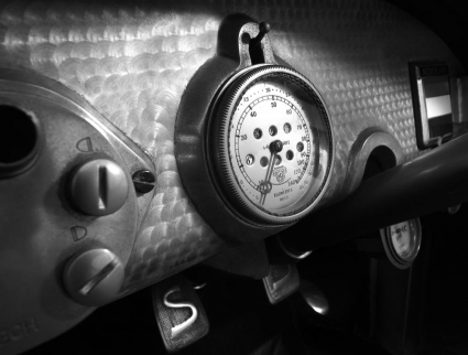
There are two types of background materials to choose from on the C1; carbon fiber or guilloche machined steel. I highly recommend sticking with the machined steel. Carbon fiber is a great material. Light, and strong, it can be shaped in nearly any manner. It serves no functional purpose on a watch face other than to add what is honestly a cheap looking three dimensional effect. This material is completely overused on watch faces these days, and must be carefully implemented to look right. The machined steel on the other hand is much nicer. High-end products often contain machined steel, which has a series of circular pattens caused by a machine polishing. High-end Spyker automobiles use this finish on their dashboard for an excellent look. The machined steel background also does not contrast as harshly with the dials on the face. The problem however, is the non-machined clover shape outline of the subdials does not integrate well with either background as the transition is harsh and unappealing. This is a problem with all watch faces that feature a “layered” look.
 Well done however are the Concord C1 main hour and minute hands. While arguably also unimaginative, they are well suited to their purpose, and I particularly like the alternated sections with luminant. On the hour hand, the first segment of the hand is covered with luminant, while the second half of the hand is cut away. The opposite combination exists on the minute hand. Thus when the hands overlap, you can still see the lower hour hand underneath. I do think the minute hand extends to far in the aft section as it covers too much of the hour hand though. The alternation of elements on the hands is a fun idea, not perfectly executed, but appreciated nonetheless.
While not knowing the details behind the C1’s design, it is hard to accuse Concord or the new CEO of bad taste, or hasty decision making. Viewing the end product of any campaign is not a full telling of the efforts and intentions that went into the process. I therefore cannot say that this is a bad watch, or indicative of future watches to come out of Concord’s new rule. I can however say that from a design perspective, this watch fails to live up to what a $10,000 -$20,000 watch should be. No doubt many will be impressed by the Concord C1’s bold and assertive looks. Others however will take issue with the many incomplete elements of the watch. The bottom line is that the C1 is not meant to be a cash cow for Concord. It is intended to bring attention to the brand. So that the new styling of the La Scala, Saratoga, and Mariner that I anticipate will arrive soon, will be all the more noticed by the watch loving public. These mainstream watches will be more important to Concord’s future, and I can hope they will be given the necessary design treatments.
See Concord watches on eBay here.
See Concord watches on Amazon here.Thanks to PuristSPro.com for images and feature of the Concord C1 here.
[phpbay]concord, 6, “14324”, “”[/phpbay]