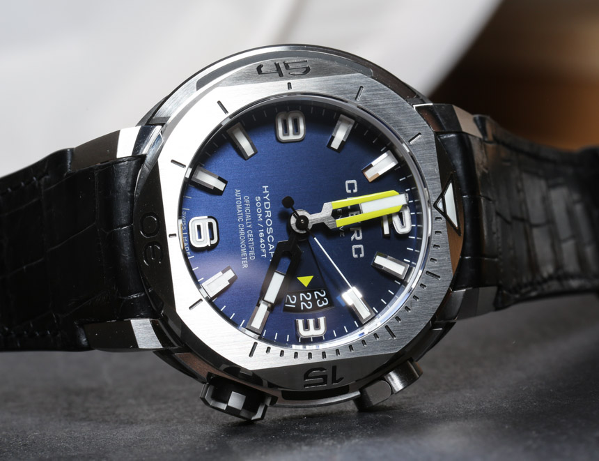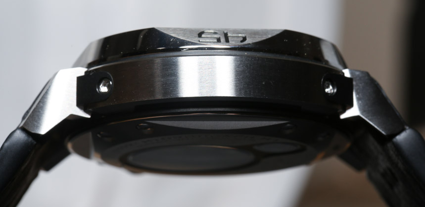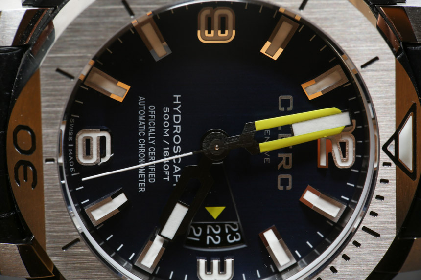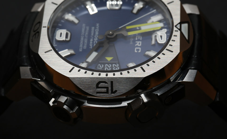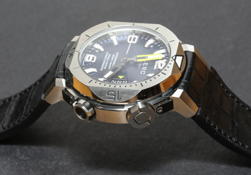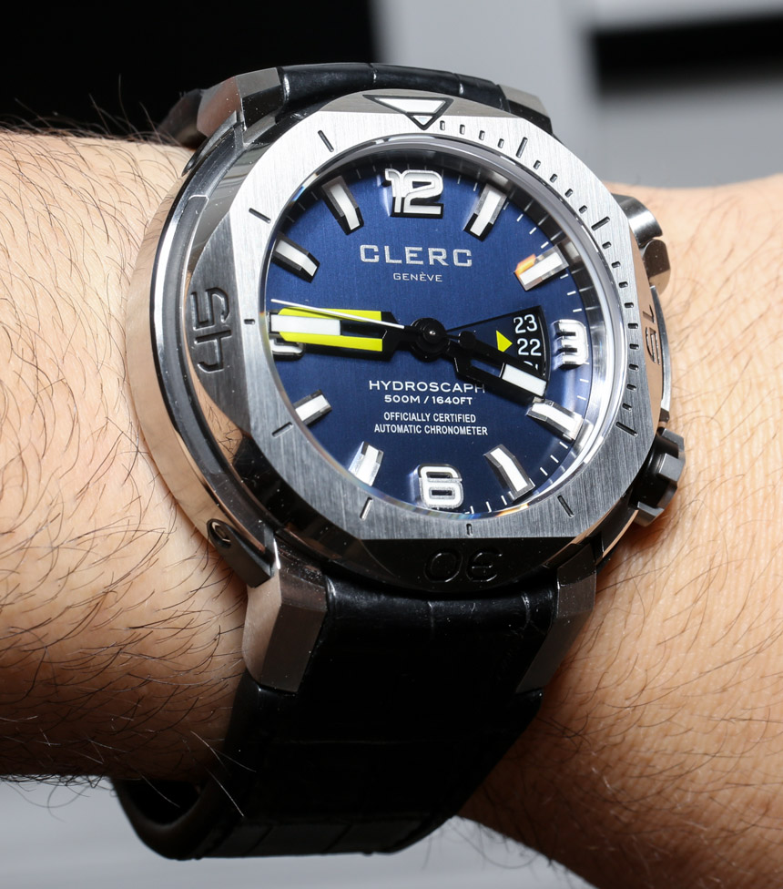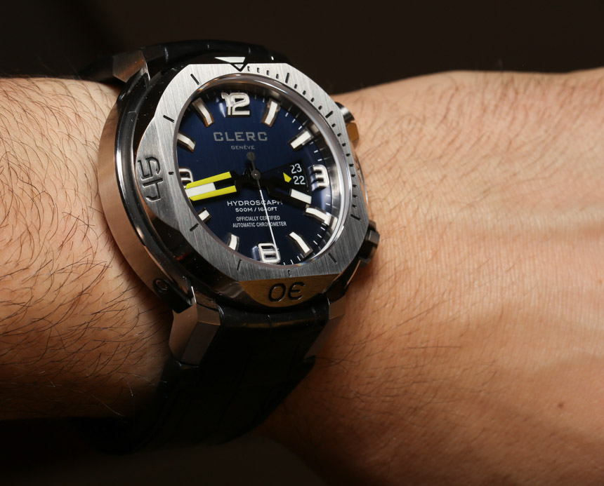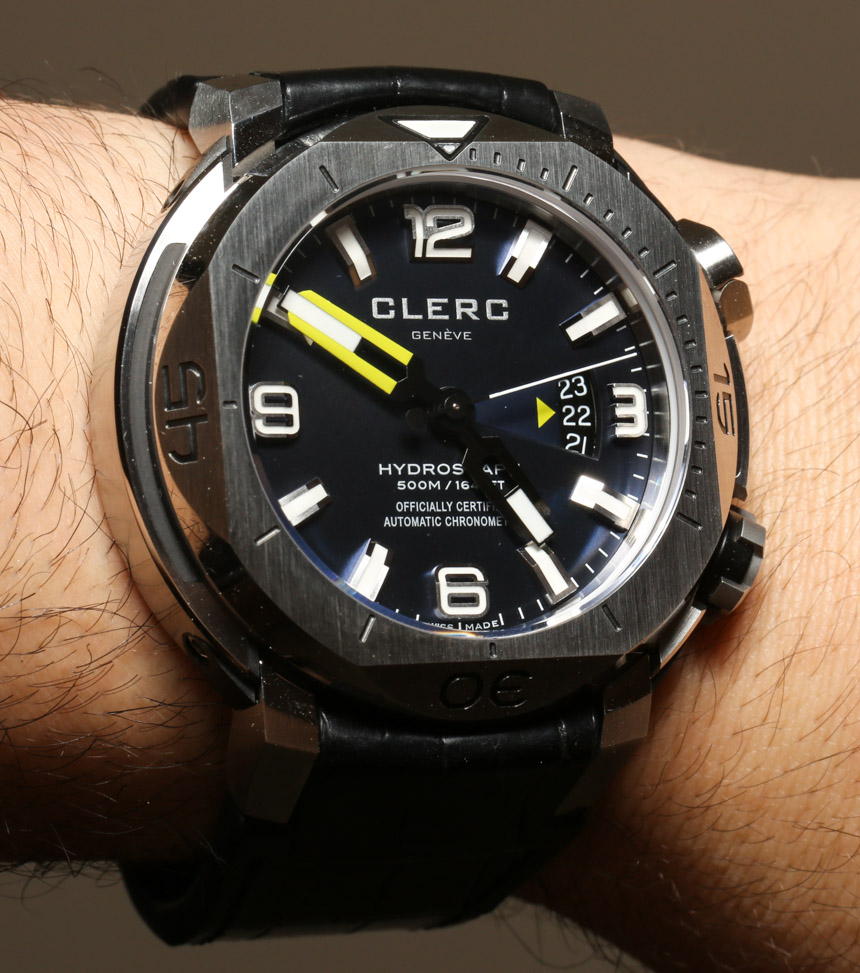
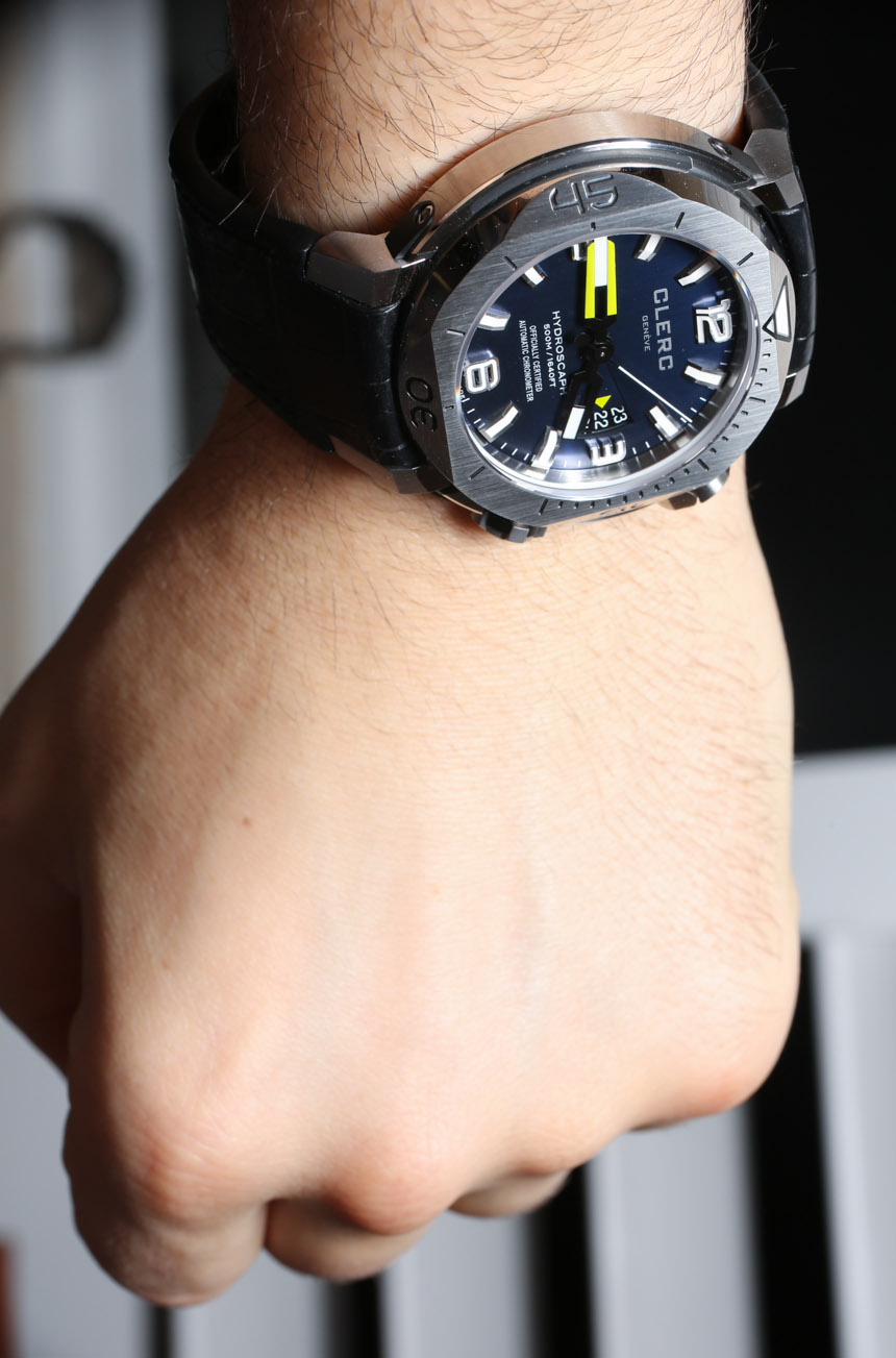
Having said all that, the Hydroscaph H1 makes a business case for itself just in its appearance. While there is inherently nothing novel added to the Hydroscaph family with the H1, it just looks good enough to eat. Especially when checking out some of those other color options (if blue and green aren’t your thing). The black and red H1 (for example) is one handsome devil. What Clerc got very right with this watch is in executing what most people want in a watch dial (whether or not they know how to ask for it).
What do they want you ask? In short, people are looking for watches with easy to see hour markers, properly sized hands that reach out to the end of a dial, no unnecessary reflections that cause distortion or blur, high contrast colors between the markers and the face, and that special mix of visual design and utility that is equally functional and attractive. This watch has pretty much all of that. The large applied hour markers have flat polished surfaces that offer the right type of reflection (for you know, a little bling), and colors that help key elements stand out properly. The dial also looks crisp and technical alluding to both performance and high-design.
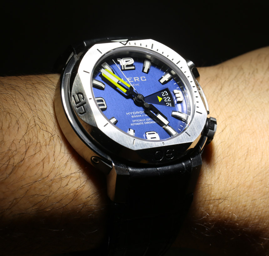
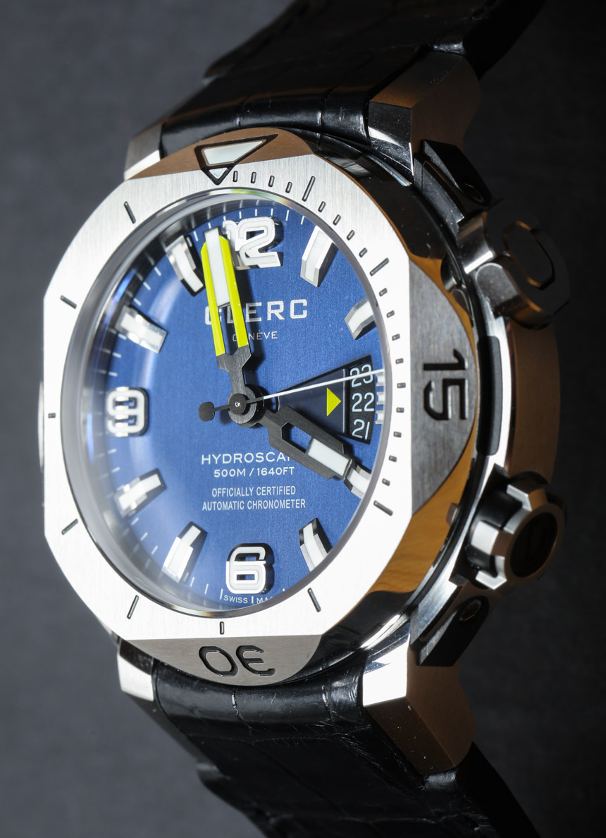
It is really the little things on the dial that make it look interesting. You see a bit of the Clerc DNA in the expanding triangle that goes from where the hands intersect to the open date window. In fact, it is even done in a way where the open date window doesn’t really bother me. The dial doesn’t even try to suggest that it is a functional element – and is clear that it is purely for decorative fun.
Can you spot the homage to Rolex? The text under the hands is directly inspired by what Rolex has printed on the dials of Submariner watches for years. First is the name of the model, then the water resistance, and then of course the overly verbose language about it being a Chronometer. Rolex watches actually say “Superlative Chronometer Officially Certified,” while Clerc has adopted it to say “Officially Certified Automatic Chronometer.” It is a nicely flattering adopted element from a gold-standard leader that I feel helps tie-in the Hydroscaph with the larger world of luxury dive watches.
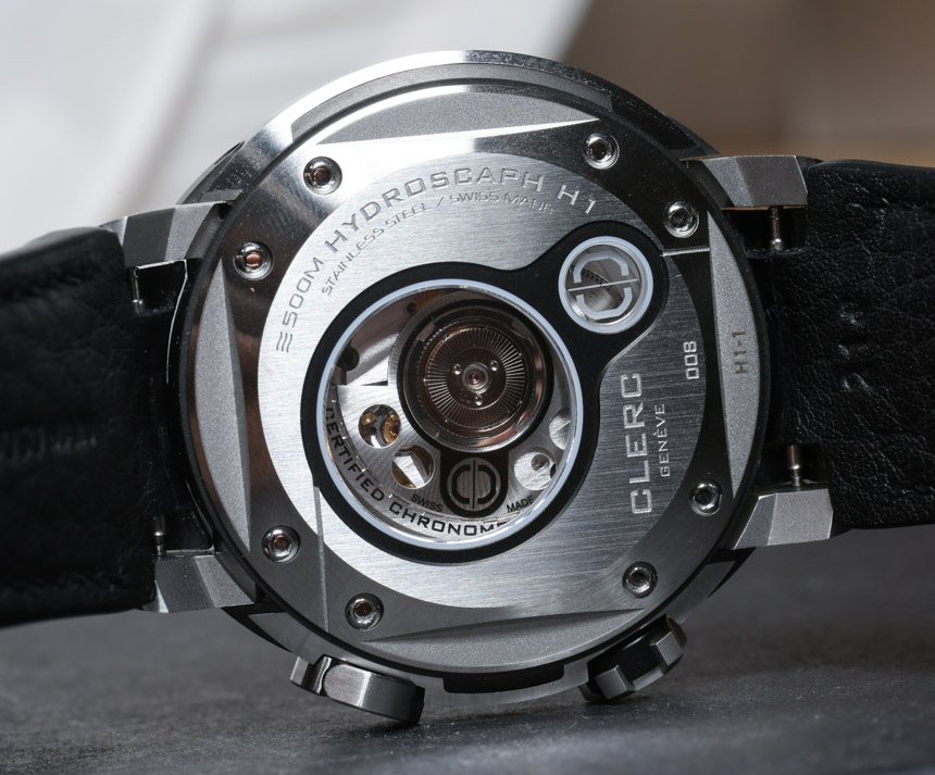
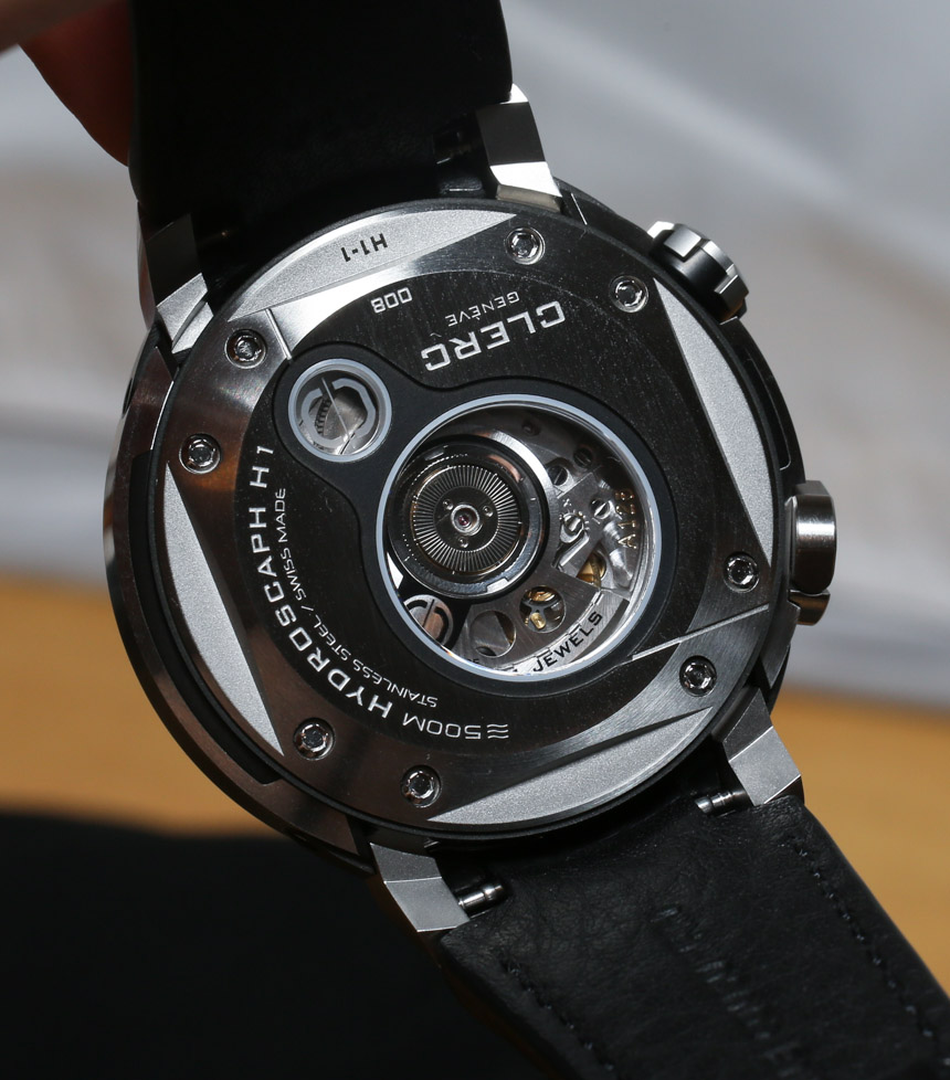
Inside the Hydroscaph H1 is a Swiss automatic COSC Chronometer movement which is probably a base ETA 2892. Clerc calls it their caliber C609 movement. On the back of the watch you can see the movement through two smaller sapphire crystal caseback windows. I’ve always felt that the caseback on Hydroscaph models was done particularly well with a nice attention to detail and design.
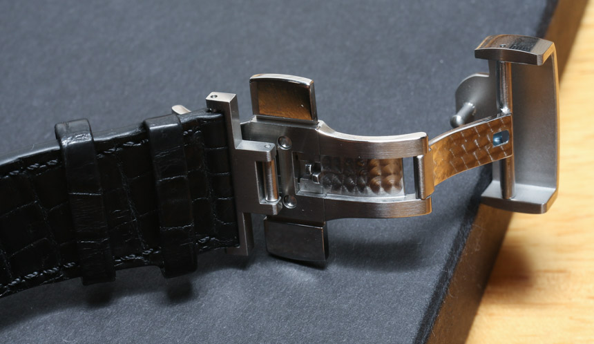
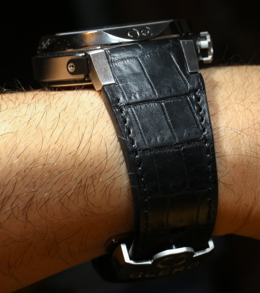
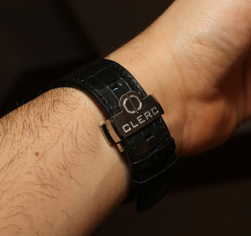
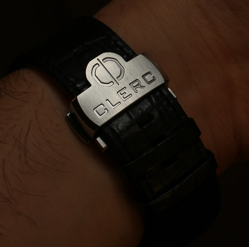
Attached to the Clerc Hydroscaph H1 is either an alligator leather strap or a rubber strap. The straps are custom made and fit snugly in the lugs and taper down a bit to the deployant clasp. A good strap helps make a nice watch even better, and especially on the alligator strap, it makes the H1 look stellar. While Clerc went for simplicity rather than novelty with the H1, it is probably because it’s an actual diver that they’ve given it a simple and easy to read dial. It is an expensive watch given the competition, but significantly more accessible than other Hydroscaph models that cost thousands more. Overall simple and satisfying, the H1 is probably a great watch for those who’ve owned a few of the classic dive watches out there and are ready for something a bit more unique and modern. Price for the Clerc Hydroscaph H1 on rubber is $5,900 and $6,300 on an alligator strap. clercwatches.com
Necessary Data
>Brand: Clerc
>Model: Hydroscaph H1
>Price: $5,900 – $6,300
>Size: 44mm
>Would reviewer personally wear it: Yes
>Friend we’d recommend it to first: Dive watch lover who has worn a range of classics and wants to branch out.
>Worst characteristic of watch: Pricey, and leaves fans eager for an updated, thinner case design given the more simple movement.
>Best characteristic of watch: Still cool, the Hydroscaph case wears nicely with a dial that is attractive, modern, and inherently legible.

