When I first saw the press shots for the Christopher Ward C1 Moonglow, I immediately opened my watch wish list (a real-life document that has been ever-evolving through the lifespan of several laptops and a handful of crippled credit cards) and stuck it right at the top. I’d been lucky enough to cover the Hermès Arceau L’Heure De La Lune watch upon its release in January, and it had piqued my interest in bold, avant-garde moonphase watches that were able to meld what is truly one of my favorite complications with a more up-to-date aesthetic.
The problem I have with many moonphase watches is that they are simply too traditional for my tastes. The moonphase complication is forever associated with a polished gold moon on a navy blue background. A tasteful combination? Undoubtedly. Is it, however, ripe for marriage with the stylistic tastes of 2019? Not so often. Without getting creative in the way the information is displayed, it is quite difficult to get away from that time-honored aesthetic. But more and more watchmakers are managing it. And while the upper echelons of the industry have been at it for years (think, for example, the Konstantin Chaykin Lunokhod, the Christiaan Van Der Klaaw Real Moon Tides, or the De Bethune DB28 Skybridge), seeing something so graphical and dynamic at this price point is kind of novel.
Although I’ll follow the script and leave the pricing reveal until the end of the article, I will say this now: I was impressed. I don’t own a Christopher Ward (yet), and while I have very much wanted to add one to my collection, there was often something else in and around (read slightly above) the price point in the same design category that ended up turning my head instead. There is not much else I can compare the Christopher Ward C1 Moonglow to at this price, and so it stands out as the watch I would recommend to anyone looking for a reasonably priced, visually engaging moonphase watch.
So, we’ve established that I was blown away by the press kit and the pre-release shots of this watch. But what of the wearing experience and appearance in the metal? In truth, by the time the watch arrived, my anticipation level had reached fever pitch, so anything other than slight deflation seemed unlikely.
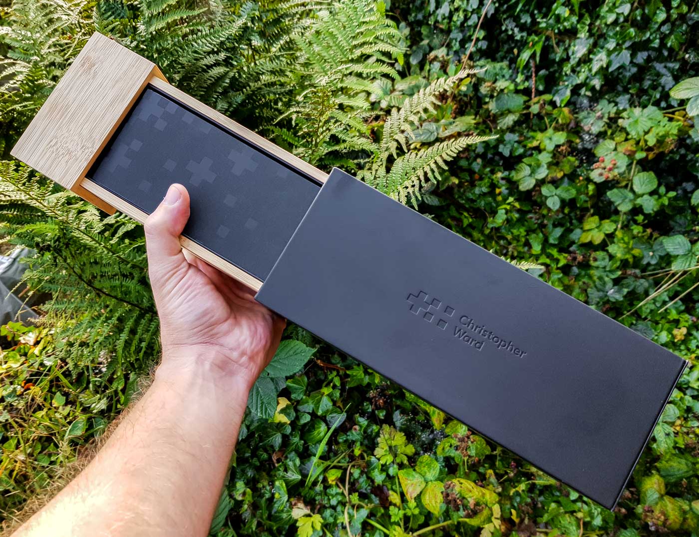
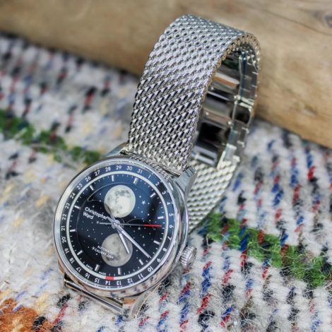
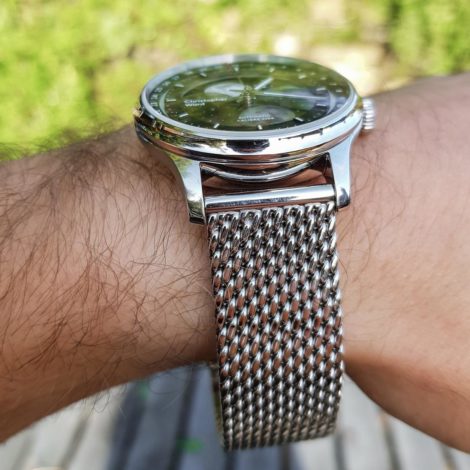
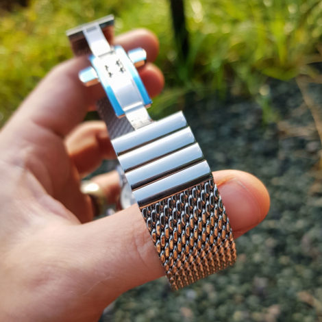
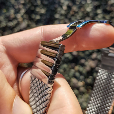
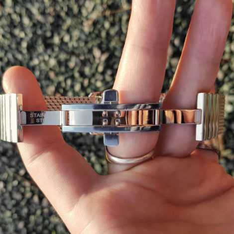
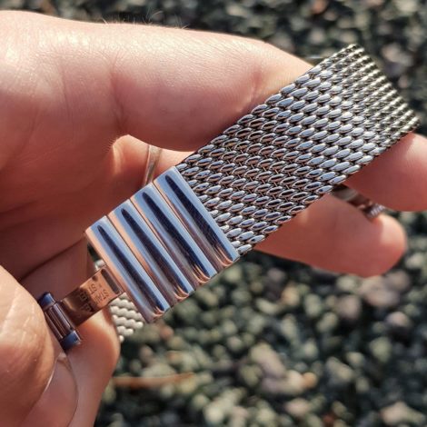
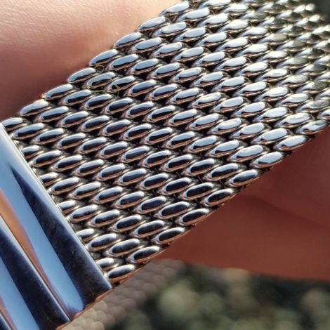
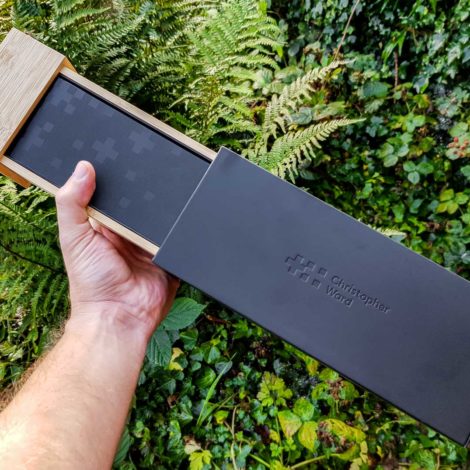
On first impressions, the overall presentation of the watch is great. The new box design from Christopher Ward is classy and robust and perfectly suited to a watch of this value. I was sent the watch on the Milanese bracelet, which was something of a surprise, as it technically hadn’t been released at that point. Frustratingly, that meant I was unable to wear the watch as it was intended because despite being a fully grown man, my 6.5” wrists were too slender for this bracelet even with all possible links removed.
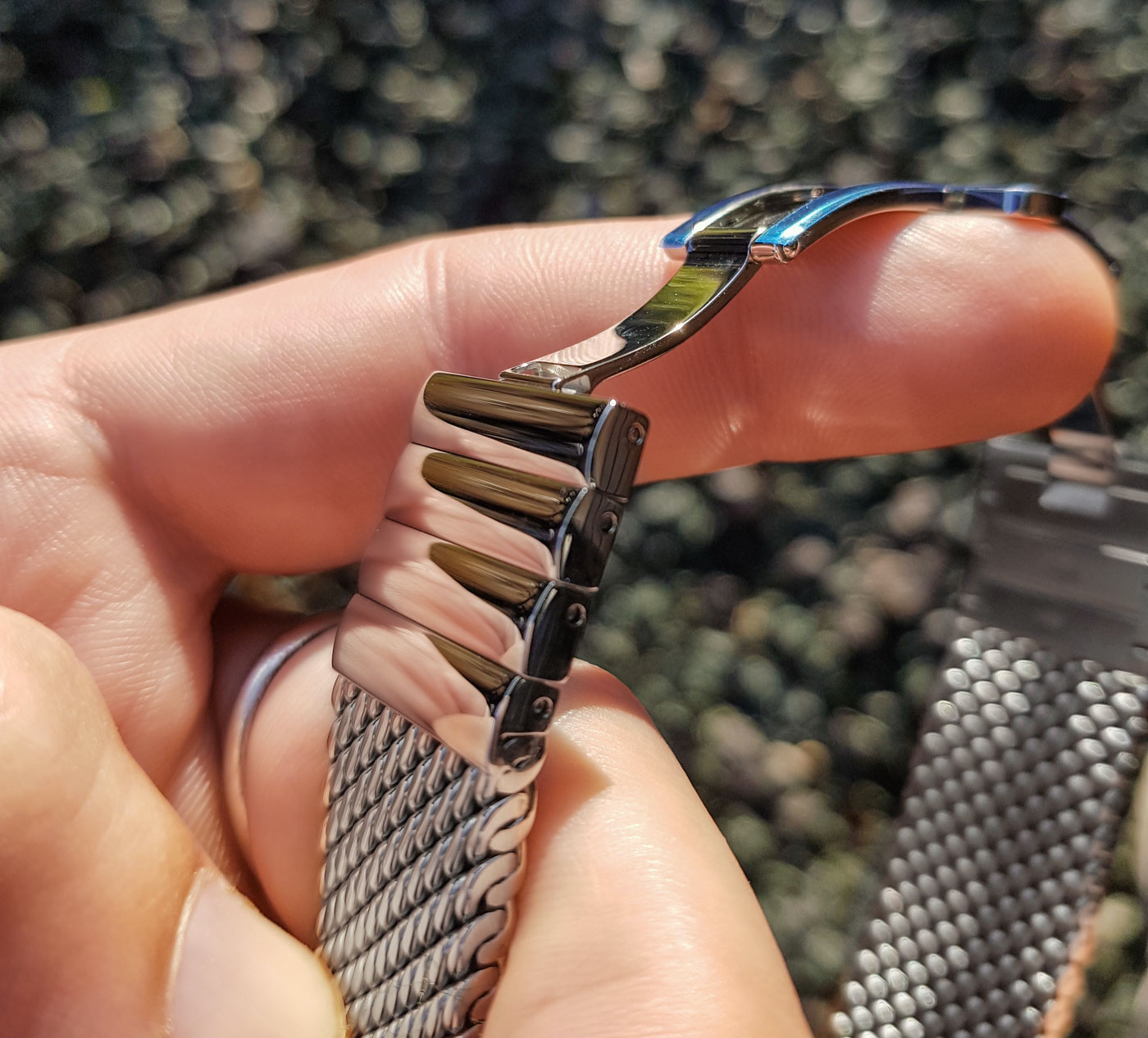
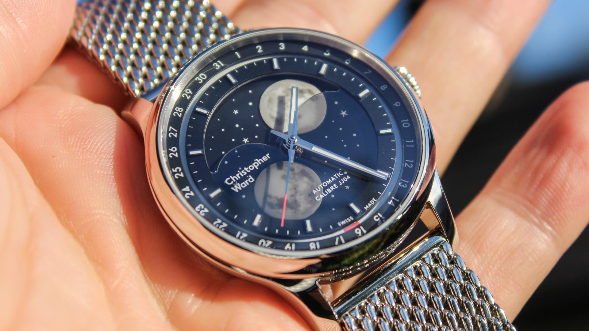
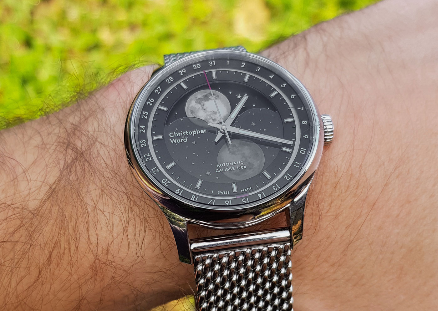
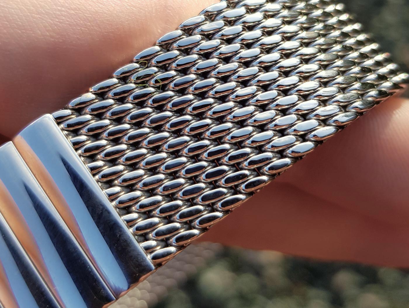
To get a feel for the watch on the wrist, I stuck it on an old suede strap for a week or two, but haven’t included any of the photos I took of it for reference because it wouldn’t present the watch in the correct light. The bracelet does, however, seem to be of excellent quality and would make for a nice change-up from the leather given how much it alters the watch’s overall appearance. I would personally take it on the leather, as I feel the prominence given to the watch head (and the transit of the moons on the dial) is greater and makes the most of the unusually animated dial. The bracelet also adds significant visual and literal weight to the watch, which I’m not sure it really needs.
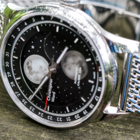
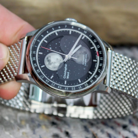
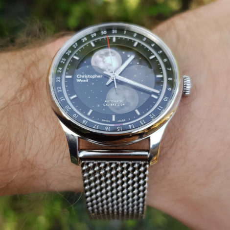
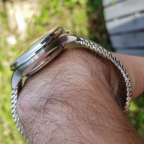
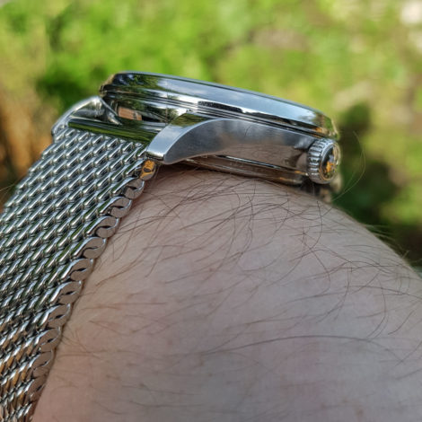
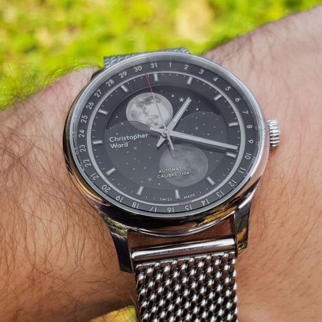
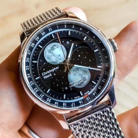
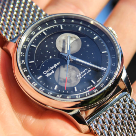
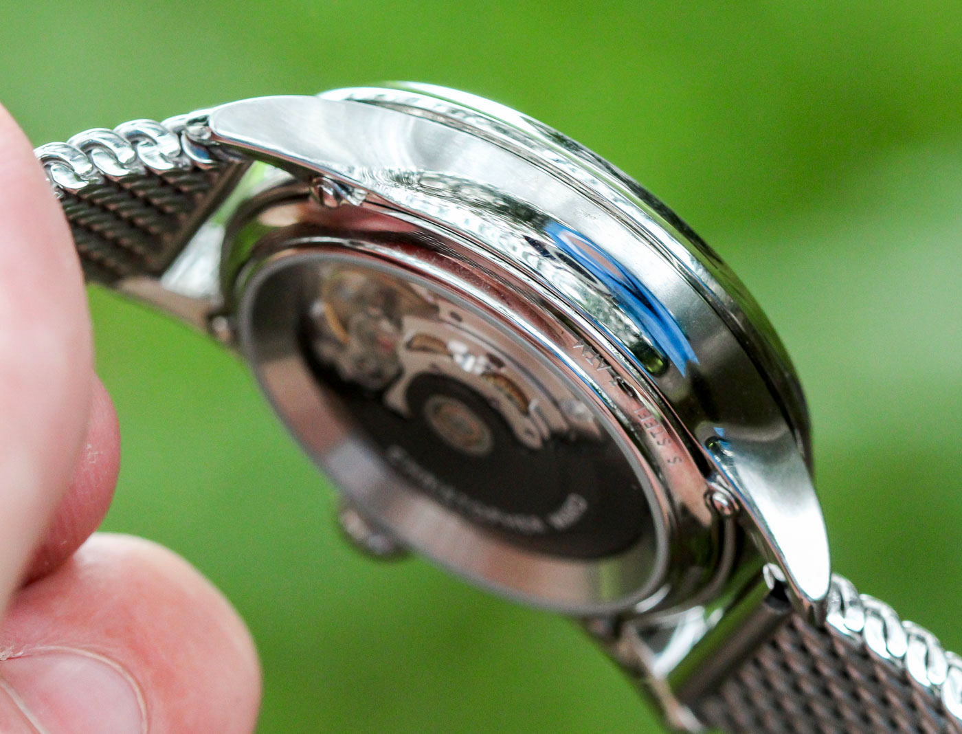
The watch wears quite tall on the wrist, given its pleasingly petite diameter (40.05mm), but not insignificant height (12.35mm). One of the loveliest touches of this case is the scalloped undersides. Both flanks have been partially excavated to leave concave trenches on the sides of the watch facing the hand and the forearm.
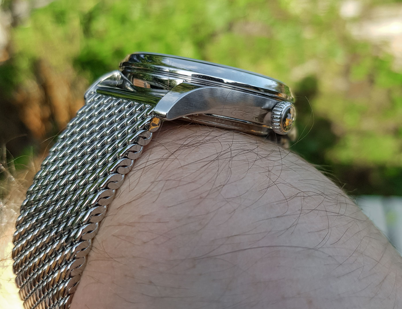
The upshot is far less restricted hand movement and much-increased comfort. In my opinion, far more watches — especially sport watches — should utilize this case structure. (I’m often left blinking away tears when I bend my wrist all the way back into some gargantuan adventure timer as I’m reaching for an awkward handhold on a cliff face I definitely don’t want to let go of in order to adjust my watch.)
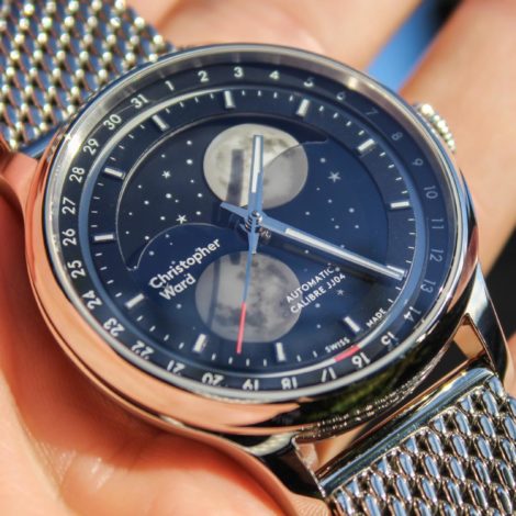
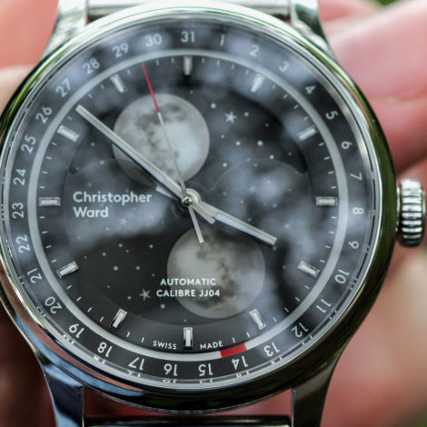
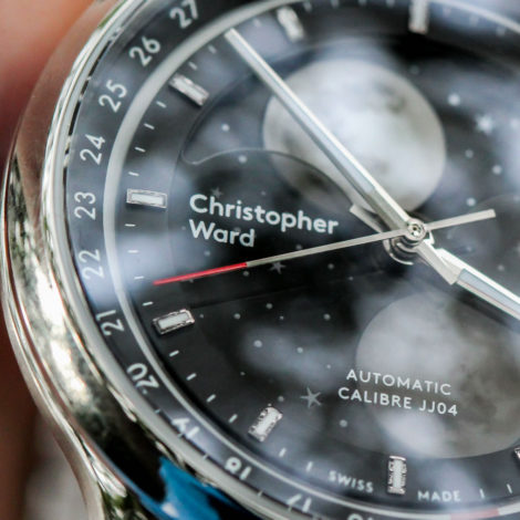
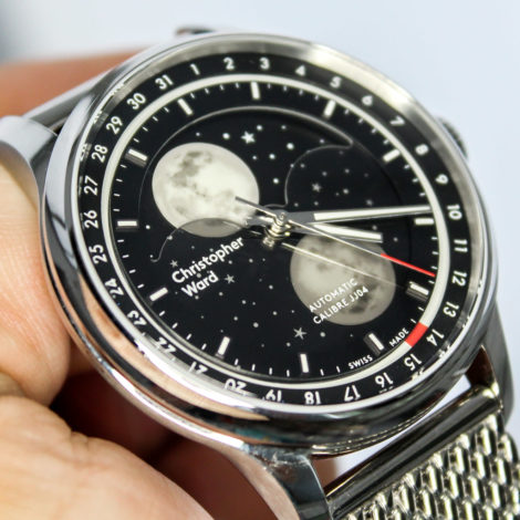
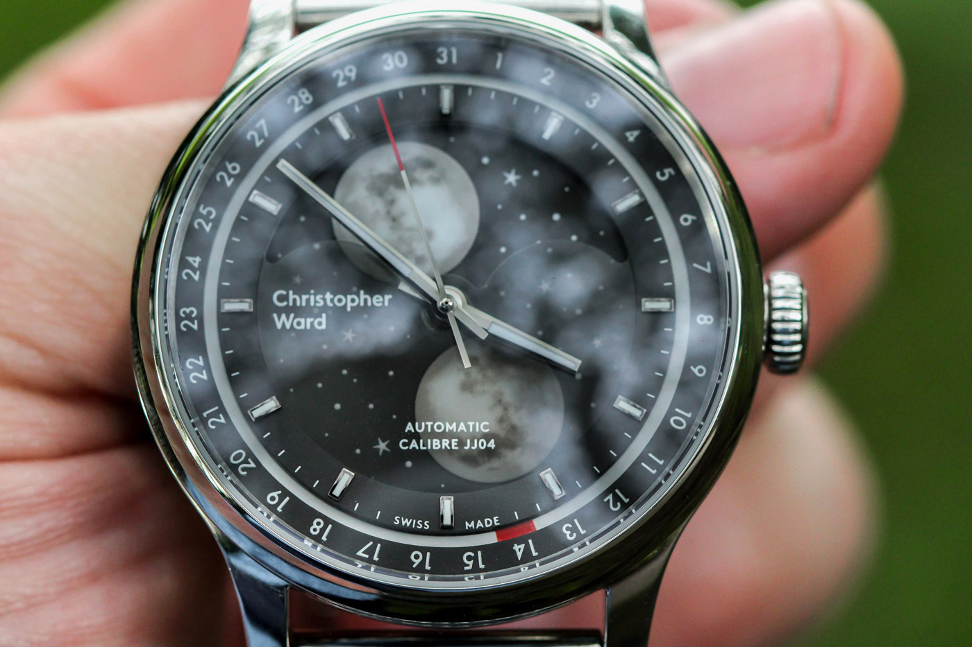
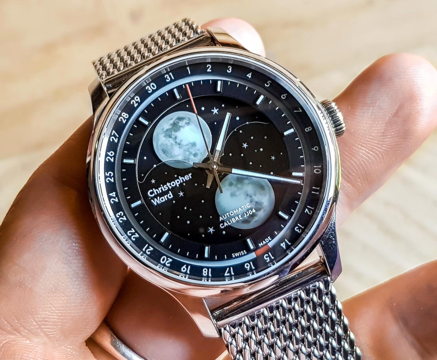
In daylight, this watch appears just as nuanced as the press shots suggested. The dial, which boasts three distinct levels (the top, time-telling tier, the expansive moonphase disc, and the recessed date indicator) is boosted by the smoked crystal insert that partially obscures the inactive areas of the moon disc. Polished, applied hour markers working with a polished handset make telling the time easy while the luminous date ring, with the active day blocked out in red, is an ingenious way of presenting the date at night. (So many watches fail to take this into account.) By having the luminous section of the date ring constantly exposed to light means it should, theoretically, charge up at the same rate as the other luminous dial elements.
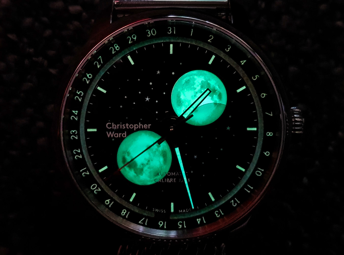
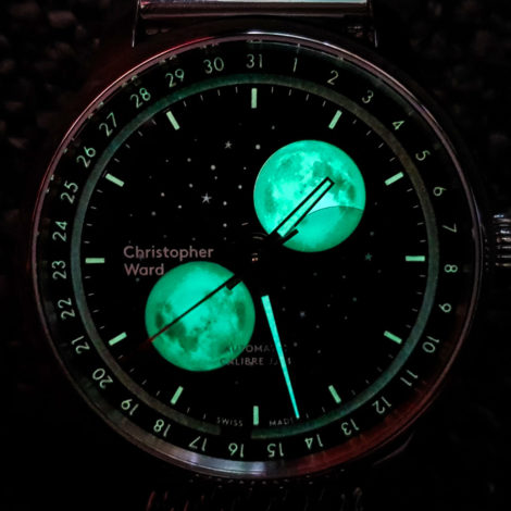
However, this is where the Christopher Ward C1 Moonglow lets itself down a bit. While the concept is sublime, the execution leaves something to be desired. Simply put, the lume on the date ring does not produce a glow anyway near as bright as the moons, hands, or hour markers, even when charged with a 500-lumen torch for five minutes. It works, the date is visible but with nowhere near as much clarity as the other information. In fairness, the press shots of the lume in action are not in the least bit misleading (the grainy, duller glow of the date ring can clearly be seen in the below stock shot included for comparison).
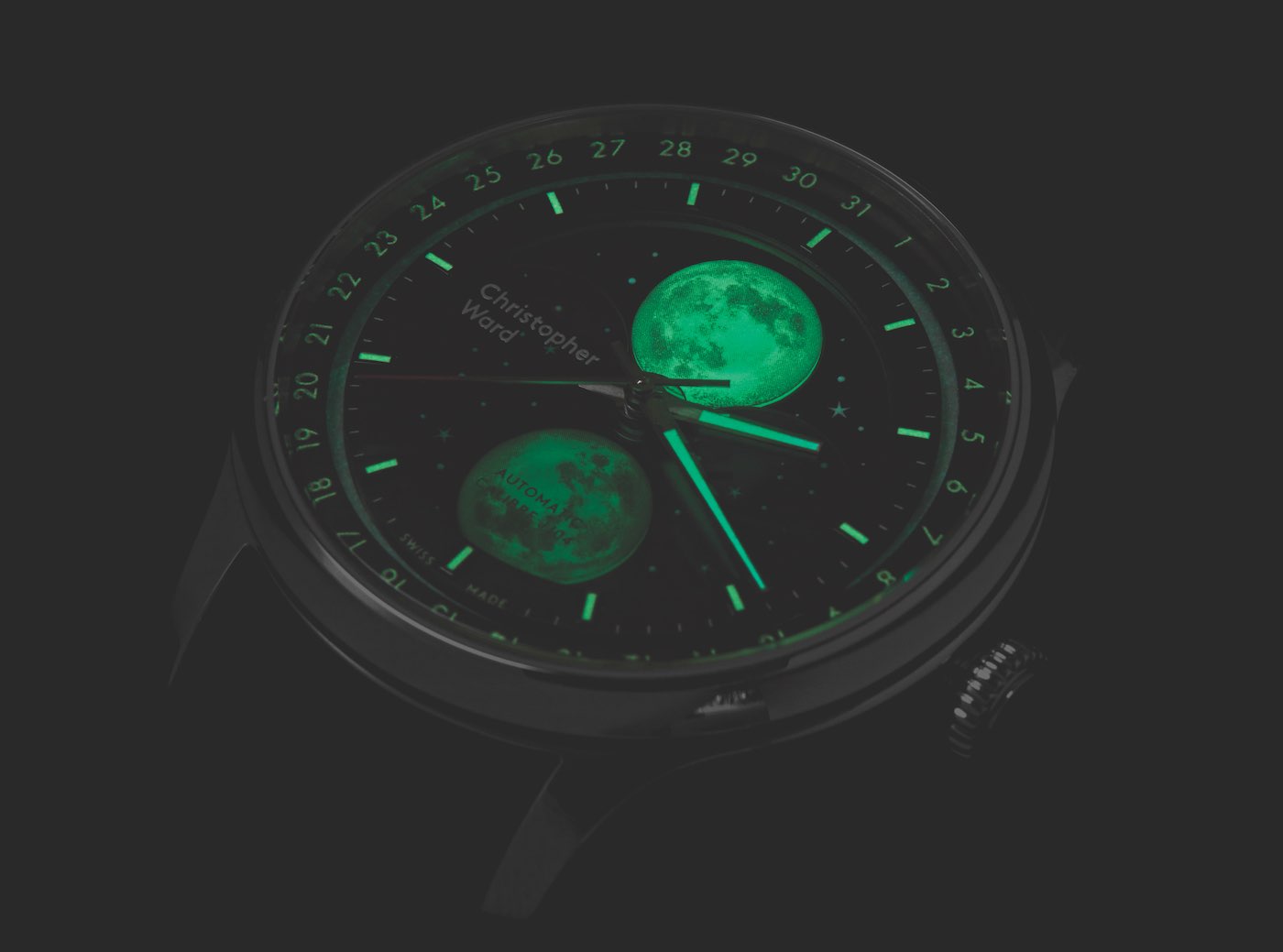
And while the handset and the hour markers perform sufficiently in low light conditions, the dazzling lume show I was hoping for did not materialize with quite as much pizzazz as the press shots suggested it would. The moons are cut from a solid luminous compound (very good), but the realistic surface decoration, showing the famous moonscape we’re all familiar with, seems to be applied by a printed transfer. While it is a very satisfying effect in daylight, when the lights dim it becomes clear that the transfer dulls the ghoulish green hue the moons promised to emit. The initial glow is superb, but it fades much quicker than the hands and markers do.
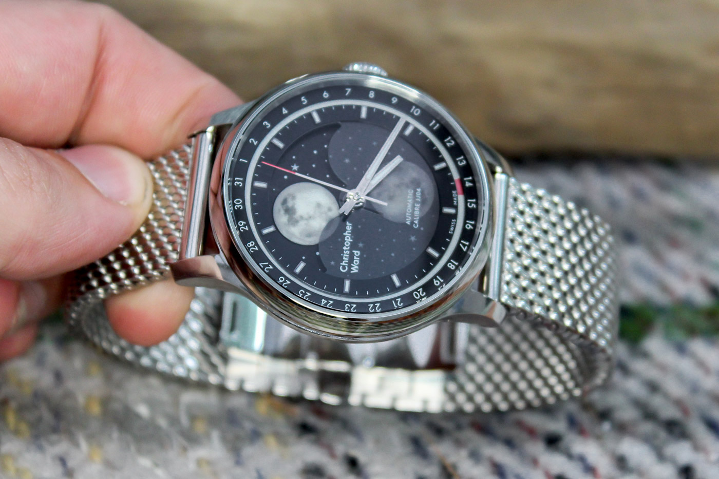
It’s still a fantastic visage, but it doesn’t last as long as I wanted it to. Of course, this is nowhere near as important as it would be on a dive or serious adventure watch, but as gimmicky as a moonphase that can be read at night might seem, it set the glow-in-the-dark-mad kid inside me leaping for joy at the prospect.
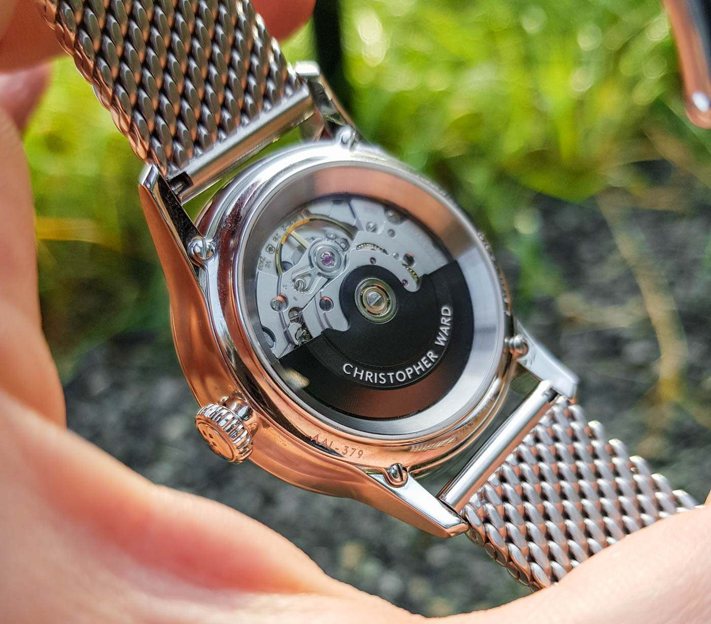
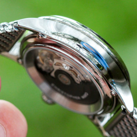
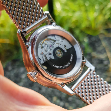
One controversial element of the dial design that didn’t bother me at all (but frequently draws heat from the watch community) is the use of Christopher Ward’s modern logo, with many likely to find the sans-serif font a drawback. The flag logo is used to sign the crown but not on the rotor as I had expected. It is possible that the model I was sent was just a press sample and that the production model will feature the flag logo on the rotor as pictured in the below press shots and mentioned in the initial press release. I think this would be a wise idea, as decorating the rotor with a repeating flag logo is, in my opinion, an excellent example of proficient secondary branding.
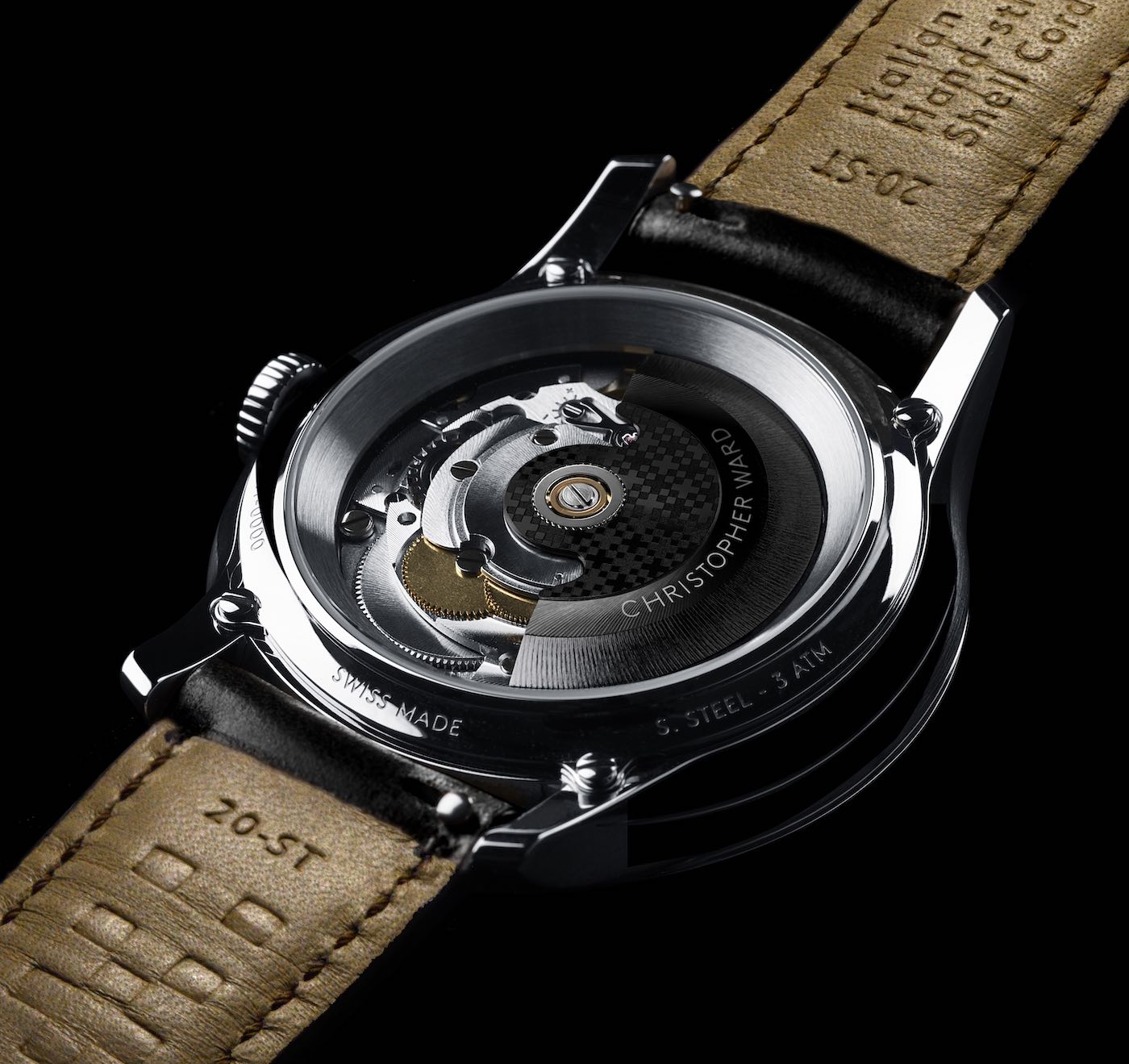
In sum, I would say that for the accessible price of £1,695 (£1,725 on the bracelet), this is one of the most interesting watches available. The design is top-drawer, and the materials come close to bringing the vision to life. It is an undeniable shame that the lume on the consciously conceived date ring isn’t better, but I have no doubt Christopher Ward has the capacity to improve this aspect for a second version, should the brand deem it worthwhile. As an avid fan of this watch and of lume, I certainly would. Learn more about the Christopher Ward C1 Moonglow and one of Britain’s fastest-growing brands at christopherward.co.uk.

