
A few months back Chopard announced a refreshed version of its L.U.C Perpetual Twin watch, and I recently spent some time with the steel model that has a striking blue dial. Perpetual Calendars are some of the most vaunted and complicated pieces in watchmaking, and Chopard understands that it is making a play in a field dominated by the likes of Patek Philippe and A. Lange & Söhne. The L.U.C line is, of course, Chopard’s highest-end movement manufacture, located in Fleurier and responsible for producing movements that are intended to compete with the aforementioned duo and their peers. Here we have what I believe to still technically be the only COSC-certified steel perpetual calendar on the market, newly refined and updated in ways that will broaden the appeal to an admittedly niche market.
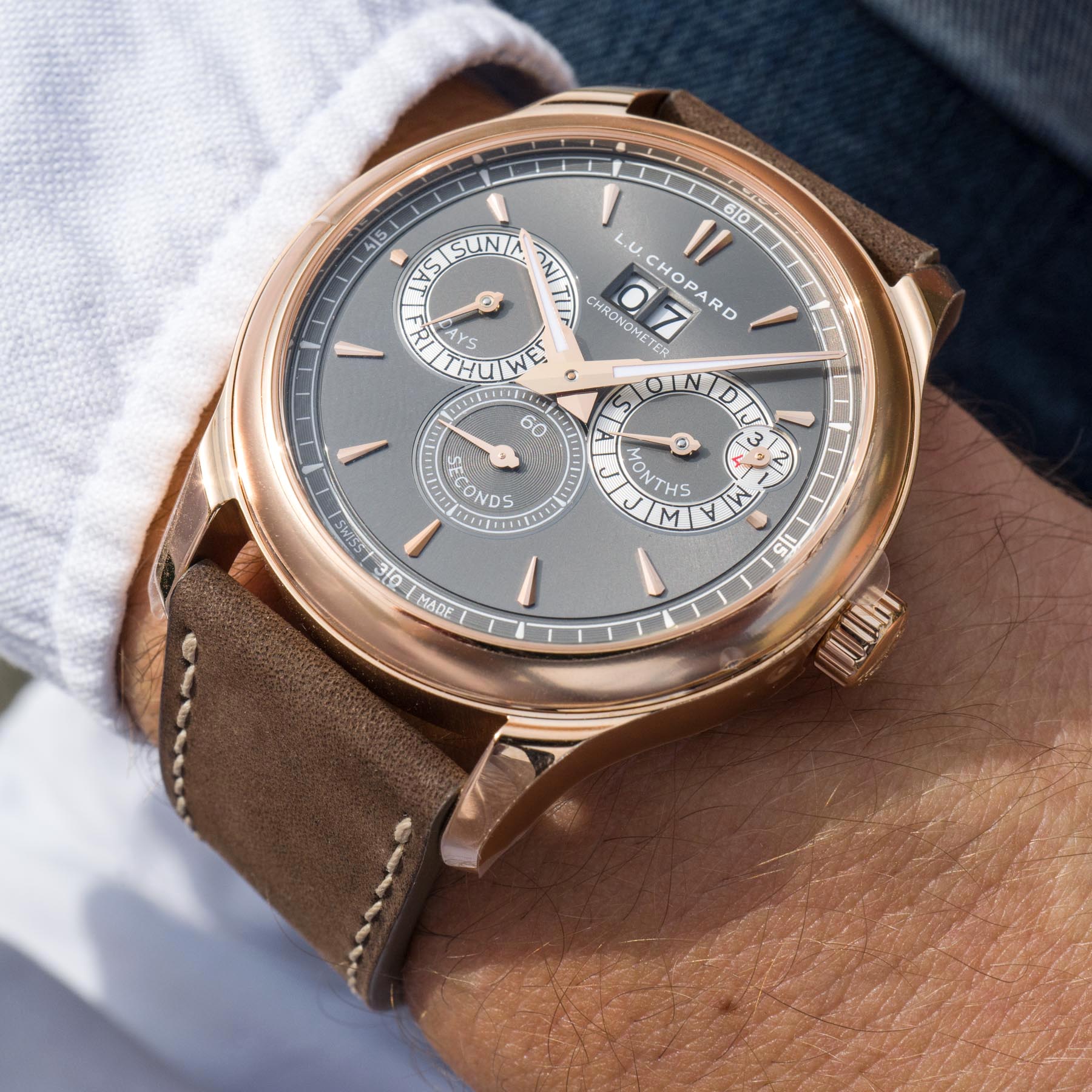
This updated Chopard L.U.C Perpetual Twin also comes in a gold variant, which our David Bredan spent some time with recently. So, while this article is going to focus on the steel model, I have sprinkled some shots of the rose gold model in the article.
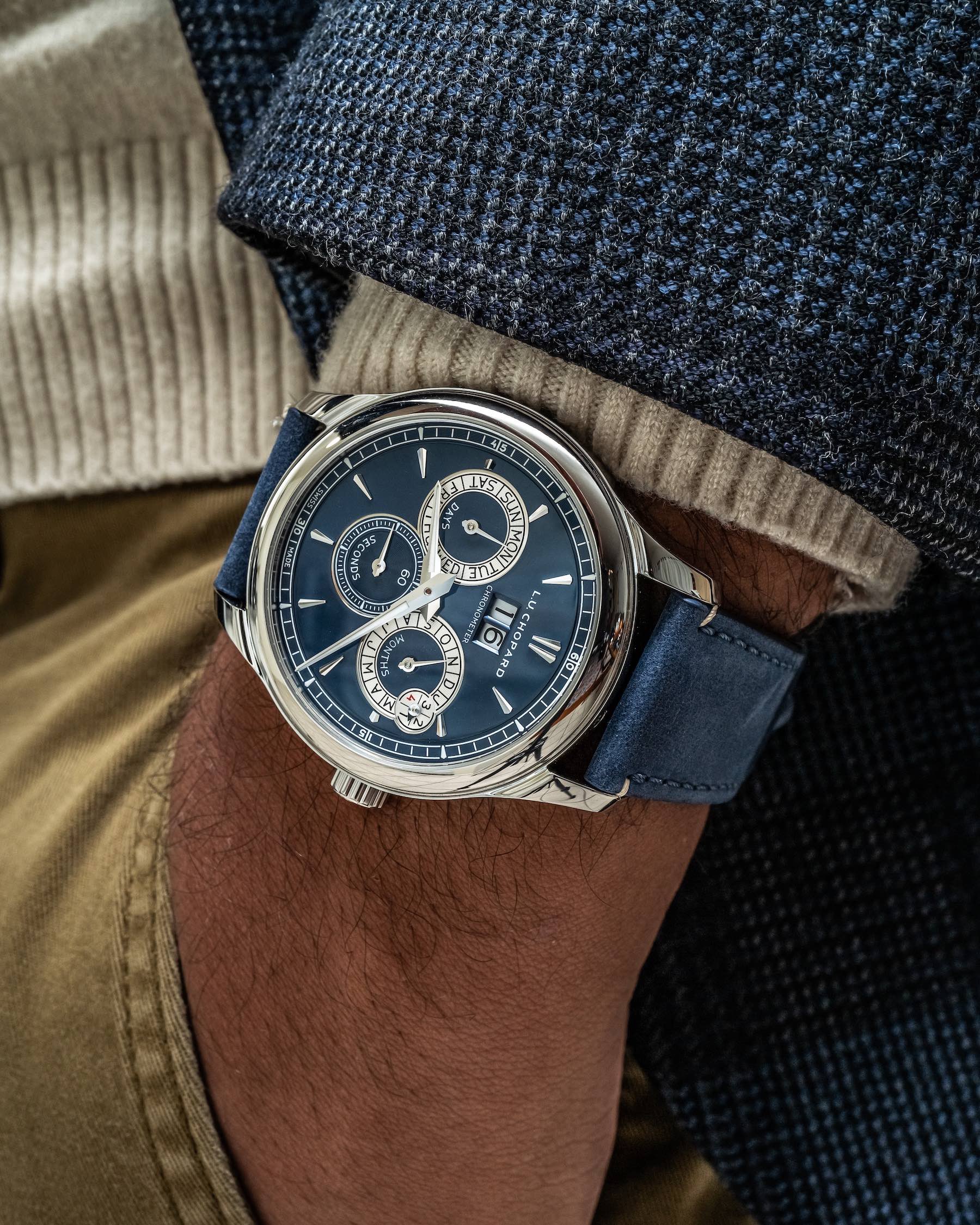
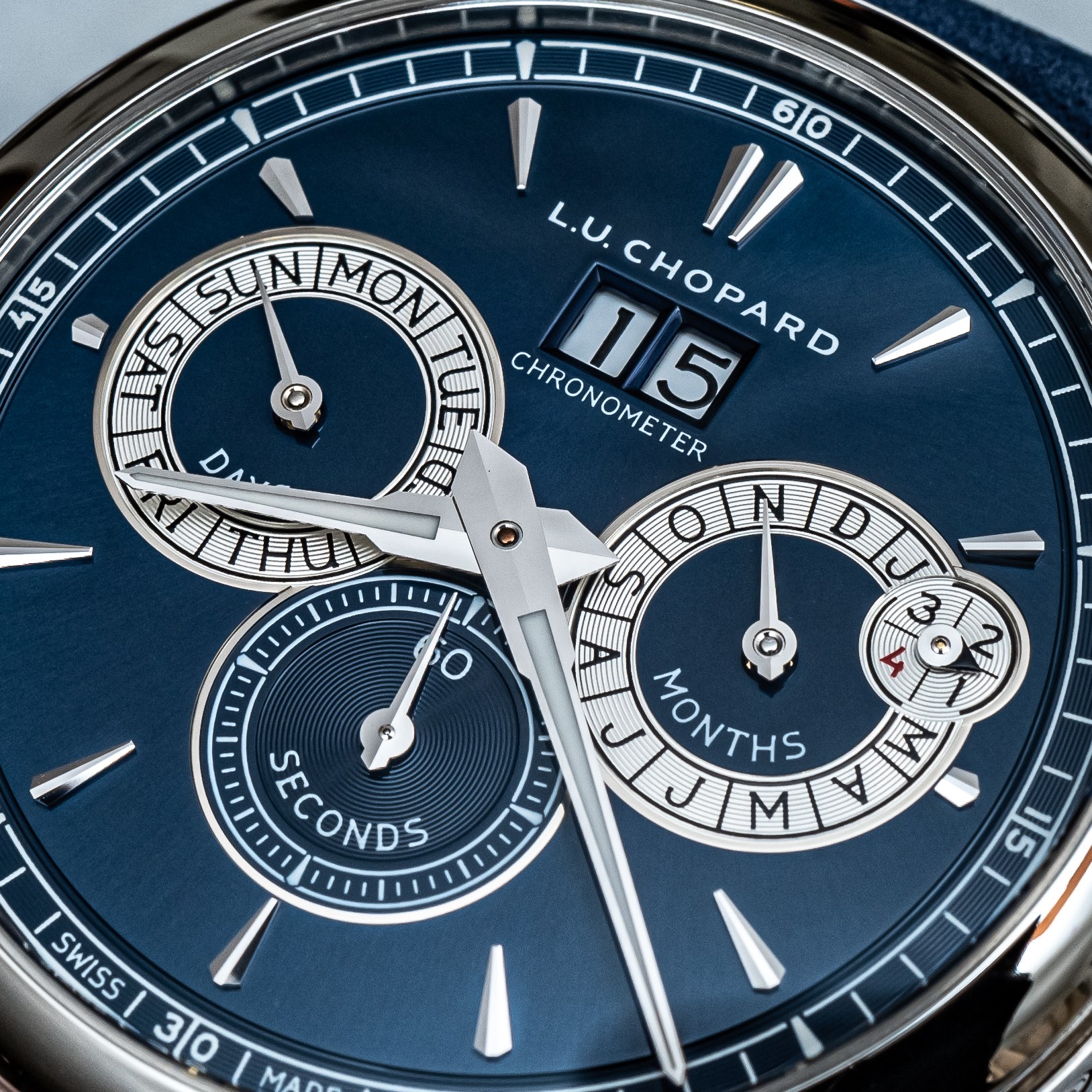
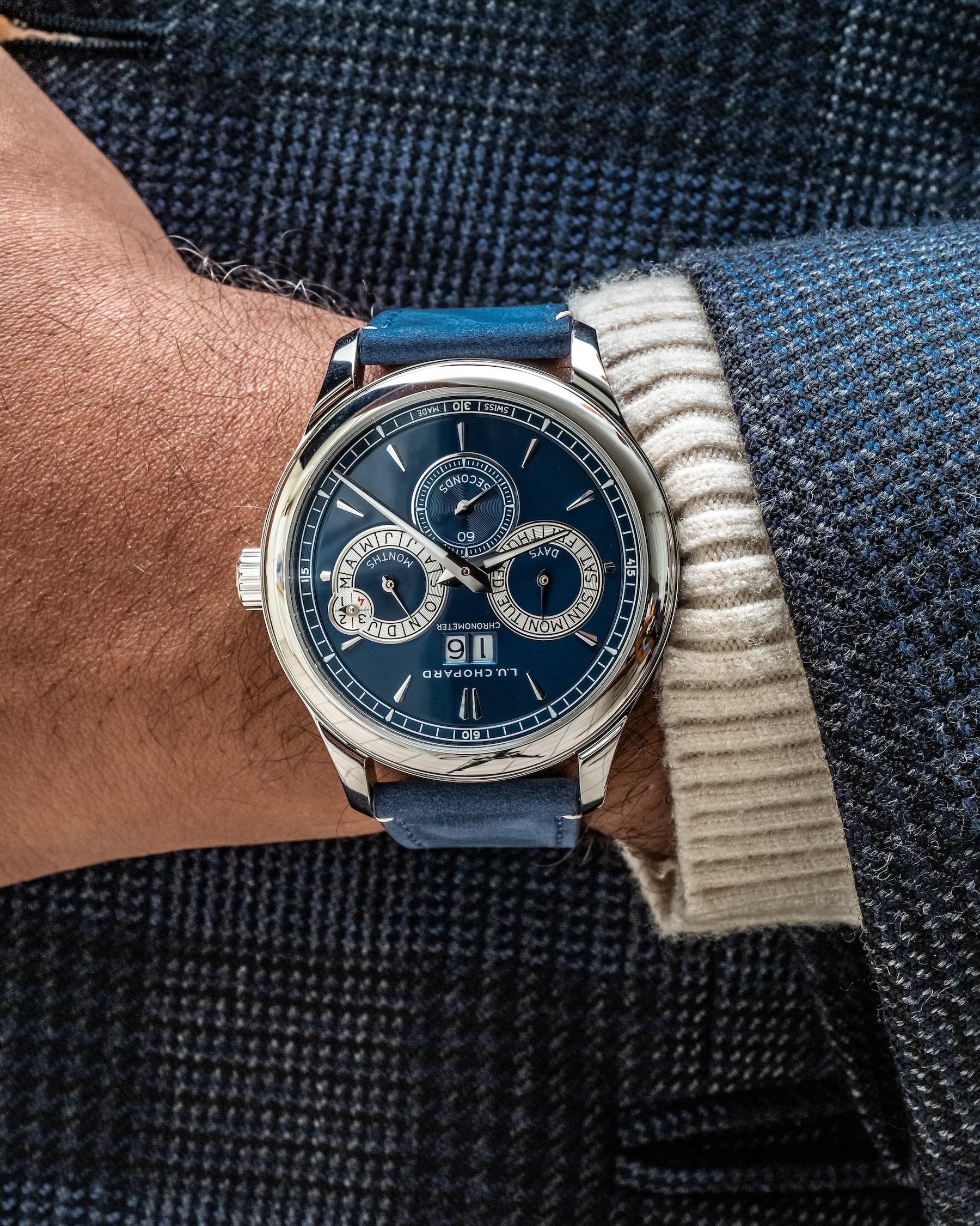
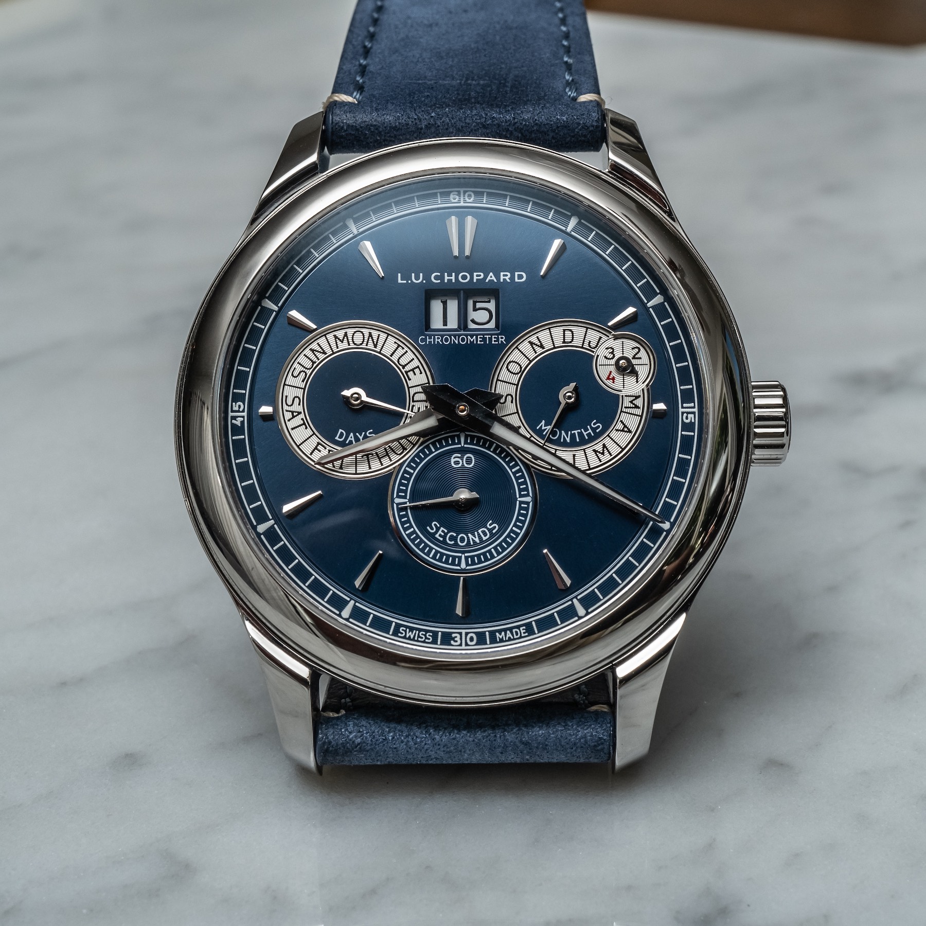
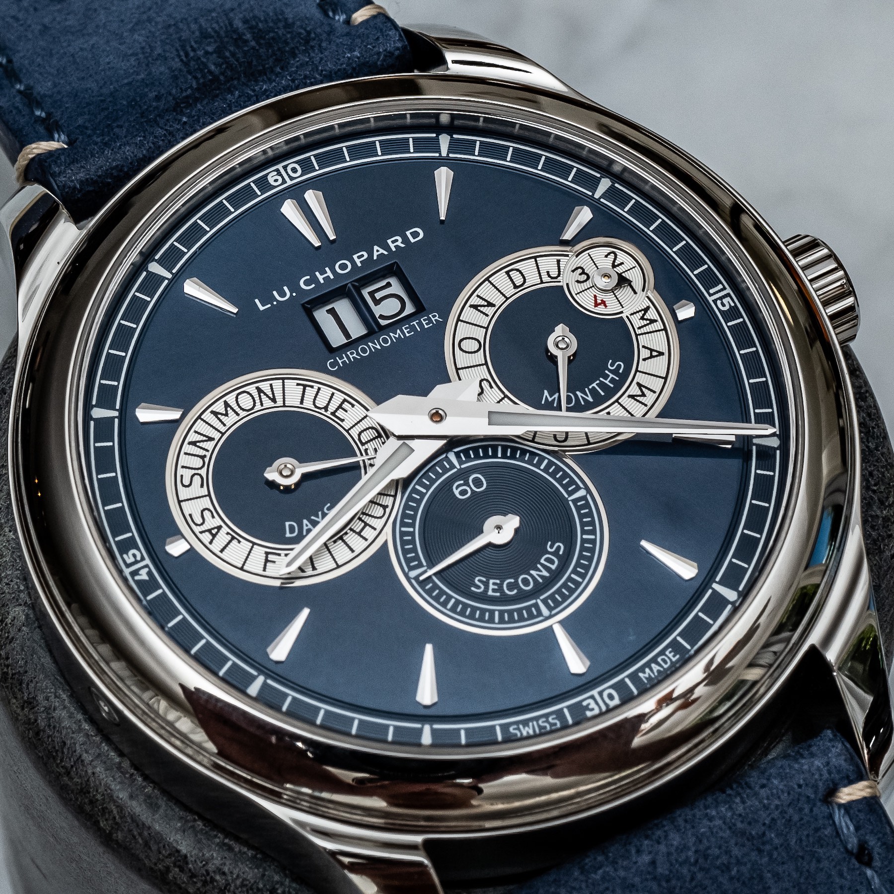
Right off the bat, the design of the new Perpetual Twin is significantly improved over its predecessor because there are no Roman numerals overstuffing the dial. Rather, the clean applied indices are a refreshing and less stuffy change that is nothing but welcome. The dial really is finished with guilloché treatment on the subdials, and the big date window right under 12 o’clock is nicely sized and proportioned as well. The faceted and lumed hands in the distinctive L.U.C. dauphine-style are recognizable to anyone familiar with the collection, adding something of an architectural Art-Deco style to the whole piece.
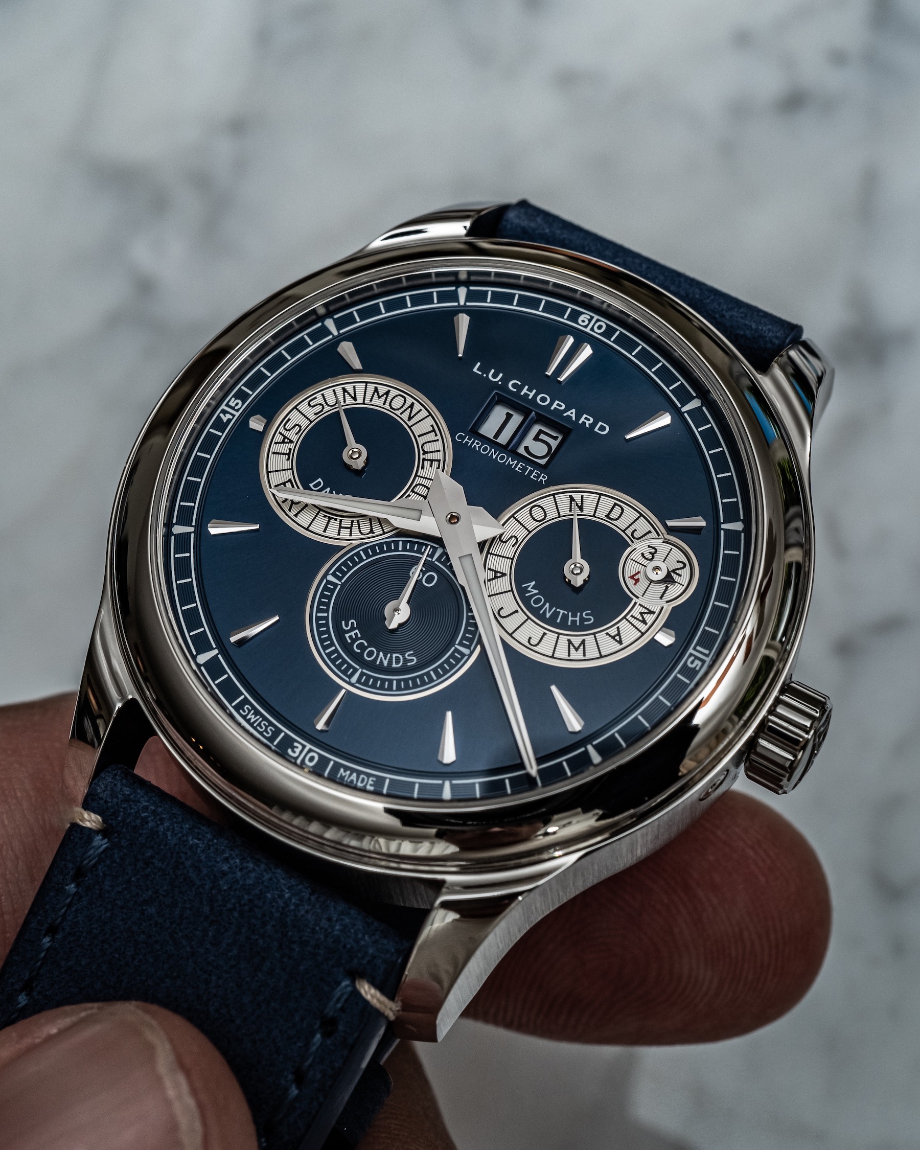
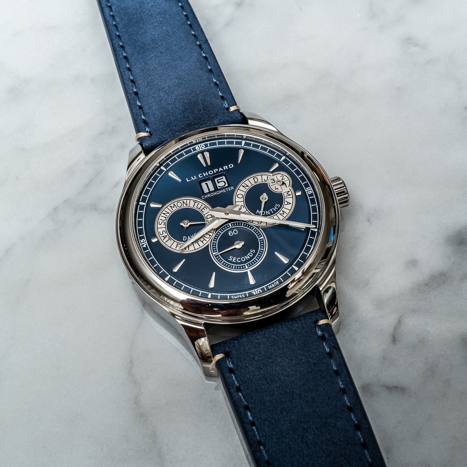
Replacing those Roman numerals with these applied indices reduces bloat on the dial, bringing more attention to the excellently clean circular guilloché pattern on the subdials, as well as around the chapter ring. The faceted hands on the subdials are elegantly simple, subtly echoing the design language expectation set from the hour and minute hands. The leap year subdial has both a unique pointer and the only other bit of color on the dial by way of the red “4.”
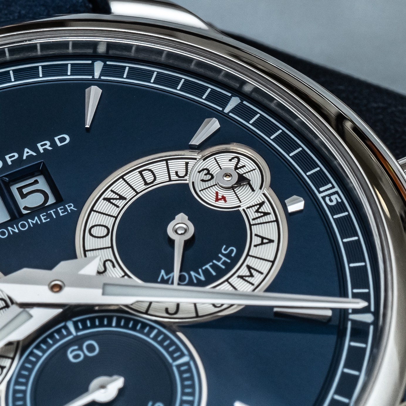
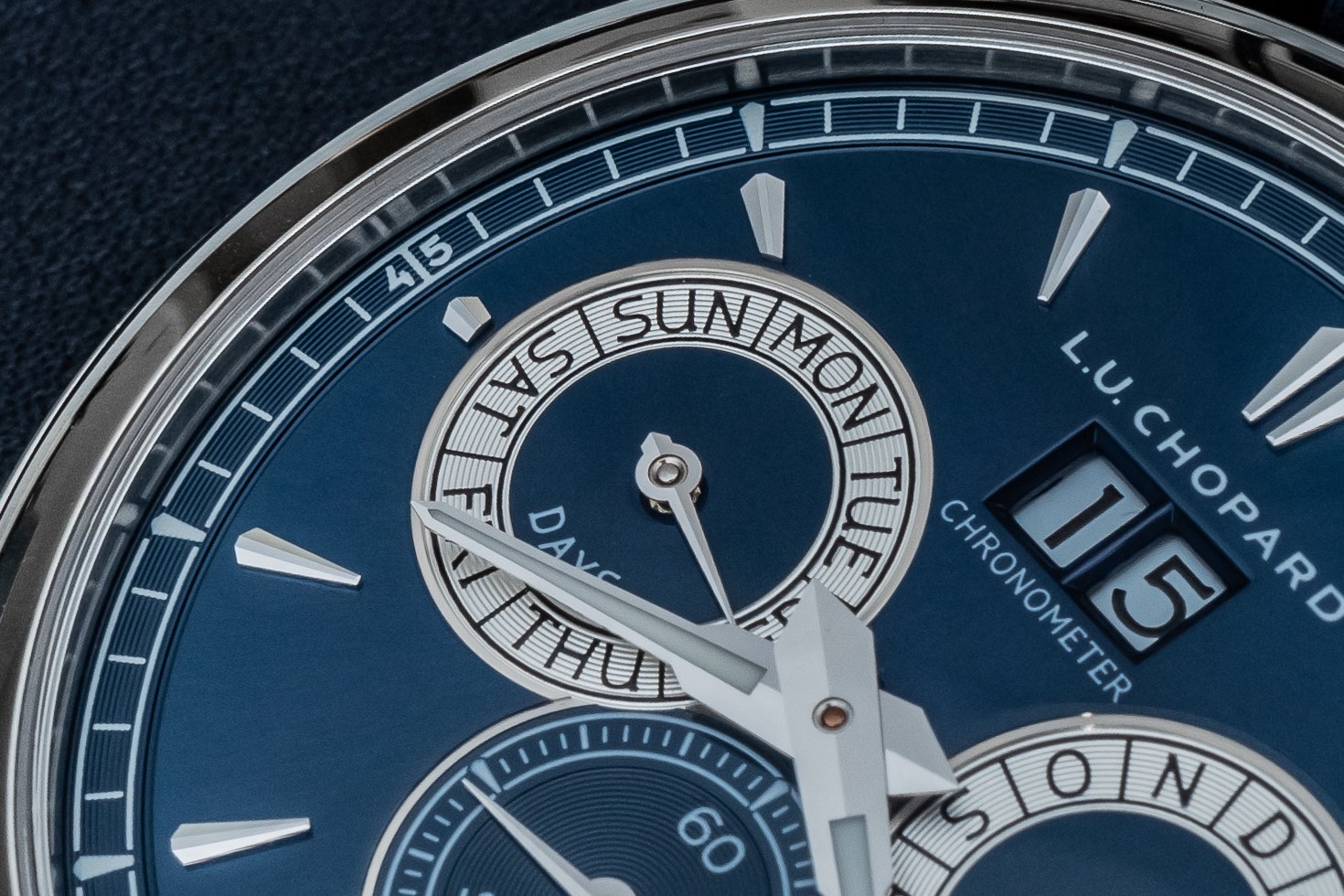
I’m also a fan of the font used on the dial, but there is absolutely room to trim down on text. Having “Days” “60 Seconds” and “Months” written on each respective subdial is just unnecessary, and I would do away with all three. I’m not entirely unsympathetic to the point that so much information on the dial without some kind of labeling could confuse potential buyers, but I think expecting a certain (and frankly, quite minimal) expectation of knowledge from a buyer signals confidence. Maybe something to keep in mind for the next iteration?
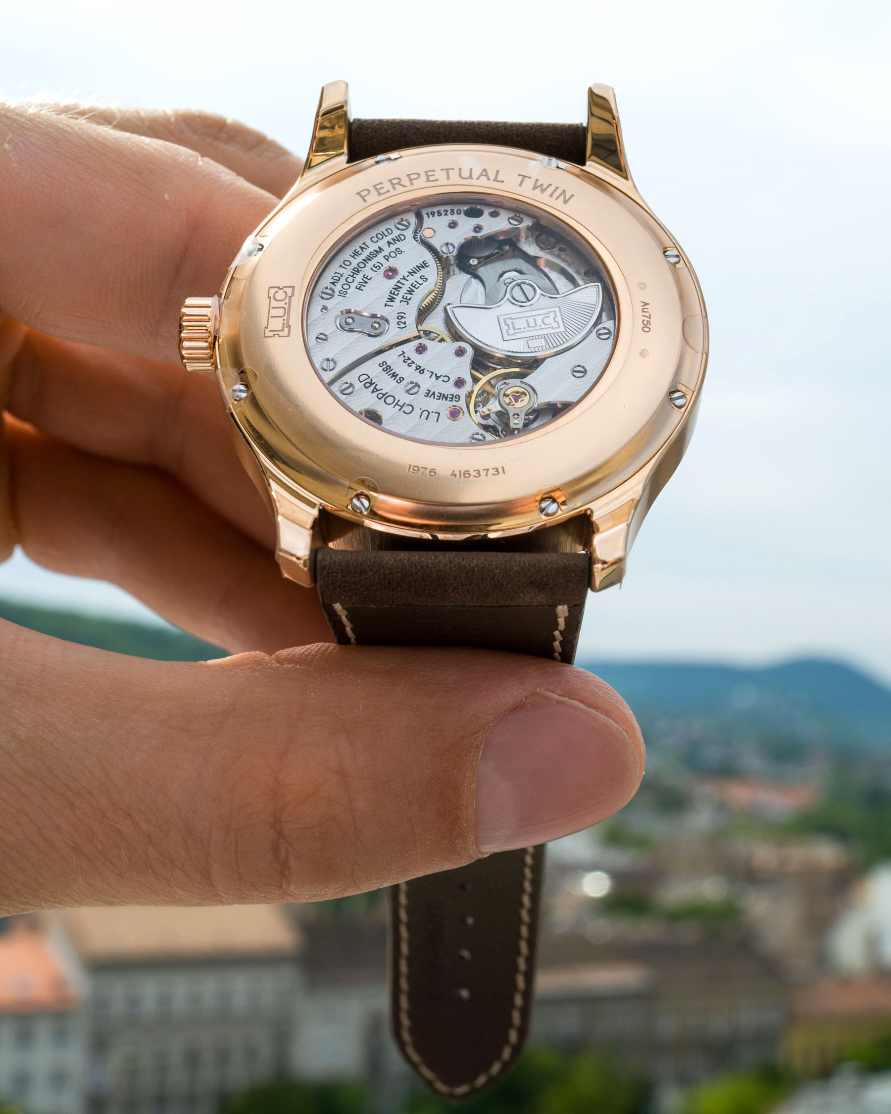
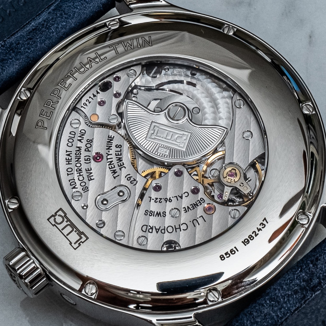
The centerpiece of any Chopard L.U.C. watch is the movement, and here we see the COSC-certified in-house calibre 96.22-L. This movement is a descendent of the first (and some would argue greatest) L.U.C. 1.96 that was developed in 1996 in partnership with Michel Parmigiani. Clearly inspired by the legendary Patek Philippe Cal. 240, the 1.96 remains a mainstay template for many L.U.C. calibers. The automatic movement features 29 jewels and is equipped with the signature micro-rotor and namesake twin mainspring barrels, operating at 28,800 vph with a 65-hour power reserve.
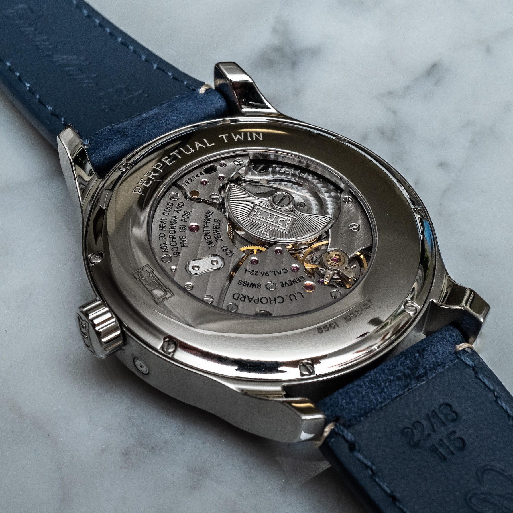
The inset micro-rotor is finished with an Art Deco flair that I would find at home as easily on the Chrysler Building as I do here. Geneva stripes, mirror-beveled edges, engine-turned perlage, circular graining, and that 22k gold micro-rotor make for a beautifully finished, visually impressive, and somewhat mellow movement. A hacking seconds perpetual calendar with an impressive level of finishing, the 96.22-L is a hell of a movement that Chopard should, and does, take pride in.
Measuring 33mm-wide and just 6mm-thick, the dimensions of the L.U.C. 96.22-L betray what may frankly be my only substantial criticism of the Perpetual Twin and that is the case size. And, before I criticize, allow me to praise the relatively slim 11.47mm-thick case. That said, I think 43mm is about 2mm too big. I recognize that in the news story I wrote, “I am sure Chopard recognized that there is no shortage of 39mm Perpetual Calendars out there,” and while this is certainly true, I still think something along the lines of 40-41mm would be ideal here. The movement-to-caseback ratio backs this up, as well.
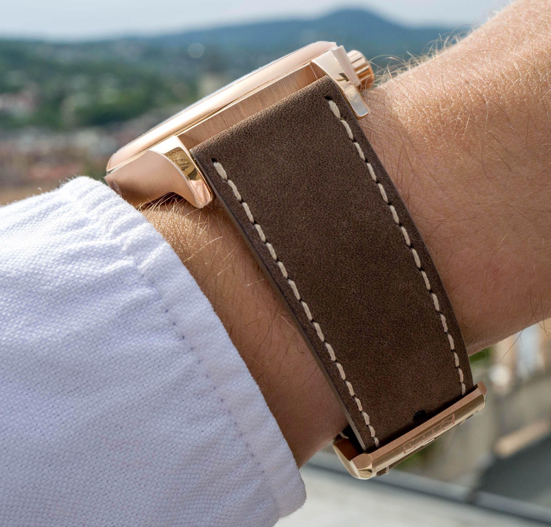
The case is water-resistant to 30M which is decent enough when you consider the two inset pushers on either side of the case, used for adjusting the day or month. The polished bezel and satin-brushed case center make for an attractive piece that looks great and could look even more refined with some beveling or chamfering along the lugs. In terms of wearability, the L.U.C Perpetual Twin is well proportioned for its 43mm-wide case, and it feels balanced on my wrist.
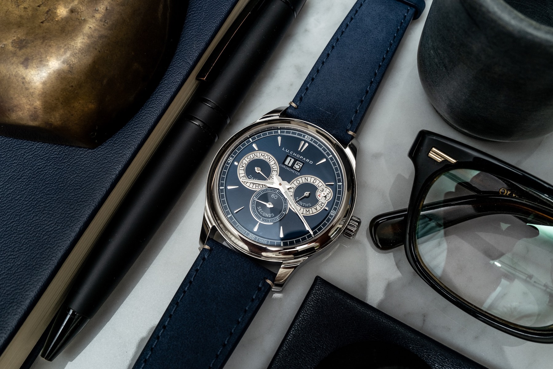
The Chopard L.U.C. Perpetual Twin in steel isn’t without direct peers, but there aren’t many. The updated IWC Portugieser Perpetual Calendar, Jaeger-LeCoultre Master Ultra Thin Perpetual, and Glashutte Original Senator Excellent Perpetual Calendar are a few that immediately come to mind. Seen here on a hand-sewn blue alligator leather strap, the Chopard L.U.C. Perpetual Twin in steel (Ref. 168561-3003) is priced at $24,700 and the rose gold variant (Ref. 161976-5003) is priced at $49,800. You can learn more at chopard.com.
