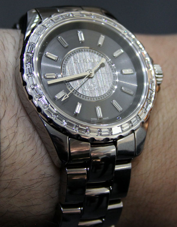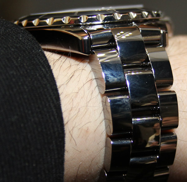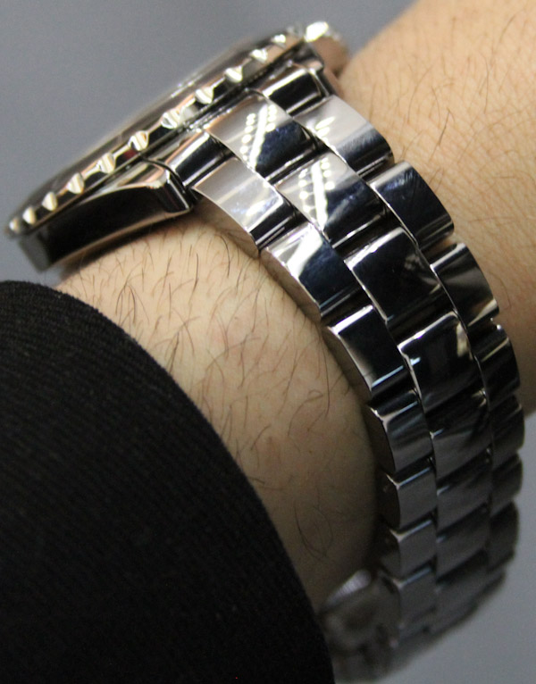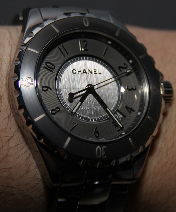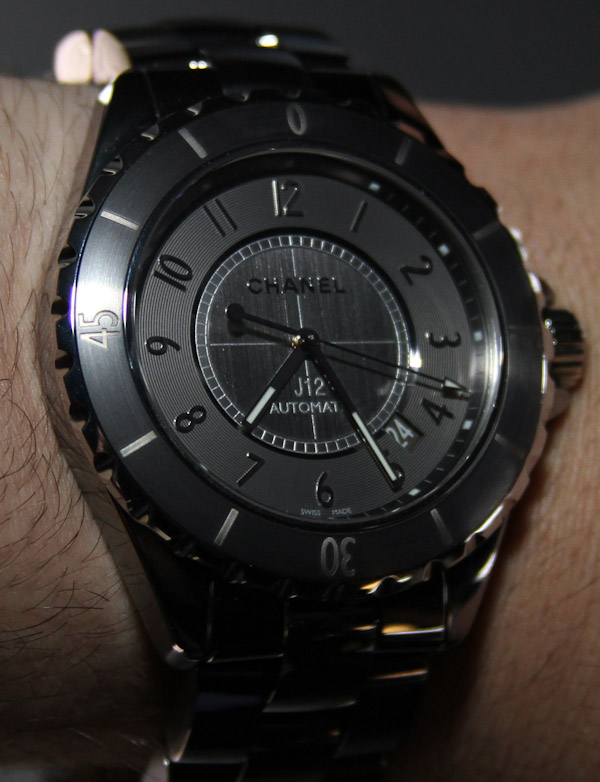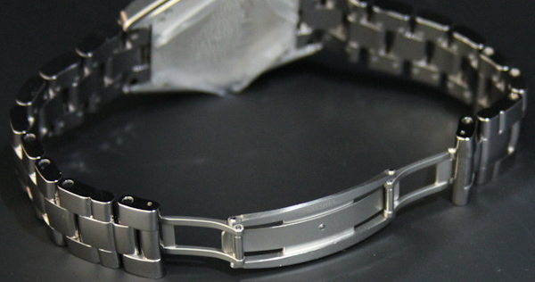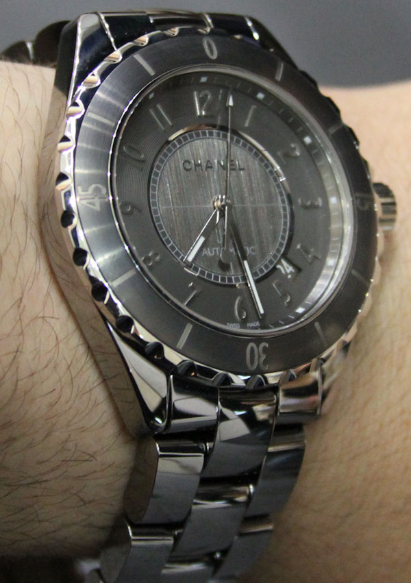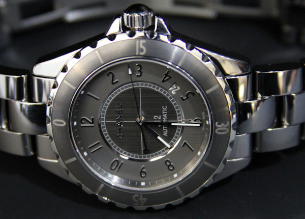
In my short years as an ‘aspiring’ watch photographer, few timepieces have truly evaded a good picture as the Chanel J12 Chromatic. The rich universe of hues that emit from Chanel’s new “chromatic” material are more or less impossible to capture in stills – as the colors mix and meld with the light so amazingly. It is a sin to evaluate this watch for yourself seeing it in still images alone.
I first wrote about and debuted Chanel’s C12 Chromatic watch here. There is discussed the important of the new material and the history a bit. Over 10 years ago Chanel swept the industry with the J12 – and there has been no looking back. In white and black, Chanel has been experimenting in-house with the new tone and style to feature. What they ended up with is a metallic monolithic gray that has an amazing sheen to it. The gray is dark, but lively as it plays with the light. I expect it to turn into the T1000 enemy machine from Terminator 2.
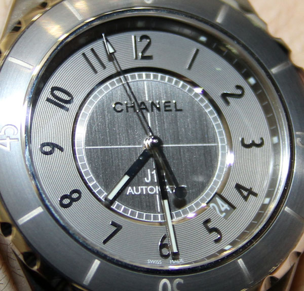
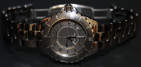
Again, the new ceramic material is a skillful mix of traditional ceramic material with titanium. Together they are highly polished and tasteful. Chanel did however do something weird (for my tastes) with the collection. The larger version is 41mm wide versus 42mm wide as is the case with the standard J12 collection. Why? According to Chanel they wanted this version to have something a bit different. I get that, but I still don’t agree with the logic. Anyone who has a Chanel J12 is into fashion and will supplement their wrist’s “look” often. Meaning that the material on the J12 Chromatic is enough for people to want to get it. If they don’t have a J12, it isn’t because they desperately wanted a 41mm wide size – because 42 was too big, and 38 was too small. Plus, the smaller size might actually prevent some people from getting an otherwise great watch as they feel it is too small. I love the feel of the Chromatic on my wrist, but would love for a 43-45mm wide size.
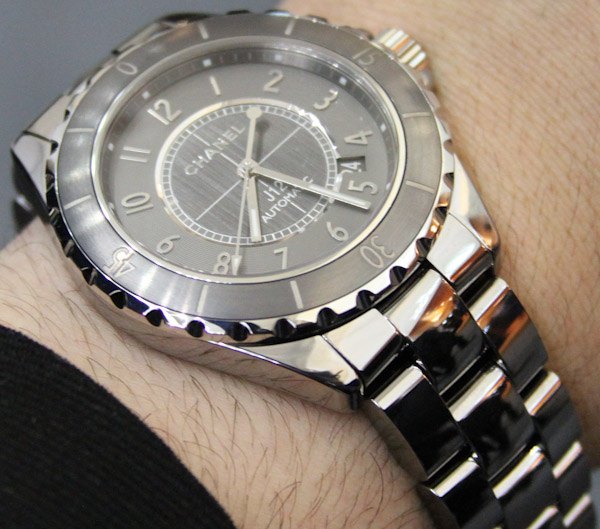
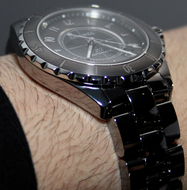

Gray is a curious color for luxury and fashion, but it works. Gray is the color of rainy skies and concrete prisons. However, gray does have an interesting quality, that when it reflects light can look orange on the edges – which is very cool. In a high-gloss finish it looks pretty stupendous. Chanel even added other gray elements to the dial as well as a new brushed metal central dial.
Of the most interesting things about the J12 Chromatic is the weight. Still hard and durable, it is very light in weight – a property not common to ceramic items. The rich character of the color and the J12’s enduring personality make this one of the nicest fashion watches around. Many people would be amiss by not having one of these in their collections.

