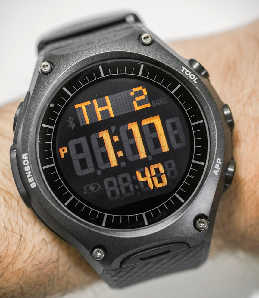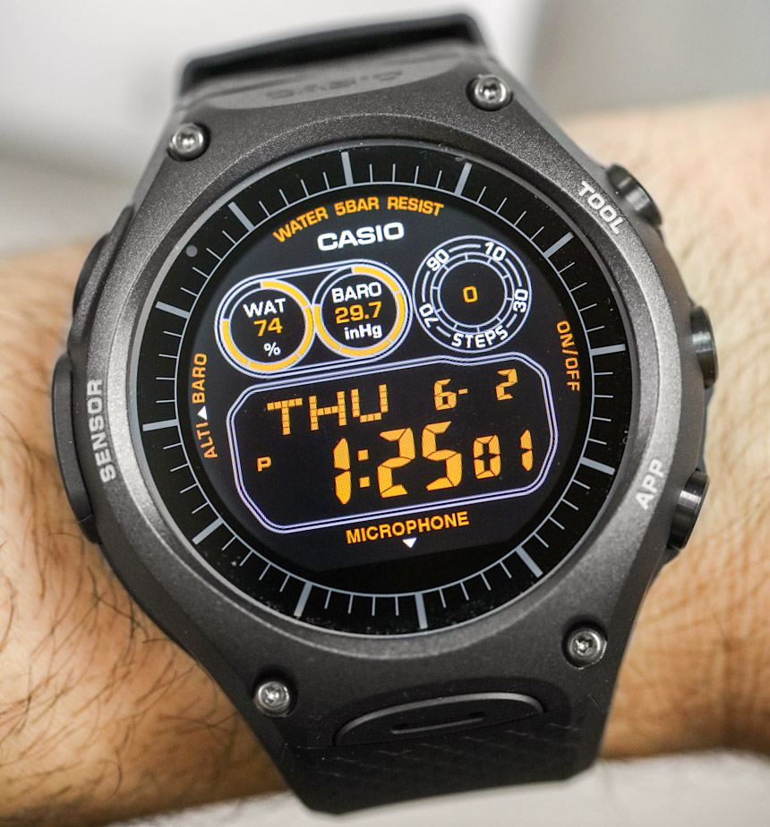
Just a few years ago, I never thought I’d be wearing a Casio smartwatch on my wrist, so I have to say that it brings me pleasure to review the 2016 Casio WSD-F10 that runs Android Wear. I recall a meeting with some of the brand’s own dedicated employees who seriously questioned the value of smartwatches in the context of “connected wearable technology devices.” Undoubtedly, companies like Casio – who, in their own opinions, “have been building smartwatches for years” – harbor their own ideas and notions about what consumers want and how smartwatches should behave and look.
By mid-2015, there was still no word of an official Casio smartwatch, and it prompted me to write an essay on what a Casio smartwatch should be like in May of that year. I did that because I felt the popular Japanese “technology watch” maker was in a fantastic position to create an amazing smartwatch product. Less than a year later, in January of 2016, Casio finally did it, and announced their first official connected smartwatch with the WSD-F10 here.
This now puts me in a unique situation because I’m reviewing a product that I made a wish list for prior to it ever being announced. The question, then, becomes: did Casio live up to my own personal expectations in terms of its seminal smartwatch product? And, more importantly, where do they go from here?
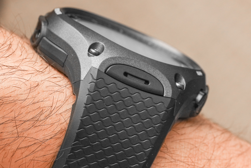
In essence, the Casio WSD-F10 runs Google’s Android Wear operating system platform, using their own case and screen hardware, as well as a few other little interesting features that make the watch different from other smartwatches out there. For most consumers, the real allure of the Casio WSD-F10 will be its superior durability over many other smartwatches, as well as the inclusion of various built-in sensor technology that Casio fans have come to expect in models coming from the Pro Trek or G-Shock family. I happen to like the fact that the Casio WSD-F10 is among Casio’s products that is produced in Japan – whereas most smartwatches are produced in China.
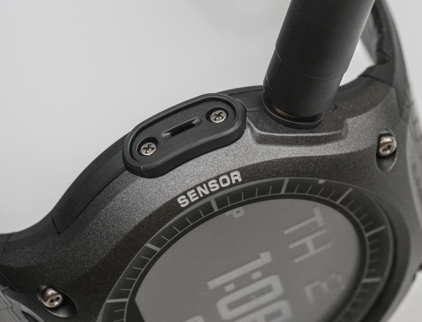
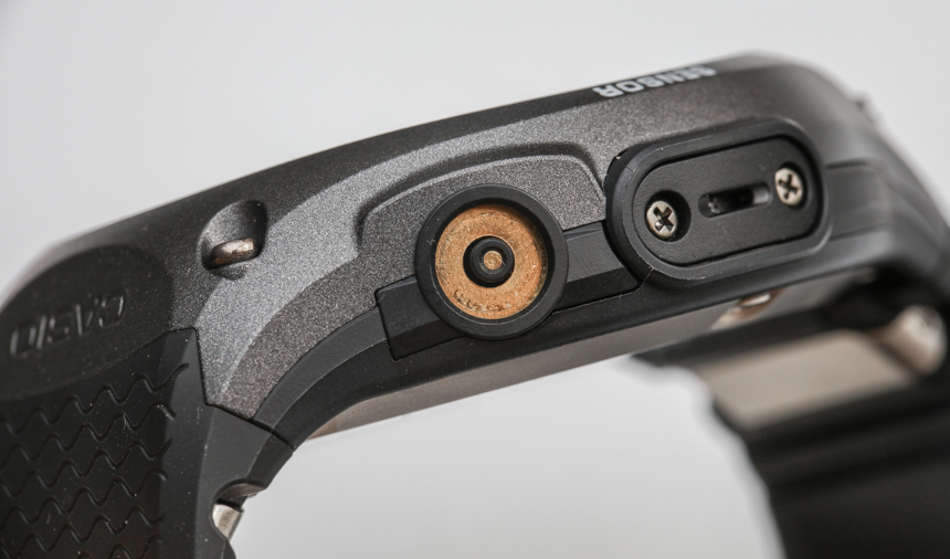
Fit and finish for the Casio WSD-F10 is very good. It isn’t a G-Shock in terms of overall durability, but it feels like one of the better-made plastic Casio watches with a premium feel and great textures on the case. If I had to make any complaints about the case itself, it would be that it is very large in size, and that the charging port (located at 10 o’clock) feels a bit “exposed.”
With that said, case size is as big as it is probably because of the battery. Remember that in the smartwatch world batteries are currently the weakest link, and brands need to use amply sized batteries contained in the cases so as to ensure at least a day’s worth of wear. I will, however, say that despite the rather massive proportions of the Casio WSD-F10, it is very comfortable. How is that so? Well, the watch doesn’t weigh that much at just 93 grams, so you don’t even really feel it there, and the strap happens to fit quite snugly too.
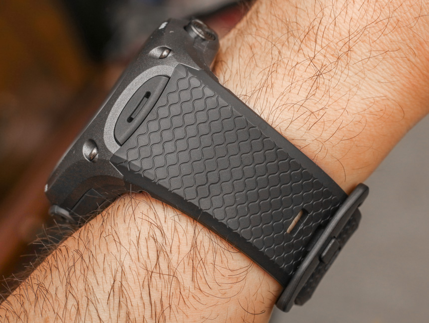
The Casio WSD-F10 is 56.4mm wide, 61.7mm tall, and 15.7mm thick. As a sporty outdoors watch, this is fine, but don’t be the guy trying to wear this with anything even remotely formal. Since the Pro Trek, Casio has made it clear that its outdoors watches are made for where suits should never go. As of now, Casio offers the WSD-F10 in a metallic orange-colored body (WSD-F10RG) as well as this black one (WSD-F10BK)… and also a red (WSD-F10RD) and green model (WSD-F10GN), for now. I prefer the black, as it helps visually reduce mass, and the orange one looks too much like a toy for big boys. When you have a watch this size, you don’t need to call extra attention to its girth.
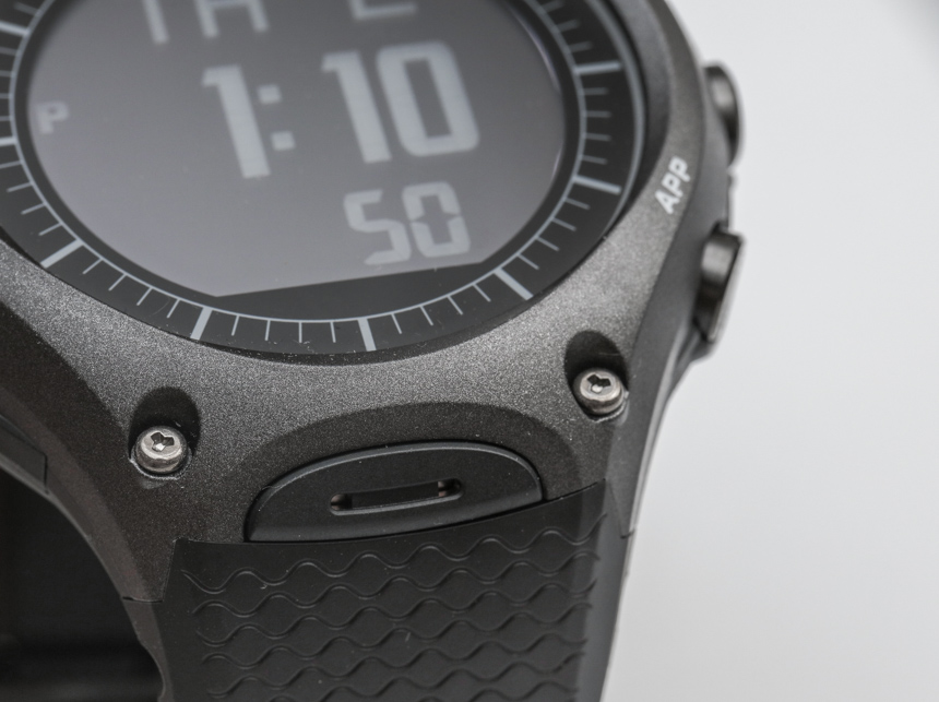
Casio designed the case with three buttons, two of which are proprietary to Casio’s systems over Android Wear. The middle button that is located where the crown would be is the “home” button which activates the screen or takes you back to the home screen. The other two buttons are actually semi-programmable and allow you to select from a series of apps that they can launch – which proves quite useful.
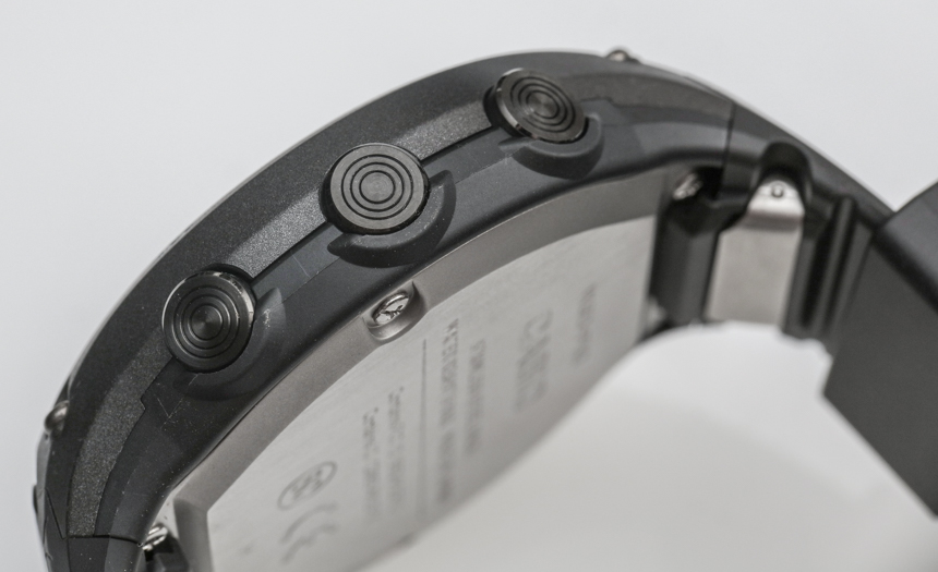
As much as I love touchscreen on devices (and I say this as someone who desperately misses physical keyboards on smartphones… oh Blackberry, why did you have to leave the land of the relevant?), I find physical buttons to be very (very) useful. Not only can you feel for them with your fingers and not have to look at what you are doing, but they also tend to not suffer from things like lag and other issues which come from “virtual buttons.” while I agree that smartwatches need touchscreens, I really dislike the “de-buttonification” of technology because, frankly, I hate shoving my oiling fingers on the screen that I am otherwise trying to actually look at. I remember the first time I was prompted to play a game on a smartphone, and was like, “you are telling me that the direction controls and buttons overlap the screen I am trying to look at?” Talk about intrusive UI…

Anyhow, I say all of the above in part as praise for Casio adding a couple more buttons to the Android Wear formula – and I hope in the future we get even more buttons. Buttons, buttons galore is all this smartwatch lover wants for the holidays! The top button is labeled “Tool,” and it controls a variety of Casio-made apps which mostly focus around the sensors that the watch has internally. This is great because it isn’t using data from the phone, which increases the wrist watch’s autonomy.
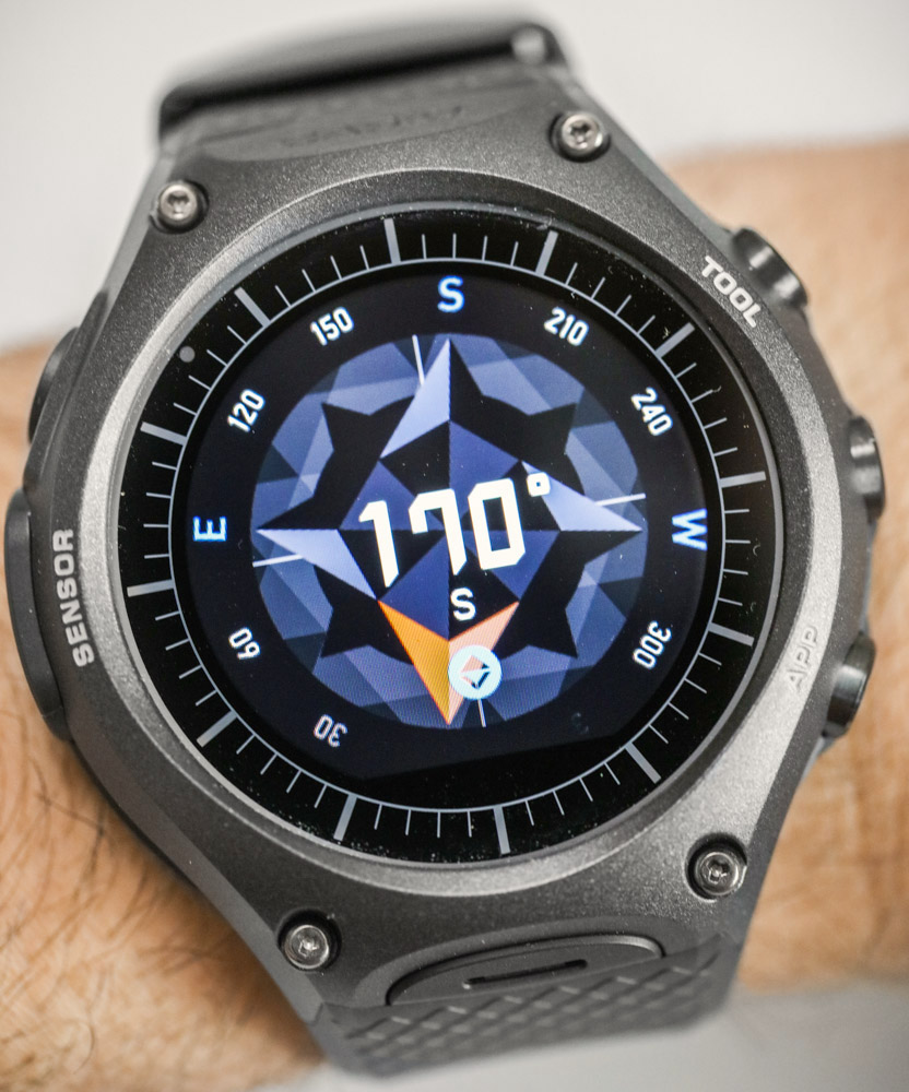
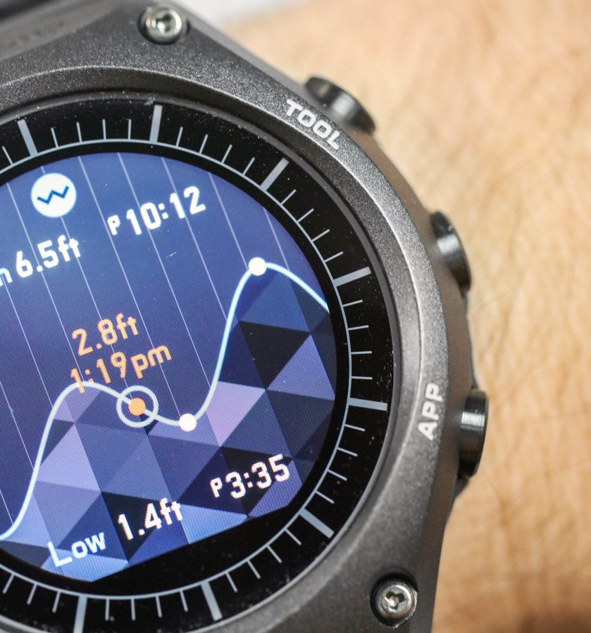
Press the Tool button and you can cycle through various app screens. In the “Casio Moment Setter+” app that you need to download on your phone, you can adjust the various apps you cycle through and remove some or rearrange them. For me, pressing the Tool button initially opens up the compass app. You can then access other apps such as the barometer, altimeter, and sunset and sunrise times, along with various graphs about your treks and adventures. Casio designed all the graphical user interface of these apps, and I think they are for the most part nicely done. Colorful and modern, they even evoke what feels like a new design language from the brand.
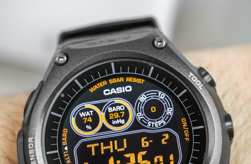
The inclusion of the compass, barometer, and altimeter sensors in the Casio WSD-F10 not only helps this watch be a “real” Casio sports watch, but also helps distinguish it from the crowd. I am a huge proponent of smartwatches that have their own sensors and don’t just rely on those from the host phone device. Where some consumers might find the watch lacking is the absence of features such as a heart rate monitor, etc., that timepieces such as the Apple Watch have. With that said, Casio intends for the WSD-F10 and future smartwatches to speak with other devices and sensors. For example, when the Casio WSD-F10 launched, so did a jacket-mounted body reference EX-FR100 camera that you can control with the watch. This accessory isn’t sold officially in America, but when I was traveling in Japan in February 2016 the Casio EX-FR100 was for sale all over the place. Like other brands which offer additional fitness accessories, I have a feeling the universe of companion products could easily grow.
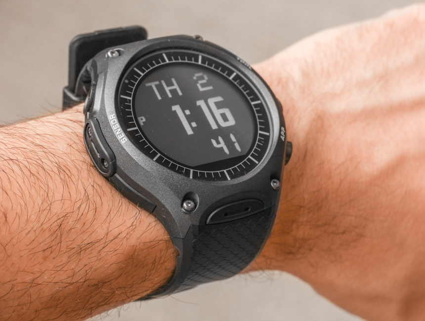
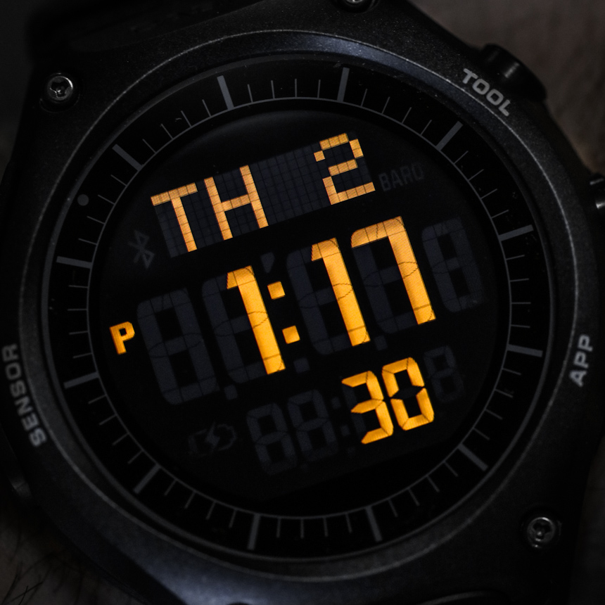
The other button on the case is located at 4 o’clock and is labeled “App.” Slightly more flexible in its customization, you use the Casio Moment Setter+ app to select a large range of installed applications that this button can launch. For me, I have it set to launch a weather application. While I really like the presence of the two additional pushers on the Casio WSD-F10 case I found that they are disabled when the watch screen is not activated. That means you need to first activate the screen and then push them. It means an additional step, and I hope that perhaps in a future software update you will be able to directly push them without having to first press the middle button.

