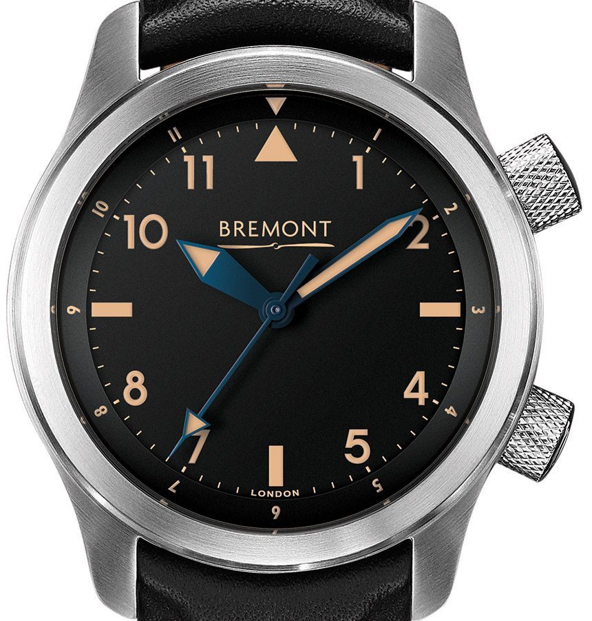
One of the great things about having friends in amazing watch companies like Bremont, Nomos, and Damasko is that you can, when the stars align just right, answer the question: “Wouldn’t it be cool if they made a watch like this?” It’s a question that every watch collector has from time to time. They want to see their favorite model with blued hands, or with a silver dial, or perhaps without a date. We’re watch collectors too, and we share that experience.
In our case, we took a good look at one of our favorite aviation-inspired brands, Bremont. Bremont is a relatively young and innovative company, so they weren’t around to make watches in the 1940s, but we wondered: what watch would Bremont have produced if they were?
Fortunately for us, we were in a position to answer that question. We’ve produced a number of limited editions at this point, something we’re quite proud of, but we have one overarching design theme in everything we do. Simply put, we like the watches we carry, and therefore, we have no desire to completely scrap the design that they come with. Instead, we examine what the goal of the watch’s design was when the brand created it, and then we try to amplify that. When we did our Timeless Club, we took Nomos’ casual wear watch and made it more casual. When we did the Orion, we took Nomos’ dress watch and made it dressier.
When we got the opportunity to do a Damasko, and now, a Bremont, we recognized the inspiration for their respective models: WW2-era fliegers. These played a huge role in their design, as they do in almost all pilot’s watches. So our aim was to really bring out that heritage, and in a sense, return to it while keeping true to what makes the original design great.
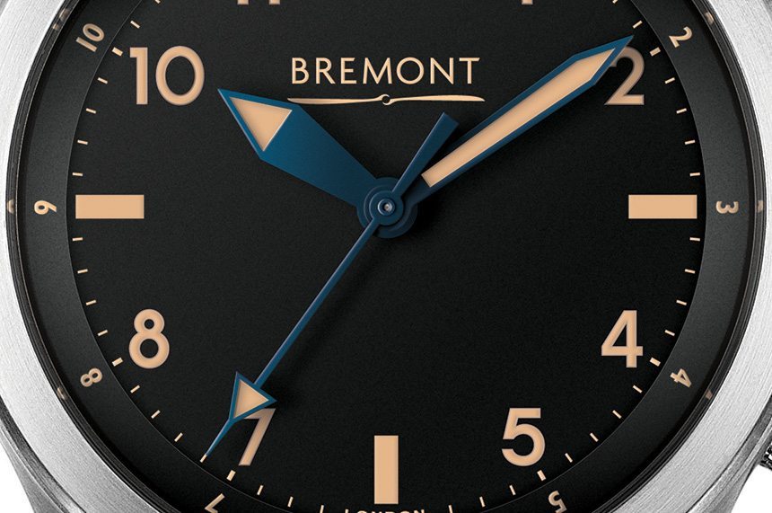
Thus, when we finally got the go-ahead to design a Bremont, our path was clear: we were going to make a vintage model. Initially, we had two competing designs, an extremely wild chronograph that was inspired by the nose art on classic P51 Mustangs. The alternative was the exact opposite, a super simple, back-to-basics tool watch, except it’s a tool watch as it would have existed 75 years ago. It goes without saying that the latter won out, and that’s what we see here today.
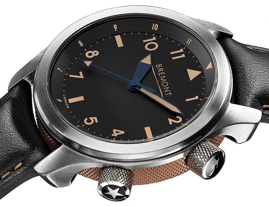
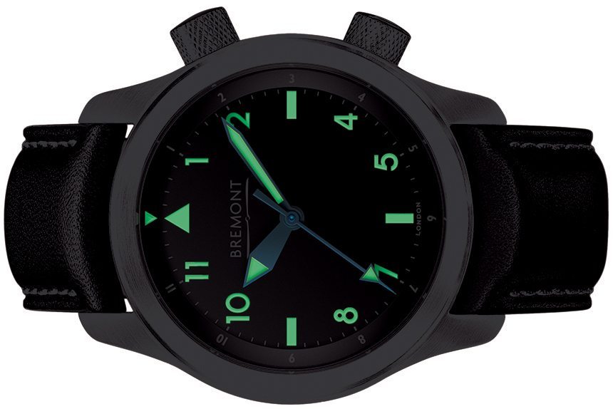
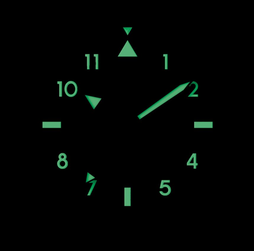
The first choice we made was to go with vintage-colored lume, often referred to as aged radium. This alone makes a huge difference in how the watch looks.
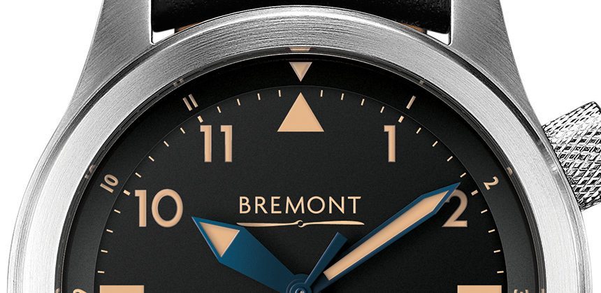
While the lume may look old, it’s anything but. The luminous paint used here is the same as Bremont’s ALT1-ZT/51, a version of Super-LumiNova that is unique to Bremont, and now, to our watch as well. It ensures that the Bremont U2/T is just as easy to read at night as it is in the day.
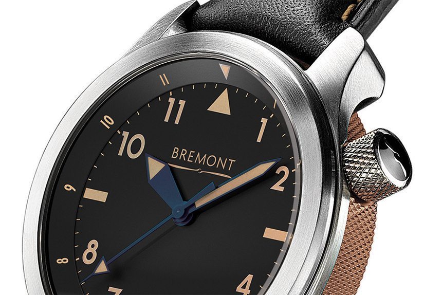
That decision was pretty easy, but the next two were not. We went through literally dozens of renders figuring out exactly what to do with the day and date complications. The source material, namely the original U2, has both, but where to put them? In the end, we made the decision to get rid of them entirely. If you actually go back to vintage pilot’s watches of the era, quite unlike their contemporary versions, they were almost totally devoid of complications. These were tool watches in the literal sense, and legibility was the priority, not convenience when filling out paperwork. Thus, we opted for an ultra-clean dial.
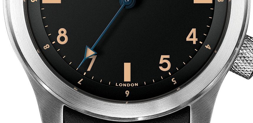
Another design challenge was in the hands. We wanted to do blued hands because, frankly, we think they look cool, and they also fit nicely into the vintage look. If you’ve been paying close attention, you’ll notice that all of our limited editions incorporate blue as well. We were worried, however, that the tendency of heat blued hands to sometimes appear black may make them difficult to read against the black dial. We went through many, many renders, trying out a variety of options and examining their legibility. In the end, we found that the heavy dose of luminous paint was sufficient on its own to make the watch easily readable, so we were able to accommodate our preference for blued hands without compromising the usefulness of the watch.
One thing we love about the U2 is its rotating inner bezel/chapter ring. Like our Damasko DB3 and DB4, we wanted to reduce the clutter here, so we stripped it down to its bare basics, Arabic numeral markers and a luminous 12:00 triangle. This contributes to the overall austere look of the watch but it doesn’t compromise any of its utility. You can still use the inner bezel to track a second time zone, for instance, a feature we wanted because of its utility for pilots.
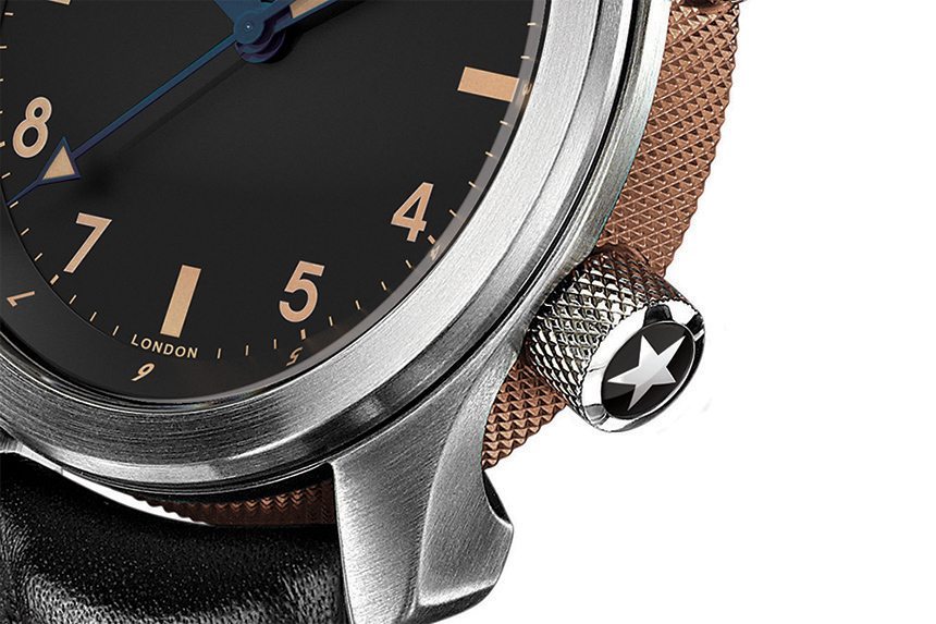
Cases are certainly one of Bremont’s strong suits, so when it came to designing the Bremont U2/T’s, we found that little change was required. Our Bremont U2/T is still constructed from the ultra-hard steel that all Bremonts are. Stylistically, we wanted to go with a bronze barrel because it matches the color of the lume quite well. We also opted for a USAF-inspired star on the crown, a fitting touch given the nature of the watch.
The dial lacks Bremont’s typical Chronometer writing, but no need to worry, it was only removed to contribute to its clean look. Inside beats the modified Calibre 11 ½’’’ BE-36AE automatic, a tough and accurate chronometer-grade movement.
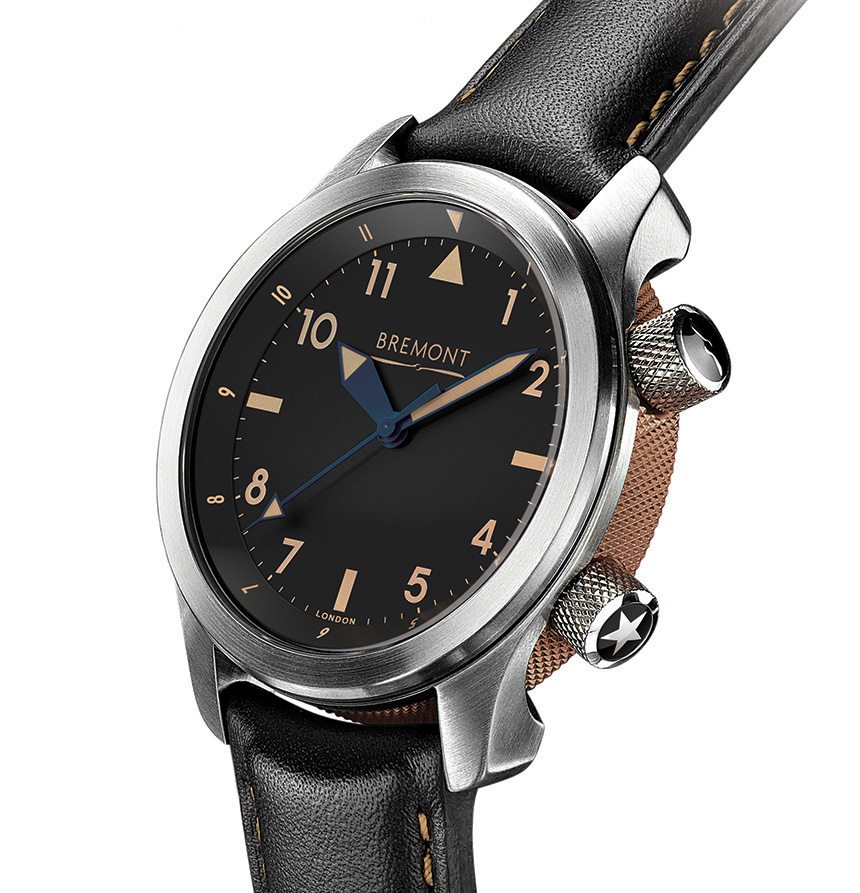
All in all, we’re really proud of what we’ve done with the U2 in creating the Bremont U2/T. It has great vintage looks, it’s as legible as ever thanks to its clean dial, and we think it captures exactly what a tool watch of its era should be. As always, we have to thank our great partners in designing this watch, Bremont, who have been with us since their first days on American shores. Unfortunately, the Bremont U2/T is a limited edition of 100 pieces, so if you find yourself as fond of it as we are, you will probably want to pre-order here.
· Matte black dial
· Vintage luminous paint
· Blued steel hands
· 43mm U2 case
· Black leather strap
· Bronze-colored center barrel
· BE-36AE automatic chronometer
· 100 Pieces
· Free worldwide shipping
· MSRP: $5,495

