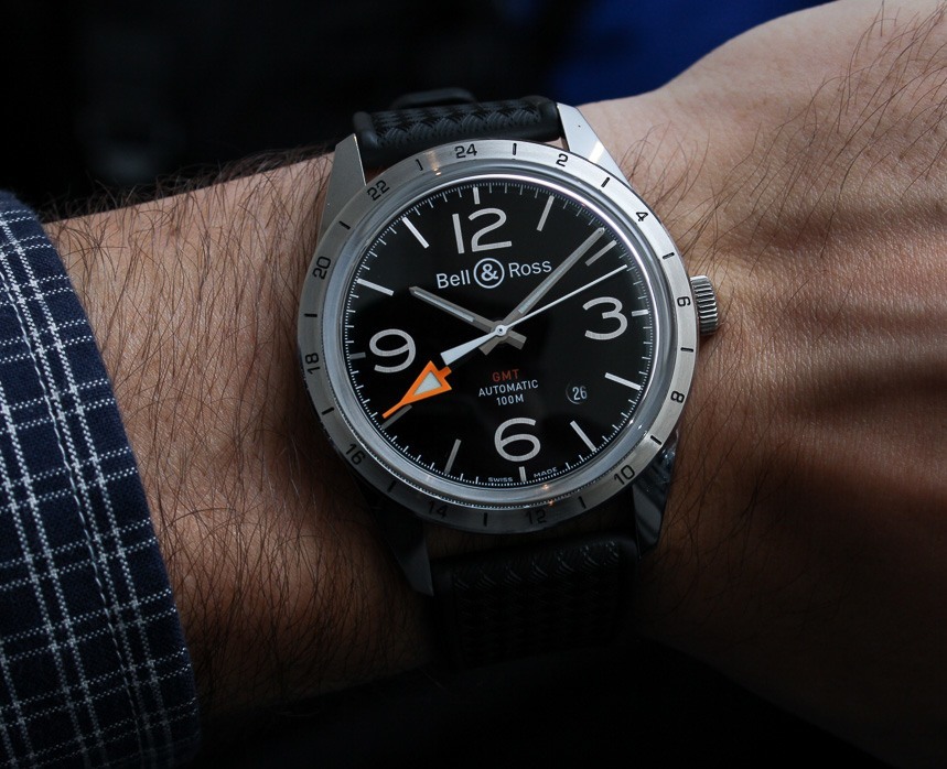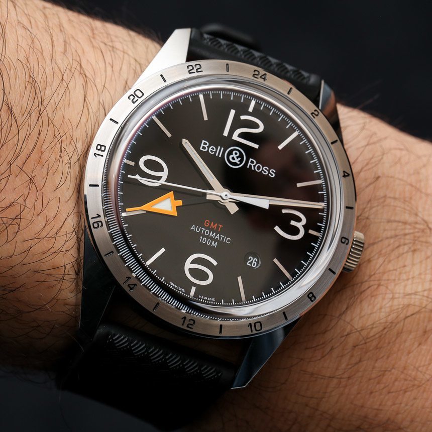
You can call it unoriginal or call it derivative, but I still really like the new Bell & Ross BR 123 GMT 24H watch. As an “inspired” design fueled by historic sport watches this is another well-curated treat from the French watchmaker. There is no getting around the simple fact that the BR 123 GMT 24H watch is a combination of Bell & Ross’s current round watch face design along with look of a Rolex Explorer II. Having said that, I do feel that the elements go together very well.
This isn’t the first time Bell & Ross has borrowed the large orange GMT hand of the Explorer II watch. Maybe I have a thing for Bell & Ross GMT watches but I equally liked the Bell & Ross BR 01-93 GMT piece that I reviewed here. The clean, legible looks of the purposeful tool-watch style and that large orange GMT hand look cool. It takes the watch into a real instrumental range making it feel like a navigational item more than a typical sport watch. The Explorer II-style steel bezel is retro-cool and adds to the vintage flair that Bell & Ross is known for playing with successfully.
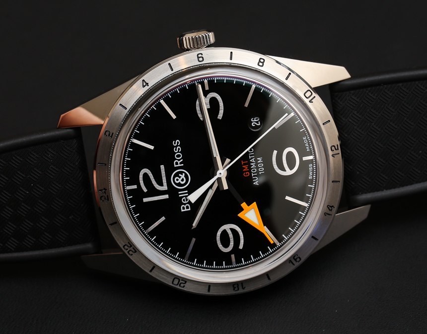
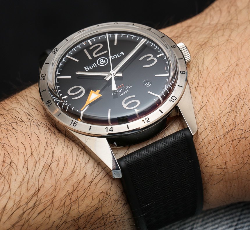
A honed eye is required to notice many of the smaller details that make this BR 123 collection was unique from others. One important element is the sapphire crystal which sits over the dial like a bowl similar to old acrylic crystals. This is a unique touch that I don’t recall seeing on previous BR 123 models, and it works particularly well with the bezel style.
The 42mm wide steel case is polished up nicely (another vintage-style touch) and it contrasts well with the brushed steel non-rotating GMT bezel. The bezel is thin which works well to emphasize the size of the dial and this is the first time Bell & Ross has emulated this bezel design in their watches. The bezel is also the only place to bear the 24 hour indicators leaving the dial relatively clean.
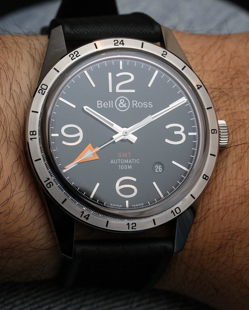
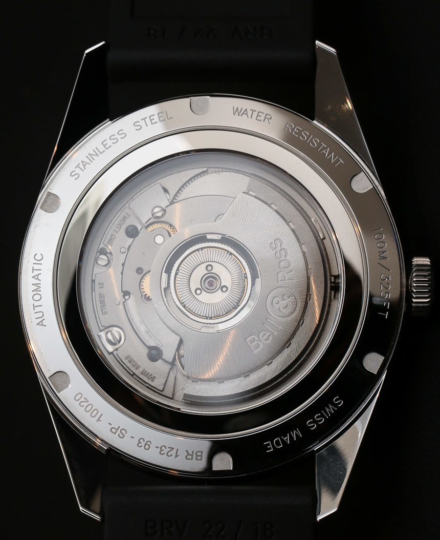
By now people associate this dial style with Bell & Ross, which is marked by the aviator style Arabic numeral hour indicators along with the more classic baton hour indicators and thinner hands. In honor of further promoting legibility Bell & Ross correctly finished the hour markers with a brushed polish versus a more reflective mirror polish. This is exactly what helps dials offer more readability because it reduces glare and helps the eye spot the indexes in most lighting situations.
A subtle date window is added on the dial in the form of a small circular window over a black date disc. It doesn’t disrupt the symmetry of the dial but still offers the extra complication. Once again, I will say that the dial is a testament to correct choices among existing options versus originality.
