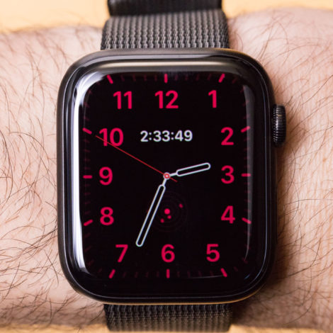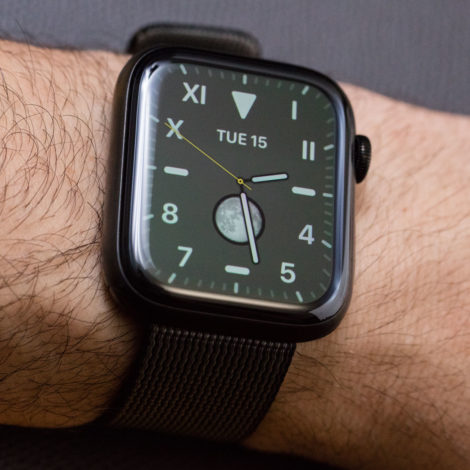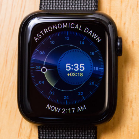
With each new generation of Apple Watch, Apple adds functionality and variety to the available watch faces users can select and customize to meet their needs and interests. When the Apple Watch Series 5 was released, Apple went so far as to introduce some brand new “complications,” adding to the long list of information widgets (in software versus horology parlance) available for Apple Watch users to select from. In this article, I’d like to talk about the importance of complications on timepieces, in general, as well as look at some of the latest and most important bits of information Apple Watch users now have access to in the world’s most popular smartwatch. (My in-depth aBlogtoWatch review of the Apple Watch Series 5 is here.)
Apple Watch, as a product, is highly influenced by traditional timepieces. The term “complication” (which Apple likes to use) stems from the world of traditional mechanical watches. “Complication” more or less means a function that a movement can perform. Being able to indicate the date on a watch dial is an added complication. Other time zones, alarms, or stopwatch (chronograph) features are all their own complications. The term represents the fact that, historically, the more functions a traditional watch had, the more complicated its mechanism needed to be. More complicated watches were generally more expensive to produce and design, coming with an associated higher cost. For a number of years (and still today among timepiece collectors), the more “complications” a watch had, the more desirable it was.
“Widget, function, or information display” might be a more appropriate term for a complication on a smartwatch, but the historical relevance and convenience of “complications” make the term relevant for smartwatches when talking about the number of features available on a watch face display. The original “complication” on smartwatches was the ability to have phone notifications on your wrist. Aside from that, most smartwatches did not fundamentally add complications to their watch faces that did not exist in traditional mechanical watches.
I find this to be an interesting state of affairs because, with the advent of a direct connection to the Internet, as well as having more sophisticated onboard sensors, one would have thought that smartwatches would immediately innovate in the area of complications users come to enjoy on a wristwatch display. What smartwatch makers quickly found is that a user measures the utilitarian value of a smartwatch not by the potential information it can display but rather by the quality of the user interface in bringing that information front and center. Indeed, in the era of smartwatches, the real challenge with data isn’t collecting it or the complexity of computing it, but rather in how and when to display it.
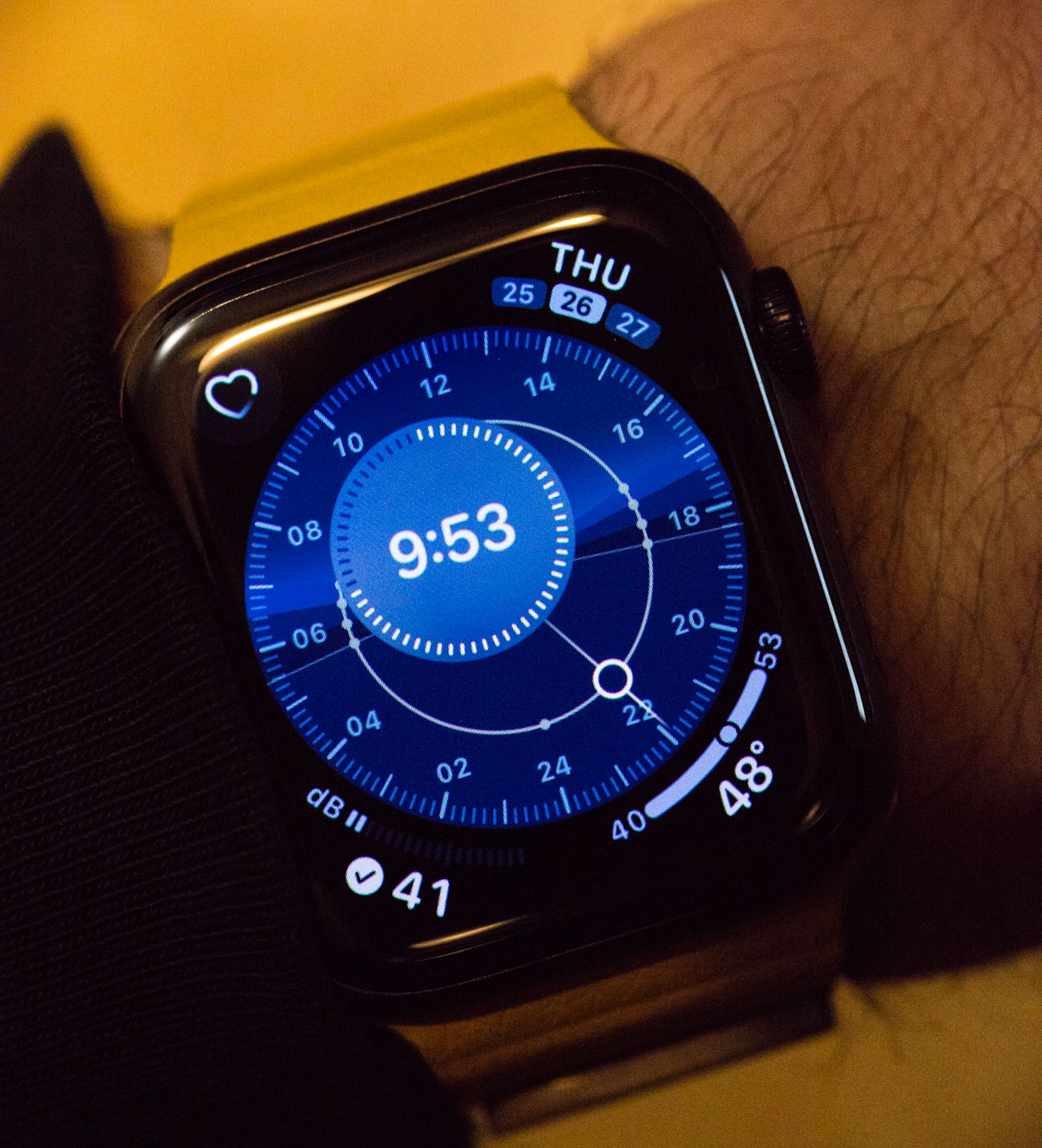
Even today, as the Apple Watch is in its fifth iteration, the industry of specialized smartwatch display user interface designers is nascent. Apple, for example, has an in-house team they have trained, and no third-party application developer can make replacement or alternative watch faces for the Apple Watch. Google Wear OS, on the other hand, has a more liberal approach to watch faces, making third-party displays available for users to download. That said, in some ways Apple’s closed Apple Watch OS display environment makes sense. It simply isn’t easy to design a watch face for a smartwatch, and it’s probably not a good idea to trust too many others to do this. This is easily evidenced by the fact that the Wear OS watch face marketplace is populated by a lot of poorly designed dials or decent ones that are, more or less, copycat designs of famous traditional watches.
It is with patience that we see the world of smartwatch faces evolve, but already many exciting developments are worth mentioning. A successful watch face begins by asking the question, “What does someone need to know when viewing this face?” With smartwatches, the almost endless variety of information you can put on the dial doesn’t help matters. So, prior to there being a robust industry of smartwatch face designers, there needs to be an established list of smartwatch complications that users come to both expect and rely on.


In the Apple Watches Series 5, Apple introduced several new complications (for the Apple Watch), each of which have incredible user appeal -—with two of the complications being sufficiently novel that most users don’t yet know what to do with the information. As an example, I will mention a previous complication Apple introduced for the Apple Watch and that is the ability to know the current air quality. The Air Quality Index (AQI) complication uses an EPA-based air quality measurement that borrows from Internet data to make an assumption about local air quality. This is interesting for sure, but it has two small issues.
The first issue is that the air quality is measured not natively on your watch, but rather at a local weather station — which may or may not represent the air quality where the user physically is. Still, the data is relevant enough for most people when it comes to going outside. The second issue is the utility of the data; most people don’t understand what an AQI number even means. The result is that for the air quality complication to be more useful, at the least users need to understand how to read the information. So, in this regard, Apple might be a bit ahead of their time.
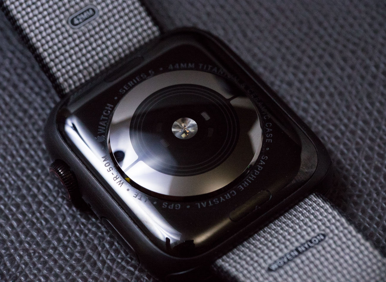

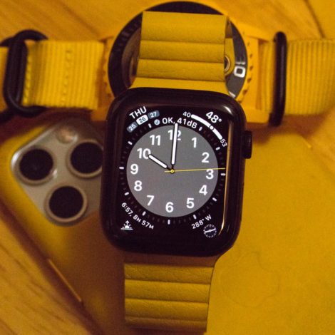
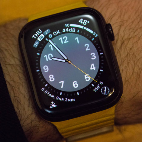
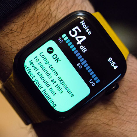
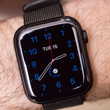
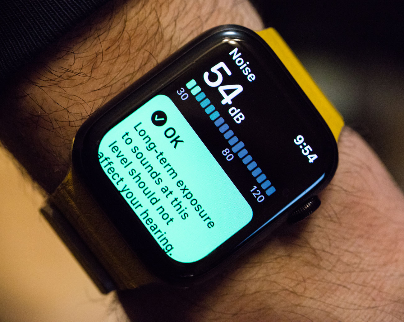
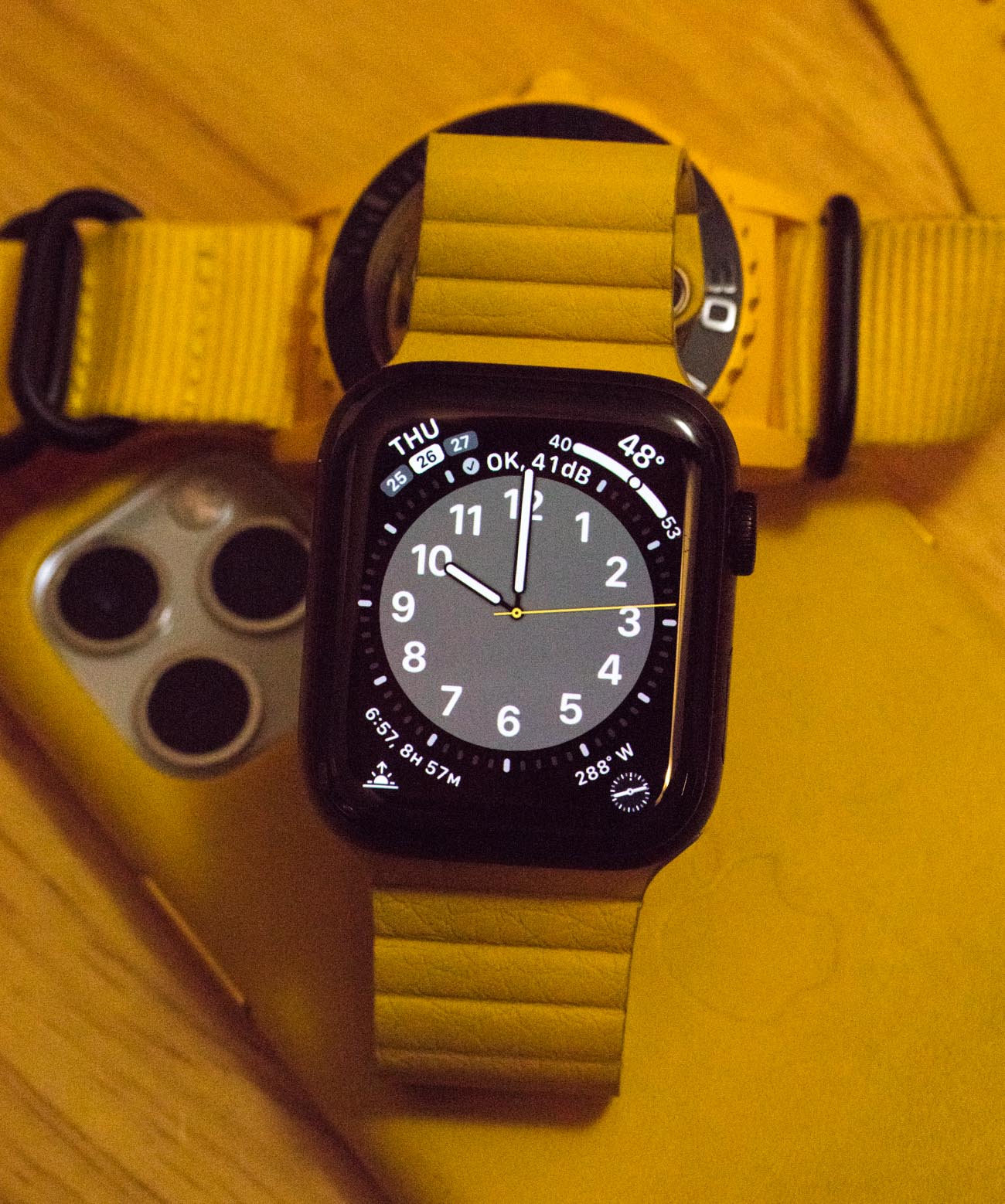
What Apple got right with the AQI complication was that users are curious about their immediate surroundings. Smartwatch wears are interested in maximized environmental awareness. The more a smartwatch can display relevant information about our immediate surroundings (especially when related to health) the more useful (and thus sticky) a product like the Apple Watch will be. For the Apple Watch Series 5, Apple introduced a brilliant new complication that is a decibel-level meter to measure noise. It uses the watch’s internal microphone to display a real-time numeric value for the current sound level, as well as whether or not hearing such a noise volume can harm your health.
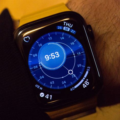
What I love about the noise complication is that it is both technologically clever and efficient, but it’s also imminently useful to users. It isn’t just that the watch can measure this information, but rather that by making it into a complication, users can now glance at the time, as well as whether or not their immediate, ambient soundscape is safe or might damage their ears. Over time, users will further be able to immediately understand the numeric value of a decibel level because they can hear the associated sound that goes with it. So, in this regard, the Apple Watch is teaching someone everything they need to know in the execution of the decibel level meter complication. “Noise” happens to be really well done, and on most of my Apple Watch faces, I have customized them to include this new Series 5 feature.
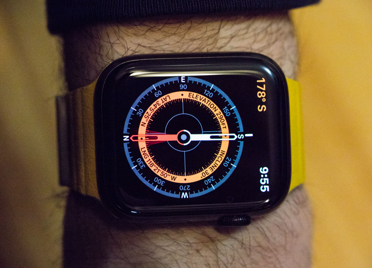
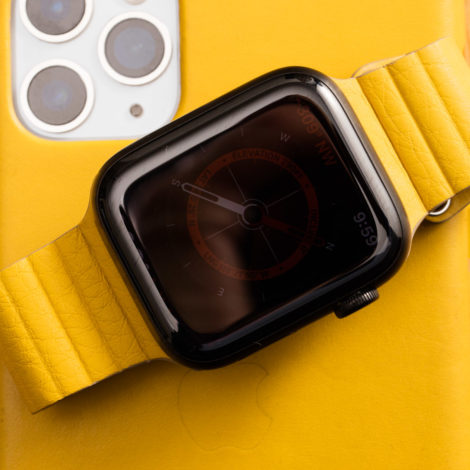
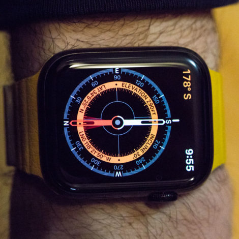
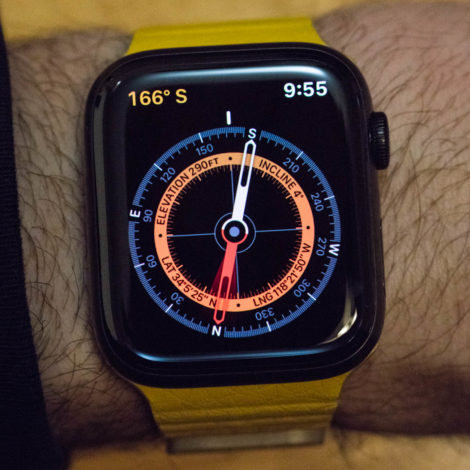
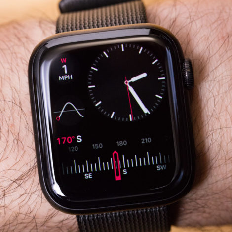
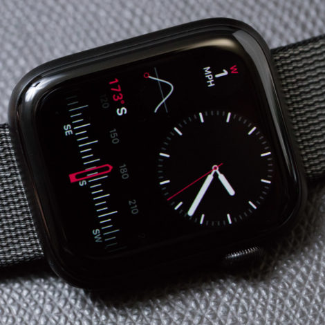
Kudos to Apple for finally including a compass complication for the Apple Watch. This is by no means a new complication, but the way Apple designed it, I think the humble compass deserves some revisiting. Apple created both a complication and distinct data screen for the compass, which also benefits by acting as an inclinometer. There are mechanical watches with compass complications in them, so this is technically a legacy feature. It does, however, represent a piece of information about one’s immediate surrounding that isn’t readily available, and having it on your wrist is very useful. What I find interesting is that Apple’s ingenuity is making its very digital instrument appear as though it were an analog instrument. It does this by replicating the movement of an actual magnetic hand. Most people might not notice this ode to the past, but we have one of the most technologically sophisticated companies in the world create a state-of-the-art tool that appears like something from the past. There are multiple ways to approach this discussion, but to me, the fascinating end result is that Apple decided the most effective way of displaying compass information was in a traditional analog style. The best way to display information — no matter how useful — is always a tricky design decision.
The Apple Watch Series 5 sees Apple introduce a complication especially for women known as the Cycle Tracker. Not being a woman, I will not proceed to review this complication, but it is another way in which Apple probably correctly argues a user’s life can be made better by having particular information conveniently shared with them on their wrist. No matter how regular our life cycles are, my understanding is that most of use are woefully lacking when it comes to tracking them with our internal clocks alone.
Let us not forget that the Apple Watch Series 5 also introduced the necessary feature of an always-on display for the world’s most popular smartwatch. Finally, users can have displays that persistently display information as opposed to light up only when a wearer glances at them. This speeds up a user’s ability to reference information on their wrist (important for all complications) and also gives the Apple Watch a new dimension of expressive power when it comes to people who view the product on someone’s wrist. I speak more about the Apple Watch Series 5 always-on screen in my review of the Apple Watch Series 5 (linked to above).
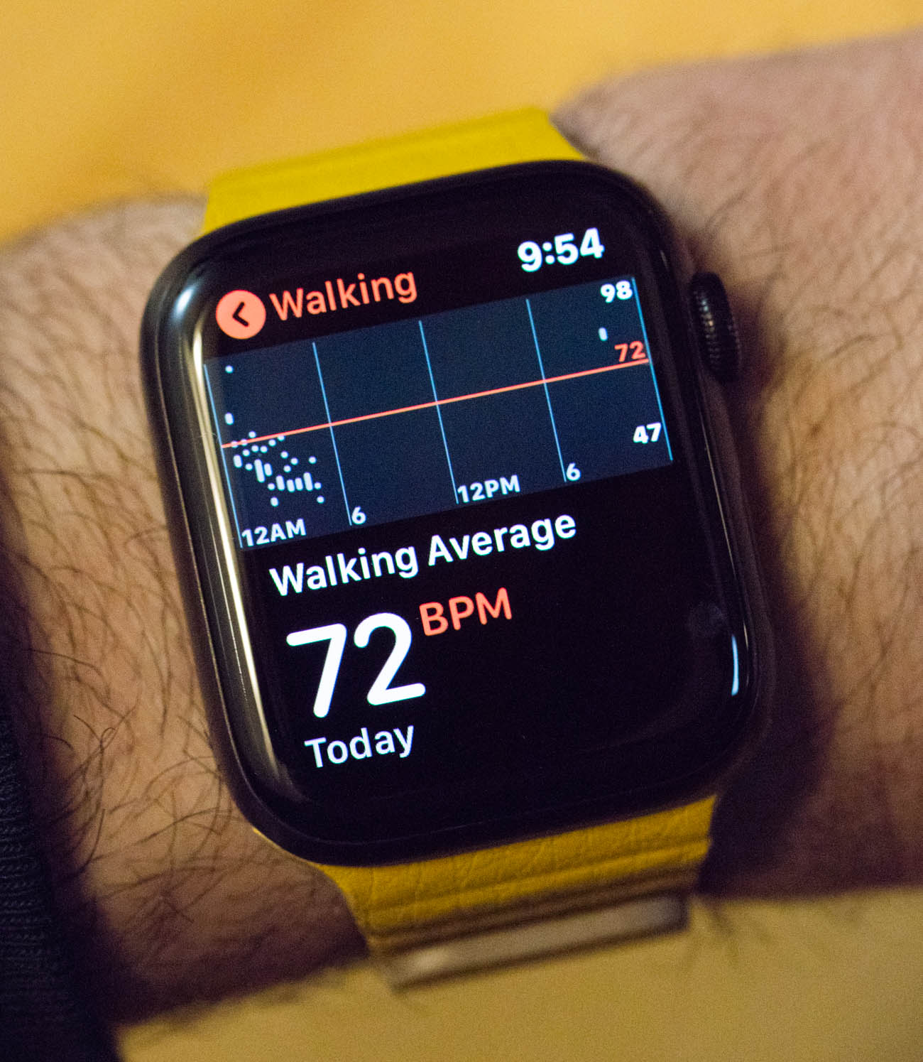
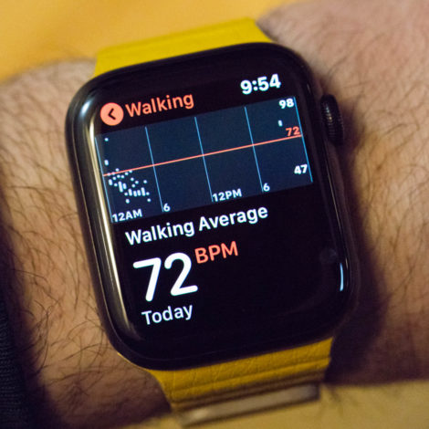
As Apple continues to assert the Apple Watch as a “wellness device” (tool to help you monitor your vital stats and help you know if your body might be having a problem), features like the hear-rate monitor are becoming more front and center. In fact, for some people, I think being able to know your current heart rate is more important than completing your activity rings (a reference to the Apple Watch’s fitness tracking features). Knowing your current heart rate is a core feature of many smartwatches, but Apple does it in a very slick and immediate manner. More so, it is the only smartwatch I know of to so successfully combine health monitoring functions with the otherwise fashionable and daily watch faces users typically use.
No matter what smartwatch you wear, knowing your instant heart rate information is important these days for at least two reasons: fitness and stress management. It is known that to keep physical fitness levels in the positive, we all need to increase our heart rates several times a week. Thus, being able to get a physical measure of your current heart rate is very helpful when determining if you are exercising hard enough. And when you aren’t exercising, it is actually a good idea to keep your heart rate down. You will live longer, if only because a stressed heart stresses other parts of the body, as well. In order to maximize relaxation (and thus de-stress), we need to maintain a relaxed heart rate. Being able to view our current heart rate and realize that we are stressed, even if we don’t feel stressed, can help train people to be better stress managers. Again, it isn’t as though other tools don’t exist to help measure this information, but rather that without intelligent integration into a personal electronic device, few people actually make use out of technologically available information. Now, I am someone who has come to rely on devices like the Apple Watch to know my current heart rate for both health and fitness reasons.
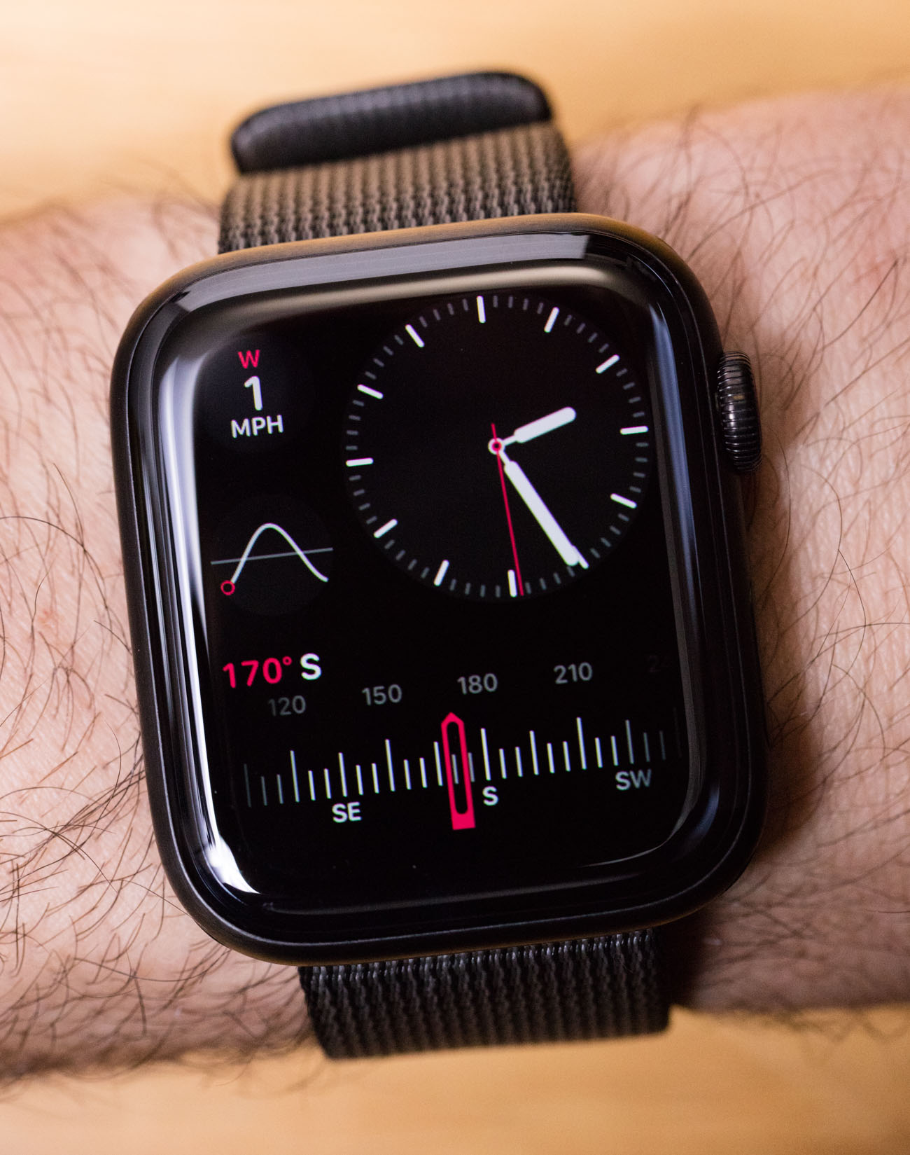
Apple will continue to experiment with various complications both novel and historic. I’ve spent more than a dozen years writing about traditional watches and, in that time, pretty much no new complications were ever released. The innovative nature of smartwatches means that new complications will now start to increasingly trickle in. Apple Watch will always be a place for the most useful of them. Even if Apple isn’t always first to the party, by the time they get there you can be sure they will be the best dressed. Learn more at the Apple website here.

