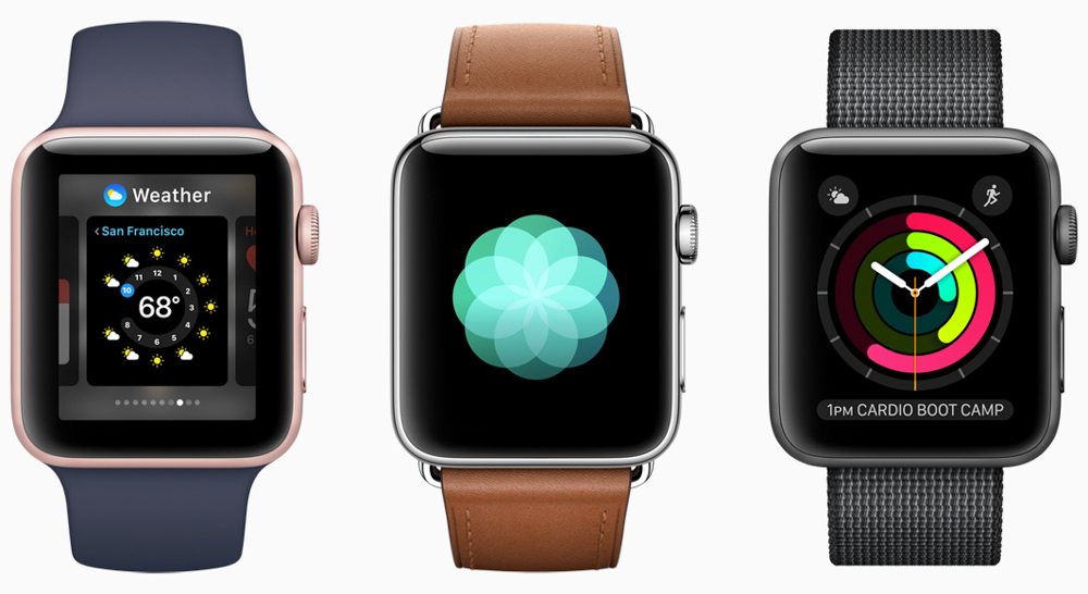
I tend to agree with Apple, and I dislike it when people (namely watch lovers) shout that the Apple Watch or other smartwatches are “not a watch.” Sure they are watches. They might not be a lot of other things those individuals are looking for, but they are a tool strapped to your wrist that can tell you the time – and much more. Stop saying it isn’t a watch, because it is. If it doesn’t appeal to your emotions or tastes as other more traditional watches do, then just say so or find a better term to express your sentiments. Don’t remove smartwatches from the watch conversation just because you don’t like them. The Apple Watch is a watch, even if it is a watch some people don’t currently “agree” with.
New Hardware, Same Face
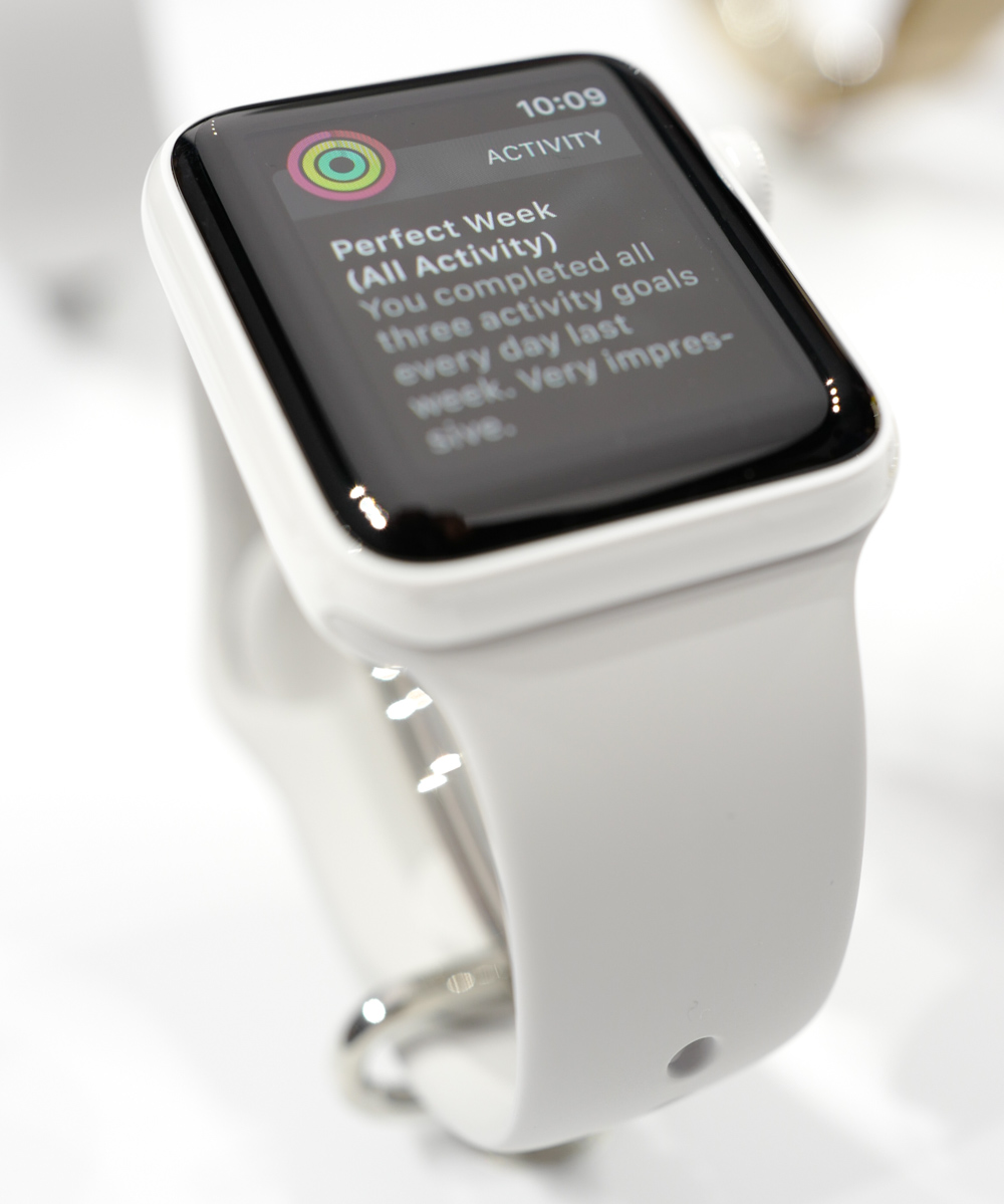
I think a lot of people were rightly surprised to learn that the Apple Watch Series 2 is more or less visually identical to the Apple Watch Series 1. I, however, was not surprised that Apple decided to continue selling the original Apple Watch (with the same faster S2 processor as the Series 2) for at least the time being. That was smart of them because now they get to eat up some sales from other companies who were selling at lower prices. With a new starting price of about $270 (for the 38mm aluminum Series 1), Apple has opened up the Apple Watch to new consumers.
The case, inputs, proprietary strap/bracelet attachment system, and overall functionality of the Apple Watch is more or less unchanged with Series 2. Yes, the new OS3 operating system adds some cool new stuff, but so much of what people wanted Apple to include in their new smartwatch was absent. What was new was on the inside, and even compared to new iPhone launches, the Apple Watch Series 2 will be almost impossible to visually identify from its predecessor (despite Apple offering even more finishing colors and material options).
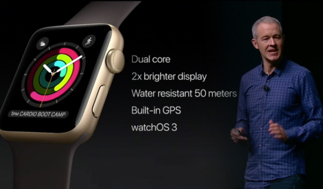
This is a weird oversight, in my opinion, because part of the benefit of getting something new or upgrading is being able to visually see something new in your hand (or on your wrist). Apple pleased crowds with the Apple Watch’s new more useful water resistance rating and brighter screen (twice as bright as before), but sadly no one who upgrades from a Series 1 to a Series 2 will get that sense of immediate “newness” gratification. Even with iPhones, you get that when moving to new models. Apple might say that a new form-factor is what people should wait for the next time around, but unlike the iPhone with its one year product cycle, Apple has not established that the Apple Watch will follow the same release cycle.
I’ll be honest that while I think the Apple Watch Series 2 is cool, and I certainly want one, I was disappointed that Apple did not include a feature that I felt was really missing from the original Apple Watch – and that is an always-on display. Apple will likely come out with such a feature in the future – but in their typical manner, they will do it when they are ready and not on anyone else’s schedule. Apple will correctly argue that an always-on display comes with some significant technical drawbacks. For one thing, having a screen that is always on invariably draws upon valuable battery life. Moreover, they will point out that the Apple Watch is intelligent enough to know when the wearer is looking at it and will turn the display on. Yes, but not all the time.
The short delay period of the screen having to come on is not something to overlook, and ideally there should be zero delay between someone wanting to view the dial and it being on. Further, with traditional watches, you can view the dial from many angles, and immediately. I’ve heard people astutely say that if Apple or another smartwatch maker wants them to take their products seriously, they need to offer everything a traditional watch offers and more. Things like a blank display much of the time, regularly needing to charge the battery, and fragility are the smartwatch weaknesses that most traditional watches don’t have to contend with.
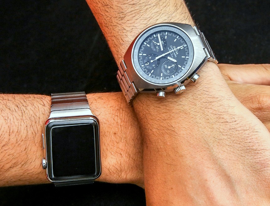
It is true that smartwatches are getting better on all of these fronts, including the Apple Watch. I will not, however, stop asking for an always-on watch face when it not only adds some convenience (small, but important) and, more importantly, adds character to the watch. Further, other existing smartwatches and those coming on the market now are being designed with clever and attractive always-on displays. Apple doesn’t need to follow them per se, but it should offer its own take on this feature – especially because the Apple Watch screen is beautiful, and so are the dials they have designed.
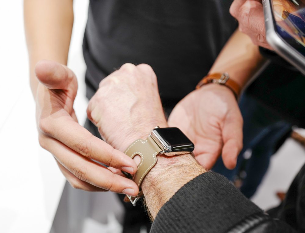
Apple will face increasing competition from its long-time rival Samsung as well as other companies who are designing products with always-on displays that work very well. Samsung developed a small separate system with its own RAM to power the always-on display on the Gear S3, which is currently the most sophisticated always-on display available. Apple is likely working on its own solution, but we can only wonder when they will show up in future Apple Watch products. All I know is that it isn’t now, and because I’ve sampled the fruits of this functionality elsewhere, I am extremely hungry for Apple to offer it as well.
I’ll sum up my sentiments on the lack of an always-on display state by saying that, in my opinion (as I’ve said several times before in other articles), this leaves a watch “cold looking” most of the time. Activate the screen on an Apple Watch and its personality comes to life. When it goes off, then it goes back into some type of soulless hibernation state just waiting to be woken up. I want to see personality in the watch dial all the time, and I don’t think that I am the only one.
Choices Galore, But Not In Terms Of Apps Or Watch Faces
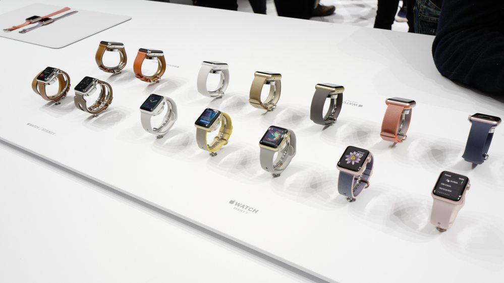
Even though Apple quietly discontinued the Apple Watch Edition in 18k gold (for now, that is, and the current luxury models are the Apple Watch Hermes versions and the white ceramic Apple Watch Edition), the choices of materials, finishes, and styles is getting a bit nuts. Between the cases, sizes, and straps, you could spend an hour sorting through all the options and still not know which model is right for you. This is an interesting byproduct of Apple moving into a space in which it is less comfortable, and that is fashion rather than pure tech. Offering a few colors of the same phone or computer is one thing, but everything that they are offering in terms of options for the Apple Watch is almost overwhelming.

On the plus side, this is good for consumers who want to feel as though they are making an independent choice of what watch to wear. Timepieces are supposed to be personal and communicate something about the wearer. Given all the color and material options, you can say that the Apple Watch accomplishes that to an extent – but I think at the same time a lot of people simply aren’t sure which model to get. This is made more confusing when you consider that there are versions of the Apple Watch (or accessories) which are purely decorative versus functional and with prices that are all over the place.
Put yourself in the shoes of a mainstream consumer who sees a roughly $1,000 price difference between the cheapest and most expensive versions of the Apple Watch (based on what is currently available). All of the watches more or less do the same thing, and to get the features of the Apple Watch Series 2 model (in the 42mm-tall men’s model) you need to spend about $400 in aluminum and about $600 in steel. Why, then, is the ceramic or Hermes model twice as much, and what do consumers get out of this? For these reasons, Apple has specialized sales staff to assist with the selling process, but at the end of the day, most consumers do their product decision making from home before they go into a store (if they go into a store at all).
