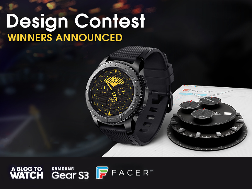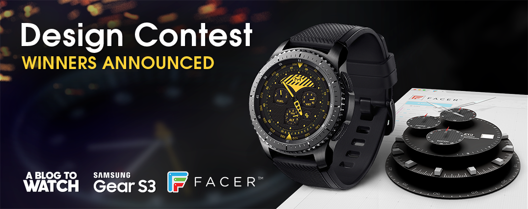
In February, we launched a design competition for people keen to develop animated digital dials for smartwatches – namely the Samsung Gear S3. Five winners would get a Samsung Gear S3 smartwatch, and one of them would also get $500 in cash. Further, all entrants will have their dials listed on the Facer platform – a service that allows people to download new dials for their smartwatches.
aBlogtoWatch worked with Facer and Samsung Mobile on this design competition because we’ve seen a general lack in the quality of watch dials being made for smartwatches. Some are great, but most are not so great. In our opinion, while smartwatches need to focus on developing in all areas, design and sex-appeal are the two major issues the smartwatch industry needs to tackle. We hoped that a competition of this nature would help us promote good smartwatch dial design – and help designers understand some of the things we value when it comes to watch dial design.
Facer told us that about 2,000 Samsung Gear S3 watch dial designs were submitted to them in the several weeks the competition was open. I looked through a wide variety of them and can say that while there is some “gold” out there, a lot of the designers would benefit from understanding what makes traditional dials great and apply them to smartwatch interfaces. The most common mistake I saw was trying to overload a dial with way too much information – so much that legibility is practically destroyed (not to mention processing power).
A lot of smartwatch designers are still designing “off the wrist.” Meaning that dials are on computer screens and it appears that little to no time is actually spent testing them in wrist watch form, or as utilitarian devices. This novice approach to smartwatch design is something I expect as third-party designers only recently began offering watch dials for smartwatches. This could be a major money-making market in the near future as more open smartwatch platforms make it to people’s wrists, and those watches take a greater role in their individual lifestyles.
Before choosing the winners, we each decided on some finalists and then pooled our opinions. Besides myself, the voting panel included Yvan Arpa – who designed the Samsung Gear S3 case – and some of the top guys at Facer. I’m pretty proud of the winners. What I most look for are high-quality, distinctive and original designs that make the best use out of the medium – a smartwatch dial. These are designs that should match the look of the case, be visually interesting, symmetrical and well-balanced, and also combine the best of what we like about traditional watch design with the opportunities presented by smartwatch design.
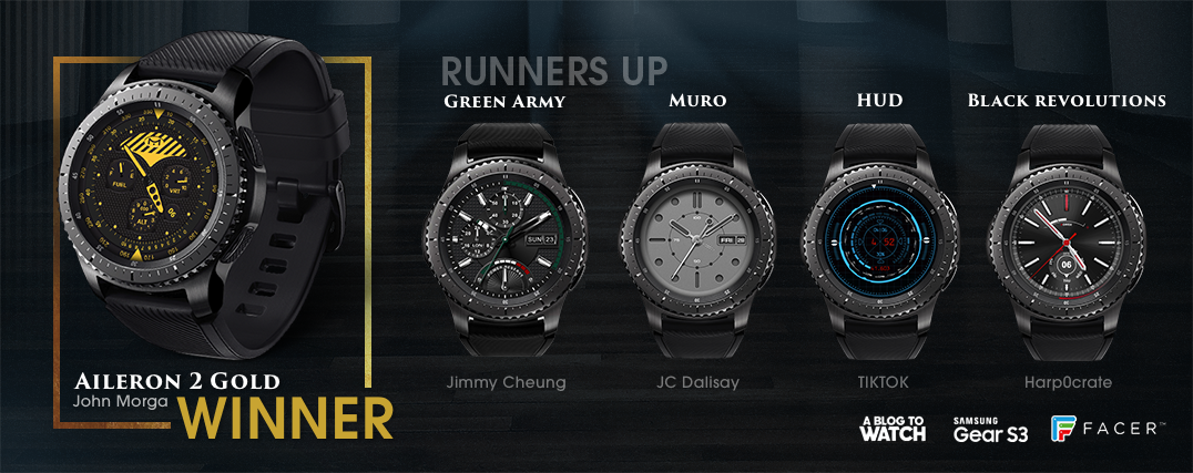
You’ll soon be able to download each of these dials for your own Samsung Gear S3 (as well as a few other compatible smartwatch devices). The list of aBlogtoWatch & Facer Samsung Gear S3 Smartwatch dial design competition winners are:
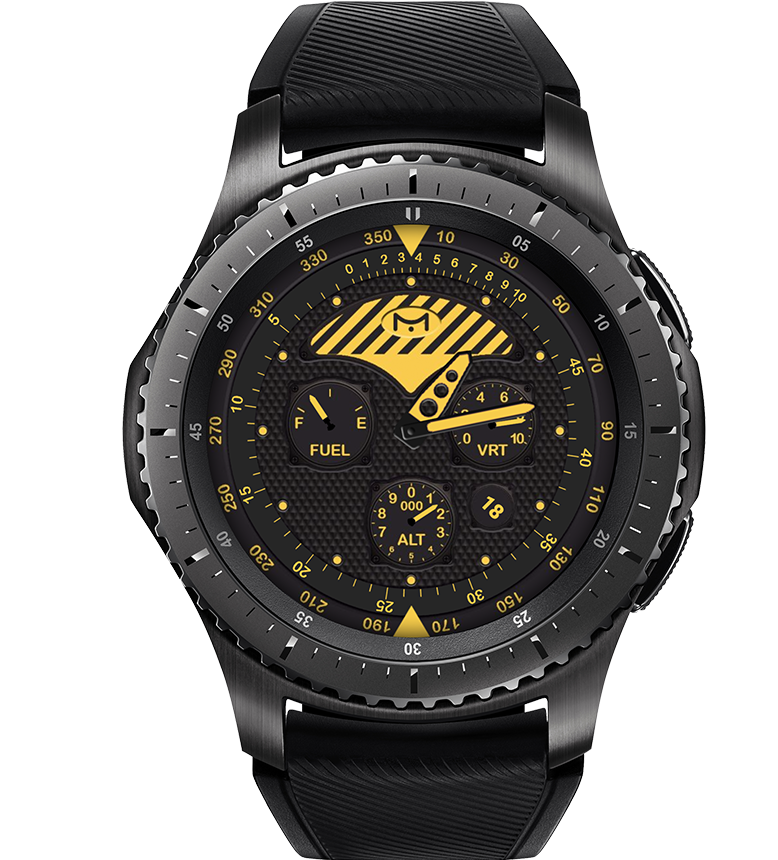
- MbM – Aileron 2 Gold by John Morga
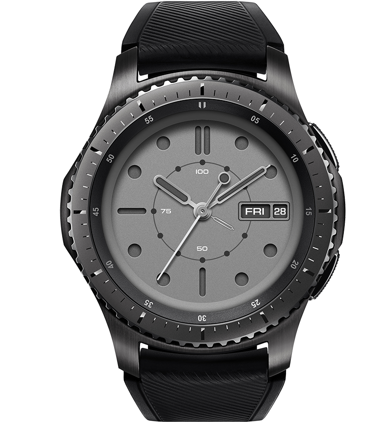
- Muro by JC Dalisay
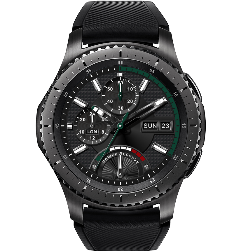
- Green Army by Jimmy Cheung
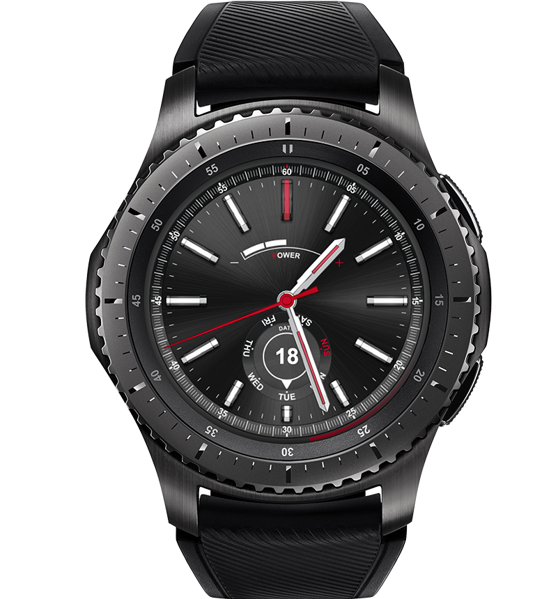
- Black Revolutions by Harpocrate
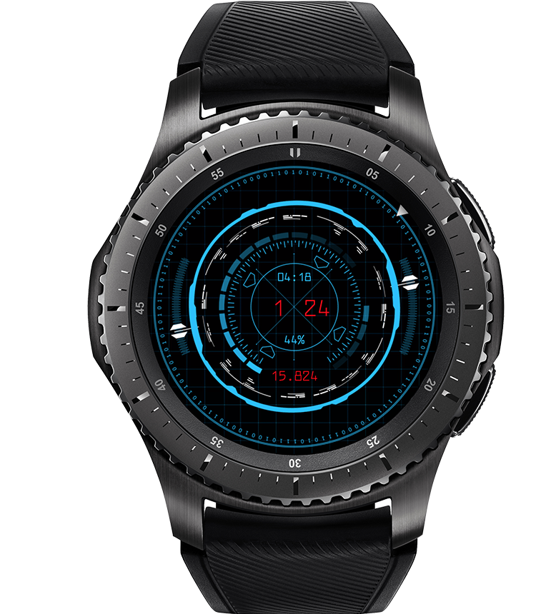
- HUD by TIKTOK
I’d like to thank everyone who participated in the design competition. Thanks also to Facer and Samsung Mobile for helping to make this happen. samsung.com

